How Vox built a calendar marking every mass shooting in 2015
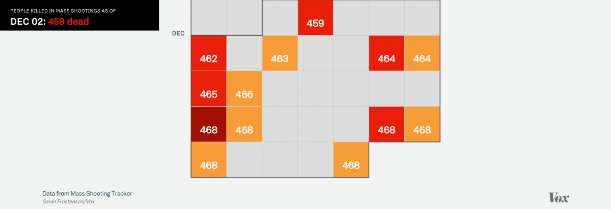
Last year in the United States, 468 people were killed in 372 mass shootings. More than 1,000 were injured.
As Vox reported at the end of 2015, “not a single month in 2015 was free from a mass shooting.” Mass shootings were defined in their data as incidents in which four or more people were shot.
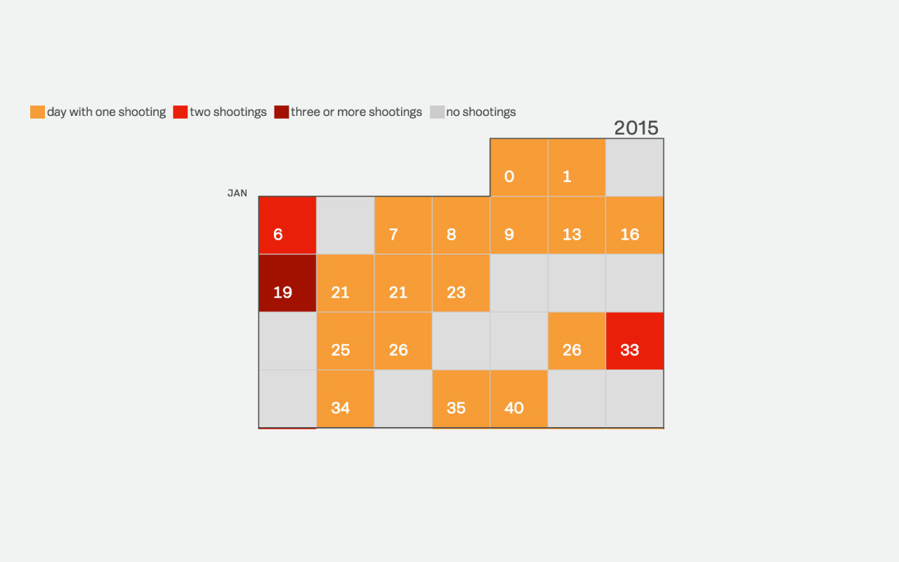
To illustrate the tragic tally, graphics reporter Sarah Frostenson visualized data from the crowdsourced website Mass Shooting Tracker. She built a calendar that outlines which days saw a mass shooting and how many people were killed or injured on those days.
Storybench spoke to Frostenson about how she built the calendar.
Why did you want to visualize 2015’s mass shootings?
Mass shootings received a lot of national attention in 2015 from the shooting of a historic black church that killed nine and injured three in Charleston, South Carolina to the shooting and attempted bombing in San Bernardino, California that killed 16 and injured 19.
But in 2015, the focus on mass shootings shifted away from individual tragedies to a larger narrative that emphasized the frequency in which mass shootings occur. The definition of what constitutes a mass shooting was even discussed and disputed—was it an incident where four or more people were shot (as Mass Shooting Tracker defined it) or four or more people were killed. But despite differing definitions, data on mass shootings became easier to access in real-time with the Mass Shooting Tracker, a crowdsourced database (now managed by the Gun Violence Archive) that tracked mass shootings in America post-Sandy Hook in 2012.
How was the project pitched to Vox?
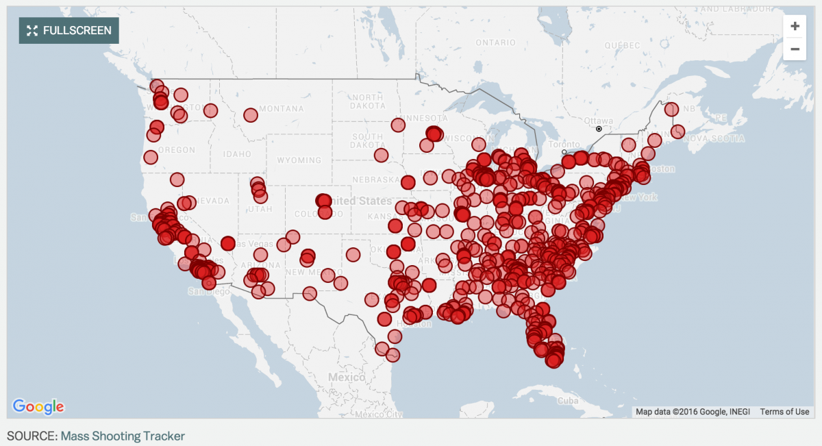
Vox’s first answer to using the data collected by Mass Shooting Tracker was to geocode the incidents and visualize the number of mass shootings in an interactive map. My colleague Soo Oh built the map and launched it in August 2015. The automated process Soo built for updating the map with new data was important to the success of the map and calendar because when Vox decided to present the mass shooting data in calendar form, I was able to focus on presentation and reuse much of Soo’s code to populate the calendar with data.
One of the first news outlets to approach visualizing mass shootings by day was the Wonkblog at the Washington Post, and my graphics editor, Javier Zarracina, loved the idea of Vox producing its own calendar that could be quickly updated with new data when a shooting was reported.
How was your mass shootings calendar built?
Inspired by the design of Nathan Yau’s calendar of vehicles involved in fatal crashes, I went about creating Vox’s own vertical D3 calendar that shaded the days by the number of shootings that day and kept a running tally of the number of deaths from mass shootings. On click, pop-up data provides more detail of what happened on a specific day, including the number of shootings and the number killed and injured.
The calendar’s scrolling functionality was suggested by my colleague Alvin Chang and our visuals editor Sarah Kliff as an effective way to encourage the reader to scroll through the entire interactive, as there was reasonable concern that a standalone calendar wouldn’t spark enough interest to continue scrolling.
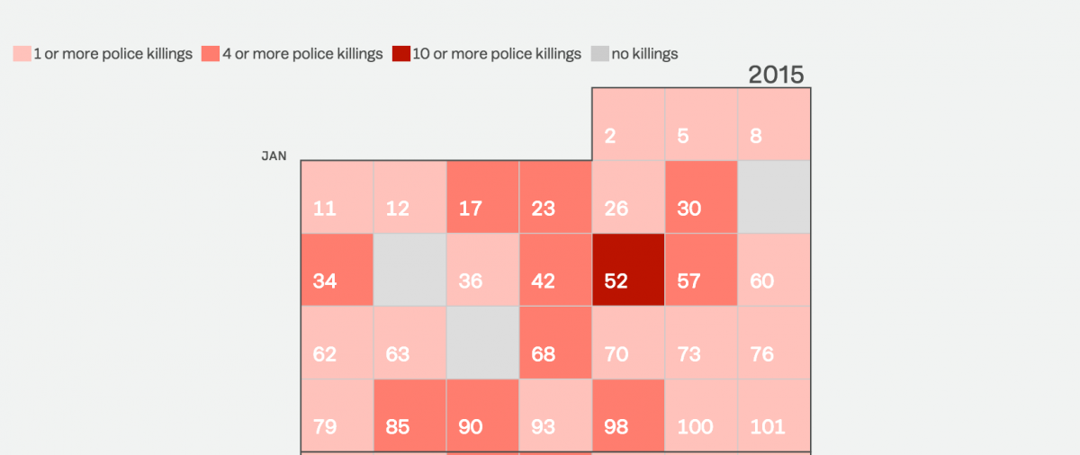
As our team has discussed other ways to reuse and adapt the calendar design—most recently, I repurposed it for an interactive on daily killings by police—we’ve tried to brainstorm projects that allow us to use the scrolling technology as a way to convey accumulated outrage, as Javier pointed out that this is what the calendar does effectively—by keeping a running tally, it lets the user realize how widespread a problem or phenomenon is.
Can you tell us how you built the scrolling function?
Scrolling as a narrative storytelling form is popular and there’s a variety of ways to implement it. The challenge in implementing a scroll for this project was that the calendar was a SVG, which meant I needed a way to calculate the start of the SVG element on the page and an end position in addition to a function for accessing the x,y position of each week in the SVG so I could create a running tally by week.
Working with my colleague Kayva Sukumar, we calculated the start and end position of the SVG and created a global array called positions, where I could then push the x,y positions from each week of the calendar SVG in addition to the week’s date and total deaths as of the current position.
What was the biggest challenge in creating this visualization?
Reusability and sharing an interactive across as many platforms and storytelling mediums as possible is something that Vox is constantly aware of and working to improve. In addition to the interactives produced for this specific project, Javier produced a GIF for social and our Snapchat team produced an edition on mass shootings featuring the calendar.
Can you tell us about the challenges newsrooms face with embedding these kinds of interactives?
At Vox, we have two main ways for publishing an interactive—either as an embed and part of our editorial graphics rig or as a standalone editorial app. Both processes rely on Middleman to generate static pages that are then uploaded into our CMS.
The standalone app is still part of the CMS, but as is the case in many newsrooms, it’s essentially a blank article page that allows for fewer constraints when producing a more custom interactive like the mass shootings calendar. That said, for this project, because updating the calendar was automated, I again worked with Kavya to see if there was a way to have the calendar act as both an editorial app and an embed, in case a reporter wanted to include the interactive in his or her story.
By separating the calendar and chart code into partials, I was able to call them both in the standalone editorial app and provide embeds of each to reporters for use in individual stories. Now when I update the editorial app with new data, the embeds are updated as well. One small tradeoff with this process was that the scrolling functionality of the calendar is lost in the embed as the content is iframed.
This was the first time we did something like this at Vox, but it’s already being used by developers at other verticals at Vox Media and will definitely be used again by our team for projects that require regularly updated data.


