The Boston Globe opinion section showed what it’s like to be a teenager today using essays, poems and art
It’s no secret that being a teenager comes with many ups and downs. The Opinion team at The Boston Globe wanted to learn more about what these were, so a simple question was put in the paper: “What is it like to be a teenager today?”
Kelly Horan, deputy editor of Globe Ideas, and Heather Hopp-Bruce, director of visual strategy for the Opinion section, used the responses to create “Teens Speak,” a collection of essays, poems, art pieces and other forms of expression submitted by teenagers across the country, all of which put a voice to issues ranging from gun violence to parental expectations.
Storybench spoke with Horan and Hopp-Bruce about how this piece was born, from the anecdotes to the art.
The following interview has been edited for clarity and length.
Where did the idea for this project come from?
Horan: I oversee the inbox of pieces that come in [to the Opinion section] and there you see real trends and get a sense of what people are thinking about. Many of the pieces that came in the last year were by child psychologists, journalists and parents talking about teens. We ran some of them, but it really got me thinking, “I’d rather hear from the kids” because I had a feeling this bird’s-eye view of their lives was getting at something, but it wasn’t really in it.
We put a call-out in the paper in June. We ran it for two straight weeks and I couldn’t believe the response. It signaled that kids were waiting to be asked. There’s this idea about teenagers that they don’t want to talk to adults. These submissions really defied that idea because one of the main themes of all the pieces was that kids do want to talk about it.
What was the process of creating the piece?
Horan: My side was going through all the submissions and Heather’s side was asking about how you capture the essence of what people are going to read in visual format.
I was reading every single submission and what I was trying to do was offer readers a real, true representation of the whole. What really represents the sum of what we got in terms of the message? I put them all in a single Google [document]; by doing that, I was able to search for keywords. What clicked into my brain was, “Oh, my goodness, there’s a theme here.” The most used words were “pressure” and “expectations.” The most used phrase was “I thought I was alone.”
Once we settled on the pieces to use, I went back to the submissions. Even though a submission might not have been something I could use on its own, just about every single piece had something that was worth saying. We called those “thought bubbles,” and that was also a way to get more kids into the issue and to amplify more voices.
What do you think the importance of those illustrations are?
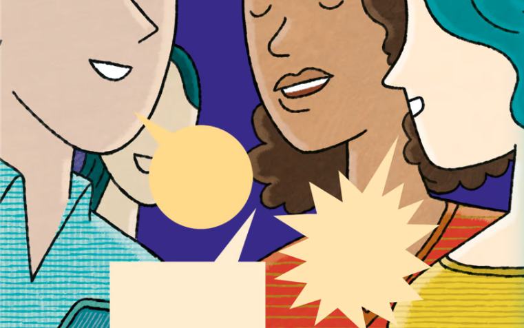
Hopp-Bruce: Every illustrator is slightly different. They all have a different cadence and have different ways of interpreting things. Some are very good with specific instructions, others are good if you give them something vague and let them go with it. [Juan Berrio, an illustrator] gave us a ton of nice sketches, which were easy to work with. There were a couple of times we said, “We’re going to switch this story out for another story” and changed gears a little and he was fine with it the whole time.
What makes his illustrations particularly good for this is that there’s a lot of vulnerability in them. All the characters seemed approachable and real. We had a lot of discussions about diversity –– of gender, identity, race and body type.
It was a huge, ongoing conversation about who we were representing and why and how important it was to represent what kids really look like. I was hoping that kids would see these illustrations and see themselves.
What is some of the UX design in this piece?
Hopp-Bruce: The first big decision we made on this is whether to have just one page that was a continuous scroll versus putting each story on their own page. The advantage of putting them on their own page is that they would have a unique URL. But time-wise and production-wise, that just didn’t make sense after a certain point.
So, I used this tool called Ceros and we decided to do continuous scroll and use anchor points as a navigation. There’s something called “deep linking” where you can create a unique URL that navigates to an anchor point. The unique URL is a little bit clunky, but we decided that it was worth it to do that. With a continuous scroll, you can just scroll uninterrupted. That’s also why I did the chunks of colors. Each story has its own color background, so it had the feel that each was its own unique page, even though it was continuous. It’s a choose-your-own-adventure navigation that lets you discover the content as you like.
We had basically three days to do the mobile [layout]. When I started the mobile, I realized that it could only be a certain depth, and all of the content we had was not going to fit in that depth. So, we ended up doing a lot of little pop-up things so the whole thing would actually fit.

How does the inclusion of other digital and visual elements, such as video and personal art, elevate the piece?
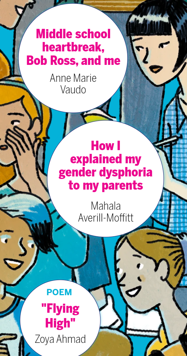
Horan: Heather really helped one teen, Charlotte Pinto, with direction on color and all the other things that make a cartoon work for digital and print. With [one of the teenagers], Anne Marie Vaudo, I found her essay very charming, and then I was like, “We’ve got to see some of your art.” It was just one of those things where I couldn’t imagine running her piece without seeing her art.
Our social media editor told us she could do four videos. I told her who I thought would be particularly good for a video based on my interactions with them in the editing process. That was really a great element to have, to hear the kids in their own voice sharing their message.
What do you hope the audience will gain after interacting with this piece?
Horan: I hope that young people have found it and feel like [they’re] part of a larger community that’s thinking about the same things. I hope it’s creating conversations at kitchen tables with parents talking to their kids and asking questions in a way that invites conversation.
For me, the big takeaway of reading all the pieces was that we’re kind of doing it wrong. We’re valuing some of the wrong things, like success and productivity — but there’s different definitions of success. What I really hope is that we can hit refresh on what we value and what matters.
Hopp-Bruce: I agree. I actually hope educators read this as well, because there are some teachers and people in schools who maybe unwittingly put this kind of pressure on kids. As adults who deal with kids in any kind of way, we all need to work together to relieve stress from kids.