How Northeastern’s news service visualized the social network of Game of Thrones
Last summer, as the hit HBO television series Game of Thrones was wrapping up its seventh season, Lia Petronio, a graduate of Northeastern University’s MFA program in Information Design and Visualization on staff at Northeastern’s news service News@Northeastern, created two interactive graphics to help users navigate the show’s complex story.
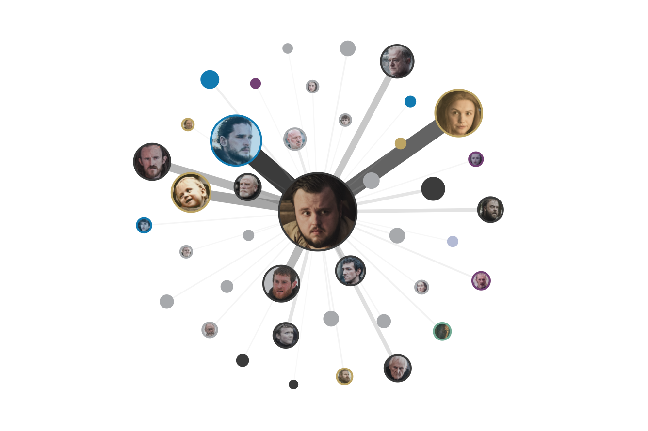
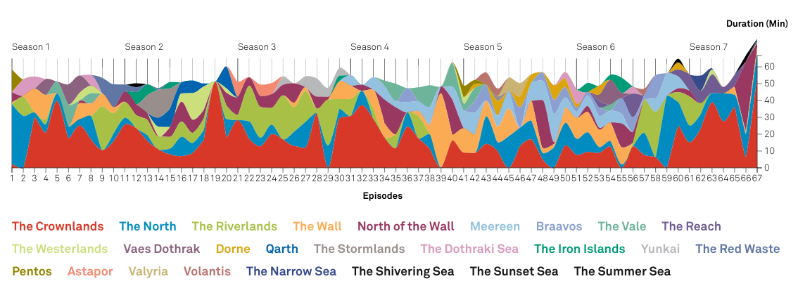
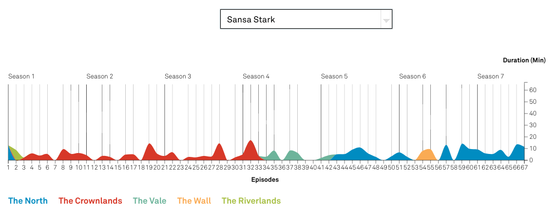
Petronio created a stream graph that allows one to select different characters to reveal the locations in which they’ve spent time across the seasons. Her second visualization was a social network graph that showed interactions between characters in order to reveal which characters have met one another in the past.
Storybench spoke with Petronio about what went into creating these complex graphics and what she has on the docket for the final season of Game of Thrones.
How much research went into these Game of Thrones visualizations?
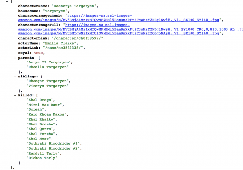
I am a Game of Thrones fan, so in terms of researching Game of Thrones, I did not do much research. I found a datasheet that a fan created for the GOT series. Each episode was broken down by scene, with details including: who was there, what time in the episode did the scene start, what time did it end, and where did it take place. I used another datasheet that records what characters belong to what house/allegiance.
With these two datasheets, I was able to construct a visual perspective of the GOT series. To decide upon what form the visualization will take I did a lot of research, looking at examples of visualizations that show storylines and relationships over time. During this process, I sketch out how I think the data will need to be structured and what needs to be calculated in order to show certain information. In short, what data structure do I have and what data structure do I need? And of course, can the structure I have be transformed into the structure I need? Once I decide upon a resolution to these questions, I begin structuring the data and throughout the rest of the process I am constantly looking at open-source coding references to solve coding problems as they arise.
How did you create the web of character relationships?
The visualizations are made with JavaScript and a library called D3, which is specifically for data visualization. To calculate the relationships between characters I write a series of functions that restructure and calculate the data into the form I need. For each scene, I calculate the duration using the start time and the end time provided in the datasheet.
Next, I write a script that outputs a list of who each character is within each scene and match that with the duration of the scene. This ultimately gives me a data structure that I can manipulate further to map the relationships between characters, based on the amount of time they are together on screen.
Because the data started at a very granular level – scene by scene – it is possible to “zoom out and in” on the relationships, which I implement in the form of filters by season and/or character.
How did you settle on the two types of graphics you made? Why not a “who killed who” type of thing, or something else?
The first visualization, which shows the duration of time on screen each character spent in each location, was hard to decide upon. The datasets I found were so rich and on a topic that a lot of people are enthusiastic about, including myself. Naturally, at first I wanted to show everything. But a quote I heard in my studies at Northeastern Information Design and Visualization MFA program is to show one thing really well, rather than trying to show everything. I took this advice and started sketching possible visualizations.
“Show one thing really well, rather than trying to show everything.”
It is a conceptual challenge between understanding what the data can tell and what visual form can tell it. I had originally wanted to incorporate information about who characters were with in each location, but this additional piece of information would make for a much more complex visualization and I wanted to show one thing really well instead. For this reason, I only show the duration of time spent on screen in each location throughout the series, filterable by character. When you filter, you can in turn see how much of the episode the character was in throughout the series. I enjoy how the absence of details about what happened or who was there allows us to use our recollection when interacting with the piece.
After the first visualization, I knew I would make a second, because the data was just too good. A network was the obvious form to make next. The most recent season had characters who had been apart so long finally coming together, and a network, filterable by season and character, would show us an evolution of relationships and journeys throughout the series.
Was there anything that you wanted to incorporate in the character web that you ended up scrapping for the final product?
The character network is exactly as I had intended, which is a rare thing!
Did you experience any issues in creating these graphics that held you back?
Issues are experienced all the time. For the Game of Thrones social network, I had to re-code the entire thing at one point. Figuring out the best way to structure your program, for me, is the most important, conceptually challenging, agonizing, but also intriguing, part of the process. A good program structure is key.
Do you plan on creating something new for season eight?
I will definitely create another visualization for season eight. As for the form it will take, I intend to make something unlike anything else I have made. I will probably look for more datasets and think of crafty ways I can extract interesting information from them.