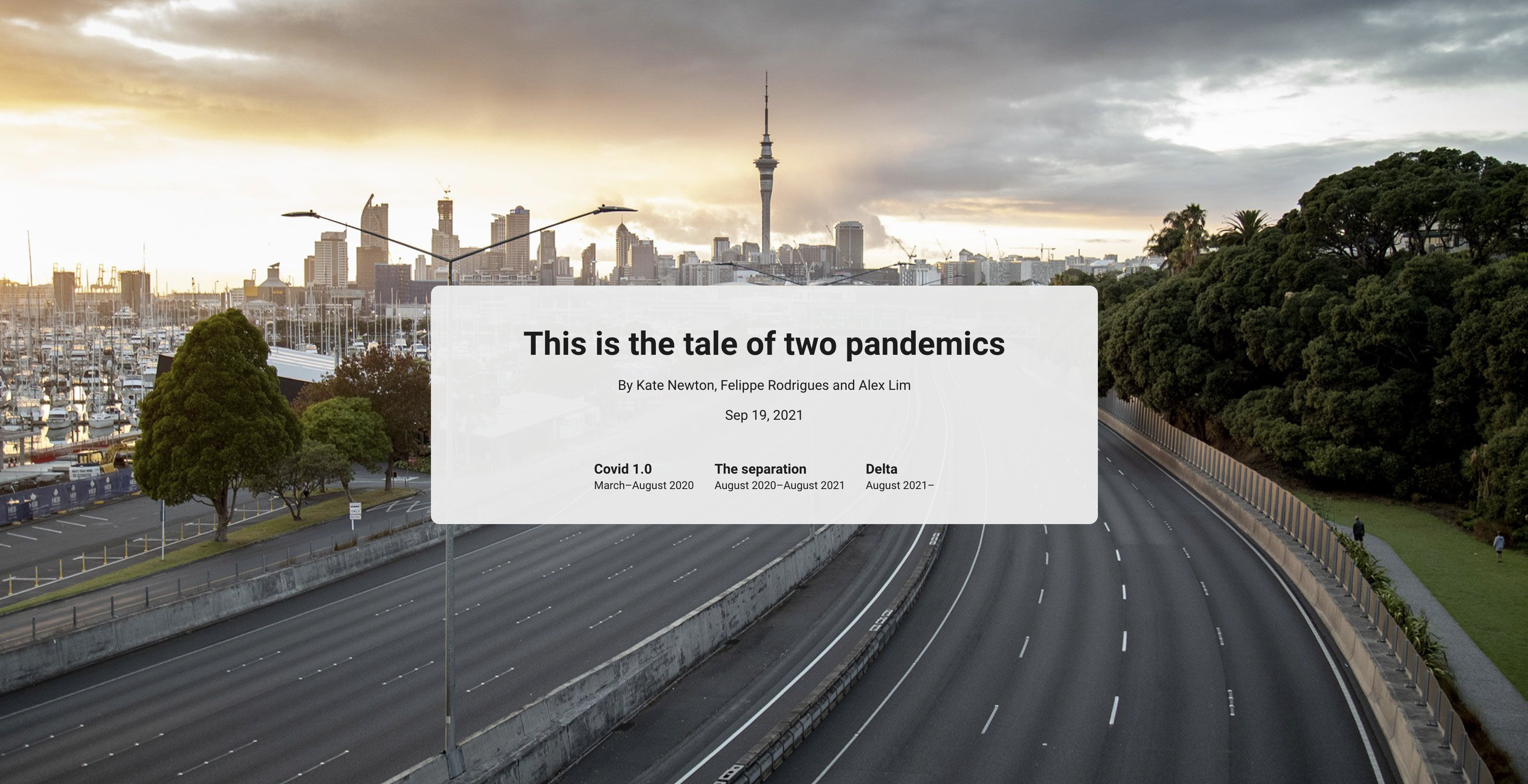
How stuff.co.nz tells the tale of two pandemics in Auckland with an interactive timeline.
We have witnessed various stages of COVID-19 response here in the United States. As early surges and lockdowns led to debates over school openings and mask mandates, now we grapple with signs of renewed hope as more people are vaccinated and communities begin to reopen.
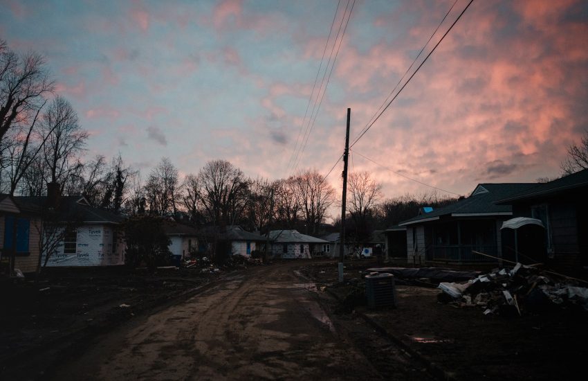
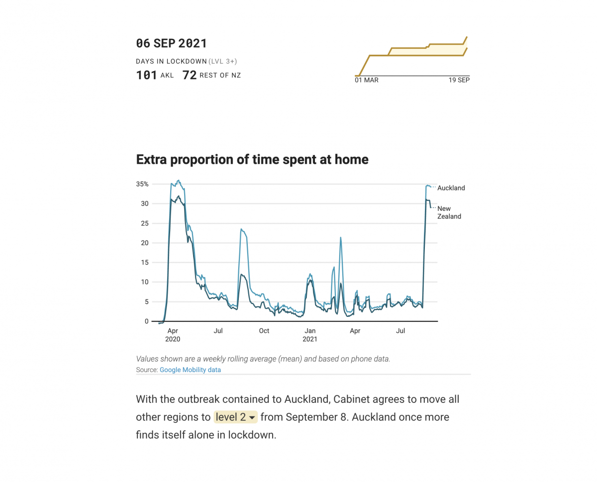
New Zealand pursued a strategy of “COVID zero,” closing borders and imposing tight lockdowns to keep COVID-19 contained. Recently, government officials have acknowledged the end of the seven-week lockdown strategy as it has failed to halt an outbreak of the Delta variant. The restriction will be gradually lifted in Auckland, the country’s largest city.
Northeastern alumni Felippe Rodrigues and Alex Lim reunited in a newsroom at New Zealand’s stuff.co.nz. They worked on a project along with senior data journalist Kate Newton exploring life in Auckland during the year and a half-long lockdown. “The Tale of Two Pandemics” walks readers through different events that have played out in Auckland from March 2020 to September of this year by using an interactive timeline series.
For Lim, New Zealand’s lockdown strategy was a marvel coming from the U.S. As an interactive designer at stuff.co.nz, Lim was responsible for building visuals and maintaining the harmony of the story.
“Finding ways to break it up in sections, images and breakout anecdotes to keep the [audience engaged] in this scrolling experience” were important elements to the story, he explained.
Storybench spoke to Lim about the techniques and design tools utilized within the project as well as the importance of detail and interactive storytelling more broadly in journalism.
This interview has been edited for length and clarity.
What inspired the creation of this project?
New Zealand’s COVID outbreak has been ongoing for quite some time. The trajectory of the pandemic, then the Delta [variant] outbreak that began in August and how Auckland has borne the brunt of the lockdowns. As an American, I think [my background] has always given me an interesting perspective on COVID coverage because the mindset with COVID is just so vastly different [in New Zealand].
Data collection is hard. How did you gather the data for this story?
It was a mix of manually curating datasets and requesting others from government departments including the Ministry of Education, Stats NZ and the Ministry of Social Development.
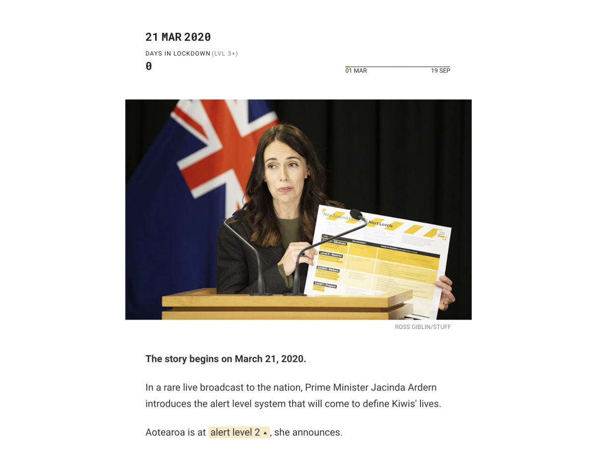
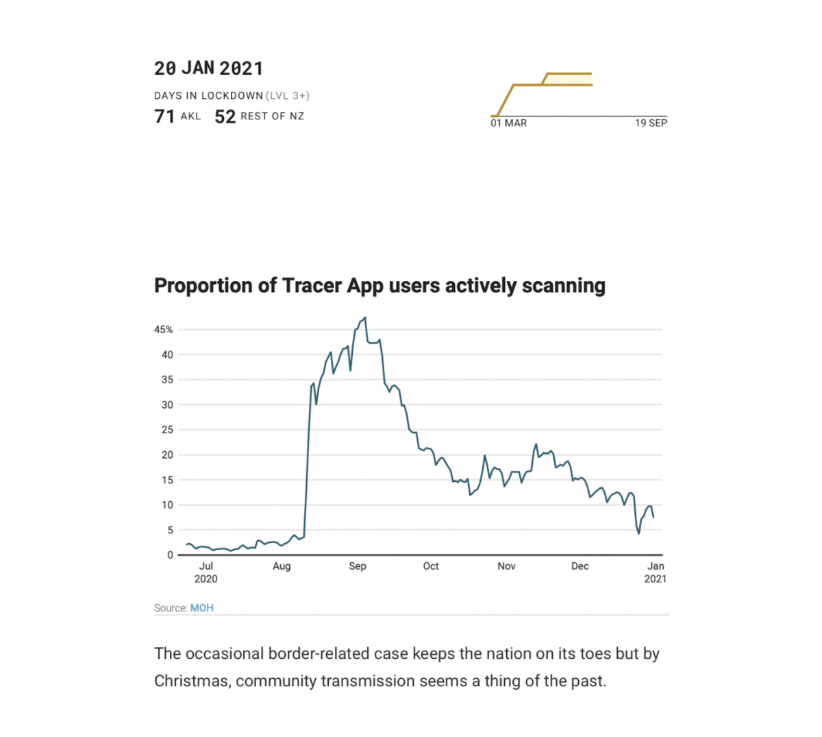
Newton and Rodrigues constructed the time series using the documented alert level changes winding back to March 2020. Plus the regular task of just trying to remember all that’s happened in the last 18 months. Newton also did some work in R to draw insights from the data like cumulative values.

The timeline series for this story was very cool. How did you create that?
For interactive we use a platform called shorthand which lets us create more bespoke interactive using different sections. To encourage it to do more bespoke things that are beyond the scope of what the platform offers, I worked with Felippe Rodrigues to insert this section that uses D3.js to power the chart as you scroll. D3.js is a JavaScript library that lets you code both static and interactive data visualizations.
Rodrigues created the animating line chart using the JavaScript library D3.js. Together we worked on how to integrate the piece into the broader story — setting up each timeline entry with a “date attribute” embedded in the HTML which triggers the chart, date and days-in-lockdown ticker to advance as they scroll into view. The data behind it all is a spreadsheet of timeline dates with the corresponding number of days in lockdown at the time. D3 lets us make it dynamic by animating the transitions between steps.
So, the way that the story works is that, as you scroll, each block of text or each timeline event has an attribute in the code with the date. Those dates scroll into the page view.
Tell me about the importance of detail and presentation in the story.
In terms of presentation, one big consideration for the project was the tone. The pandemic and lockdown are such heavy topics to deal with and we didn’t want to dwell too much on it. We wanted to make sure we featured positive moments of the pandemic, so there are a couple of anecdotes from the great Bear Hunt, the Six60 concert that was earlier this year at Auckland’s Eden Park. So trying to keep the tone of the story by bringing balance.
Visually, we wanted to make sure that we could keep the rhythm of the story because you have to do so much scrolling — finding ways to break it up into sections, images and breakout anecdotes to keep the [audience engaged] in this growing experience.
As an interactive designer yourself, how important do you think the role of design is in storytelling?
How a story is presented can really make or break whether you want to read it or not. It’s not just from how things look but it’s also how things flow. As I mentioned, the rhythm of the story is important — if it’s a long text column that you know is not inviting to read versus when you use elements like pull-quotes and in-line photos vs. full-bleed photos. There are a lot of these considerations that impact how you read and experience the story.
Any advice for journalism students who are in their early phases of creating data visualization pieces?
It’s more valuable to understand when to use different types of charts and visualizations. It’s more important to know the do’s and don’ts of visualizing data than it is to know the software. There are plenty of visualization platforms like Flourish or Datawrapper. Those tools are very easy to use but very easy to use poorly if you don’t understand [the fundamentals of data visualization]. Making stories inviting to read often involves punctuating your story with sections, defining important parts of your story and giving people entry points into your story.
Do you think interactive visual storytelling helps readers better retain information over traditional storytelling methods?
I think it depends. Just because something is interactive doesn’t mean it’s effective. There are plenty of opportunities where you can go overboard with an interactive one. Sometimes the interactivity can confuse more. So, I restrain myself when it comes to jumping toward interactive because they’re cool and rather think about what the clearest way is to present information.
Also, question whether interactivity is adding something to the story. The use of annotations and textual context to explain what I am looking at are important to include.
You recently moved to New Zealand to work at stuff.co.nz. Do you have anything to share for journalism students who just graduated and are looking for jobs?
The first is to lean on your community. I am a member of the Asian American Journalists Association (AAJA). The communities that you’re in can really come through in ways that you won’t expect in your career.
Being more flexible. If I had certain goals or a specific idea of where I wanted to be, I might not have been as receptive to leaving the door open for something like [a big international move].
She is passionate aboutcreating interactive media, focusing on issues like class struggle, education and healthcare inequality. A lifelong cinéphile, she also loves to write essays on avant-garde cinema and has published journals on Point of View Magazine and Deep Focus Review.
- How stuff.co.nz tells the tale of two pandemics in Auckland with an interactive timeline. - October 20, 2021
- How the Parametric Press explains the environmental cost of digital consumption - March 1, 2021
- How the Center for Collaborative Investigative Journalism is reporting on water access around the world - November 12, 2020