How Reuters Visualized the Chilean Economic Crisis
Ally Levine has a firm grasp on what it takes to turn meaningful data into a compelling story. Having jump-started her journalistic career as an intern on the graphics team at the Los Angeles Times, Levine, 24, moved on to become a data visualization fellow for ProPublica before landing her current position as a full-time graphics reporter at Reuters.
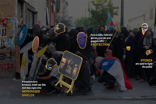
Last November, Levine gathered a series of photos taken by Reuters reporters during the often-violent Chilean economic protests and turned them into an immersive visually-driven story, illuminating the social injustice underpinning the citizens’ unrest.
Storybench spoke with Levine about how this story unfolded and the importance of data visualization in modern journalism.
Why did you first become interested in data visualization?
Well, when I’m reading the news, I immediately scroll to the photos and the graphics and I’m honestly reading as little as possible. Sometimes I may just read the headlines and subheads. So in my own reporting, I wanted to make stories that people didn’t have to read, that they could scroll through to look at the visuals and immediately understand what the story is trying to communicate.
I think everyone absorbs information differently. At Reuters we really cater to those who enjoy reading and getting a lot of in-depth information. But for me, I’ve always been a visual learner. Visuals aren’t always the best way to tell a story, but when they are, I think they should be created. I think that’s becoming a wider practice now, but for a long time stories were only text, regardless of whether or not the information could have been better communicated in other ways.
Focusing on the Chilean protest story, how did you develop the concept for the accompanying visuals?
It was interesting. From what I remember, we were trying to figure out if there even was any visual information. When an event happens there will always be news, but the question for us on the graphics team is whether there are visual elements to create, whether it’s worth turning into a graphic. And what we found in the Reuters coverage of the protests is that there was a lot of information concerning how the conflict started, but not a lot of information that told you about what was happening on the ground. And so we wanted to get into that and we had a lot of incredible photos to work with. So our goal with this story was to give a little bit of background information, about how and why they got to this point with the economic situation in Chile, and then we keyed in on the ways that these protestors were defending themselves. We focused on the tools that they were using, and so we were able to use these great photos that we had as a resource, and combine that with graphics to deliver information to our readers.
When you developed this story, did you exclusively use data from Reuters reporting or did you obtain it from other sources?
In this case, the data largely is in, or the data is these photographs. But just like any other story, the words that you have on the page aren’t the only resource. That’s the final product, but there’s a lot that went into putting those words on the page. For us, we talked to Reuters reporters who were on the ground in Chile and we read all of the stories they wrote. My friend had two friends living in Chile who were a part of the protest, so I connected with them and asked what they were seeing and what their most common tools were that they were using, and what they were seeing other people use. And that actually gave me a much better sense of the scale of everything. I learned from them that all of the protests were largely peaceful until the police came through. Of course you also have to think about who your source is, and this is someone on one side of the conflict, so I took that into account. But they would give me information, like how lots of people are using pots and pans or whistles or laser pointers to defend themselves, and then we would search for photos where protesters were using these instruments that we could then show our readers.
That’s a very innovative approach. What do you think is the benefit of structuring stories around data visualization like that, as opposed to just using text?
I think that when you expand the way you tell stories — moving from text to the use of color and images — you can really communicate information a lot faster. So what we try to do is design our story pages in a way that the reader immediately knows what they’re getting into, before they’ve read a single word. And we do that through creating a feeling as opposed to just writing information. I think that’s one way that visuals can do a lot more for a story.
We don’t want to base the story around visuals, but rather base visuals around a story when it’s important, so that it’s content-driven. And if we feel like maybe there’s a process we want to explain that’s super complicated in words but is pretty simple when you draw out a diagram, we’ll always go in that direction. Another common thing that we try to avoid is making graphics that could be said or explained in a single sentence. So some statistics don’t need a visual, it just depends on the content.
Do you run into a lot of challenges with that?
Yes, definitely. Sometimes you can have data but that doesn’t necessarily mean that you have a graphic. So things we look for are patterns that we want to explain, which I’m actually doing right now as we’re looking at candidate financing. And if you just look at how much money everyone has, that’s a bar chart. But if you’re looking at specific candidates who tend to get specific donors with an agenda, and if you can track a pattern for a reason in donating, you have a much more compelling graphic. So, actually, you can visualize any data but not every dataset has a story. So really what we want is to visualize when there is a story in data.
How long did it take to compile the data and the photographs for the Chile story?
We put that story out pretty quickly. It was less than a week, maybe four days.
What software or digital tools did you use to create the graphs and visuals?
We’re always programming for all of our stories, so I’m doing a lot of front-end development with Javascript, HTML and CSS. If we’re doing some data analysis, which we didn’t do on the Chile story, we’ll use data processing like R or SQL, and it’s sort of up to the preference of the graphics reporter. We did not alter the photos in any way, to be clear, but we toned them in Photoshop to get their true color and then we used Illustrator to outline all those instruments. Those are the programs we mostly use, as well as Excel.
Obviously it takes a long time to master those programs, but it seems like those are all accessible tools.
Yeah, totally, and that’s something that I think all newsrooms are really pushing for right now. Especially graphics departments, which are really trying to get their text reporters to think about graphics, or even begin producing graphics. Every newsroom I’ve been in has tools that make chart building super simple for reporters, so maybe all they have to do is input data into a box and decide whether they want a line chart or a bar chart.
Graphics are super helpful, but graphics desks across the world are trying to shift away from being a service desk where they’re making graphics for reporters that are super straight-forward charts. Now I think graphics reporters are trying to create those bigger and more exciting story packages, and we have more time for that when text reporters are able to make their own simple graphics.
What do you hope readers gain from your work, or from stories that are driven by data visualization at large?
There are so many reasons why I like graphics. I think it’s one of those things, and I did touch on this before, but there are so many different ways to take in information and some information is better told visually. And I think the data needs to be delivered in a way that speaks more to the stories we’re trying to tell. We really should be driving our storytelling methods around the content so that we can best tell those stories … Graphics are important for communicating information quickly and comprehensively, and that’s always our goal. And I hope that’s what people take away. If you have to read every piece of a chart to understand its message, then I think I have failed. Because what I want is to help my readers get this information without really having to work, because I’ve already put the effort into making the graphics.
- How Reuters Visualized the Chilean Economic Crisis - April 14, 2020


