How Vox visualized sea and land ice loss over the last decade
Last December, Vox published a piece that uses interactive images and charts to visualize the loss of sea and land ice over the last decade. The reporter, Umair Irfan, focuses on areas such as Iceland, where the Okjökull glacier has melted substantially from 1986 to 2019, and the poles.
Irfan spoke to Storybench about the process behind this project.
What made you interested in this issue?
I write about climate change as my beat, so paying attention to these trends is kind of what I do, but we were putting together our year-end and decade-end packages from all the different reporters here and looking at some of the major trends. So I looked at ice because it was a big thing we know has changed a lot in the past 10 years. That seemed like a really good framing and benchmark to compare at the beginning of the decade until now.
What was the process for you and your team, in terms of visuals and technology?
I was just trying to find different ways to represent the same information. We could graph it and show you know ice declines in every glacier and then track it around the world, but we thought that could get repetitive. We’re trying to see what is the most compelling way, and some of this was the satellite images with the before and after with the glaciers. Some of them are the time-lapse and some just using a line chart to show how fast and rapid the decline was. We just wanted to show the rate of decline and show that the story is changing very fast and just trying to come up with a diverse number of ways to come up with that point, both through charts and what the satellite images show.
Did you and your team need special permission for the visuals used in the article?
NASA, because it is a government agency, their images are public domain, so we are allowed to use them for non-commercial purposes and that’s what we did. The charts we did were reproduced by scientific papers under fair use, and we modified charts that were in research articles and just made them more aesthetically pleasing. The same with the arctic line decline graph — it had more lines than the original paper, and we just highlighted the ones we thought were the most important.
Did you have a digital team help you? Was it your idea and you passed it on to someone with more experience in this field?
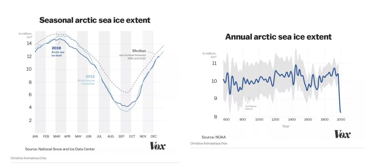
I know how to find this information, so I did work with visual journalist Christina Animashaun. She is credited in the images that she made – the graphs – but she also helped look over the overall visuals of the presentation as well. So she was kind of involved in how we find different ways to represent the same information. She was excellent in terms of the seasonal sea ice extent chart. It was a very complex chart and she simplified it drastically to make the point much more clear.
How does this project differ from others?
Since I knew this was going to be a visual article, it was more of finding compelling visuals for me. I mainly write, and those stories tend to focus on interviews and reading scientific papers and pulling information from there. But since this was visual, it was mainly trying to find good visuals and good charts. So I did talk to a scientist for the story, and I asked them what was the best way to represent this information, what would show the declines we want to show, but to not be misleading, because there are patterns of ice around the world that regularly grow and contract. We wanted to show the long-term trend and we wanted to emphasize that this is a phenomenon due to climate change and not just seasonal variations.
How did you select these areas to highlight?
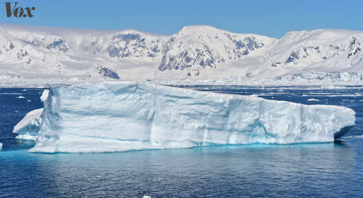
Generally, the biggest changes are happening at the poles, so we were trying to find the places that we could visualize the ice being lost on the sea and on land. The Iceland photo was so striking because it is almost a complete loss of that glacier especially compared to the before and after, the original photo is actually from the 1986 and not the beginning of the decade, because it was declared no longer a glacier at the beginning of this decade. And so the before and after is still very striking, but in the past 10 years either 2010 or further back from the benchmark you see a pretty significant change. The overall point that the climate is warming and that ice is retreating all over the world still stands.
What do you want your audience to take away when they read this?
Just showing it visually that, you know, you can write something in text but sometimes the picture is worth a thousand words, or — like with the videos we embedded that NASA produced — to show the this is a dynamic trend that this is something that isn’t just happening slowly but that this is something that is happening kind of quickly, and there is also back and forth. There is sometimes growth, sometimes shrinkage, but the overall trend is a decline. It is subtle but very much present, and I think the videos represent that well in a way that text would have a hard time conveying, and it is just a different entry point to this story. I also write a lot about this as well and you want to meet your readers where they are and this is something, especially with the charts we made, where we could easily share them on Twitter and social media. And for people that aren’t as inclined to read a very dense article, this is ideal.
Out of all the visual sources you have, which one did you find the most appealing and relevant for the article?
The slider was the more compelling one, and that is why I put that one at the very top, but it is just one case study. That’s why I didn’t want to emphasize it too much, since it is just a small glacier in Iceland, and it isn’t entirely in the poles either. So I just wanted to show that as an example of moving to the big pitch of things and the overall ice decline and get into the bigger picture. I think that the chart showing the annual arctic sea ice extent that has that line just plummeting on the right side of the graph, to me was pretty stunning, and that was one I wanted to make sure we reproduced for our story.
- How Vox visualized sea and land ice loss over the last decade - April 13, 2020


