How The Pudding analyzed the “diva-ness” of national anthem performances
Performing the national anthem at any large-scale event is a high honor. However, upon accepting this assignment, singers often feel compelled to infuse the standard rendition with their artistic flair. Demi Lovato ranged far and wide to give “proof through the night” while Taylor Swift kept it simple. How many famous artists actually prioritize their voice shining through while performing the national anthem?
In a recent interactive story by The Pudding, “Quantifying the Diva-ness of 138 National Anthem Performances,” Jan Diehm and Michelle McGhee explored this question by analyzing 138 performances from major political and sporting events to quantify the uniqueness of each national anthem rendition.
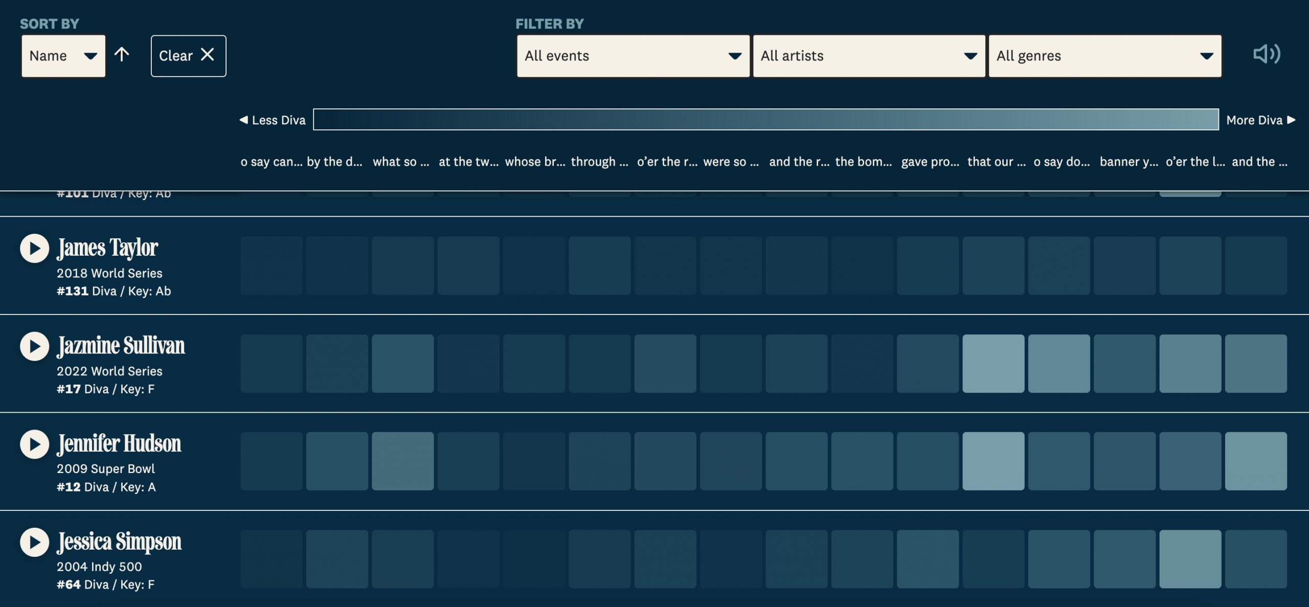
To do this, they created a Diva Score, which was measured based on how much a performer deviated from the standard melody. The piece itself takes readers through a handful of viral performances and then allows them to explore the entire database, with the ability to listen to song clips themselves, phrase by phrase — where each phrase is associated with a color on a gradient of more or less “diva.”
Storybench spoke with Diehm and McGhee about how they approached this intensely data-heavy project, their design inspirations and how the teamwork helped their story thrive.
The following interview has been edited for length and clarity.

How did you come up with this idea?
McGhee: I had an idea that I had been tossing around for a while: visualizing and analyzing vocal runs and sections where a singer will hit a ton of notes, going up and down. The missing piece I was trying to find was the content. Is it all from one singer? Is it all one song?
Another member on our team, at one of our brainstorming meetings, suggested looking at the national anthem. Six months after that, Jan and I decided we wanted to work on something together because we had never worked together only us. We went through a couple of past ideas similar to this one, but this just quickly became our favorite.
What was the timeline for creating this project?
McGhee: We made it fast relative to other projects, because we really wanted to get it out right around the Super Bowl.
Diehm: We started talking about it and doing some general listening around Thanksgiving. By Christmas break, we had done enough general research to know that we needed somebody to do this step, that step, etc. We farmed out data collection to others in our Slack group who had experience with either data or audio engineering. At this point, we had 180 songs in our data set that we knew we’d never get through by ourselves.
When we came back from Christmas break in January, we were able to make an assessment of the data we had gotten. Did we need to refine it, recollect it, change the way that we’re thinking about it, etc.? For example, we originally were collecting data by word. But at this point we realized that the data was a little bit too granular, so we shifted to collecting data by phrase instead.
February was the big final push visually. So, it took around 3 ½ months in total.
What was your process in designing the story?
McGhee: The research is one thread. And once we had all the data from this research, we unlocked the second thread — starting to think about the look and feel of it, or what the design is ultimately going to be. That’s Jan’s wheelhouse. She started a Figma document, which we often use for our projects in the early stages to compile inspiration. We also had a very exploratory analysis, where we had five different performances we looked at on a small scale to relate to what we wanted a bigger data set to look like.
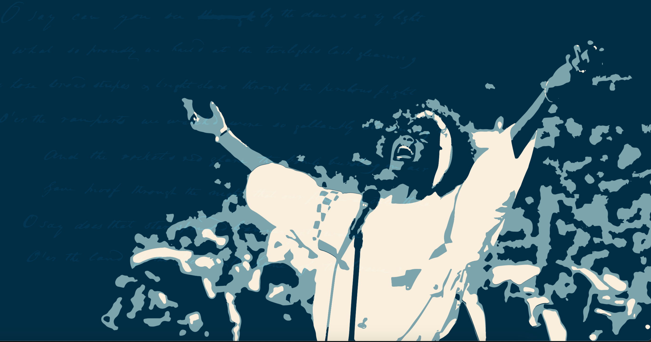
Diehm: I went Googling and down the rabbit hole of what other people have done when they’re trying to visualize data and what we could take from each instance to combine them all nicely. We knew that at the beginning of the article, we wanted it to feel patriotic but not problematic. I went back to some of the Obama-era designs and took a lot of inspiration from those, like the Shepard Fairey “Hope” poster. That became the motif we followed throughout the piece — a little twinge of patriotic sophistication, but not to the point where it gets gaudy.
How was your teamwork an important part of this project?
Diehm: I want to echo that at every step; having somebody else to bounce ideas around made the project stronger. There were so many calls where we would hop on for a second and try to troubleshoot a small little task. And by the end of the call, it was like, “Oh, we completely reworked this. And it feels so much better.”Having that collaboration just made me have warm fuzzy feelings about the project, even though some of the work each week can be a little bit tough.

- “Wrestling with the past”: How Chris Dalla Riva uncovered the deeper story in Rolling Stones’ GOAT music album rankings - November 22, 2024
- How The Pudding analyzed the “diva-ness” of national anthem performances - April 4, 2024
- ProPublica remembers children lost to stillbirth through interactive memorial - March 21, 2024


