How The Pudding visualized the representation and treatment of female superheroes
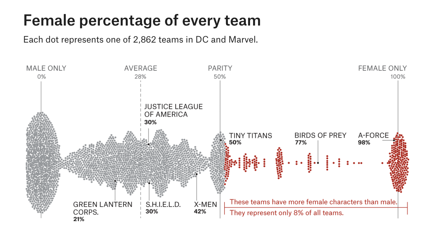
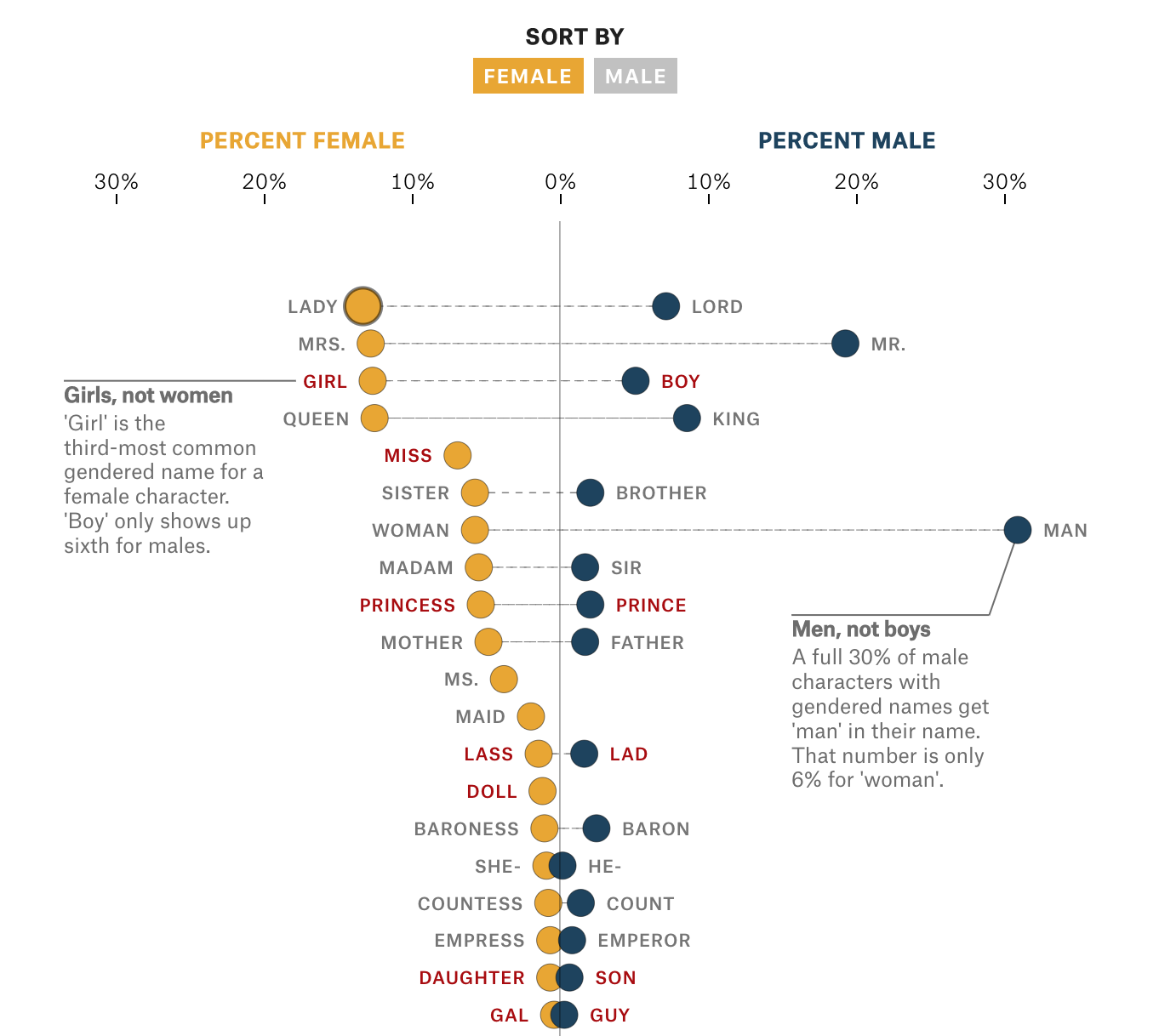
Amanda Shrendruk, an award-winning visual journalist and data visualization expert with the Council on Foreign Relations, recently published an interactive story that displayed how female superheroes are represented and treated in comic books, movies, television and the media. Her research shows readers how female superheroes tend to be underrepresented, sexualized, stereotyped and patronized.
Storybench spoke with Shrendruk about how she visualized the data and what advice she has for others looking to create similar projects.
How did you come up with the idea for the piece? What was the inspiration?
I had a long discussion about feminism and comic books with someone who is a big fan of superhero comics. As a non-reader myself, I didn’t realize how consistently female characters are poorly represented. They are stereotyped, hyper-sexualized, infantilized and often the victim of extreme violence. Everything I read about it, however, was anecdotal. And I thought, I wonder if there’s a way to put numbers to what avid readers are already aware of? I felt it was important to try to introduce some statistics into the conversation if I could.
How did you obtain the data used throughout the piece?
I used the API from Comic Vine, which is a fan-powered wiki about comic books and characters. This allowed me to download information on every character in the Marvel and DC universes.
Why did you decide to tell this story visually and interactively?
“I felt it was important to try to introduce some statistics into the conversation if I could.”
Comic books are such a strong visual medium that it felt like a shame to not play off that in my piece. I kept the design pretty simple — as I didn’t want a lot of distracting illustration — but I included the GIFs as a mechanism to remind readers of some of the characters they may already know. The choice to visualize the data was a no-brainer for me. I think when the data shows something significant, it’s nice to visualize it. And often, a good visualization can make a more powerful statement than the accompanying text. The visualizations also help me access different audiences; someone who knows nothing about comics can read through this and enjoy it because it’s not too focused on characters and teams they don’t know. For another audience — the super fan — the visualizations provide a way to dive as deep as they want into the nitty gritty of some of the incredibly detailed data.
How were the GIFs and interactive components created?
The GIFs were created by an illustrator named Nicole Derksen, and I built the interactive components myself, using javascript and D3.
What was the biggest challenge you faced putting together this piece?
I spent so much time with the data that I had trouble stepping back to see what was really important. I found all the data so fascinating that I struggled with when to stop exploring and when to start writing and visualizing. This is where a good editor is very valuable; they can provide course-correcting conversation and context.
What were you hoping the reader would take away from your piece?
I wanted to add data and statistics to an important conversation that has, for the most part, lacked a quantitative approach. The more we see these characters appear in pop culture, the more their representation matters — especially because female characters appear much less often than their male counterparts.
What advice do you have for journalists working on similar pieces?
When working with very large datasets, be prepared to take longer than you planned analyzing it. Give yourself plenty of time to question the data, approach it from different angles and mash it up. And allow for false starts. As I worked through the data, the story that I had planned to write changed a number of times. The final product was quite different from what I had originally planned, but you need to have that flexibility to let the data inform where the story ultimately goes. You’ll get so deep in the data that it can be hard to pop your head up, get some context and remember what you’re doing — you’re not writing a PhD dissertation; you’re trying to figure out how to present interesting, important and complex data to your audience.


