How The Washington Post used text, video and audio to convey the emotional complexity behind border walls
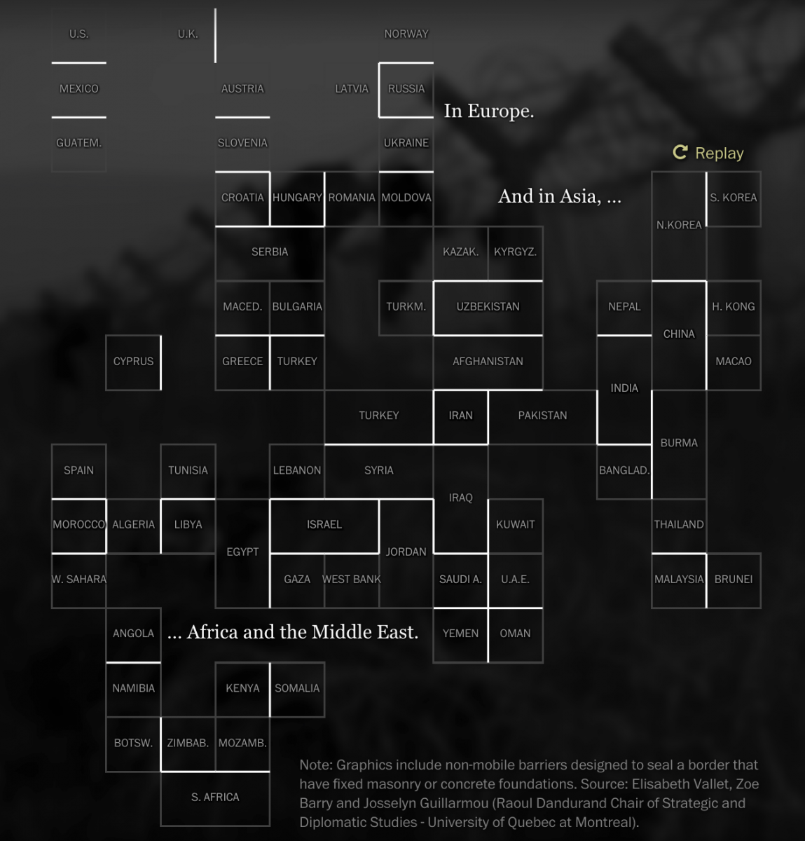
Last October, in order to depict the effects physical barriers around the world are having on human migration, The Washington Post published “Fenced Out,” a three-episode interactive project that used text, video and audio to illustrate the concept of division – between people and countries – which looked at eight nations across three continents.
The Post’s Samuel Granados, Zoeann Murphy, Kevin Schaul and Anthony Faiola used data on the unfolding refugee crisis and interviews with migrants and paired that reporting with the perspectives of politicians, fence constructors, security experts and immigration activists to produce an emotional story that would resonate with readers.
Storybench asked Kevin Schaul, a graphics editor at The Washington Post, about what inspired the piece, how they created its various elements, and whether it achieved its goals.
How did you get the idea for this project?
We had finished a piece specifically about the refugee crisis and how migrants first stepped on European soil on the Greek island of Lesbos. Of course that was a huge story. But we knew there was so more to explore.
Countries were building fences and walls to stop the flow. Nationalist politicians gained power. Opinions split sharply on what should be done. We wanted to understand that better. And we thought the physicality of barriers was a way to approach these ideas. The more we looked into the building of barriers between countries, the more we realized the uniqueness of this moment.
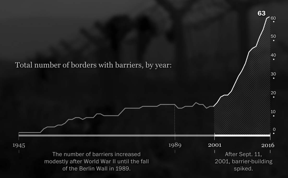
We hoped to explore these ideas from multiple “zoom” levels. Writing can give a far-back, consider-everything level. Data can be more specific, showing exactly how many people were processed at a given facility, or how many barriers were built in 2015. But each of these data points represents a person, or a line between two countries full of people. Video can zoom in, letting us into the particulars of someone’s situation, helping us feel what they are going through. We strove to weave together different mediums to give viewers a nuanced picture of border barriers.
How did you decide to construct the project the way you did?
We ran the video fullscreen, shot and edited to immerse viewers in the scene. Interviews rarely have B-roll, for example, but are often preceded and succeeded by long, standalone shots. The format we created let us run 45 seconds of an intense, loud scene — far longer than we would give in a traditional video. A viewer who wanted to move on just had to scroll.
How did your team organize the data to create this project?
Data is a source. In some ways, it’s like any other interview. Throughout the making of this piece, we referred back to our spreadsheets, looking at it in a different way based on something else we learned, asking the data different questions.
Can you walk me through the process of creating one of your maps?
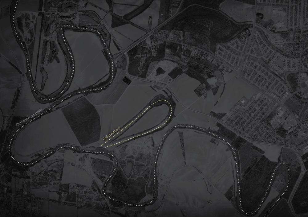
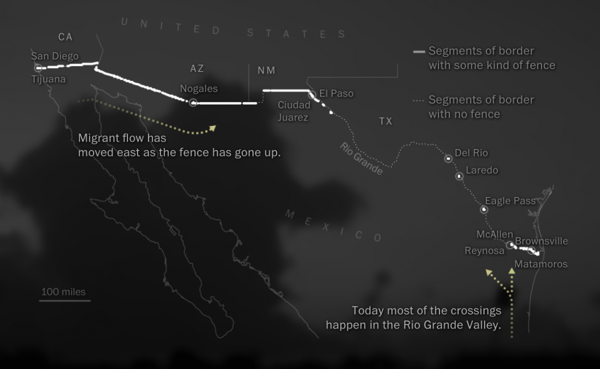
Each map has a specific purpose, so we created them with that purpose in mind. There are usually a few layers to these. The geography layer, of course. The data we’re showing (e.g. number of arrivals in a particular country). And usually a context layer or two (e.g. common routes taken by migrants, which countries do not require passports at borders). There is always more information we could put on a map. The key is to inform, not overwhelm.
In many cases, that’s easier to do without a map. You’ll see examples of charts in this project that involve geography but are shown in a different way.
Why did you decide to stick to the color scheme of black and white?
One of the themes that continually struck us was how so many of these scenes looked like old photos of yesterday’s conflicts. The way migrants set up tents next to a newly built barrier. How people marched along railroad tracks. Newspapers run black and white photos every day. But we aren’t used to seeing present-day video without color. If you do notice that the project is black and white, it might make you consider how what you’re watching, the conflict of “us” versus “them,” the emotion and struggle, are not new concepts.
What were some challenges you encountered in creating this piece?
Designing an experience that weaved video, graphics and essays together was tough. Arguably the most natural movement online is to scroll. But scrolling through video is just weird. We worked a lot on different cues and indicators to make that feel more natural.
But it isn’t easy, and there’s more opportunity in this space. Video is a lean-back experience. Press “play” and watch. The pace is set for you. But reading is active. You control the pace. We tried to make switching between those contexts feel seamless. It’s tough.
What did you want the users to get out of this piece?
One of my goals for the piece was to carefully consider the complexity of border barriers. Some parts of our piece are surprising, others deeply emotional, analytical, thoughtful. The numbers are undeniable — we are living through an inflection point in the history of wall-building. It’s enormously complicated. Let’s consider that.
