Europe’s migrant crisis: A roundup of visualizations
Roughly one million migrants have made their way into Europe since 2014, fleeing danger in Africa, the Middle East, and other regions. Journalists, international aid organizations and data visualization experts have worked to convey the enormity and gravity of this wave of refugees. Storybench took a look at some of the most interesting and interactive visual interpretations of this unfolding international crisis.
The historical context of European migration
Europa Dreaming, April 2016
Using refugee data from the United Nations and Eurostat, a group of anthropologists, journalists, photographers and designers came together to tell a story of the history of migrants traveling through Europe. Maps, videos and data animations tell the complex story of those seeking asylum. Storybench has covered Matteo Moretti’s work in the past.
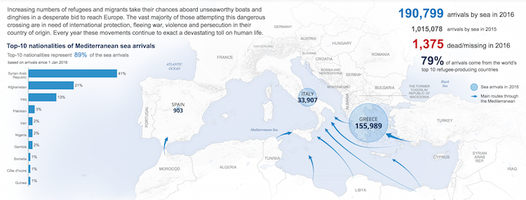
Mediterranean Sea arrivals
UNHCR, May 2016
The United Nations High Commissioner for Refugees (UNHCR) has been gathering some of the most complete data on the current wave of migration into Europe. The UNHCR has also built an impressive website to display the information, complete with maps and links to spreadsheets of data.
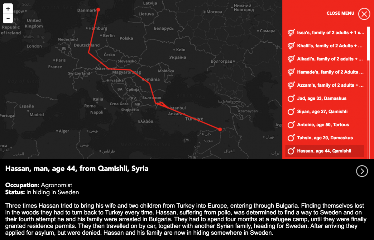
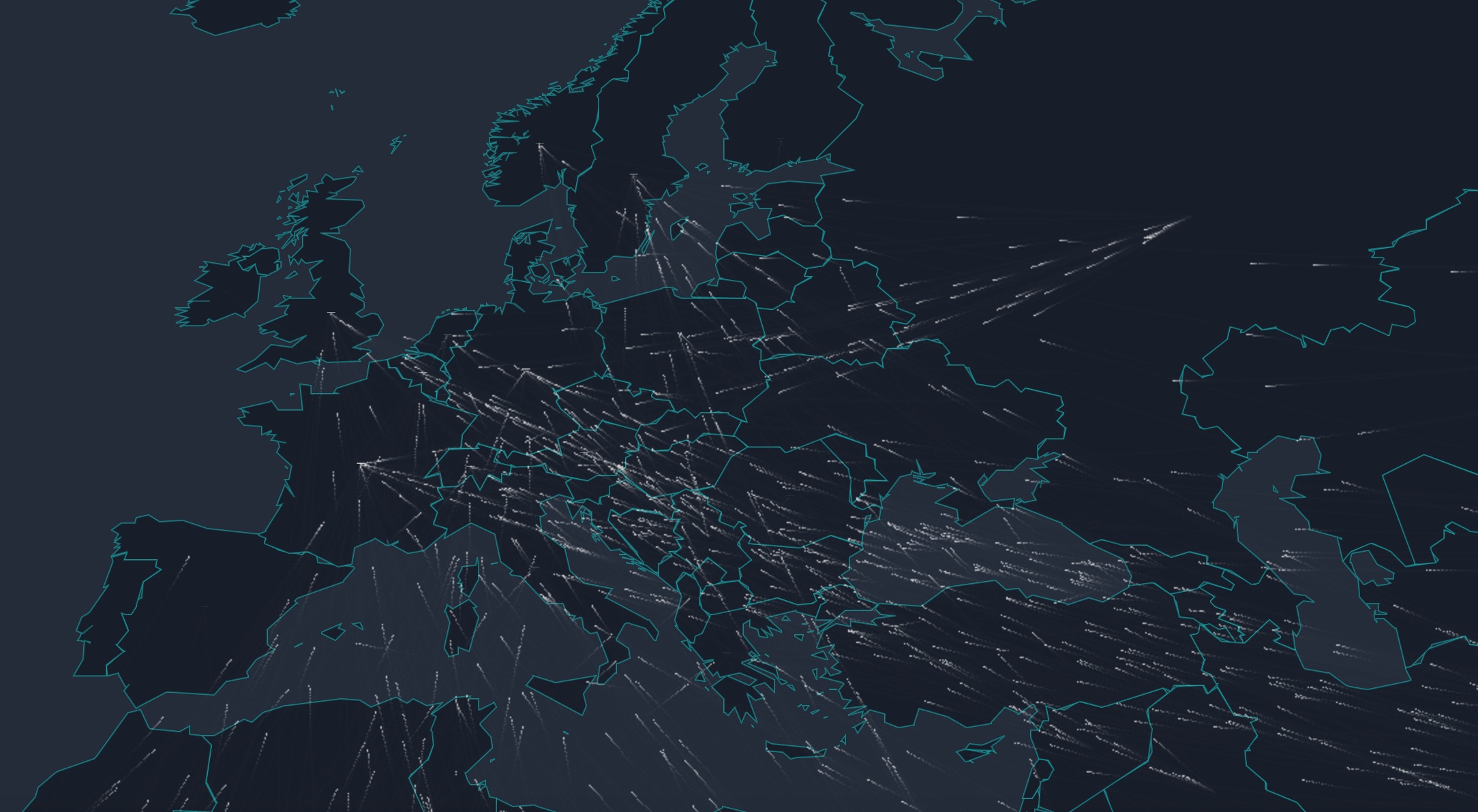
Fortress Europe: Syrian escape stories
Sverige Radio, January 2015
In 2015 Swedish independent broadcaster Sverige Radio published a project where readers could follow the lengthy paths of 70 Syrians as they heard personal stories of strife and struggle as they journeyed towards safer countries. The difficulty of their trips becomes very obvious as one traces the visuals of each person’s path. The accompanying audio interviews adds emotion and personal context to the shocking statistics conveyed through the map.
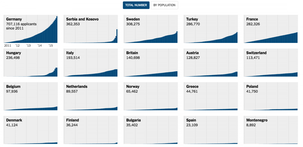
European countries are feeling the pressure
The New York Times, Dec. 22, 2015
By the end of 2015, the migrant crisis had reached a peak and European countries were struggling to help migrants all over the continent. This visual uses UNHCR data to shows the uneven distribution seen across the main countries currently absorbing the refugees.
The flow to Europe since 2012
Lucify, May 16, 2016
This interactive graphic shows the steady flow of migrants seeking asylum in various European countries using both a moving line chart and a flow map. It uses UNHCR data from January 2012 to March 2016. As more and more dots flow into various countries, you can watch bar graphs grow as the refugee population skyrockets. The entire project is housed on Github.
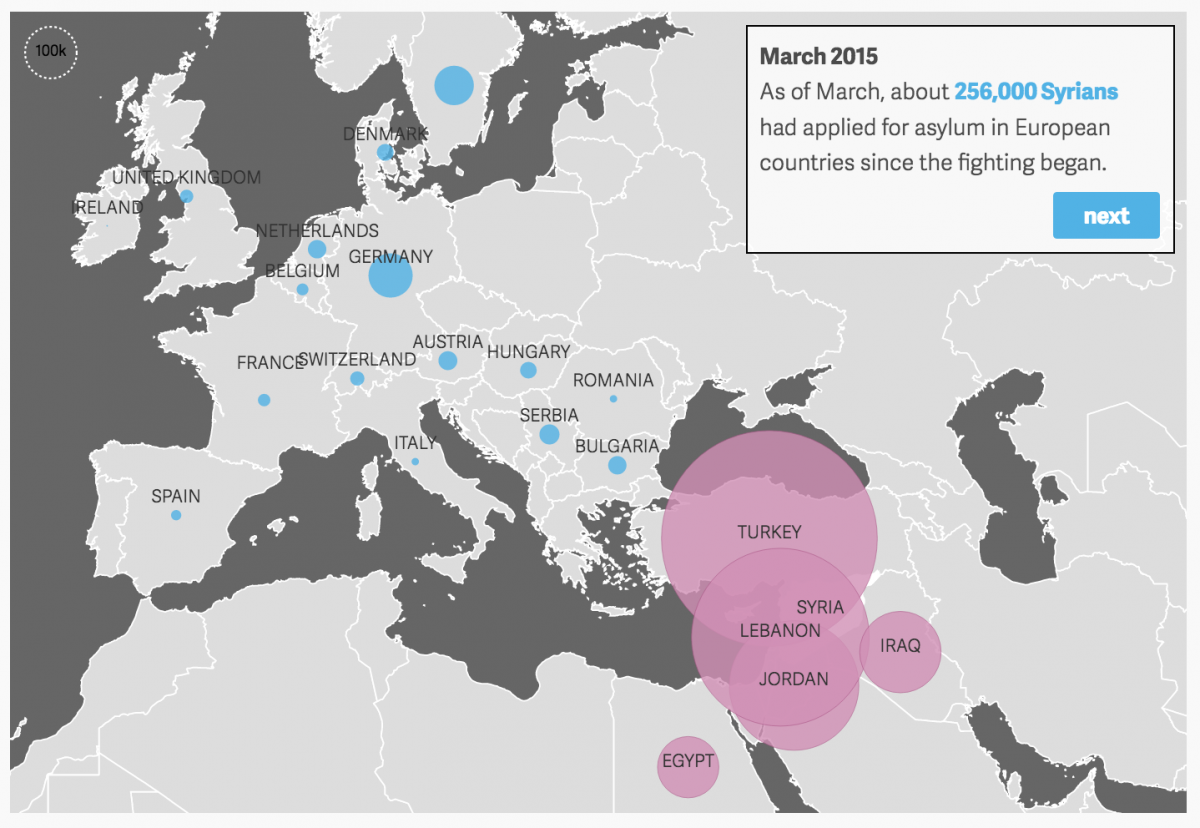
The flow from Syria
Quartz, Sept. 10, 2015
After violence and protests in major cities of Syria in 2012, many citizens began leaving their homes, fleeing to nearby countries. As the fighting continued, refugees began to look farther, throughout Europe for a safe place to stay. This step-by-step visualization, using UNHCR and Eurostat data, pairs the history of the violence in Syrian cities with the flow of Syrian refugees to various European countries, as well as each country’s plan for absorbing future refugees.
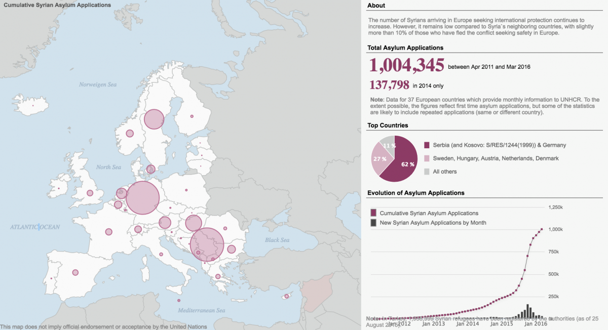
International protection through applications for asylum
UNHCR, March 2016
As refugees enter Europe, many of them attempt to gain international protection, or asylum. In order to do this, they must apply, but so far only a small portion of these applicants have been able to gain asylum. The UNHCR visualization shows the numbers of Syrian applicants of asylum by country and the drastic increases at the end of 2015. Over 1 million applications are currently at different stages of processing, submitted between April 2011 and March 2016.
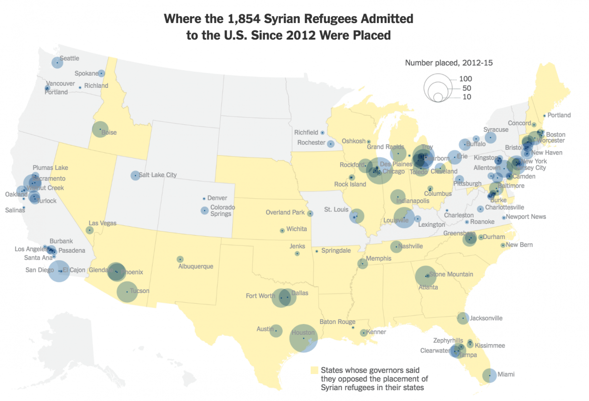
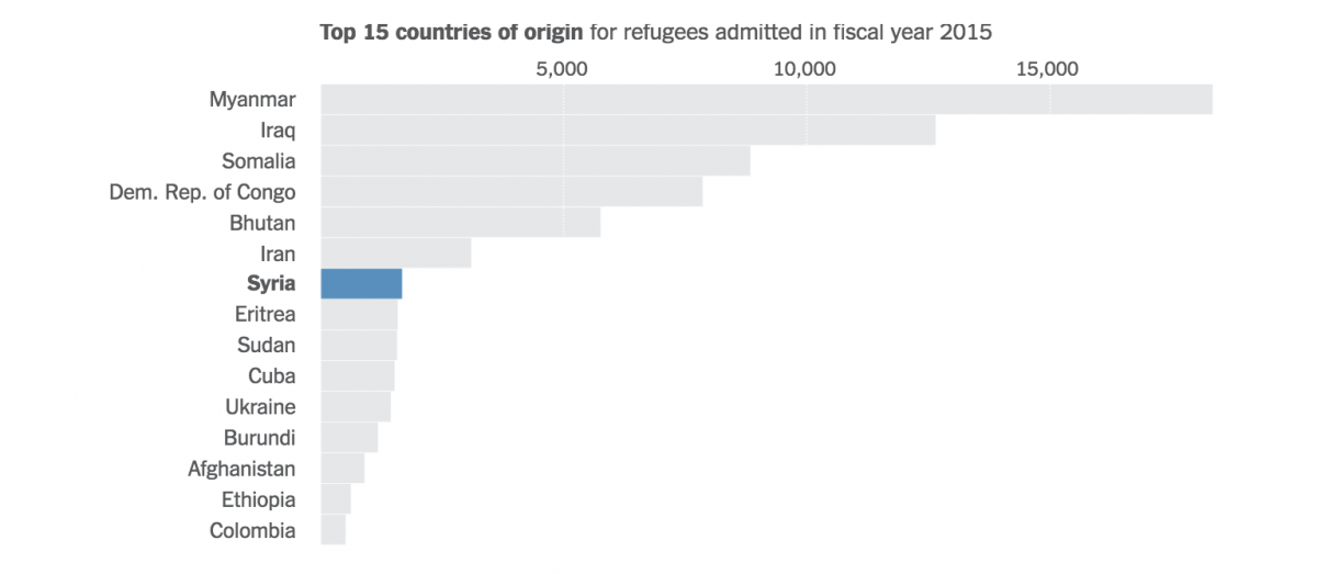
Syrian refugees in the United States
The New York Times, November 19, 2015
The New York Times‘ visuals show where in the United States Syrians who were admitted into the country since 2012 have been placed. This article came out after the Parisian terrorist attacks, which caused some states to refuse entry to Syrian refugees.
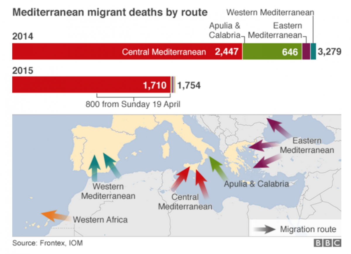
Migrant routes are dangerous
BBC, April 22, 2015
Traveling across the Mediterranean Sea to reach Europe has become one of the most dangerous routes to safety. The BBC’s visuals convey deaths by month, by route, and by area from which the refugees were migrating. These values were represented in a variety of ways to show the severity of this situation through different mediums. The maps show exactly how dangerous the route through the central Mediterranean has been, killing 2,447 refugees through 2014 and killing 1,710 in the first few months of 2015 – 800 of whom died the same night after a boat capsized south of a small Italian island.
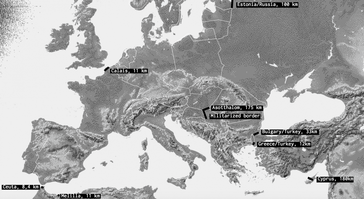
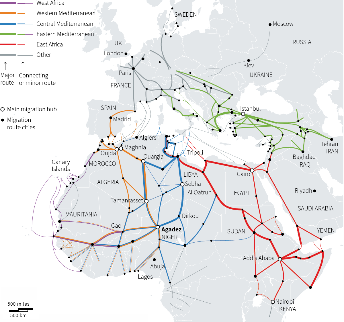
Migrant routes summarized in one visual
Reuters, January 5, 2016
As the state of the migrant crisis continues to change and become more complicated, Reuters provides a clean map demonstrating the routes of migration.
Sage Wesenberg is a student at Northeastern University studying biochemistry, with minors in journalism and ethics.
- Europe’s migrant crisis: A roundup of visualizations - May 24, 2016
- How a small data design company visualized the world’s scientific collaborations - January 5, 2016