How The Washington Post used urban tree data to make readers see their cities differently
Washington Post writer Janice Kai Chen has long been interested in the intersection of data and storytelling. She applied that interest to her piece “Does your city have too much of one kind of tree? That can be a problem”, by building an interactive data visualization that invites readers to explore the urban tree landscape in their own cities.
Chen’s idea for the piece came from discovering an urban tree dataset from the University of Chicago. She was immediately drawn to its unique data and its direct connection to her home city, and saw an opportunity to create a story filled with data, visuals, writing, research and observations. By grounding the piece in local information, she hoped to get readers to look at their everyday surroundings in a new way and to spark curiosity about something most people walk past without a second thought.
Storybench sat down with Chen to talk about how the piece came together and the thinking behind its interactive component.
This interview has been edited for length and clarity.
How did you collect data for this story?
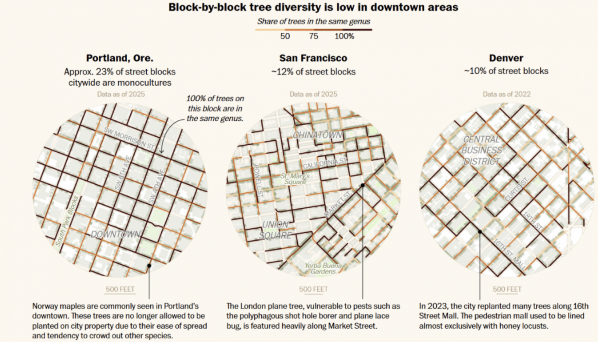
Collecting the data was actually quite challenging —there were lots of stops and starts. Initially, I found this dataset by these researchers [at the University of Chicago]and they essentially published a dataset of 5 million street trees across around sixty cities. I think that’s actually what originally sparked my interest in the story — I analyzed the data percentile and was impressed that 20 percent of trees in Seattle are Maples. It’s crazy —what if they were wiped out?
The main challenge when working with that dataset was that it did not include metadata about when the inventories were taken and what types of trees they were counting. Right now, there are some developments in the AI sphere of image detection, but up until very recently, tree inventory data consisted of people going out and counting trees. In that process, people are making decisions about what data to collect. Some cities would count park and street trees, while some other cities would just count street trees. Some cities would even have data on trees in their urban forests, which dramatically increases the size. I replicated their process a bit — I also went out and sourced my own city tree inventories. In that process, I made sure I outlined exactly what I was collecting, so in the interactive part of the article, you know exactly what is being visualized.
How did you create the interactive data element?
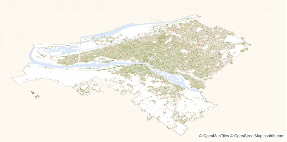
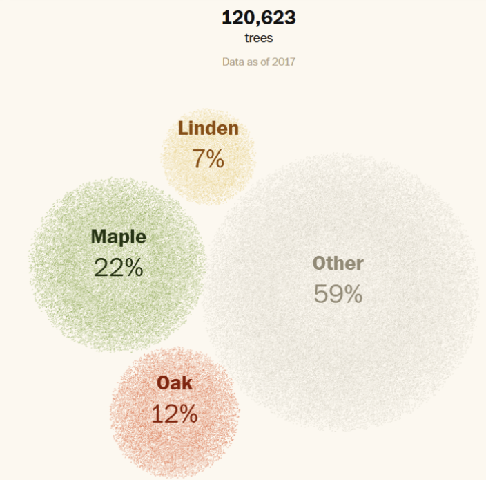
For the space map, I used an open source map. Then on top of that, when the map transitions from dots on a map into a proportional diagram, that was made using something called 3JS, which is a 3D JavaScript library. And then specifically, I used the REACT free map library because that is what we use in-house at the Post.
Why did you choose to include the data visualization?
I wanted to learn a new skill — I had never done this kind of 3D work before. I also thought it would be good to have the proportional chart to give a visual tie into trees on a map. I think there’s something very physical about trees in an urban landscape,so I wanted to use that to ground readers.I was just really hoping to give readers a sense of the initial scale of the issue that we’re talking about.
How did you feel you were able to communicate the idea better visually?
I think readers love an interactive component. I got a lot of positive feedback about this particular method. It’s kind of shocking to see these random dots on a map materialize into shocking results.As visual journalists, I think we’re always looking for ways to capture readers’ attention, and that was important to me.
Who do you think the target audience would be for this story?
I definitely wanted to empower anybody who cares about the urban landscape and the environment to take an active role in their surroundings. I end the story by talking about different programs that cities have used to plant more diverse trees, and a lot of these programs actually evolve residents. In Seattle where I live, residents can advocate for a specific type of tree to be planted.
In terms of general audience, I’m just hoping that people are able to take a look around them with a fresh perspective.
What motivated you to focus on tree diversity as a climate story?
It was really that University of Chicago dataset that sparked my interest. I generally like a story that gets people into things that they don’t really notice. I think it’s also a very existential story. I mean, things we take for granted are at risk of being wiped out.At the same time, it’s a very hopeful story. While tree diversity is not where it should be, there has been a lot of movement in recent years. I think that’s one of the great things about this story.
What kind of public awareness or public action would you consider a success for this piece?
I got a lot of good feedback from sources and readers. One person wrote in to say that they are a professor of Environmental Studies and they would be including the article in their syllabus, which is really cool. It’s very hard to find an aggregated, centralized place or source for this kind of data beyond the University of Chicago dataset, so I’m hoping that the article is also a lasting resource.


