How to begin making your data visualizations more accessible to people with disabilities
How can you make data visualizations accessible? What factors should be considered and prioritized? And how do you write alt text when you have a visual that has dozens (or hundreds) of data points? These are questions I’m regularly asked as a consultant and accessibility trainer.
This tutorial will help you think about ways to make data more accessible, whether it’s presented in charts, maps or all of the above. This will not be an exhaustive tutorial, but a starting point so, I’m intentionally omitting solutions using JavaScript, d3.js, and/or ARIA (for more on the latter, check out “Myth: ARIA has perfect support”). I’m assuming you have some basic HTML and CSS knowledge, but no JavaScript is needed. We’ll be referring to alt text — the alt attribute on an image element in HTML — which is the text that screen reader users get in place of an image.
Mapping presidential election results
We’ll start by working with the 2020 United States presidential results. We’ll use the traditional color-coded choropleth map that has the states won by the Democratic candidate in blue and the states won by the Republican candidate in red.
Alt text for a color-coded map
Imagine you have a static .PNG or .JPG of this map, ready to go into an article or blog post. You have been told you have to use this image because this is the one provided to you, as it matches your organization’s color palette and it matches the way this map will look in print. You need to write an alt tag so that people using screen readers can get the same context as sighted users. How would you describe it?
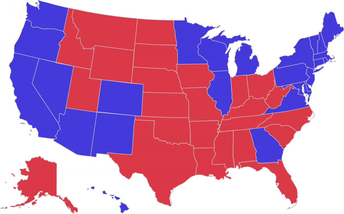
You could start with the obvious: “Color-coded map of the U.S. representing who voted for Biden in 2020 and who voted for Trump. The states won by Biden are in blue and the states won by Trump are in red.”
That describes what it looks like, but doesn’t give users any information. It’s useless.
Instead, you could list the results shown in the map: “Color-coded map of the U.S. representing who voted for Biden in 2020 and who voted for Trump. Biden won Arizona, California, Colorado, Connecticut, Delaware, District of Columbia, Georgia, Hawaii, Illinois, Maine, Maryland, Massachusetts, Michigan, Minnesota, Nevada, New Hampshire, New Jersey, New Mexico, New York, Oregon, Pennsylvania, Rhode Island, Vermont, Virginia, Washington, and Wisconsin. Trump won Alabama, Alaska, Arkansas, Florida, Idaho, Indiana, Iowa, Kansas, Kentucky, Louisiana, Mississippi, Missouri, Montana, Nebraska, North Carolina, North Dakota, Ohio, Oklahoma, South Carolina, South Dakota, Tennessee, Texas, Utah, West Virginia, and Wyoming.”
That’s accurate, but overwhelming. A person hearing the information needs to hold a lot of information at once. Maps are a vital tool in election coverage because they allow users to see trends more quickly than reading a list of text.
So, you could summarize the trends: “Color-coded map of the U.S. representing who voted for Biden in 2020 and who voted for Trump. The map shows that Biden won the West Coast and some of the southwest, along with some northern midwest states, the Northeast U.S., and Georgia. Trump won most of the Southeast, and most of the Midwest and most of the Great Plains.”
Depending on the focus of the article that this map accompanies, you might tailor your alt text accordingly. For example, the article might focus on the states that Biden won. Or the states that Trump won. Or the states in a particular region.
Adding a table to give more context
However you write the alt text for the image, you’ll likely find it most appealing to not to list every state result. This makes the alt text less clunky and overwhelming. But it also makes it difficult for the user to answer the question, “How did my state vote?” That’s OK, because we can still have that information in a table underneath the map. By including both the map and the table, all users benefit.
| State | Total Electoral Votes | Biden | Trump | Winner |
|---|---|---|---|---|
| Alabama | 9 | 0 | 9 | Trump |
| Alaska | 3 | 0 | 3 | Trump |
| Arizona | 11 | 11 | 0 | Biden |
| Arkansas | 6 | 0 | 6 | Trump |
| California | 55 | 55 | 0 | Biden |
| Colorado | 9 | 9 | 0 | Biden |
| Connecticut | 7 | 7 | 0 | Biden |
| Delaware | 3 | 3 | 0 | Biden |
| District of Columbia | 3 | 3 | 0 | Biden |
| Florida | 29 | 0 | 29 | Trump |
| Georgia | 16 | 16 | 0 | Biden |
| Hawaii | 4 | 4 | 0 | Biden |
| Idaho | 4 | 0 | 4 | Trump |
| Illinois | 20 | 20 | 0 | Biden |
| Indiana | 11 | 0 | 11 | Trump |
| Iowa | 6 | 0 | 6 | Trump |
| Kansas | 6 | 0 | 6 | Trump |
| Kentucky | 8 | 0 | 8 | Trump |
| Louisiana | 8 | 0 | 8 | Trump |
| Maine | 4 | 3 | 1 | Biden |
| Maryland | 10 | 10 | 0 | Biden |
| Massachusetts | 11 | 11 | 0 | Biden |
| Michigan | 16 | 16 | 0 | Biden |
| Minnesota | 10 | 10 | 0 | Biden |
| Mississippi | 6 | 0 | 6 | Trump |
| Missouri | 10 | 0 | 10 | Trump |
| Montana | 3 | 0 | 3 | Trump |
| Nebraska | 5 | 1 | 4 | Trump |
| Nevada | 6 | 6 | 0 | Biden |
| New Hampshire | 4 | 4 | 0 | Biden |
| New Jersey | 14 | 14 | 0 | Biden |
| New Mexico | 5 | 5 | 0 | Biden |
| New York | 29 | 29 | 0 | Biden |
| North Carolina | 15 | 0 | 15 | Trump |
| North Dakota | 3 | 0 | 3 | Trump |
| Ohio | 18 | 0 | 18 | Trump |
| Oklahoma | 7 | 0 | 7 | Trump |
| Oregon | 7 | 7 | 0 | Biden |
| Pennsylvania | 20 | 20 | 0 | Biden |
| Rhode Island | 4 | 4 | 0 | Biden |
| South Carolina | 9 | 0 | 9 | Trump |
| South Dakota | 3 | 0 | 3 | Trump |
| Tennessee | 11 | 0 | 11 | Trump |
| Texas | 38 | 0 | 38 | Trump |
| Utah | 6 | 0 | 6 | Trump |
| Vermont | 3 | 3 | 0 | Biden |
| Virginia | 13 | 13 | 0 | Biden |
| Washington | 12 | 12 | 0 | Biden |
| West Virginia | 5 | 0 | 5 | Trump |
| Wisconsin | 10 | 10 | 0 | Biden |
| Wyoming | 3 | 0 | 3 | Trump |
This data table approach also helps if you have charts that have several data points. For example, if you had a chart showing a few years of monthly unemployment numbers, it might be too much to include in alt text for a chart. Once again, a data table underneath the image would help users be able to get the information they need.
Keep in mind that tables can be difficult to make responsive for smaller breakpoints. That doesn’t mean they shouldn’t be done, but if you’re trying to cram several data points into one table, it might be better to simplify the information.
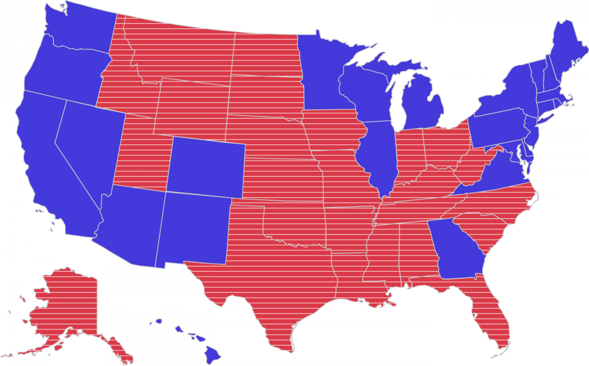
Color considerations for maps
One of the criteria for success in the Web Content Accessibility Guidelines is that “color is not used as the only visual means of conveying information, indicating an action, prompting a response, or distinguishing a visual element.” For people with color vision deficiency (color-blindness), using color alone to convey information can leave them unable to distinguish the values.
For these situations, people sometimes suggest adding textures to bar charts or maps. So instead of just using colors, one would have different patterns with the colors.
Here’s the 2020 state-by-state map with straight lines added to the red states:
Here’s the 2020 state-by-state map with dotted lines added to the blue states:
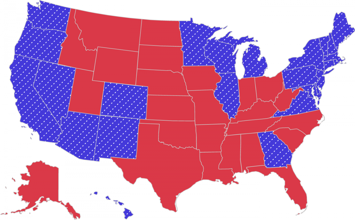
Here’s the 2020 state-by-state map with straight lines added to the red states and dotted lines added to the blue states:
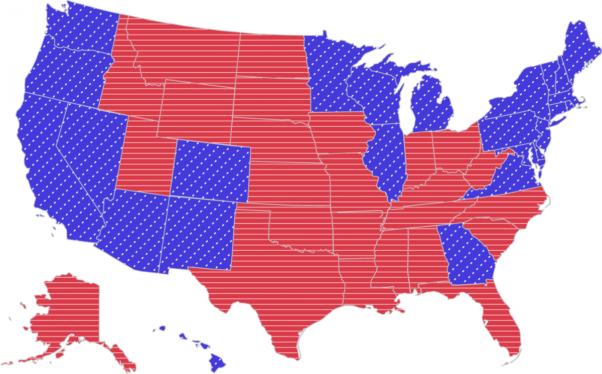
Some might find those overwhelming, and that’s why in Highcharts, there’s an option to toggle between those textured backgrounds.
You might be tempted to test colors on tools that claim to recreate the experience of colorblind users. Those can be useful, but remember that those will be approximations for some users rather than the exact colors seen by everyone with color vision deficiency.
Charting 2024 candidate polling numbers
In October 2023, a Fox News poll reported that Donald Trump had more support among GOP primary voters than any other candidate. Imagine you have the chart as an image that you have to share on your organization’s social media account. How might you describe that chart in the alt text?
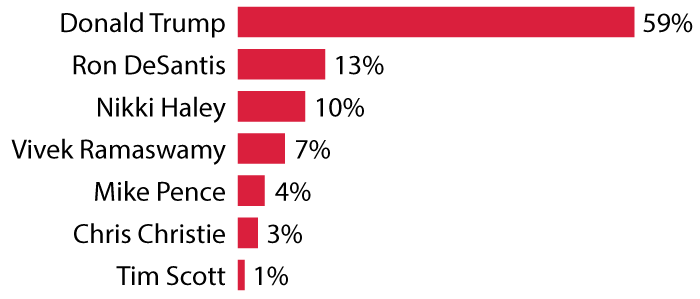
In the article “Writing Alt Text For Data Visualization,” Amy Cesal suggests the formula where you use the alt text to describe the following things about the chart:
- The type of chart
- The type of data
- The reason for including the chart
With that formula in mind, one might come up with this: “Bar chart of how well Republican presidential candidates are polling with GOP primary voters, showing that Donald Trump has 59%, far more than the other six candidates combined.”
This is a similar approach to how we handled the state-by-state map where we summarized the graphic rather than listing each result. But in that case, there were a lot of data points. Here, we only have seven. Arguably, that’s a small enough number to be able to include the numbers in the alt text. Here’s how you might do that: “Bar chart showing Republican presidential candidates, ranked by what percentage of GOP primary voters support them: Donald Trump, 59%; Ron DeSantis, 13%; Nikki Haley, 10%; Vivek Ramaswamy, 7%; Mike Pence, 4%; Chris Christie, 3%; Tim Scott, 1%.”
One option would be to recreate the look of a chart using some HTML and CSS.
<ul class="fake-chart" style="list-style-type: none;padding-inline-start: 0;max-width:37.5rem">
  <li style="margin: 0.25rem 0rem"><span class="candidate-name" style="width: 8.75rem">Donald Trump</span><span class="fake-bar" style="background-color: #da1f3d;height: auto;margin-right:0.25rem;width:calc(59%/1.55)"></span><span class="chart-number">59%</span></li>
  <li style="margin: 0.25rem 0rem"><span class="candidate-name" style="width: 8.75rem">Ron DeSantis</span><span class="fake-bar" style="background-color: #da1f3d;height: auto;margin-right:0.25rem;width:calc(13%/1.55)"></span><span class="chart-number">13%</span></li>
  <li style="margin: 0.25rem 0rem"><span class="candidate-name" style="width: 8.75rem">Nikki Haley</span><span class="fake-bar" style="background-color: #da1f3d;height: auto;margin-right:0.25rem;width:calc(10%/1.55)"></span><span class="chart-number">10%</span></li
  <li style="margin: 0.25rem 0rem"><span class="candidate-name" style="width: 8.75rem">Vivek Ramaswamy</span><span class="fake-bar" style="background-color: #da1f3d;height: auto;margin-right:0.25rem;width:calc(7%/1.55)"></span><span class="chart-number">7%</span></li>
  <li style="margin: 0.25rem 0rem"><span class="candidate-name" style="width: 8.75rem">Mike Pence</span><span class="fake-bar" style="background-color: #da1f3d;height: auto;margin-right:0.25rem;width:calc(4%/1.55)"></span><span class="chart-number">4%</span></li>
  <li style="margin: 0.25rem 0rem"><span class="candidate-name" style="width: 8.75rem">Chris Christie</span><span class="fake-bar" style="background-color: #da1f3d;height: auto;margin-right:0.25rem;width:calc(3%/1.55)"></span><span class="chart-number">3%</span></li>
  <li style="margin: 0.25rem 0rem"><span class="candidate-name" style="width: 8.75rem">Tim Scott</span><span class="fake-bar" style="background-color: #da1f3d;height: auto;margin-right:0.25rem;width:calc(1%/1.55)"></span><span class="chart-number">1%</span></li>
</ul>
This is actually just an unordered list in HTML. Screen reader users will encounter this as a list, for others the bars will display because of how it’s been styled.
Take-aways
When it comes to data visualizations, you probably won’t be able to write a text experience that exactly conveys the same context as the visual. And that’s OK. Rather than try to communicate the entirety of the visualization, instead try to summarize it as best you can. In some cases, you might decide to rely on tables underneath the image to fully flesh out the data.
Just as there are many ways to visualize data, there are many ways to make data visualizations more accessible to people with disabilities. The “best way” will vary depending on the individual project, as there will be important factors to consider on a case-by-case basis. Remember that alt text should be tailored to the context where it appears. The same photo could appear on three different pages and require different alt text for each instance. The alt text for an image can vary, depending on the context of the image, its role on the page, and the intended message. That’s true for all images, including charts.
We’ve just scratched the surface of how to make data visualizations more accessible. For developers who have more experience with JavaScript, you’ll probably want to learn more about the advantages and disadvantages of using d3. I’ve included some resources that I hope will help you continue down the rabbit hole in your quest to make your work more accessible to people with disabilities.
More resources
- Chartability, an auditing framework for data visualizations
- What we can learn from Apple’s dataviz accessibility
- How (not) to make accessible data visualizations, illustrated by the US presidential election
- Dataviz accessibility review: what we can learn from the Norwegian 2023 election graphs
- An intro to designing accessible data visualizations
- An introduction to accessible data visualizations with D3.js
- Highcharts: 10 Guidelines for dataviz accessibility
- Datawrapper: How we make sure our charts, maps and tables are accessible
- Accessible Numbers