Mapbreaking: Why cartographic flaws can sometimes be a good thing
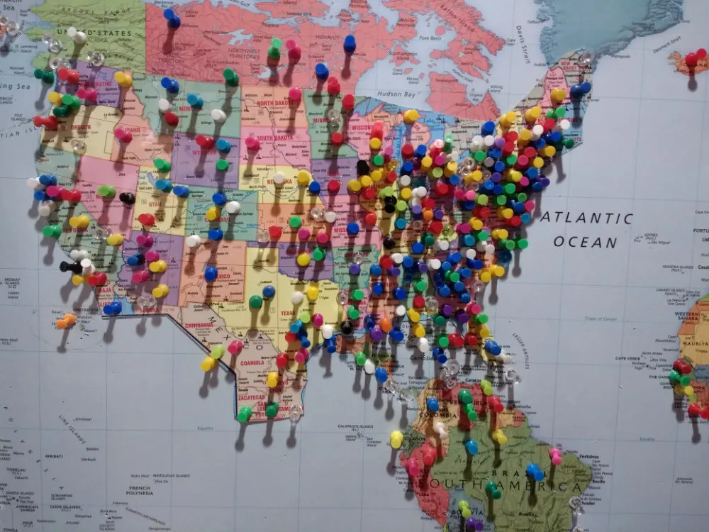
I love this ugly map. I found it in a hospital in Baltimore and at first glance instinctually looked over the part where I live (New England) and found a dense saturation of pins. Each pin represents where one of the patients who came to Baltimore was from. The entire East Coast is densely represented, and every state in the United States has at least one pin. In fact, it’s a full world map with pins on all continents except Antarctica.
It was only the following day that I noticed the new, angular southwestern coastline from Texas to California pushing out into the Pacific. Looking closer, this border includes parts of northern Mexico. When I tried to find the rest of Mexico, it hit me that what I was looking at was a larger map of the Continental U.S. cut and glued on top of the world map.
Trading accuracy for emotional resonance
This map was put on the wall for the pins, that is, for the human experience. Every pin represents a family that visits that hospital, going through an emotional and stressful experience. The hospital offered the pins as a form of representation: I was here, I’m from there. Collectively, anonymously and over years, patients and their families gradually built up a symbolic picture of the larger community they’re a part of — likely without ever meeting more than a few others in that community.
At some point, the map didn’t offer any more physical space for Americans from geographically small states — the regions people looked to were overloaded with the pins from other visitors. The service the staff had offered the patients, the action of representation and emotionally connecting I’m from there to the collective community, was closed off.
So, they fixed the map by breaking it. What they needed was more room for pins, so they zoomed in on the U.S. with scissors and glue. Of course, it was done sloppily, at the expense of all of southern Canada and most of Mexico. And once again many states are too full to place any more pins. But the map was broken for a purpose: to allow more people the experience of connection.
All maps are broken
This is an extreme example of mapbreaking, but the flat geographic maps that we’re used to looking at, and locating ourselves on, are all incorrect. It’s easy to forget that 2D maps of the world pull one fundamental trick: flattening a sphere. These flattenings are called projections, and every projection has its tradeoffs.
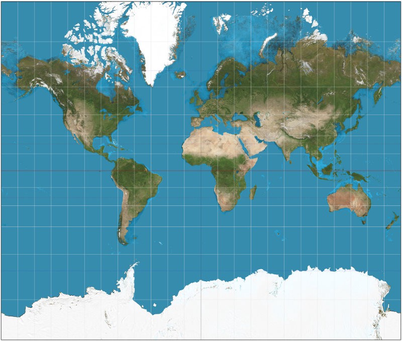
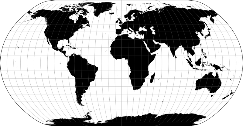
The projection we see most commonly is the Mercator Projection. If you’re navigating a ship with a compass and sextant and need to to accurately track lines of latitude, nothing beats it. The cost of any projection is distortion; it’s just a question of where. The Mercator keeps lines of latitude consistently perpendicular to lines of longitude, but it expands the poles and shrinks equatorial regions. Many of us grew up knowing that Greenland is about the size of Africa, or maybe a little bigger. Right?
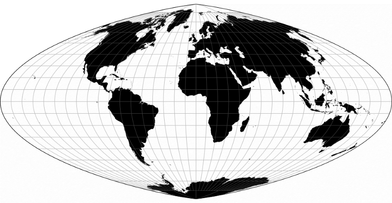
The following few projections appear more balanced across the globe, but none of them can get it completely right. Cartographers often position the map so the distortion happens more at the poles, and the “cut” goes across the Pacific.
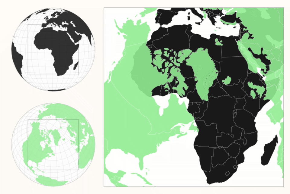
By looking at Zan Armstrong’s interactive comparative map, we can much more accurately examine the sizes of countries and continents. Greenland, for example, is dwarfed by Africa when the equivalent projection is applied to each and the two projections are overlaid:
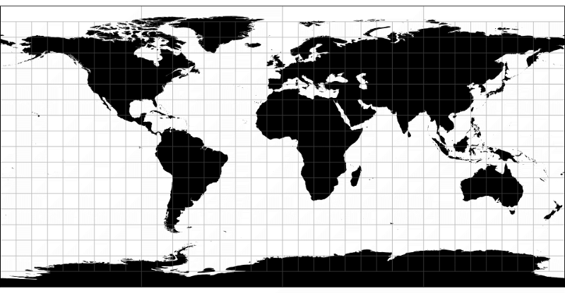
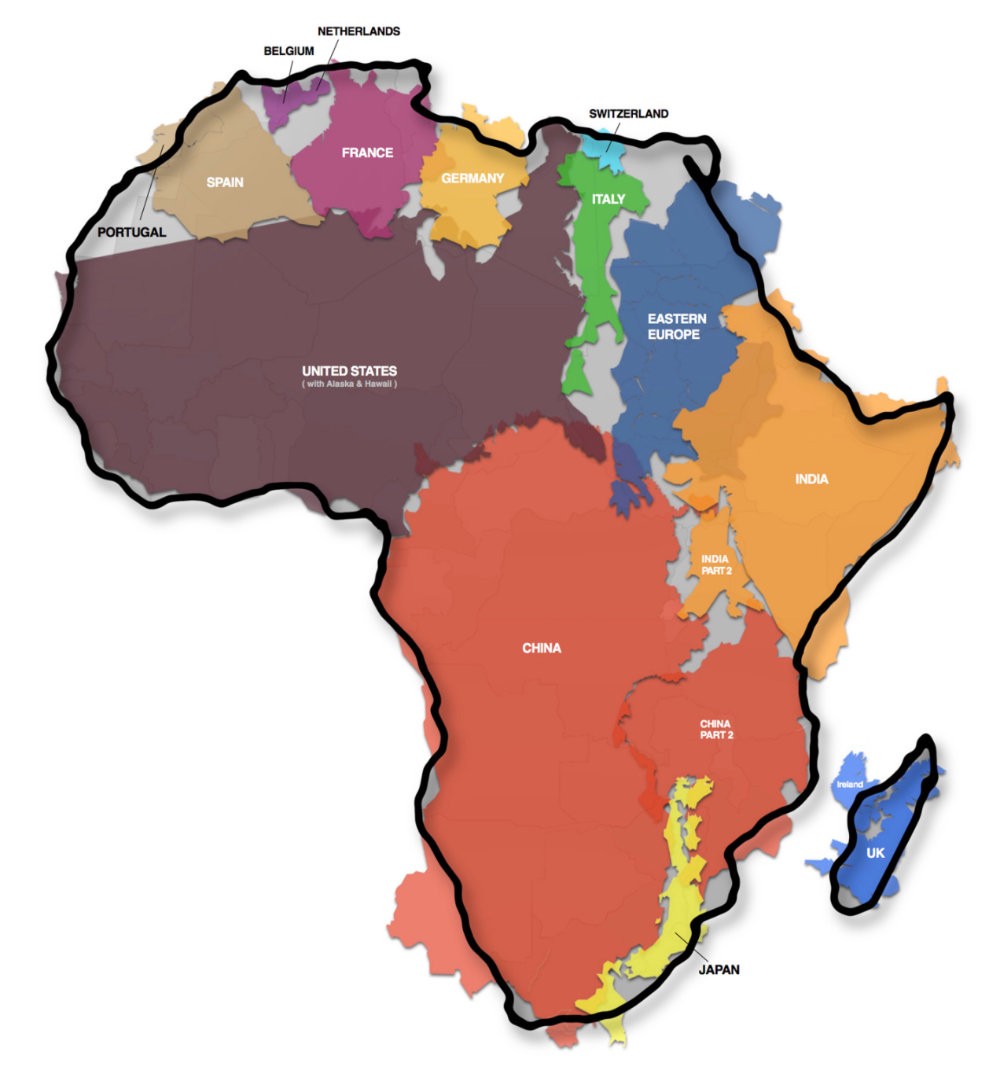
Kai Krause in his project The True Size of Africa did the graphical and the math exercises to show that several continents and countries can more or less fit within the continent of Africa.
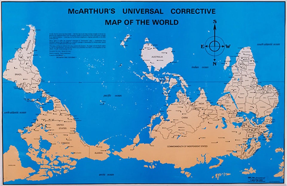
We internalize notions of North and South, “up” and “down,” with map conventions — which is strange for an orb floating in space. Any orientation should work equally well, as should any center point.
Prior art: Statistics vs. geography
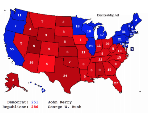
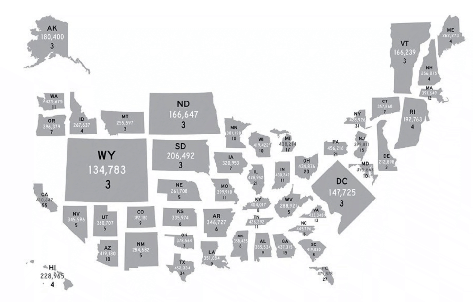
When trying to visualize measurements like population or vote counts on a geographic map, there’s a consistently vexing problem with distortion. Smaller, more densely populated regions (e.g. New Jersey) show up a fraction of the size of large, sparse regions (e.g. Wyoming) because, well, larger regions are bigger. But when we encode values on this map with color, the larger geography commands our view and gives us the impression of “much more stuff” in Wyoming, despite the evidence.
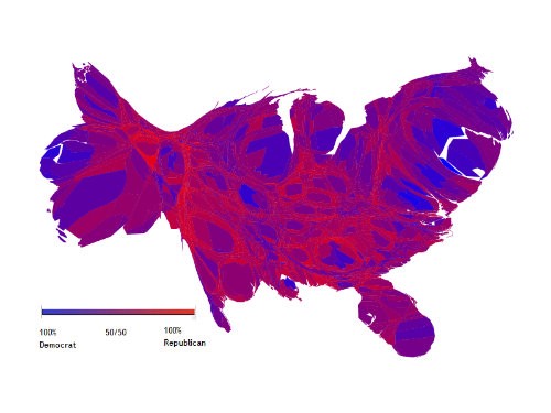
Cartograms provide a way to address this. Geographies can either be proportionally distorted to reflect the actual values they encode…
…or they can be standardized to be equal area and shape, in a stylized approximation of the correct geographic position — and they don’t have to be squares.
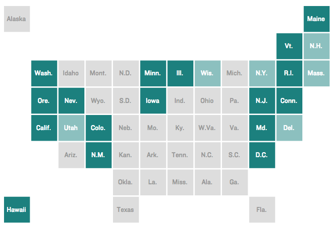
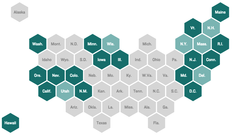
This cartogram preserves the geographic shapes of U.S. states but resizes them to encode the relative voting power residents of each state have, truly breaking the map:
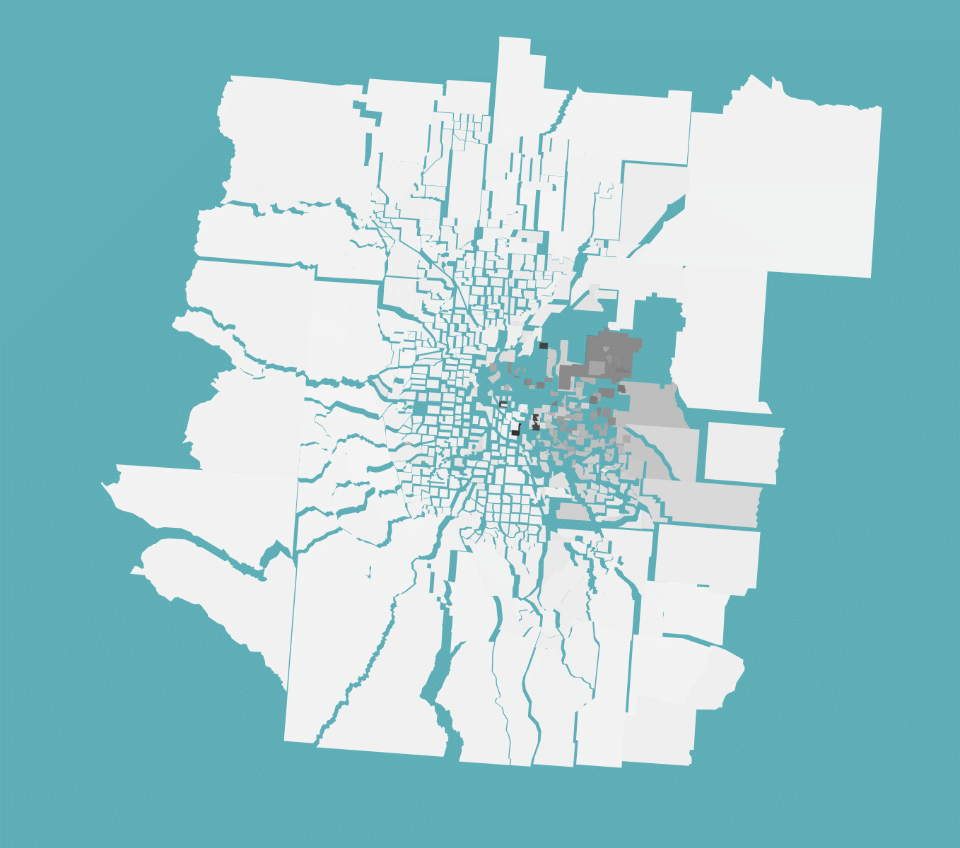
Jim Vallandingham’s Visualizing the Racial Divide project artistically rethinks how we can understand the racial makeup of Census tracts in cities. In his maps, neighboring tracts with significant racial differences push away from each other, revealing where the biggest differences are. The project intentionally leverages the emotion of a “broken” look to communicate its findings.
Alternative navigation
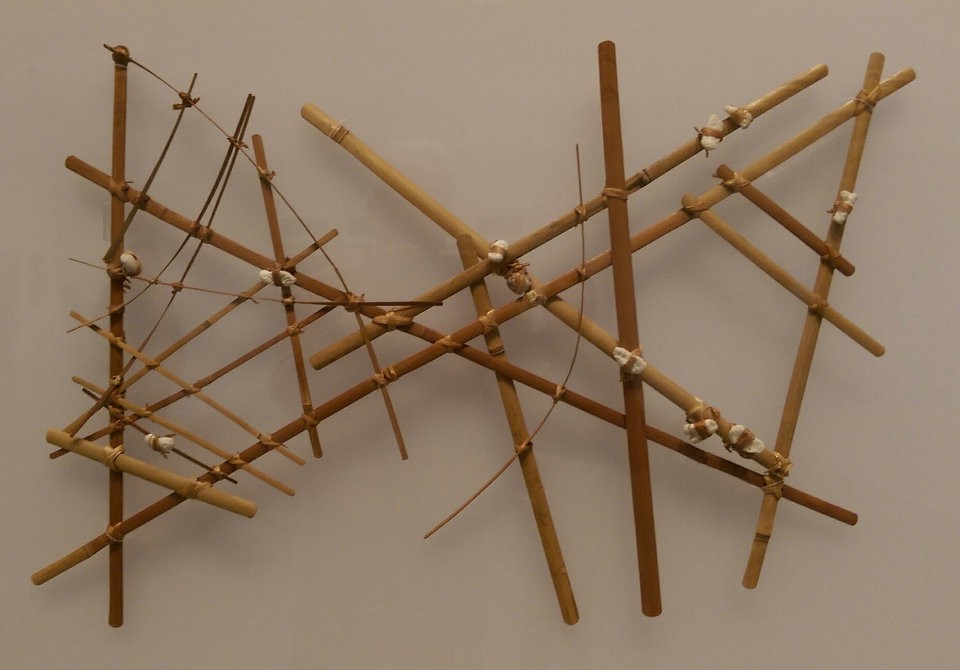
Years ago, without compasses, Pacific Islanders crafted these stick maps to represent ocean swells, currents and relative locations of islands. These were effective navigation tools which were created as memory aids but not brought on voyages.
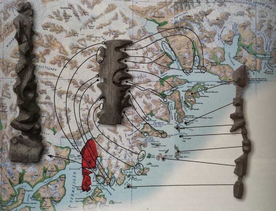
The Inuit of Eastern Greenland devised tactile maps from driftwood to navigate the complex coastline.
Trading convention for legibility
The London Tube map is a world-famous design solution to the problem of Londoners navigating public transport. In an accurate map of London, the tube lines bundle together and overlay each other, and are hard to pick apart visually.
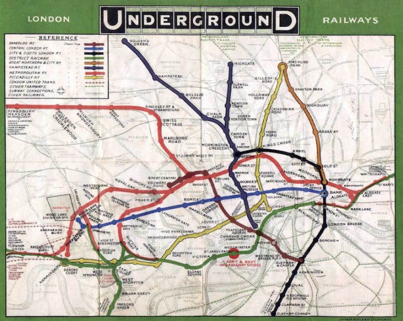
In 1931, Harry Beck took the approach of abstracting the tube lines into a more circuit-like, functional connectivity, at the cost of geographic accuracy.
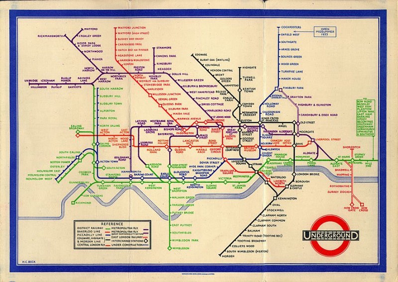
The modern Tube map, now much more complex than the original, is viewed and used daily by millions. Its geometric, utilitarian approach to bending geography has become a common standard in metro maps around the world.
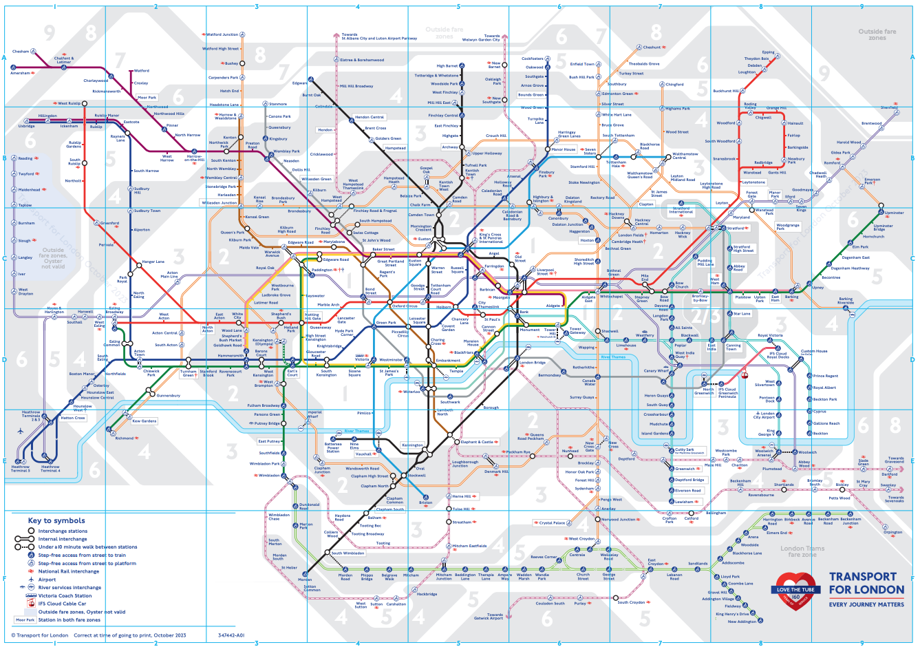
By thinking beyond strict geography, Beck created a beautiful, usable and memorable tool.
This map from Alessandro Zotta and Density Design Lab depicting the flow of ISIS fighters won gold at the 2017 Information Is Beautiful Awards.
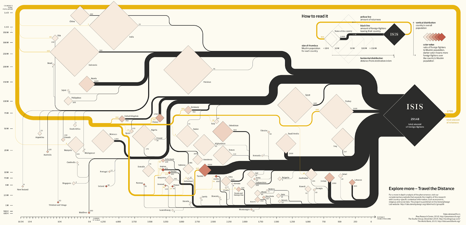
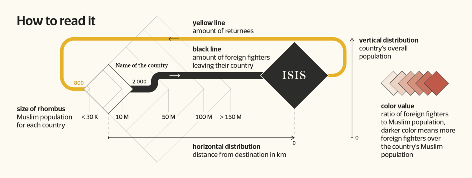
The diamonds and flow lines capture our attention, and the overall balance of the design is masterful. Countries seem to be in some kind of geographical order — but on inspection are ordered simply by distance from Syria in any direction. The size of the diamonds encodes the Muslim population per country. Countries are stacked vertically in order of total population size. Because some countries’ populations are orders of magnitude larger than others, the scale is nonlinear and customized to match the layout of the diamonds and flow lines. The flow lines split, rejoin and sometimes circulate back to their origins. Because of its novelty it’s not an easy map to read. But there are clear instructions and the image demands the reader’s attention, and rewards repeat viewing.
Views of tomorrow
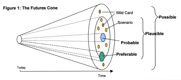
Many maps have been conceived in order to navigate our path in time, rather than in space. Some of these are conceptual, as in the Futures Cone, which gives us a useful way to imagine how likely or unlikely scenarios may play out over time:
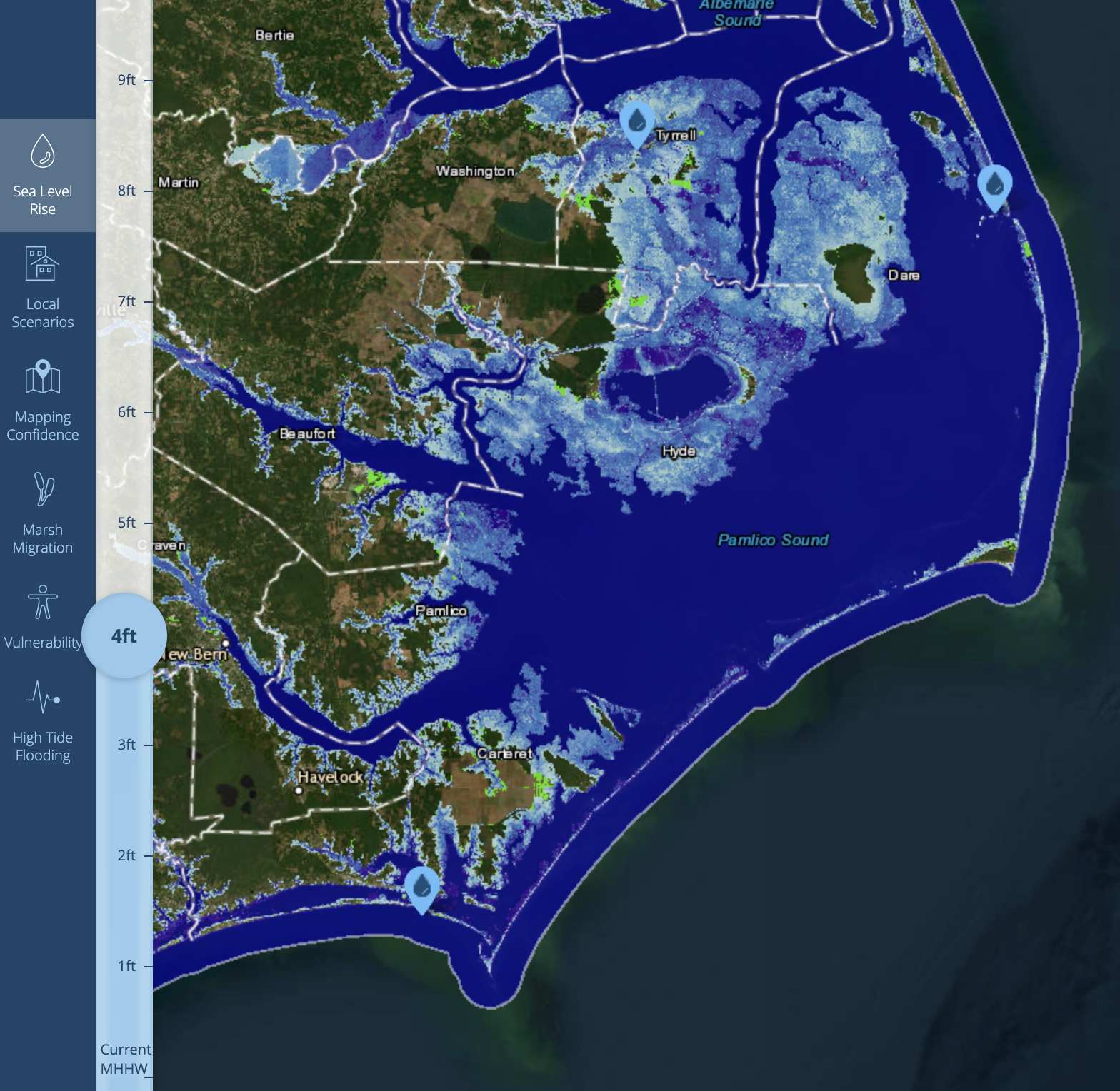
Other more pragmatic maps use scientific models to inform us about the potential geographic futures for those of us living in costal areas.
Latent space astronauts
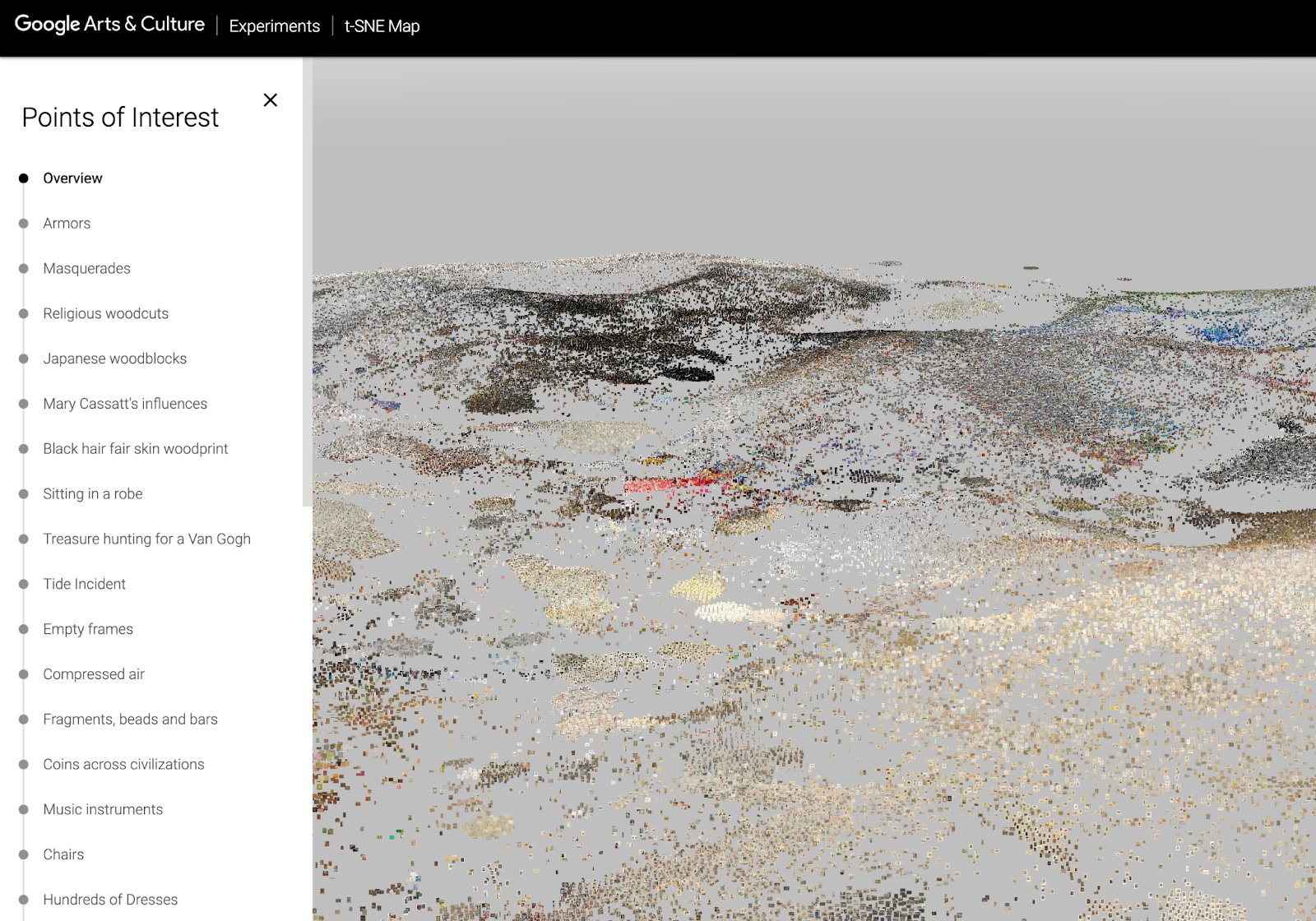
The advances of Artificial Intelligence models have generally preceded our common or even expert understanding of how they work. Part of the difficulty is native to the solution: In order to predict or generate useful answers to sophisticated questions, data scientists created programs that model neural networks — which are inherently complex and nonlinear. One visual approach to communicating how these algorithms “think” is to compress hundreds or thousands of dimensions of a mathematical model down to two or three dimensions. This portrays a landscape of areas of focus or potential answers in a visual way we humans can more readily make sense of (though as always we sacrifice accuracy for utility). For example, Google used a dimensionality reduction algorithm called t-SNE to cluster visually similar images of artworks into a navigable landscape:
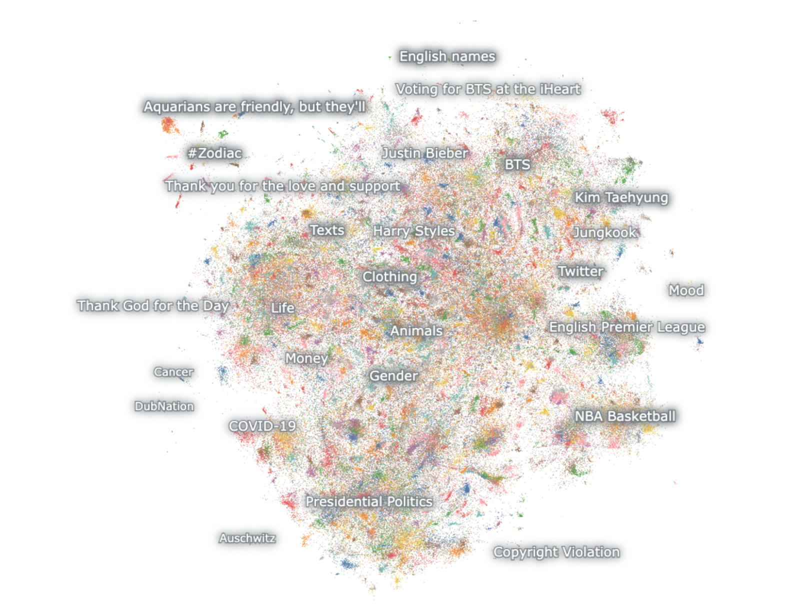
Because these spaces are so multidimensional and vast, our role in understanding them becomes less that of mapmakers and more that of explorers. Nomic makes software to create explorable dimensionality-reduced maps of huge datasets — for example, this one of the Twitter Hivemind.
Rorschach tools
Ultimately, maps are just another kind of tool we humans have made to help us navigate our way through the world. They reflect the collective knowledge and understanding of the times they are produced in and are shaped by the problems we’re using them to overcome, from terrestrial navigation to making sense of machine learning. We’re always mapping ourselves.
- Mapbreaking: Why cartographic flaws can sometimes be a good thing - November 9, 2023