How we built an interactive graphic using carcinogen data from the W.H.O.
Jeremy Scott Diamond is a developer and designer with the graphics department at Bloomberg News. Storybench previously covered his contributions on a Hillary Clinton timeline.
If there’s one thing I’ve learned working with data visualization, it’s that you don’t want your work to be boring. It’s easy to get so caught up in facts and figures that you lose sight of how simple storytelling elements can engage the viewer.
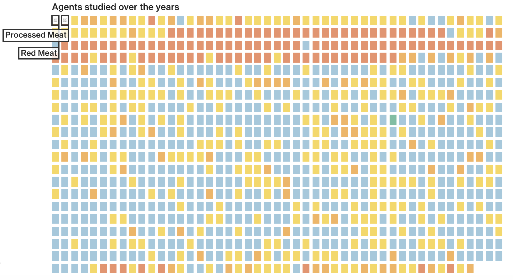
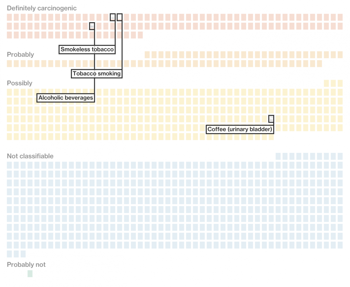
When Bloomberg put together a story on the World Health Organization’s study on whether red or processed meat caused cancer, the graphics department wanted to somehow visualize all the work the WHO had done in the past in order to help put the meat study in perspective.
Building a graphic with minimal structured data
Despite there being WHO research spanning several decades into 982 agents “from chemicals to careers” that were potentially carcinogenic, there were only a few columns of structured data that we had to work with.
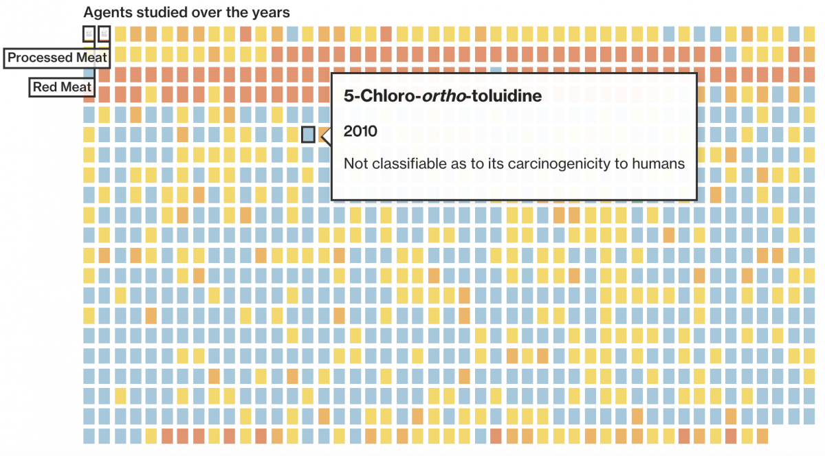
So, in order to guide the reader through this body of scientific work, we decided to highlight some of the more interesting and common agents, such as those found in tobacco, alcohol, and dry cleaning chemicals. We built a graphic of neat groups of boxes with an added layer that would pop out at you. This layer was made by going through each PDF and taking a screenshot of the page that was most visually interesting. This added enough excitement to the reading experience that it helped keep people scrolling through at least 23 study highlights.
How we made the graphic interactive
Below is a simple version of the transition from thumbnail size to full-view. See the full code here.
Positioning and calling the screenshot images
A little D3 goes a long way for positioning and having the images pop out when hovering your mouse over the little boxes.
For the fly-out animation, the CSS does most the work. By animating the width faster than the top and left, I create an effect of the image swooping into place. On mouseover the class “medium” is added to the image, making it larger and centered on the screen. On mouseout, it is removed, sending it back to it’s previous small state.
For the whole example, click here.
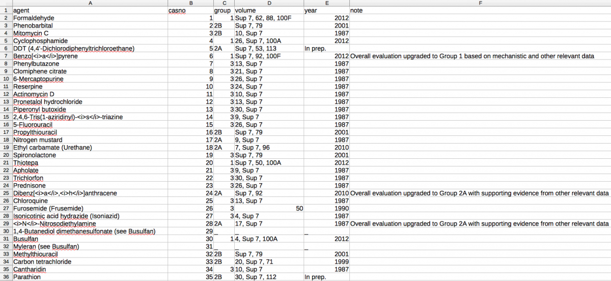
In the full graphic, I use Queue.js to load data which is a CSV with 6 columns (agent name, id number, group number, study volume, year, note), and use that to render the 984 little boxes.
Advice for digital journalists
Whether you find a government source, scrape a series of web pages, or get handed a spreadsheet by your editor, it’s generally important to feel comfortable analyzing and exploring your dataset. Excel can be adequate in simple cases (or for more complex cases if you’re an Excel master that knows how to write macros), but it can prove restrictive when you get to tasks like binning and filtering or if you’re dealing with a 1 gigabyte file.
This is where other tools like R (http://tryr.codeschool.com/) and RStudio (https://www.rstudio.com/) come in handy. With a little training and not much code, you can take a daunting CSV file and get an idea of its scope, its trends, its outliers, etc. with a wide array of visualizations in your toolkit. R is also a good way to track exactly how you got from start to finish with your dataset. Instead of a series of untraceable actions in Excel, you can keep a log of every edit and function performed in R, giving you complete transparency should anyone care to ask.
As a web developer there is also a desire to perform these tasks in Javascript for ease of output to an Internet browser. Since my final output will be a graphic for the web, why not jump right in with my production tools? You can use D3 to clean and edit your data, as well as create more complex data structures in JSON. You may sacrifice a little ease of use compared to R, but what you gain is a kind of freedom to output whatever form you dream up (which can also lead to egregious errors, so be careful and always have someone trustworthy to review your work). Once you find the points of interest in the data, you can begin exploring the best way to present it to a viewer. As you saw with the red meat study, that’s where the fun starts.
- NICAR: With the right tools, anyone can be a data journalist - March 11, 2019
- Northeastern J-school alumna Rachel Zarrell makes Forbes’ “30 under 30” - December 4, 2017
- How we built an interactive graphic using carcinogen data from the W.H.O. - November 12, 2015


