NICAR: With the right tools, anyone can be a data journalist
By Alyssa Lukpat
At the annual sleep-away camp for news nerds, better known as the computer-assisted reporting conference NICAR, held last weekend in Newport Beach, Calif., data journalists from around the world shared tips and tools. I soon learned that, even with minimal coding experience, anyone could use these tips to do investigative journalism, write data stories and create interactive graphics. From magical browser tools to extracting information from PDFs, here are some of the coolest things I learned at #NICAR19.
There’s a database for everything
In one of many pinch-me moments of the conference, a journalist from my local TV news station taught us how to prepare for breaking news. Before rushing to publish a breaking story, Stephen Stock from NBC Bay Area said it is important to gather relevant data. Stock said there are generally databases for every story, from gun violence to aviation accidents and car crashes. Without leaving the newsroom, reporters can dig up important information about any situation.
Discover government-redacted information
AP reporter Chad Day shared how AP reporters found out that Paul Manafort shared polling data with a Russian associate during the 2016 election. By using an open-source tool called pdftotext, reporters pulled redacted information out of a PDF and broke a major story. Day also shared how tools for extracting text out of image files, which you can read here.
Create beautiful data visualizations with Tableau
Ever wonder how reporters create the fantastic graphics that accompany their stories? There’s a good chance they made these visualizations in Tableau. In just a few hours, I made an interactive map of shark attacks around the world, a graph of international electric car sales and a map tracing refugee immigration. Anyone can teach themselves how to use Tableau and create data visualizations.
Make maps with QGIS
Coding experience isn’t necessary for creating publishable maps. With QGIS, a free map-making software, reporters can create static maps to showcase their data. For example, BBC data journalists showed NICAR attendees how to create a map of power consumption in California. QGIS is just one of many free tools budding data journalists can use to help readers visualize data.
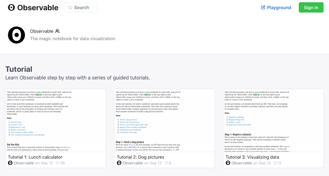
Code data visualizations in your browser
With Observable notebooks, use JavaScript in your browser to create stunning interactive graphics. Users don’t need to install anything and Observable offers easy-to-follow tutorials. The only thing you need to download is your finished visualizations.
You got this!
Photo: A collage of NICAR19 photos shared on Twitter.
- NICAR: With the right tools, anyone can be a data journalist - March 11, 2019
- Northeastern J-school alumna Rachel Zarrell makes Forbes’ “30 under 30” - December 4, 2017
- How we built an interactive graphic using carcinogen data from the W.H.O. - November 12, 2015