Unearthing the devastating earthquake strikes in Morocco
The Reuters article “Buried under the bricks” effectively communicates the impact of an earthquake that devastated Morocco in early Sept. 2023 showing the fundamental weaknesses of mud-brick constructions in the High Atlas mountain areas. The piece emphasizes the risks associated with old construction techniques, which are vulnerable to seismic natural disasters such as earthquakes.
By combining maps, topographics, expert insights and visuals to make the content more engaging and informative, the story successfully captures readers by providing a clear and concise story of the earthquake as well as the casualties and damages to the buildings in the village.
Storybench sat down with Reuters’ senior graphic editor Mariano Zafra, to learn more about how this story came about.
The following interview has been edited for clarity and length.
Where did you find your graphics data, earthquake damage assessments and architecture information? How did you put them all together?
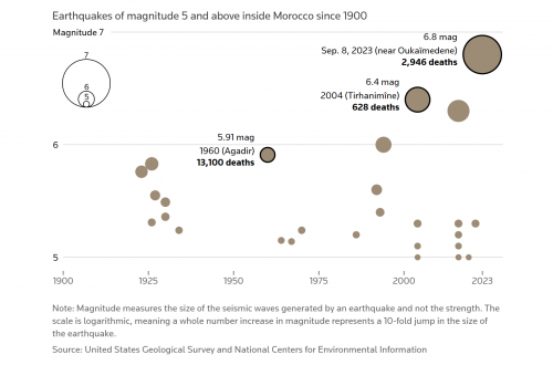
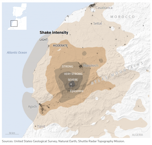
Zafra: For the earthquakes, the main data source we used is called USGS, which stands for United States Geological Surveys. In our case, we tracked a series of historical data regarding earthquakes that happened in the High Atlas mountain region in Morocco by selecting and monitoring the related range on USGS. On the other hand, we also obtained data from digital tools that showcase the intensity of the earthquakes adjacent to the epicenter. And with [that] data on hand, we started creating maps with QGIS and Google Maps.
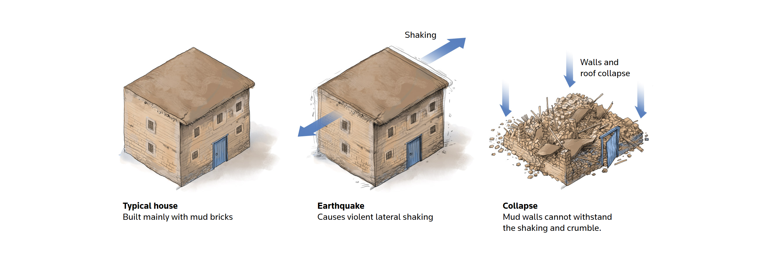
Then we conducted some analysis and combined earthquake layers we created with fonts that are downloadable from USGS. To make a vivid depiction of the mountains shown in the visuals, we used 3D software to enhance the outlook of mountain elevations at each level. Throughout the creative process of different maps, we learned about the mud-brick techniques from explanations made by two architecture specialists. The last data source we used was the European Commission, which provides published analysis of natural disasters through satellites. We have prior experience and understand that the European Commission would be able to provide useful data about the earthquakes in Morocco, regarding how many buildings were damaged in the village.
How did you ensure the accuracy of the statistics in the graphics?
We usually compare our collected data with other data sources to ensure accuracy. For example, we double-checked our data about the earthquake and our main comparable resource is USGS.
Speaking of the data on casualties, it is constantly changing. Normally, we can find this type of statistics in institutions like NGOs, agencies, authorities and even on some Twitter posts. However, the figures coming from authorities are not always accurate. So, we report our data by regularly citing sources and double-checking it with at least three or four additional sources, which is what we call the normal procedure to ensure the accuracy of our data. But overall, the data collection process is complicated, and it is hard to estimate the accuracy of the data.
Can you explain your graphics selections and creations used in the story?
Sketching was the first step of the graphics creation process. We need to think about which graphics can better explain the headlines that we desire. We were sketching while thinking about how buildings collapsed during earthquakes as well as where the earthquakes were taking place, which prompted us to come up with different maps that demonstrate the details. Eventually, we chose the best version out of all the other options available by aggregating our conclusions and thoughts.
The goal of this story is to reach a very broad base of readers. We want to make a strong and beautiful piece of story with graphics that are capable of raising awareness from our audiences, not just on the headline but also the content. We would like to explain our content beautifully. There are no other ways to build a good story for this type of article.
How do you believe the graphics complement the narrative of the story?
I wouldn’t say the graphics necessarily complement the narrative of the story, but instead, they drive you through the story. The graphics are considered part of the story and everything comes together. You can think that the story was included in the text, but really with those visuals, it was intended to make an immersive experience for the readers.
For example, as you can see how the graphics depict how a typical building collapses in earthquakes and topographic structure, you will notice the headline is usually intriguing as we were trying to catch the audience’s attention. In general, we reshape a piece of story by combining its text with images and graphics. If the images and text are too old and not easy to elaborate on, we need to explain the process of graphics more thoroughly. Sometimes, we even come up with a story without any text and simply just explain the animations.
What do you think that your graphics engage with your readers differently than the text?
I believe the primary intention of graphics is to motivate readers to spend more time reading our story. Graphics were used to grab the attention of readers. We believe readers can grasp the main ideas of the story without reading too much of the text because the demonstrations and information we have provided in the graphics are already very clear and easily digestible, which is what we say is the piece of information that would instantly take over your brain. Among most traditional news readings, you need at least six, seven and eight paragraphs about how we use techniques and try to explain everything. But here, we have everything connected step by step. I believe we can make the audience feel more intelligent when reading our graphics because they can understand what happened easily.

- Unearthing the devastating earthquake strikes in Morocco - December 7, 2023


