Visualizing Uncertainty in the Time of COVID-19: The Washington Post’s Chiqui Esteban on the Power of Words
Editor’s note: This is one of three stories Storybench is publishing about the recent “Visualizing Uncertainty” conference at Northeastern University
At the heart of the COVID-19 pandemic lay uncertainty. For journalists covering the pandemic, finding ways to visualize this uncertainty was particularly challenging. Creating graphics from clear and conclusive data is one thing, but creating informative and accurate graphics from evolving and uncertain data presents different obstacles.
Chiqui Esteban, graphics director at the Washington Post, recently spoke about his team’s work creating graphics during the early days of the pandemic, when much about the coronavirus was still unknown.
He was part of a panel of data visualization professionals brought together on Oct. 14 to speak virtually to a group of faculty and students at Northeastern University in Boston by the Northeastern School of Journalism and the Northeastern Visualization Consortium (NUVis). He was joined by New York Times graphics editor Josh Holder and Enrico Bertini, a computer science and engineering professor at New York University’s Tandon School of Engineering.
The panel discussed how data visualization evolved during the COVID-19 pandemic and how journalists found new ways to visualize the uncertainty that in many ways defined the pandemic.
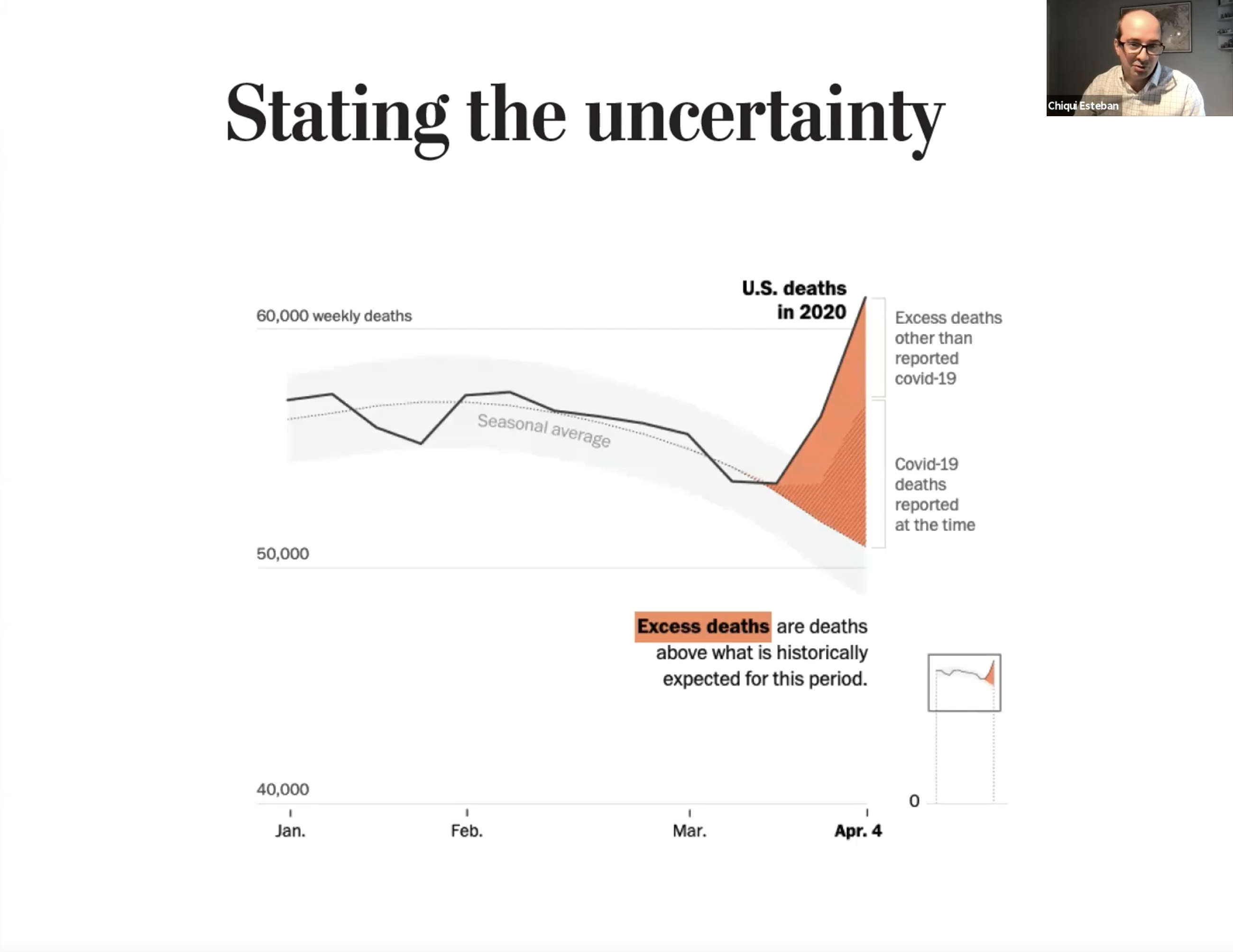
“The first task is making clear that there is a lot of uncertainty around COVID,” Esteban said. “It is hard to detect when you are uncertain about something, and that is one struggle that we have all the time. You may not know that something is uncertain because your mind tends to assume things.”
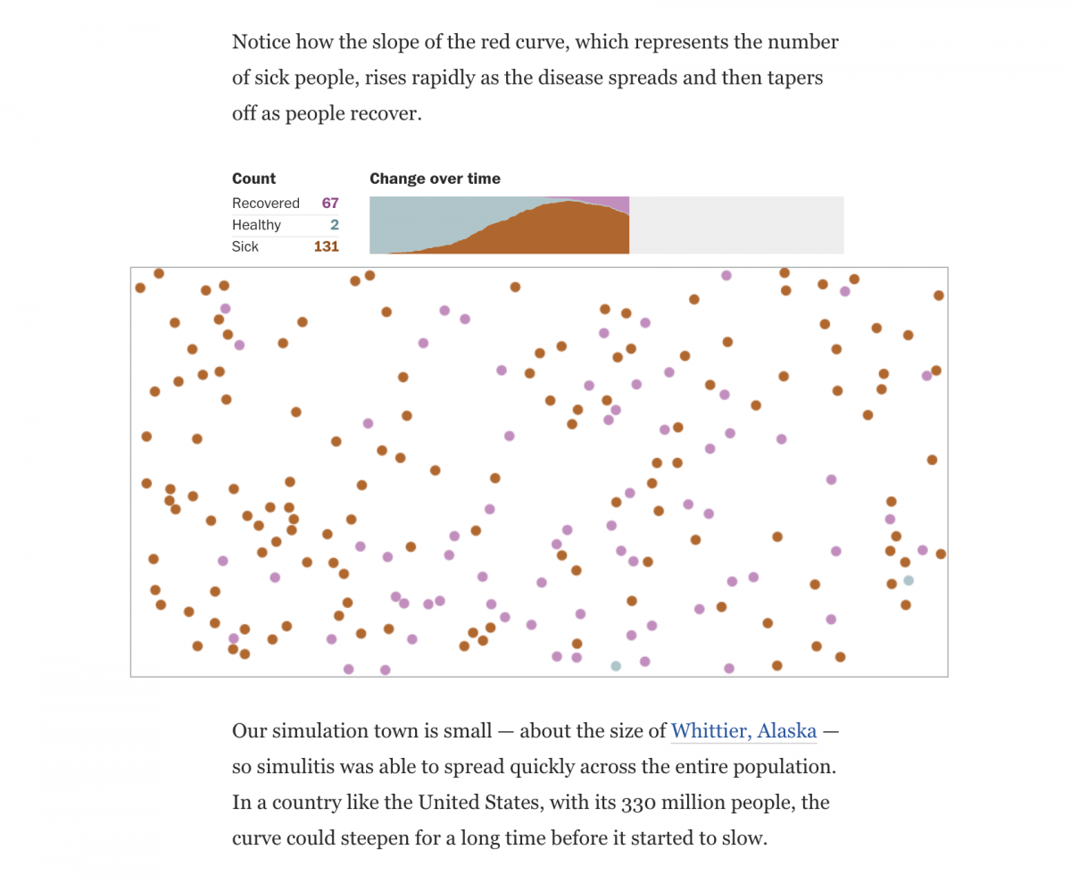
With little definitive information available on how the COVID-19 pandemic would play out, the Washington Post decided to model a hypothetical virus to illustrate how pandemics work. “We would explain how diseases work, how these things used to happen, being very careful not to say this is how COVID-19 works,” said Esteban. “In order to do this, one of the things we did was create a fake disease.”
“We needed to explain in general, without being able to say anything about the particulars of this disease,” Esteban further explained. “We wanted people to understand concepts without conveying the certainty that this is how (COVID-19) is going to work. We needed to explain this disease to people, but the reality is, we didn’t know much about the disease.”
As the pandemic continued, other interactives stressed the inexact nature of what was known regarding the impact of the virus. Esteban noted that many factors skewed COVID-19 data, such as inexact testing numbers due to asymptomatic victims of the virus.
Esteban also discussed how using phrases like “more than” and “less than” can help to communicate uncertainty. He emphasized the overall importance of the text used to explain data visualizations, which can sometimes get overlooked when communicating complex data.
“You have to say, ‘We see something here, but we are very uncertain,’” said Esteban. “When we work in visualization, sometimes we underestimate the power of words … we focus more on the graphics, but every graphic has a little bit of text and it’s very important how we word that text.”
- Visualizing Uncertainty in the Time of COVID-19: New York University’s Enrico Bertini on the role of uncertainty - December 14, 2021
- Visualizing Uncertainty in the Time of COVID-19: The New York Times’ Josh Holder on leading with questions when demonstrating uncertainty - November 17, 2021
- Visualizing Uncertainty in the Time of COVID-19: The Washington Post’s Chiqui Esteban on the Power of Words - November 8, 2021