Visualizing Uncertainty in the Time of COVID-19: The New York Times’ Josh Holder on leading with questions when demonstrating uncertainty
Editor’s note: This is the second of three stories Storybench is publishing about the recent “Visualizing Uncertainty” conference at Northeastern University. Read the first one here.
Visualizing uncertainty with data-rich stories is how New York Times graphics editor Josh Holder and his team tackled reporting the ambiguity that underpinned the COVID-19 pandemic.
Holder was part of a panel of data visualization professionals brought together on Oct. 14 to speak virtually at Northeastern University in Boston. The event was hosted by the Northeastern School of Journalism and the Northeastern Visualization Consortium (NUVis). He was joined by Washington Post graphics director Chiqui Esteban and Enrico Bertini, a computer science and engineering professor at New York University’s Tandon School of Engineering.
The panel discussed how data visualization evolved during the COVID-19 pandemic and how journalists found new ways to visualize the uncertainty that in many ways defined the pandemic.
Holder presented four examples of graphics he created that conveyed the uncertain future of the pandemic as it unfolded. Those data visualization innovations allowed him to effectively communicate both large data sets and significant uncertainty to readers, he said.
While creating the graphics for the interactive, “How the Virus Won,” Holder and his team began with a broad concept about which questions they wanted to answer for readers.
“We started out with a few key questions that, basically, the whole world was grappling with but that we wanted to try and tackle in one data-rich story,” Holder said. “So, that was basically: how instrumental was international and domestic travel to the spread of the virus?”
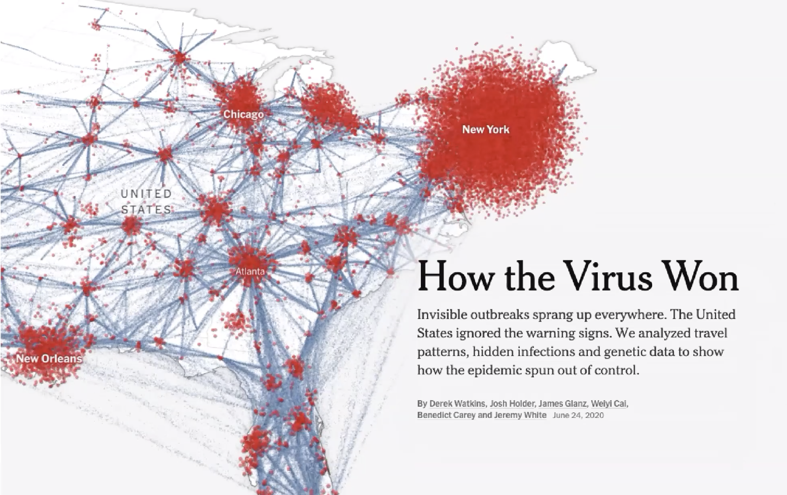
Other questions that Holder said guided the development of the interactive map included how many hidden infections were there, especially early on? What was the cost of officials’ slow reactions to the outbreak? And were social distancing measures effective?
One challenge that Holder and his team faced was creating visualizations that illustrated the multitude of information and uncertainty without overwhelming readers.
“Because we were using so many different data sets that maybe had different timeframes and different caveats, we wanted to keep it as simple as possible and not use vastly different visuals for each section,” Holder said. “We think that would have added a lot of overhead for readers as they acclimatize themselves with each new graphic.”
Taking cues from readers, Holder found that stories about the COVID-19 case count trackers attracted the most attention. He then worked to expose the uncertainties within the data that readers were consuming — the goal being to indicate to readers that what they thought they knew was not actually certain.
“This project really shone a light on how those case count trackers were just the tip of the iceberg,” Holder said. “One of the main aims was to show how much uncertainty there was in the official data itself. Obviously, we were very aware that estimates that we got from researchers had their own uncertainties.”
For this story in particular, The New York Times team chose a vague graphic that would still communicate the facts, without including any precise numbers or certain outcomes. “One way that we think we helped combat uncertainty with this piece was by choosing a visual format that by its own design was kind of imprecise,” Holder said. “Dark clouds and flowing dots of travelers don’t allow readers to read off exact values, but they still convey a sense of scale and relative magnitude.”
Those innovations in graphic style, designed specifically to communicate uncertainty, were a culmination of the techniques used at the New York Times, Holder said.
“We do use traditional techniques such as error bars and confidence intervals that you find in academic literature, but we also have to design for a broader audience,” he said. “We found some different techniques that can work really well to do that.”
One of the techniques Holder and his team frequently used was hypothetical scenarios that showed what could happen given a certain set of variables as featured in “When Could the United States Reach Herd Immunity? It’s Complicated” by Matthew Conlen and Charlie Smart.
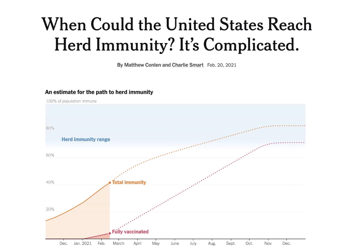
“Throughout the piece, we explained that a new variant, a change to social distancing measures or an increase in the vaccine supply would vastly affect how those estimates play out,” Holder said. “We created an interactive for each of those factors so readers could toggle between three different options and see how it would affect the herd immunity estimates.”
Holder suggested that allowing readers to interact with visualizations and explore options themselves facilitates heightened degrees of engagement and participation with data.
“By presenting those multiple scenarios, you show readers that there are different ways that this could play out,” Holder said. “You also let readers understand what factors will determine what happens next, and you don’t show that there is uncertainty, but why there is uncertainty.”
Holder presented two more examples of graphic techniques the Times used during the pandemic. The first of which is showing a range of possible values, instead of pinpointing one number as an estimate, which could give readers the impression of certainty where it is not present.

“If the value is uncertain, or if you make an estimation, it’s okay to share the range of values,” Holder said. “We didn’t feel the need to plot a median or best estimate, so we just posted the range. That’s always a great option if you are in a similar situation.”
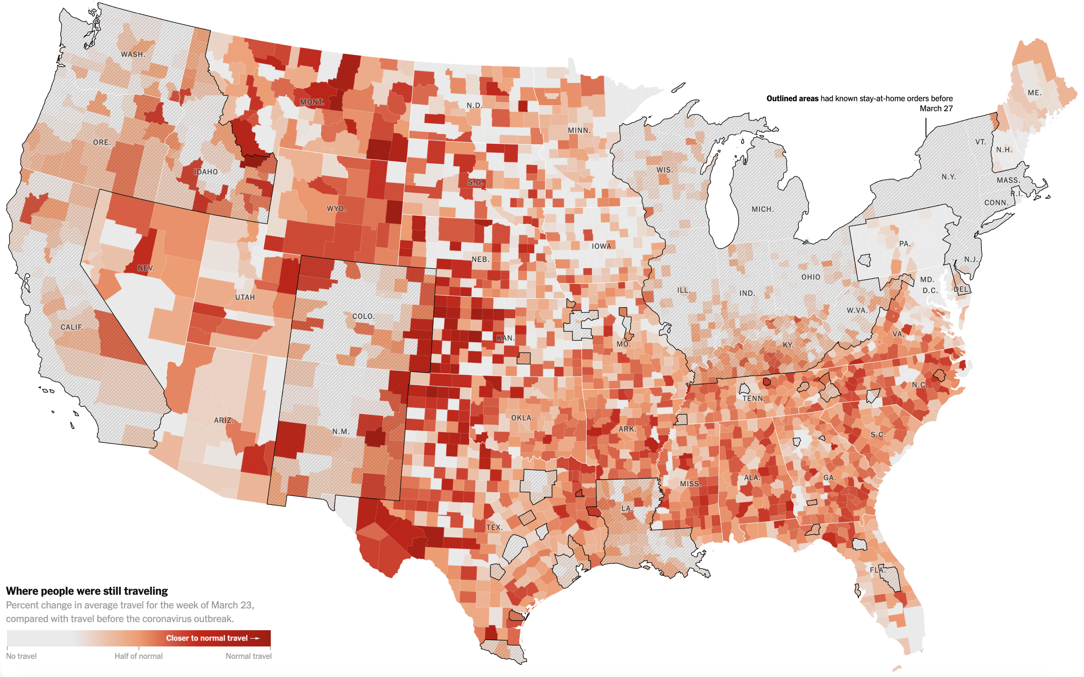
The second visual technique that Holder described to the students in attendance was showing the full distribution of data. Holder noted that this works especially well when there are several levels to a data set. In the example, each dot represents a county and the size of the dot shows the population size.
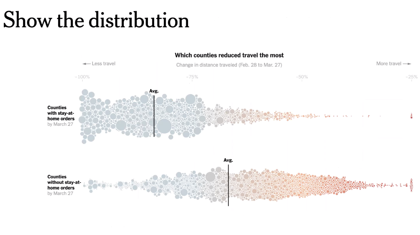
“Something I’m a big fan of is, if you’re working with medians, you can always show the distribution of values as well as the average,” Holder explained. “We convey so much more to the reader when we show them the wide variation that exists in each group as well as marking those crucial averages, which is the point of the story.”
- Visualizing Uncertainty in the Time of COVID-19: New York University’s Enrico Bertini on the role of uncertainty - December 14, 2021
- Visualizing Uncertainty in the Time of COVID-19: The New York Times’ Josh Holder on leading with questions when demonstrating uncertainty - November 17, 2021
- Visualizing Uncertainty in the Time of COVID-19: The Washington Post’s Chiqui Esteban on the Power of Words - November 8, 2021