How W.E.B. Du Bois Made Data Visualizations Simple and Easy to Understand
More than a century before modern data dashboards and interactive graphics became common in journalism, a set of bold, colorful charts challenged how data could tell a story.

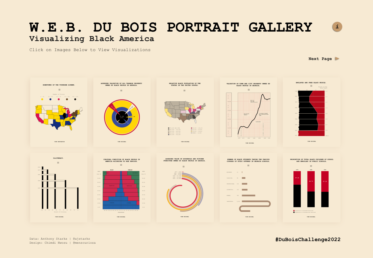
In 1900, sociologist and civil rights activist W. E. B. Du Bois and a group of students from Atlanta University created a series of striking visualizations for the Paris Exposition, a world’s fair that showcased innovations from across the globe. Their goal was simple but ambitious: to visually document the social and economic progress of Black Americans just decades after emancipation.
The result was a collection of more than 60 hand-drawn charts and maps that still look surprisingly modern today. With bold colors, geometric shapes and minimal text, the visualizations transformed statistical data into compelling visual narratives. Today, the full collection is preserved and publicly available through the Library of Congress archives.
Data as a tool for storytelling
Du Bois’ charts were not just academic exercises. They were designed to counter widespread racist narratives circulating in the United States and Europe at the time.
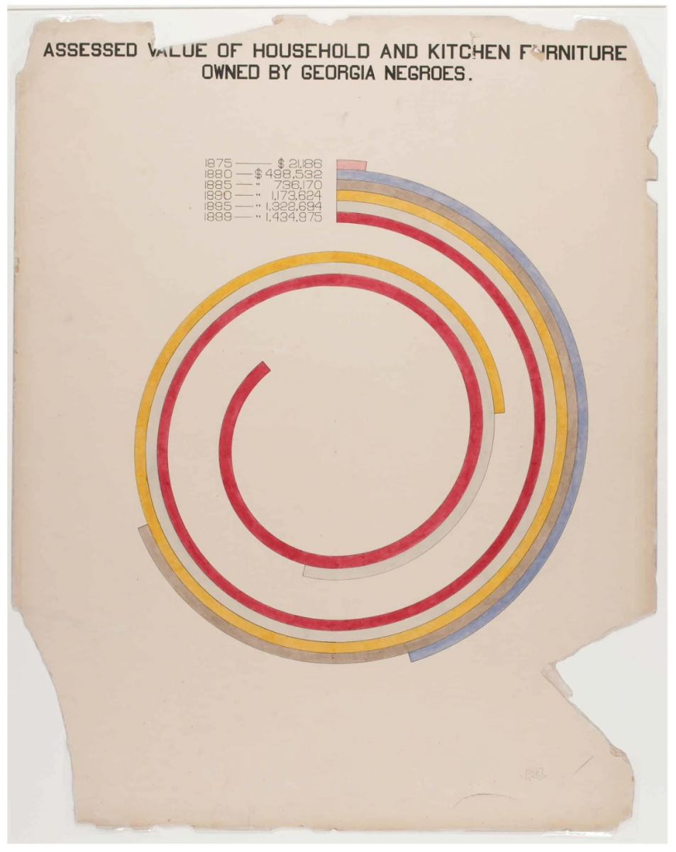
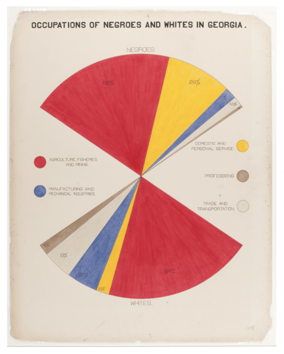
Using census data and other statistics, Du Bois and his students visualized trends in literacy, employment, land ownership, and education among Black Americans. The charts were intended to demonstrate progress and resilience while presenting evidence grounded in data.
Rather than presenting pages of tables or dense reports, the team translated numbers into visual forms that viewers could understand. Circular charts, bar diagrams, and colorful grids illustrated patterns and changes in ways that felt intuitive and engaging.
A design language that still feels modern
What makes these visualizations particularly remarkable today is how contemporary they appear.
Many of the charts rely on clean geometric structures and vibrant color palettes. Spirals show population changes. Bold bars track growth in property ownership. Carefully arranged shapes illustrate occupational distributions and education levels.
The graphics blend art and statistics in a way that feels familiar to modern readers who encounter infographics in newsrooms, research publications, and online storytelling platforms. But Du Bois and his collaborators created these visuals decades before computers or modern design software existed.
The charts were drawn by hand using ink, watercolor, and careful drafting techniques. Despite these limitations, the designers created visuals that remain visually striking and conceptually clear.
Data visualization as advocacy
Du Bois’ visualizations also demonstrate how data can be used as a persuasive storytelling tool.
At the time, many audiences in Europe and the United States held deeply entrenched beliefs about racial hierarchy. By presenting data visually, Du Bois aimed to challenge these assumptions and demonstrate the social and economic progress of Black communities following the abolition of slavery.
The charts therefore functioned as both scientific documentation and social argument. Their design helped audiences quickly grasp patterns and trends that might otherwise have been buried in numerical tables.
This approach to visual storytelling continues to shape modern discussions about data communication. Scholars such as Edward Tufte have emphasized the importance of clarity and efficiency in presenting information, Journalists and designers like Alberto Cairo have written about how well-designed graphics can build understanding and trust with audiences.
Why these charts still matter
More than a century after their creation, Du Bois’ visualizations remain influential examples of how design and data can work together to tell powerful stories.
They demonstrate that effective data visualization does not require complex technology. Instead, it depends on thoughtful choices about layout, color, structure, and narrative intent.
For journalists, designers, and researchers working with data today, Du Bois’ charts offer an early blueprint for visual storytelling. They show how data can illuminate social realities, challenge dominant narratives, and communicate complex information in ways that resonate with broad audiences.
In an era saturated with digital graphics and interactive dashboards, these hand-drawn charts remain a reminder that the core principles of data visualization, clarity, purpose, and storytelling have been shaping how we understand information for more than a century.

- How W.E.B. Du Bois Made Data Visualizations Simple and Easy to Understand - March 26, 2026
- How Copernicus Makes Climate Data Simple and Easy for You to Understand - March 19, 2026
- The Surprising Design Secrets Behind Trust in Data Visualization - March 10, 2026