How to build a simple line plot or bar chart in D3 using D3plus.js
D3, which stands for data-driven documents, is now the de facto gold standard in interactive data visualization. Built on Javascript and styled with HTML and CSS, it is bound to work on most browsers. Take a peek at the D3js.org examples page to see the breadth of visualizations you can create. The downside is that it takes an advanced level of front-end coding, namely fluency in the three languages stated above, to build a visualization in D3.
Enter D3plus. Developed by Alexander Simoes, Dave Landry, and the folks at César Hidalgo’s Macro Connections lab at the M.I.T. Media Lab, D3plus lowers the bar to coding in D3 by allowing users to deploy quick visualizations based on a limited set of visualizations–like bar charts, scatter plots, line plots and geo maps–and utilities–like fonts and colors–for customizing charts. Learning to code an interactive visualization in D3plus is the perfect introduction to D3. In this tutorial, we’ll build a simple line plot. Take it for a spin:
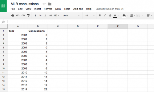
Gather your data
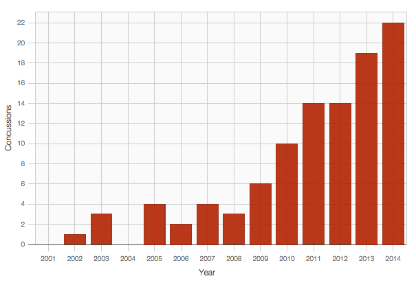
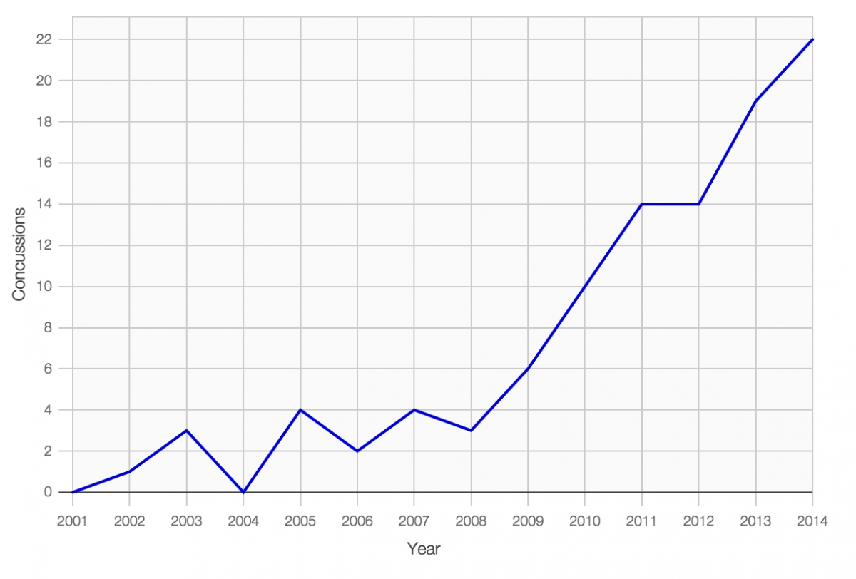
A few months ago I reported a story on the rise in concussion in major league baseball. You can download the dataset here.
Find the line plot example in D3plus
On the D3plus website, navigate to the line plot example.
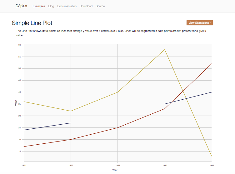
Paste the D3plus line plot code into a text editor
Below the line plot example you should see a GitHub gist holding the HTML code that includes the D3plus Javascript you’ll need to generate your line plot. Copy this and paste it into a text editor. I use Sublime Text 2.
Swap out array data for your own
Plug in the concussion data, or whatever simple data set you want, into that array in the HTML. Add a title to your page while you’re at it. I’ve renamed the “name” attribute to “concussions,” too.
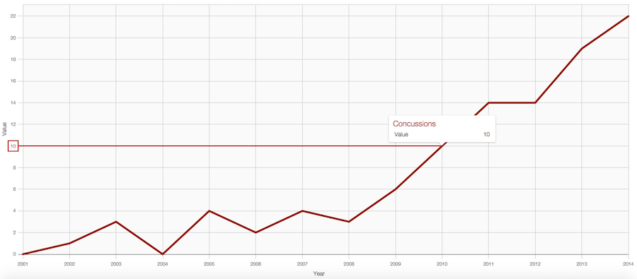
Upload your HTML page to your server
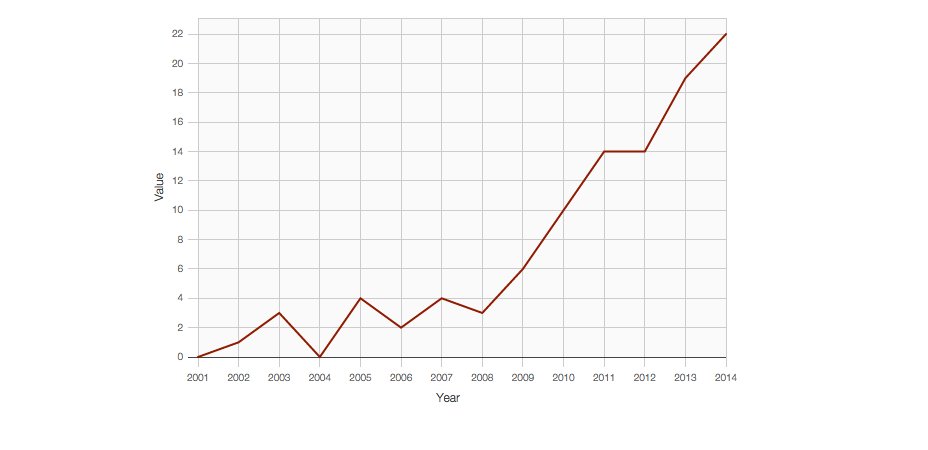
I use FileZilla but Fetch or any number of FTP clients will work. Upload your HTML page to your server and open it in your browser. This is what you should see:
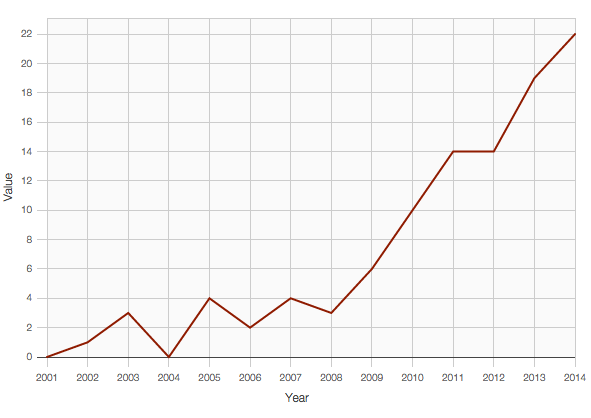
Changing the height and width to your specifications
Now that you have an interactive line plot on a standalone page on your server, you’ll probably want to either build it into a story. One way is to embed it as an iframe (which works if you have a CMS like WordPress). Before you do, you’ll notice that the line plot isn’t responsive. Simple fix: add style=”width:600px; height:400px;” to the <div id=”viz”> tag so that it reads <div id=”viz” style=”width:600px; height:400px;”></div>. Of course, add whatever height and width you want. These will work well for the Storybench post width. Re-upload to your server.
Embed your interactive chart into your story
If you’re using WordPress like us, you can embed this standalone page as an iframe. Simply paste your D3plus chart’s standalone URL into an iframe like so <iframe src=”https://storybench.org/d3plus/d3plus.html” frameborder=”0″>. Then paste that into WordPress.
Want to change the line color?
To change the color, simply add the following lines of code into the Javascript. You’ll notice we’ve added attributes and then mapped a color to the “concussions” name.
Converting this D3plus line plot into a bar chart
D3plus is organized in such a way that all you need to do to change this line plot to a bar chart is replace .type(“line”) with .type(“bar”) under the // instantiate d3plus section. Play around with the other visualizations and let us know what you come up with!