How we ran a graphics department simulation with lighthearted news stories
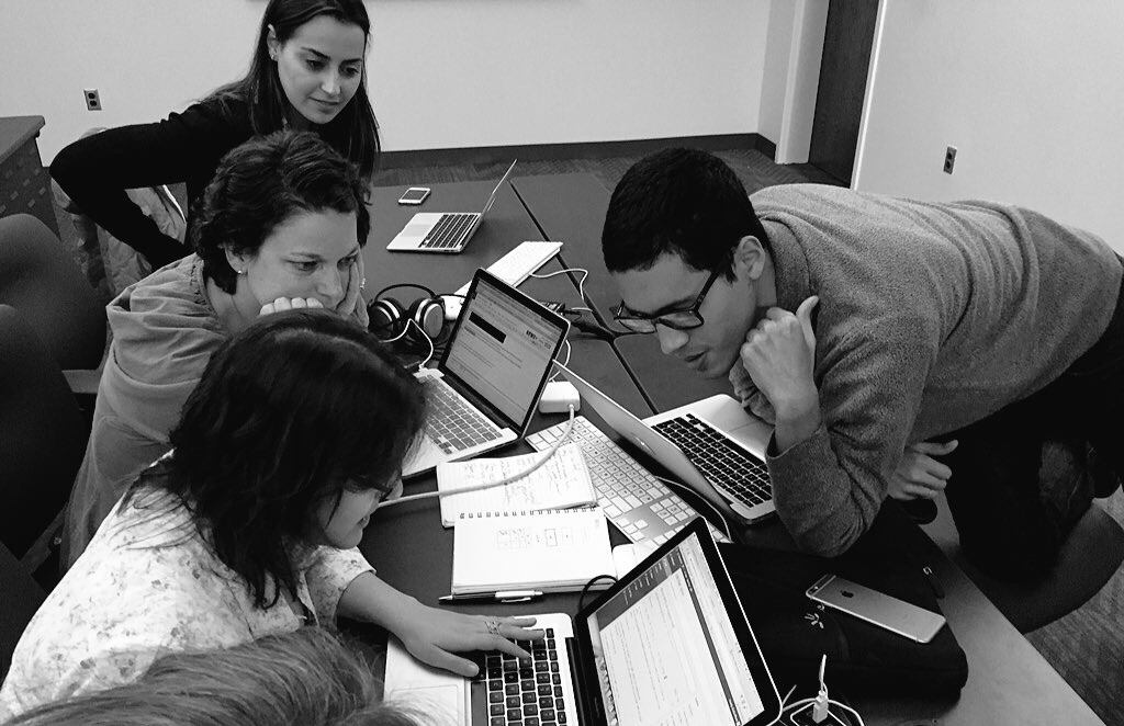
As part of a studio course at Northeastern’s Journalism School’s Media Innovation graduate program, we recently ran a digital graphics department simulation game. Here’s the assignment:
You are part of a nimble graphics team in a digital newsroom publishing on a CMS eerily similar to WordPress. Your audience is made up of tech-savvy, graphics-loving 25 to 45-year-olds in major U.S. cities. They’re mostly on their phones. It’s Wednesday night and your editor wants to publish a lighthearted story late tonight that includes a graphic element. And by graphic element she doesn’t mean a stock photo. She wants something branded, something new. It could be a couple bar charts, a simple map, a word cloud, a Storify, or a before-and-after slider image. It’s up to your team and what you think would best complement the story. You have 45 minutes before happy hour. And you want to make happy hour. Your office crush is there.
- Split into teams.
- Choose a lighthearted story (or a lighthearted angle) from the week’s news (The Star Wars trailer by the numbers, fantasy sports, San Francisco stop-as-yield cycling law, 18th century artifacts in Boston Common, etc.).
- Quickly, find and copy the text of a story from a major news outlet. Aim for the 300 to 500-word length. This is just placeholder copy while the reporter and editor gets you final copy.
- Find the data you’ll need for your graphic.
- Choose one tool from this toolkit: Chartbuilder, Google Maps, Google N-gram viewer, Storify, Raw, JuxtaposeJS, TagCrowd, WordCounter.
- Sketch out your idea on paper first.
- Then, build it!
- Publish the plain text and your graphic(s) as a post on the class WordPress site.
- Considerations: Will it complement the story? Will it distract? What data do I need?
The teams quickly decided which stories they would work on. Two teams chose the Back to the Future story that was at the time monopolizing headlines while the third team tackled the scandal over basketball player Lamar Odom photographed at a Nevada brothel.
Takeaways:
- After a brief introduction to tools like Chartbuilder, Google Maps, Google N-gram viewer, Storify, JuxtaposeJS, Wordle, and WordCounter, the students were able to quickly put together a graphic that would complement their story.
- The time constraint was important: teams needed to have a finished product to present in under an hour.
- They were able to use tools they had heard about for weeks in a game-time situation.
To quote one of our students, “I thought the workshop was very beneficial, especially having our group work under pressure. because it allows us to put some of those data tools into action. After weeks of mostly just hearing about all the tools it was nice to actually utilize them.”
Here’s what they built.
Team One
Story: Are we living in Marty McFly’s 2015?
Tools: Google Spreadsheets, WordPress style tools.
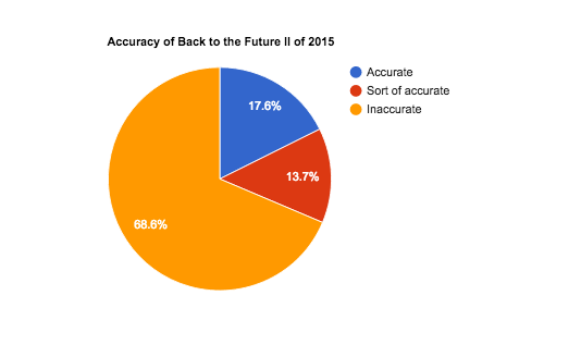
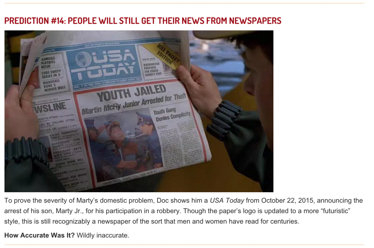
Graphic elements: 1) a pie chart showing the accuracy of the Back to the Future II movie predictions about technology and society. 2) a list of each prediction, with stills from the movie, with an explanation of how accurate each was.


Team Two
Story: Would McFly be disappointed? You decide
Tools: JuxtaposeJS, Google Spreadsheets.
Graphic elements: 1) Several sliders pairing movie stills with modern day technology. 2) A table listing the Back to the Future predictions.
Team Three
Story: Spending your cash on hookers, hooters and hash
Tools: JuxtaposeJS, Google My Maps.
Graphic elements: 1) Several sliders pairing photos of Lamar Odom before and after the scandal.. 2) A map showing the location of each basketball team Odom has played for as well as the location of the Nevada brothel.
Team three enjoyed being able to customize the markers used in their Google Map to reflect the logos of the basketball teams. All the teams liked the simplicity of the JuxtaposeJS tool. We look forward to running a similar simulation with more advanced tools. Stay tuned!


