The toll: Mass shooting data visualizations around the web
President Obama issued a rare challenge to news organizations last week when he responded to last week’s mass shooting in Oregon by asking them to do some data homework: “Tally up the number of Americans who’ve been killed through terrorist attacks over the last decade and the number of Americans who’ve been killed by gun violence and post those side by side on your news reports.”
News outlets including Vox and CNN stepped up to that mission. Poynter has a roundup of those graphics, produced in the hours after the President’s call to action.
But Storybench decided to publish a roundup of visualizations that have gone above and beyond what Obama requested.
Below are several visualizations produced by news organizations and researchers that combine great design and visualization with good old fashioned shoe-leather reporting that bring home the toll of gun violence in America. Update (12/2/15): We’re adding more visualizations on mass shooting as they are published.
This is what America’s gun crisis looks like
The Guardian, October 2, 2015
A well-done graphic, simple layout, good color scheme, and a devastatingly long scroll to the bottom of the 994 mass shootings the U.S. has seen in the last 1,004 days.
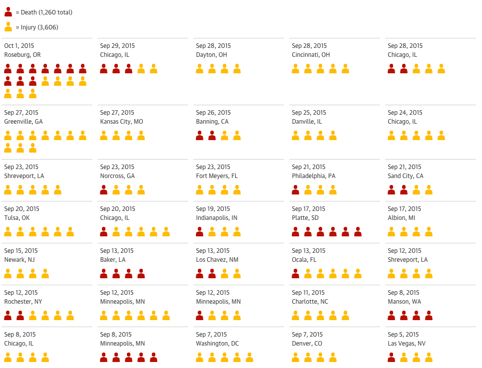
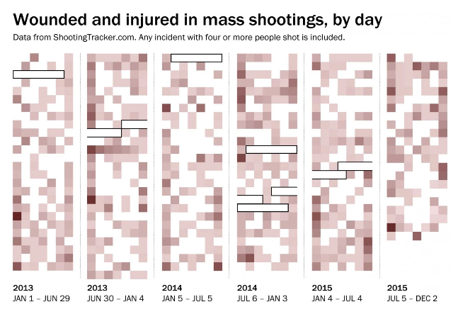
So far in 2015, we’ve had 274 days and 294 mass shootings
The Washington Post Wonk Blog, October 1, 2015
Christopher Ingraham continues to update his calendar visualization with each new shooting. It looks like a macabre game of Minesweeper. Very effective visualization though we don’t see the number of victims.
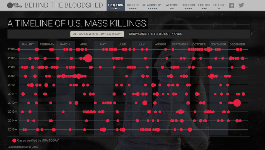
A timeline of U.S. mass killings
USA TODAY, October 8, 2015
USA TODAY built an interactive story packed with reporting, animations, and data visualization. Impactful, bold choice of colors. Nice scrolling effects.
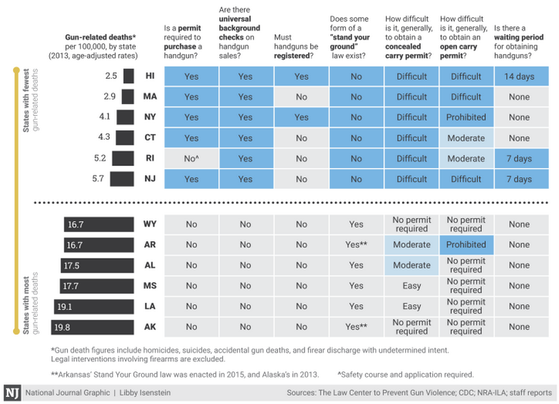
The states with the most gun laws see the fewest gun-related deaths
National Journal, August 28, 2015
Libby Isenstein breaks down what gun-related legislation looks like in each state. Good data reporting. Clean visualization for the sheer quantity of data being expressed. There is an expanded table showing all 50 states here.
Update 2/26/18: This piece has been moved to here.
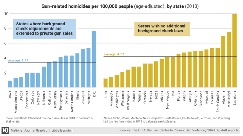
This graphic, updated October 5, 2015, juxtaposes the two kinds of states. Well done, though, obviously, an interactive graphic would allow for more exploration.
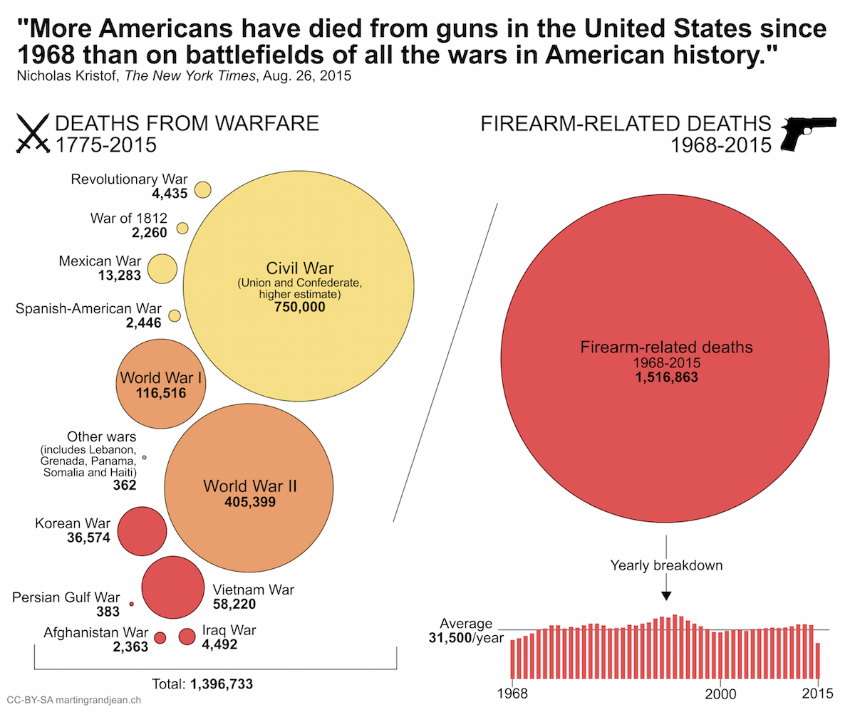
More Americans killed by guns since 1968 than in all US wars
Martin Grandjean’s blog, October 5, 2015
Martin Grandjean is a Swiss researcher in digital humanities looking at history and network analysis. Grandjean visualized data referenced by Nick Kristof in an August 26, 2015 piece for The New York Times and fact-checked by Politifact’s Louis Jacobson. Color scheme could be improved and a Y-axis for time would be helpful. When was the War of 1812, again? Still, nice data-digging and visualizing of a quote taken from The New York Times.
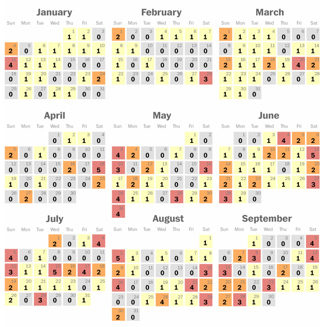
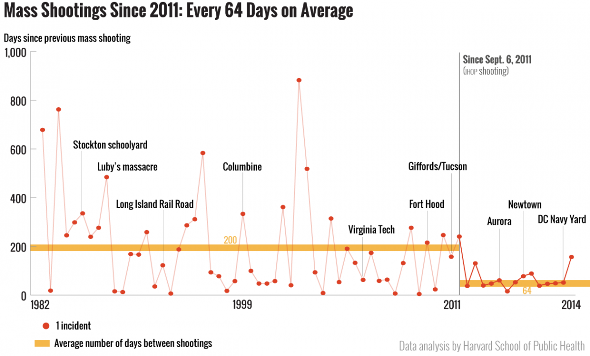
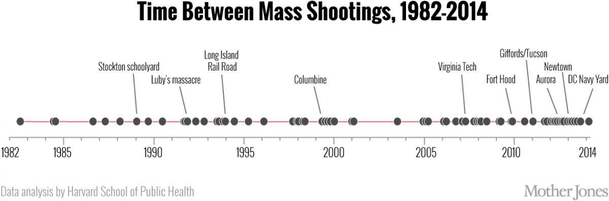
Yes, mass shootings are occurring more often
Mother Jones, October 21, 2014
Writing in Mother Jones, Harvard School of Public Health and Northeastern University researchers show that mass shootings have tripled since 2011. They used Mother Jones data and also looked at an FBI study.
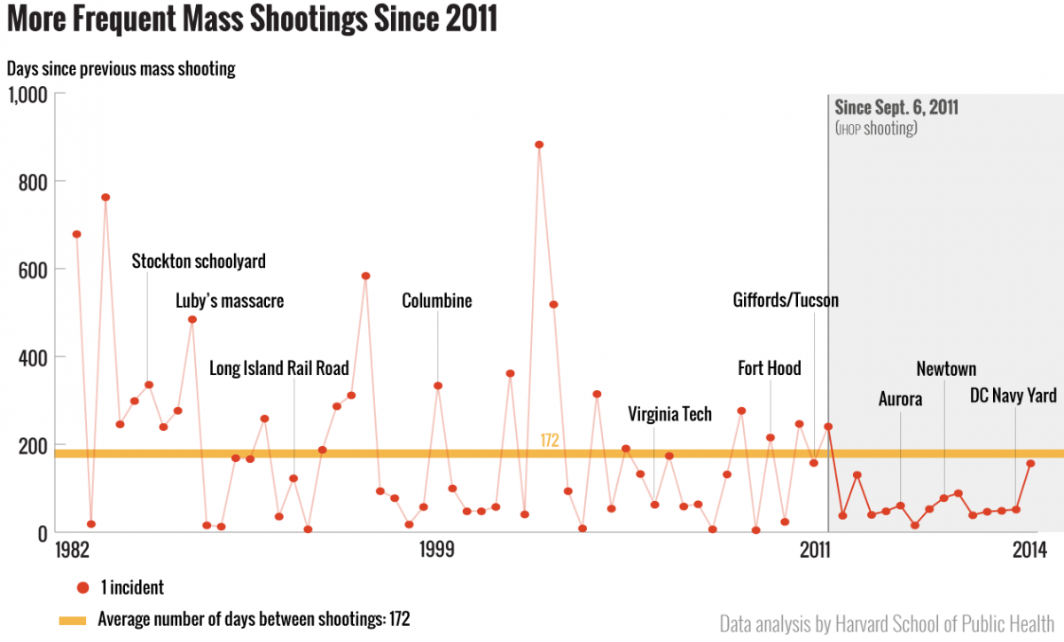
“In the first 29-year phase, mass shootings occurred every 200 days on average. In the subsequent three-year phase, mass shootings occurred every 64 days on average,” they write, producing another graph to reflect this change. Nice design, color palette and analysis. Great way of showing and explaining their work.
They also produced an image optimized for sharing on social media showing the frequency of mass shootings along a timeline. Powerful though difficult to identify the number of shootings in the clusters.
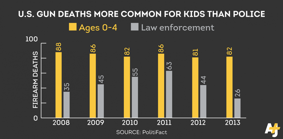
In U.S., it’s more dangerous to be a little kid than a cop
AJ Plus, October 6, 2015
By publishing directly to Facebook, Al Jazeera Plus catapulted this bold, well designed graphic into the national conversation. In two days, it had more than 2,000 likes (weird) and more than 1,300 shares.
There’s still been no calendar week without a mass shooting during President Obama’s second term
The Washington Post, October 1, 2015
Did we miss any compelling visualizations? Comment below or tweet us @storybench.

