Six tools showcased at NICAR 2019 that you should probably learn
When it comes to a major data journalism conference like NICAR, you can probably predict that a few popular data visualization and analysis tools are going to receive a lot of attention. It’s a safe bet that attendees will be able to talk about the finer points of Google Sheets, Tableau, R Shiny applications, and JavaScript’s D3 library. But what about some of the lesser-known tools that were presented?
Here’s a rundown of some of the coolest “under the radar” tools we saw at NICAR this year. (For more resources from the conference, check out Sharon Machlis’ database here.)
Datawrapper
Datawrapper is one of many emerging data visualization tools that’s being marketed to all journalists, not just data journalists or designers. This tool can instantly generate a branded chart or map from copied and pasted data ot csv files. It can also make visualizations that update in real-time. Datawrapper is free to try out, but you can pay a monthly fee to unlock additional features, such as chart styling and export options. If you’re still intimidated, you can check out the Datawrapper Academy to get some tips related to chart creation and data visualization in general.
Who’s it good for? Datawrapper is perfect for someone looking to integrate data visualization into their work without needing any major knowledge in programming or design. You’ll still have to learn a little bit to get the most out of Datawrapper, but for the most part, it’s plug-and-play.
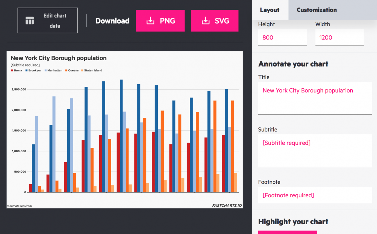
FastCharts
FastCharts is a 100 percent free data visualization tool developed by the Financial Times. As the name implies, FastCharts is focused on producing visualizations quickly. This means that there aren’t many bells and whistles to the tool. Even still, there are four different types of charts that the tool can generate. A great deal of customization is offered within FastCharts, and your imported data can be manipulated from right within the tool – no need to edit in another window and re-upload. You can export any visualization that you create to a png or svg and plug it right into your story.
Who’s it good for? FastCharts is a great tool for someone who already has a baseline familiarity with manipulating numerical data. The cost and ease of use makes this perfect for a student (or data journalist of a smaller news organization) who might want an affordable alternative to some of the more popular paid visualization tools.
Workbench
Data analysis isn’t exactly the most approachable aspect of data journalism. Workbench is here to help. Workbench, created by Jonathan Stray and his team, offers sleek, easy-to-understand curricula and tools for data analysis. Whether you’re looking to learn more about filtering data, types of charts, or adjusting for inflation, this resource serves as a crash course in all things data journalism. It also features some more hands-on tutorials that allow users to get a real taste of live data analysis, standardizing data, and web scraping.
Who’s it good for? Workbench’s broad scope makes it a superb educational resource for data journalists of any caliber. For a data greenhorn, it’s one of the most well-structured and clear online data journalism courses that one can find. For someone with a little more experience, this is a great means to brush up on the basics while picking up a few new analytical skills.
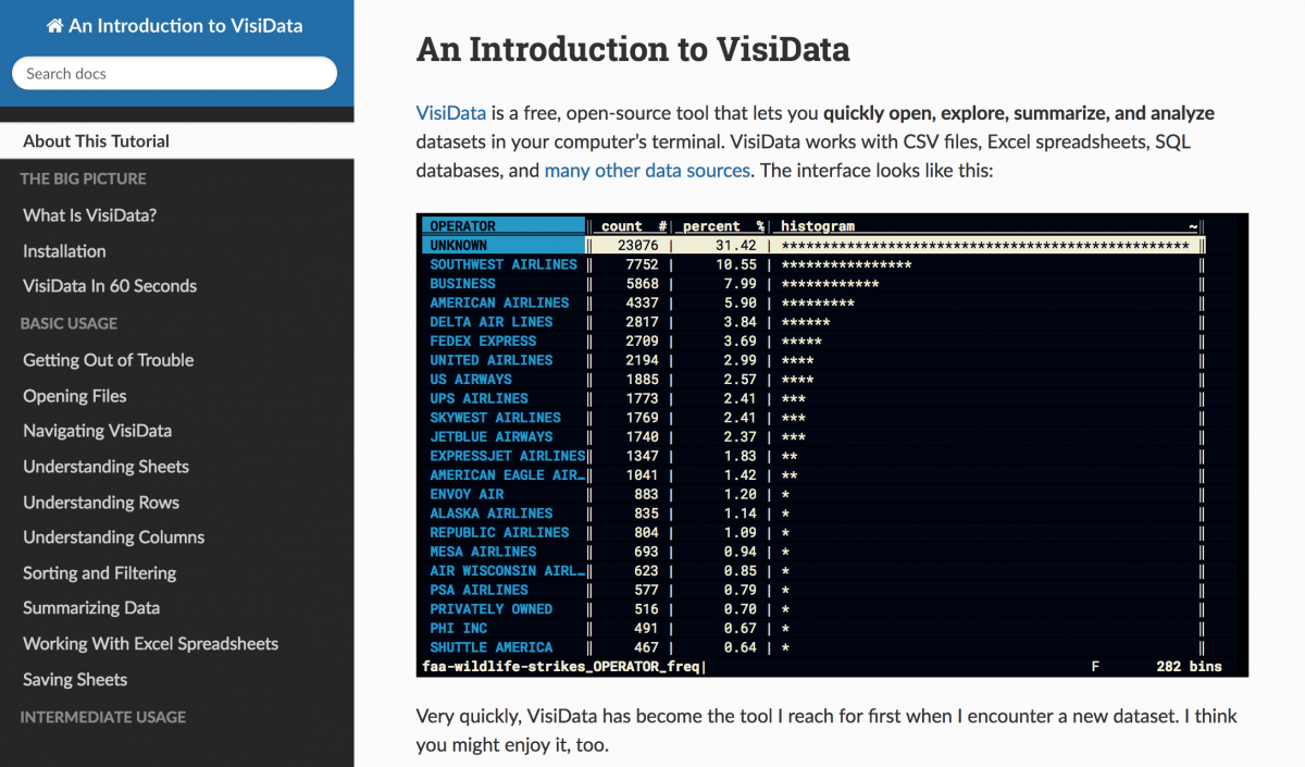
VisiData
Too cool for the GUI hype? VisiData is an open-source data analysis tool that runs completely inside of a terminal. Despite appearances, this tool is an absolute workhorse. It probably won’t be the only tool in your arsenal, but it will be the first one that you turn to. VisiData can take just about any tabular data that you throw at it, easily producing terminal histograms and scatter plots from data containing millions of rows. At NICAR, Jeremy Singer-Vine of BuzzFeed News showed off a tutorial that he authored to help newbies get a stronger handle of VisiData and its capabilities as a tool for preliminary data analysis.
Who’s it good for? VisiData would be valuable to anyone who’s looking for a go-to tool to analyze any tabular data that you might come across. If you’re turned off by all of the complicated features in some of the more popular data analysis tools, this is a great, no-frills solution.
Dedupe.io
If you’ve ever done any kind of data analysis, you know that it’s easy for the work to become extremely tedious. Dedupe.io is a tool leveraging machine learning research to clean up messy data, whether that might mean duplicated records, inconsistent formatting, or contradictory fields. You can also upload multiple datasets to Dedupe.io in order to identify overlap between them. This service is free for the first 1,000 rows of data, and paid plans start at $10. On their website, you can also find some tutorials to help you get a better sense of how the tool looks and works.
Who’s it good for? This is a really helpful tool for a journalist who might be working on a project that involves parsing a lot of messy spreadsheets. Manual deduplication is something that a team of journalists can spend hundreds of hours on, and this cuts out the majority of the work.
- How Northeastern researchers are visualizing the presidential debates - July 30, 2019
- Six tools showcased at NICAR 2019 that you should probably learn - March 26, 2019
- Six fascinating projects from the 2019 Computation + Journalism Symposium in Miami - February 6, 2019