How Northeastern researchers are visualizing the presidential debates
Don’t have time to watch the debates? It can be tricky to find a recap that accurately represents exactly what took place. That’s why Laura South, a PhD candidate studying data visualization, and Northeastern University professor Michelle Borkin, have created an application that can be used to interactively review the transcript of the debate, interpret the topics and issues discussed and explore specific interactions between candidates – all at the user’s own pace.
DebateVis, which sits at the intersection of political science, natural language processing and data visualization, is a project of the Interdisciplinary Data Visualization Laboratory, a working group led by Borkin which focuses on visualizations that explore areas of opportunity across several disciplines. DebateVis has primarily been a collaboration between Borkin and South, with some consultation from graduate student Michail Schwab and Northeastern professors Lu Wang and Nick Beauchamp. Storybench sat down with Borkin and South to gain some additional insight into how DebateVis works.
At the outset, what did you hope to achieve with this project?
Borkin: My hope for this project was to use the power and capacity of visual communication to clearly present the debates and derived information to the public in the most unbiased and transparent way as possible. In this age of data overwhelm, I feel it is so important to find ways to make data access and interpretation as easy as possible. When it comes to issues of national and civic importance, I feel it is even more critical to find clear ways of presenting data to an informed public.
This project is also unique as it requires the expertise of political science, discourse, linguistics and natural language processing, data science, and visualization. This is part of the reason it is such a challenging and daunting project to tackle. Northeastern is a unique institution to so strongly value interdisciplinary research and faculty, and it was only in this environment that we were able to assemble to necessary expert team of faculty and students covering this broad range of skills and fields of study.
From the perspective of data visualization, this is an extremely challenging project involving the visualization and presentation of a great variety of data and media to a non-expert audience.
How would you describe DebateVis to a less technical person? To a more technical person?
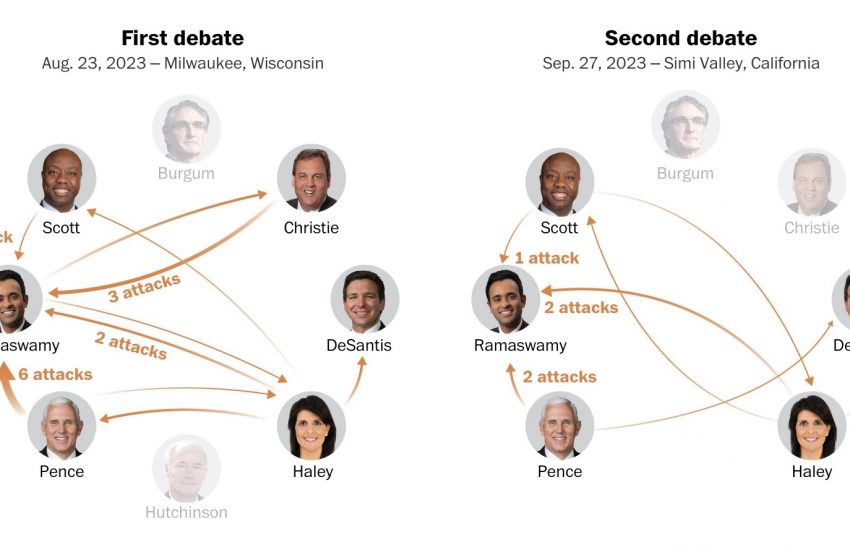
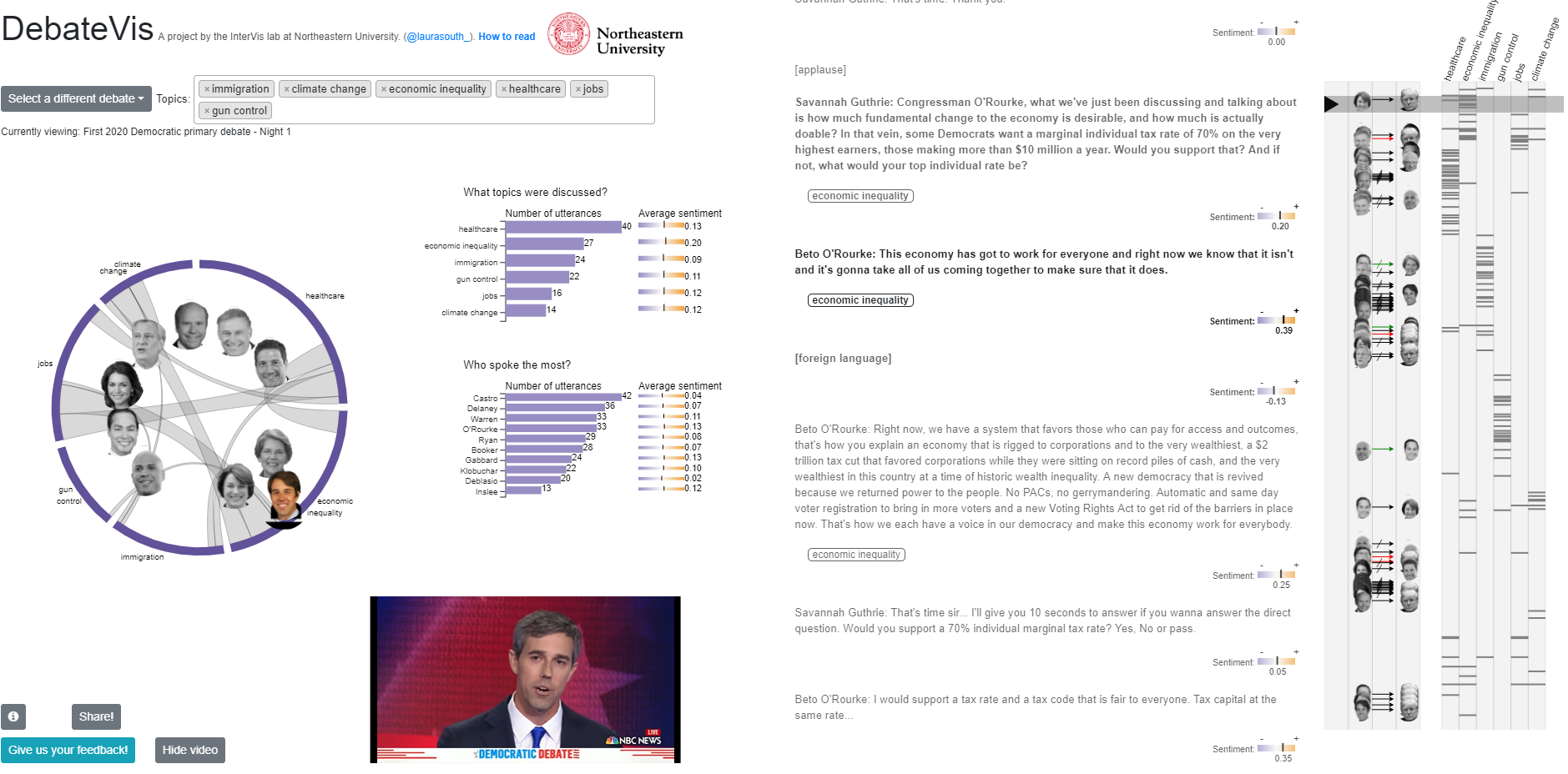
South: To a less technical person, I would say that DebateVis combines text analysis and data visualization to create new ways to engage with political debates. Publicly available debate transcripts are fed into our algorithms to automatically identify what topics are being discussed and what kind of speaker interactions are occurring, like attacks, agreement, interruptions, and more. Instead of watching hours of debate footage or relying on summaries produced by campaigns or media outlets, users can explore debate transcripts interactively at their own pace.
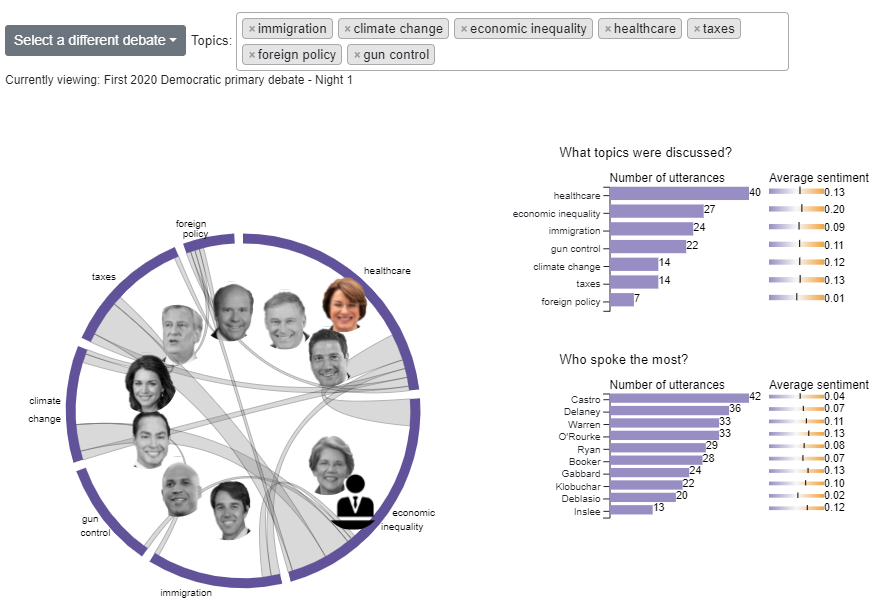
To a more technical person, I would say that DebateVis is a novel visualization tool for the exploration of political debate transcripts. We use natural language processing techniques to extract topic labels and identify speaker interactions that frequently occur in debates, like attacks, agreement, and interruptions. Several visualizations are used to convey this data to the user, including a timeline that can be used to navigate to moments of conflict or moments where a particular topic of interest is being discussed. A topic diagram gives a summary of the most frequently mentioned topics in the debate and any topic shifts occurred during the debate, since this is often evidence of strategic agenda-setting behavior. The user can also read the transcript directly, aided by in-text annotations highlighting topic labels and speaker interactions as they occur in the text.
What would you say that your biggest takeaway from this project has been thus far?
South: My biggest takeaway from this project has been a new respect for how complex our systems of communication are. It’s difficult to see how nuanced and subtle human conversation is until you try to teach a computer to identify a speech pattern that you notice automatically, like passive aggression or indirect references. This is doubly true in political debates, where the speakers have often been coached relentlessly about how to strategically attack their opponents without seeming too aggressive. Figuring out how to untangle the many deflections, barbs, and pivots of political discourse and reveal the substance underneath is a fascinating problem to work on.
What’s the pie-in-the-sky dream for DebateVis?
Borkin: I hope that through this project we will be able to use data science and visualization to produce a tool to inform the public and provide insight into a vast amount of important data. I hope this tool will lead to a more informed society and public that is able to be critical and thoughtful about its leaders.
DebateVis visualizations for the debates tonight and tomorrow night will be available a couple of hours after the debate has ended. If you happen to miss the debates – or if you just want to view them from a new perspective – be sure to check it out! Feedback? There’s a submission button on the project site or tweet us at @Storybench.
- How Northeastern researchers are visualizing the presidential debates - July 30, 2019
- Six tools showcased at NICAR 2019 that you should probably learn - March 26, 2019
- Six fascinating projects from the 2019 Computation + Journalism Symposium in Miami - February 6, 2019