5 digital practices every local TV station should be thinking about
All local television newsrooms, sooner or later, will have to accept the challenge to go digital. Some stations, though, are seeing the transition more as an opportunity than a burden and are already creating compelling digital storytelling. As part of our Reinventing Local TV News Project, Storybench has compiled some shining examples and best practices of digital ntern local TV that we’d like to see adopted by more stations.
Understanding UI/UX design
Typically, TV stations have cluttered websites that are over- and underwhelming at once. Jam-packed with ads, the weather, and news, they can be a nuisance for users trying to find the information they’re looking for. One tip: Good user interface (UI) and user experience (UX) design can be helpful to outlets thinking about how best to present their products digitally.
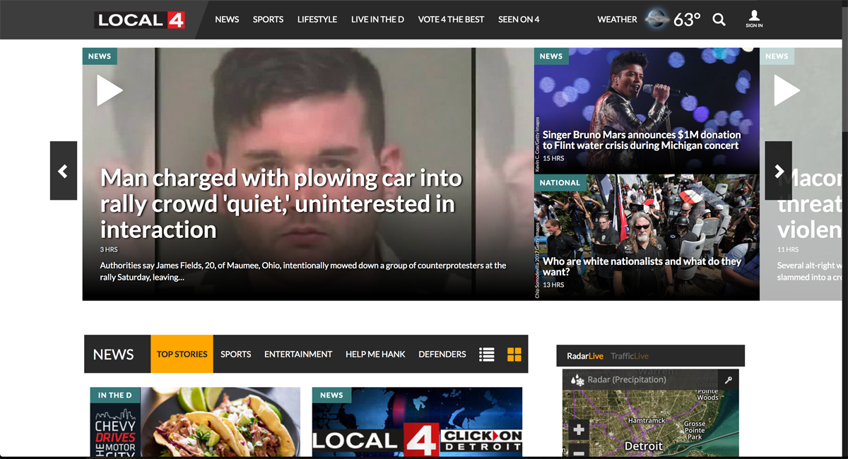
Some stations are successfully employing this kind of design. KUSA in Denver, Colorado, KSHB in Kansas City, Missouri, and WDIV in Detroit, Michigan have three of the best homepages we’ve visited. What do they all have in common? They load fast, they scroll well, they are bright and they look pretty.
WDIV’s slider, for example, is an interesting case study in how to de-clutter a front page.
On KSHB’s site, the use of varying visual elements – such as social media or embedded maps – make stories more pleasing visually, like this piece about a flood in Kansas City. It is such a simple and effective practice that it makes us wonder why many stations are still ignoring it. The letdown in the story above, however, is the multi-page layout, a practice that long ago was settled as annoying to internet users.
Using multimedia story templates
TEGNA-owned stations have at their disposal different templates for stories, and KUSA has seen that as an advantage. One of the layouts the newsroom uses for long-form, investigative pieces elevates these stories and highlights their multimedia elements while mirroring pleasing design choices seen at outlets such as Vox or The New York Times Magazine: full-bleed photos, a centered text column, right- and left-aligned images, and tons of white space.
Podcasts, 3D photos, documents and more
For one of their biggest investigations, KUSA made use of multimedia elements to tell the story of Jill Wells, a woman who was allegedly shot by her 6-year-old son. The circumstances of her death, however, were found by local reporters to raise many questions.
To tell the story, KUSA published a 3-chapter, 14,000-word piece including photos, annotated documents, audio excerpts from 911 calls, and a 3D tour of the cemetery Wells is buried in, created using tools like Bubbli and Timeline.JS.
The investigation also included a video package for broadcast and a 15-episode podcast titled “Blame,” both of which were embedded on the story’s landing page.

Interactive data-driven graphics
KHOU in Houston, another TEGNA-owned station, regularly uses data visualization tools such as static graphics and interactive maps. For its investigative piece on the death of Patrick Carver and the “sloppy” police work surrounding it, KHOU mapped shootings and deadly attacks happening in lower-income areas of Houston, created using OpenStreetMap and Leaflet.js. The story, which used the same template as KUSA, can also be found on the websites of other TEGNA stations.
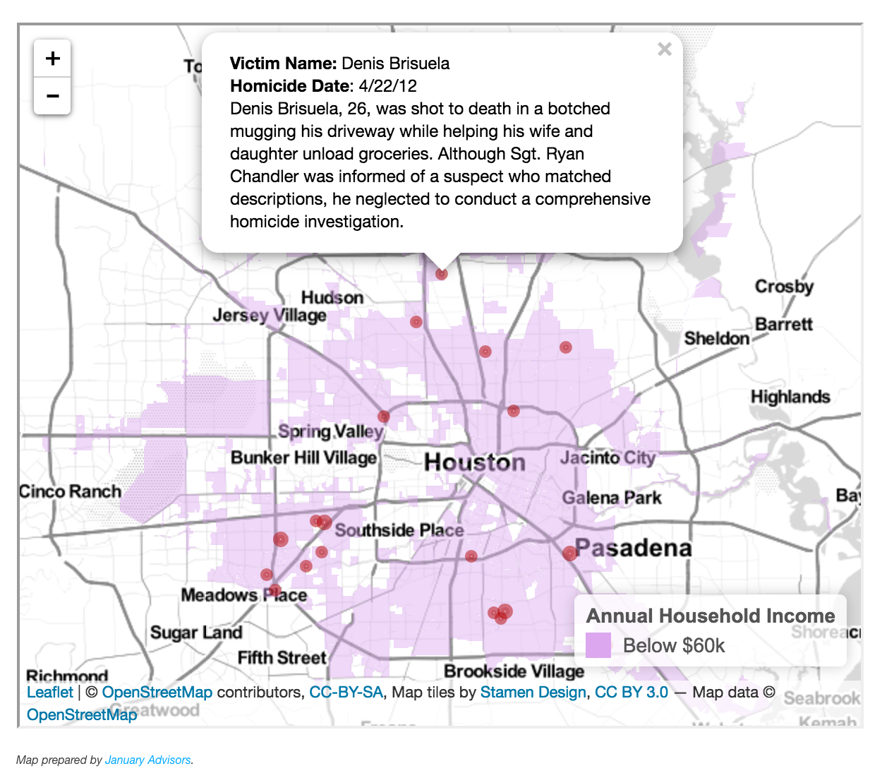 Credit: KHOU.
This summer, Houston-based KTRK built a simple yet interesting Google map of Tropical Storm Cindy’s expected path. Users could explore the projected path over the course of a 72-hour forecast. The map tallied more than 135,000 views.
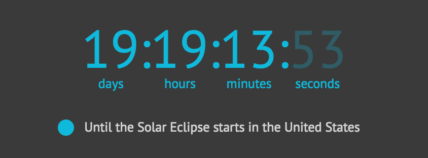
Even though Michigan was not expected to see a total solar eclipse on August 21st, Detroit’s WDIV covered the event extensively, including online. WDIV created an interactive graphic for the eclipse, outlining relevant information about the path of totality and other explanatory information. It also included a countdown clock to the eclipse.
Live teaser videos
Live social videos might be one of the most familiar strategies local station have recently picked up. But few have used them as creatively as Chicago’s WBBS did while producing a story about the fountains around the city. Reporter Vince Gerasole, while traveling around Chicago to shoot the story, broadcast live from the locations and shared some extra facts about the fountains from his interviewees. The story, in its complete form, later aired on the 5 PM newscast.
Is your local station producing innovative digital storytelling? Let us know! Tweet at me @fsorodrigues or e-mail me at fsorodrigues@gmail.com.
Cover image: WHIO via Wikimedia Commons.
- SXSW: ‘Excel is okay’ and other tweet-size insights for data journalists and news nerds - March 17, 2018
- NICAR: Data stories from last year that you could be doing in your newsroom - March 13, 2018
- How to scrape Reddit with Python - March 12, 2018