The Surprising Design Secrets Behind Trust in Data Visualization
A behind-the-scenes look at the invisible design choices that shape credibility in data journalism
When Jan Diehm’s story about pocket sizes in jeans went viral, she didn’t expect emails from the middle school science fair. Years later, she still responds to every one. “I’m honored to be the pocket expert,” she said. But what made thousands of readers,including those students,trust her measurements in the first place?
The answer begins before anyone reads a word.
Trust in data journalism forms in split seconds, shaped by design choices most readers never consciously notice: the weight of a typeface, the texture of a chart, or whether a visualization feels handmade or machine generated. For a new generation of data journalists navigating AI tools, political polarization, and audience skepticism, these invisible design decisions have never mattered more today.
We spoke with three influential voices in data visualization—Edward Tufte, the grandfather of information design; Alberto Cairo, Knight Chair in Visual Journalism at the University of Miami; and Jan Diehm, creative director at The Pudding—to understand how they think about visual trust. What emerged wasn’t consensus, but a revealing tension about whether credibility lives in discipline or humanity, restraint or transparency.
The split-second judgment
“I think most people navigate news like they navigate a TikTok feed,” Cairo said, “just scrolling, scrolling, not paying much attention.”
That inattention is the real battlefield. Before readers engage with data, they’ve already made a trust judgment based on visual signals alone. The question dividing the field: What should those signals be?
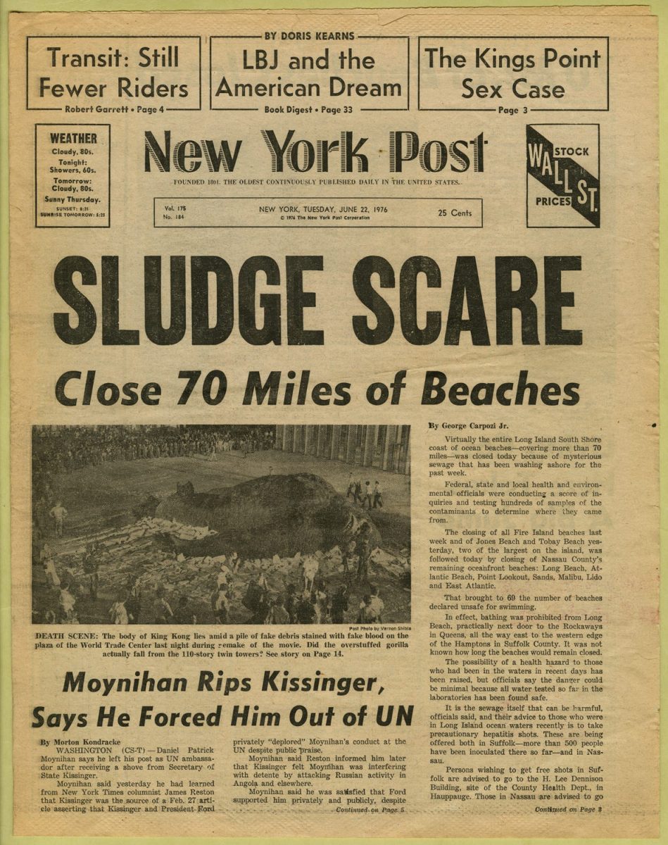
For Tufte, the answer is uncompromising: “Maximize signal/content. No toy graphics.” His philosophy, developed over decades and multiple influential books, argues that credibility emerges from visual discipline. Graphics should approach “the pixel resolution of typography”—dense, restrained, stripped of decoration.
“Commercial designers have it wrong,” Tufte wrote in response to our questions. “High-resolution graphics usually have more clarity and more information.” In his view, the profusion of “story-telling” in data visualization is “intellectually impoverished,” failing to distinguish between truth and fiction the way advertising does.
It’s a philosophy rooted in deep skepticism of commercial media. Tufte points to advertising-saturated platforms as actively harmful to truth. By contrast, he praises large language models as “ad-free tools that try for truth,” describing them as vindication of his decades-long argument for concentration and clarity over entertainment.
In this framework, trust is earned through austerity. The human hand should be minimized, replaced by density, restraint, and rigor.
“A little mess is good”
Diehm sees it differently.
“There’s something about a human aesthetic, or a slightly messy, scrappy vibe, that feels handmade and authentic,” she said. “It signals there’s a person behind the work.”
Where Tufte locates trust in restraint, Diehm locates it in presence. At The Pudding, known for experimental, subject-specific design, her philosophy is “less about pixel-perfect precision and more about designing on vibes.”
“I don’t think audiences think about design the way designers do,” she explained. “They’re responding to emotion and familiarity, not whether I used 36-point type instead of 26.”
She pointed to a recent internal debate at The Pudding: a story about Asian representation in film initially used a yellow color accent. “The photos were specifically of Asian people, and yellow face has obviously derogatory connotations,” she said. “We changed that accent color.” Both elements separately would be fine—but together, the design created an unintended signal.
This focus on psychological resonance over formal rules extends to The Pudding’s unusual metrics for success. “We don’t have Google Analytics. We have no idea how people interact with our stories,” Diehm said. “The biggest measure of success is if a story makes it back to me organically.”
For example, when her mom’s high school colleague heard the pocket story mentioned on a podcast. “That’s the measure of trust—if someone in your day-to-day life shares it with you.”
The transparency school
Cairo occupies the philosophical middle ground, emphasizing neither pure discipline nor pure humanity, but systematic transparency.
“There’s a difference between credibility and truth,” he said, describing a recent New York Times story about U.S. democratic backsliding that used a subjective “autocracy index.”
“I have a lot of problems with that index,” Cairo said. “I don’t think it measures anything meaningful, or at least it doesn’t measure it well. But I respect the effort of transparency.” The Times disclosed their methodology, explained how each component was calculated, and acknowledged its subjectivity.
“The story is fully credible, even if I disagree with the premises and the methodology,” he continued. “It doesn’t reflect what I think reality is, but it’s a credible story.”
For Cairo, trust is built systematically over time: “You build trust by putting good stuff out on a systematic basis, and when you screw up, by being transparent about the screw-up.”
He’s skeptical of pure neutrality as a trust signal. “Some people will tell you we need to be as objective and neutral as possible,” he said. “I think that’s completely wrong. People see through bullshit. Of course you have an opinion. Of course you have a view.”
His alternative: full transparency about position. “This is who I am, this is where I’m coming from, this is my position. Here’s all the evidence I’ve gathered, both in favor and against. By weighing it all, this is my take.”
What readers actually see (and don’t)
All three agreed on critical point: most readers don’t consciously process design the way designers do.
“I tend to believe a well-designed visualization looks more trustworthy intuitively,” Cairo said. “But I may be wrong. I would like to see more research.” ( He recommended speaking with Enrico Bertini at Northeastern University, who studies whether the mere presence of numbers and visualizations makes stories more credible.)
“It happens almost automatically,” Cairo added, describing the trust judgment. “The strategy to assess trustworthiness requires deliberate attention. That’s a prerequisite.”
Diehm described how her team thinks about this gap: “We’re trying to find something that makes an emotional connection to ground readers in their own experience. That attachment, that emotion, is so much more important than technical design perfection.”
She cited hurricane maps as a classic failure of this principle: “On the data vis side, it’s like, ‘we’ve shown the cone of uncertainty, we’ve checked the box.’ But that design choice doesn’t translate to the public.”
The solution, both Cairo and Diehm argued, isn’t simplification but explanation. “I believe readers, if they put a little effort in, will understand,” Cairo said. “Visualization isn’t something you glance at like a photograph. It requires attention and effort, the same way you can’t understand a story by quickly glancing at it.”
The loaded language problem
Cairo offered a framework for one of journalism’s trickiest trust problems: when does language (visual or textual) signal credibility versus bias?
“Loaded language is always contextual,” he said, providing two contrasting examples.
First: A headline using aggressive political language about ICE operations. “Without context, I automatically mistrust it simply because it uses loaded language.”
But: A headline using neutral language to describe the same events. “Having the context, that’s politically loaded language too, because it’s trying to downplay the gravity of something we all saw.”
“Loaded language can be something that’s outrageously political, or something that’s outrageously neutral when neutrality shouldn’t be part of the title,” he said.
This applies to visual choices too. Diehm described how color ramps can signal seriousness: “The CDC used to show COVID data with a dark red or purple ramp, which denoted seriousness. They redesigned it to go from blue to green. It feels not as alarming.”
Drawing the line with AI
Perhaps nowhere is the trust question more urgent today than with AI tools flooding newsrooms. All three had strong,and different,perspectives.
Tufte sees AI as vindication: “LLMs try for truth, unlike commercial artists. LLMs don’t do bullshit storytelling. LLMs have won my wars.”
Cairo is cautiously pragmatic: “Whatever you see on social media, unless it comes from a fully reputable source, you should mistrust anything. I don’t trust anything on YouTube nowadays unless it comes from specific sources that have gained my trust throughout the years.”
Diehm draws careful lines based on what’s being represented. The Pudding recently worked on a story about IVF, creating illustrated characters to follow through the process. “Because that’s meant to represent a person, a person needed to illustrate it,” she said. “Anytime we’re talking about real people, we ask real creatives to collaborate.”
But for a story about cutting onions mathematically? They used an AI-generated onion font. “We got comments like, ‘the Pudding’s using AI,'” she laughed. “It’s an onion font. It has nothing to do with the data. It’s just a flourish.”
Her principle: “If it impacts your understanding of the core concepts, you need to disclose it prominently. If it’s an onion font, you’re probably okay.”
What designers owe readers
Each was asked the same question: What is one piece of advice for designers trying to build trust?
Tufte: Focus entirely on content. “Minimize noise. High-resolution graphics have more clarity. Read about data density in my books.”
Cairo: Build systematically over time. “Keep doing what you’re doing, trying to be as honest and transparent as possible. Put the sources of your information, explain methodology in language readers understand. Correct mistakes quickly. But it’s not something that works in one day—it’s a long-term strategy.”
Diehm: Create space for conversation. “Make sure you’re having a conversation with someone instead of speaking at them. When middle schoolers email me about pockets, I respond to every one. That accessibility, that feeling they can reach out.That’s trust.”
The divide between these philosophies reflects a broader shift in how trust functions in digital media. Tufte’s model assumes credibility flows from authority and discipline—readers trust what looks serious, dense, restrained. Diehm’s model suggests contemporary audiences increasingly trust what feels human, transparent, accountable. Cairo bridges them: systematic transparency about both methodology and perspective.
No single visual language
What’s clear is that trust in data journalism is no longer signaled by a single visual approach. It emerges in tension—between clarity and connection, between discipline and disclosure, between the data itself and the human decisions that shaped it.
“The biggest thing is just creating trust within my colleagues internally,” Diehm said. “If I’m making a decision based on a blind spot of my own, somebody else will catch it. And when things slip through? You own the mistakes.”
Cairo agreed: “Stop thinking everything is up to you. The mistrust readers have toward news organizations isn’t only because of what news organizations have done. We need to fight against that and denounce it.”
Both perspectives point to the same reality: trust isn’t something designed into a single graphic. It’s built through systematic work, visible humans, transparent methodology, and honest acknowledgment when the work falls short.
The split-second judgment readers make when landing on a data story—the one that happens before they’ve read a headline or engaged with a chart—is shaped by all of this. Not just the typeface or the color palette, but the accumulated weight of whether the humans behind the data have earned trust over time.
“You know what the measure of success really is?” Diehm said. “Jonathan Van Ness from Queer Eye mentioned my pocket story on his podcast. My mom’s colleague was playing it in her home ec class. That student told my mom, ‘I think your daughter was mentioned.’ That loop—that’s when you know it worked.”

- The Rise of ‘Nano-Newsletters’: Why 500 Subscribers Beats 50,000 - April 14, 2026
- How W.E.B. Du Bois Made Data Visualizations Simple and Easy to Understand - March 26, 2026
- How Copernicus Makes Climate Data Simple and Easy for You to Understand - March 19, 2026


