Making Trillions Make Sense: How Reuters Visualized the AI Economy

When journalists report on economic forces such as AI investment, infrastructure spending and historic market shifts, the challenge is hardly ever a lack of data — it’s a lack of context. Each time, journalists face the same question: how do you make large amounts of money feel real to someone who has never seen a trillion dollars? Reuters reporter Vineet Khare and graphics journalist Mayank Bhatt faced exactly that challenge when building their data-driven investigation into AI investment.
This interview is as much about this story as it is about any story where the numbers are too big to grasp and the scale feels out of reach. The lessons they share apply to any journalist trying to help readers understand figures they cannot visualize.
This interview has been edited for length and clarity.
When you’re building a story around economic data that most readers don’t intuitively grasp, where do you start, with the data or with the story you want to tell?
VK: We start with a bunch of ideas for the story we want to tell, and then go in to check if there is data to help tell it better. Finding data points that readers can relate to quickly also helps. In our AI story, for example, we stated that higher investment flows were going toward infrastructure — something readers could connect to mentally, given how frequently those companies appear in the news.
MB: The first step is trying to understand what the numbers actually mean in the real world. With something like AI investment, the raw figures (trillions of dollars) are difficult to contextualize. So we looked for ways to anchor the scale in history, comparing it to events like the Manhattan Project or the Apollo program. Once you find that framing, the story begins to emerge. At that point, the visuals become a way to guide readers through the scale, the distribution of investment, and the relationships between companies. The storytelling and the data exploration start feeding into each other.
How do you decide when a chart, a map, or an interactive element is the right tool? Does visual complexity ever get in the way?
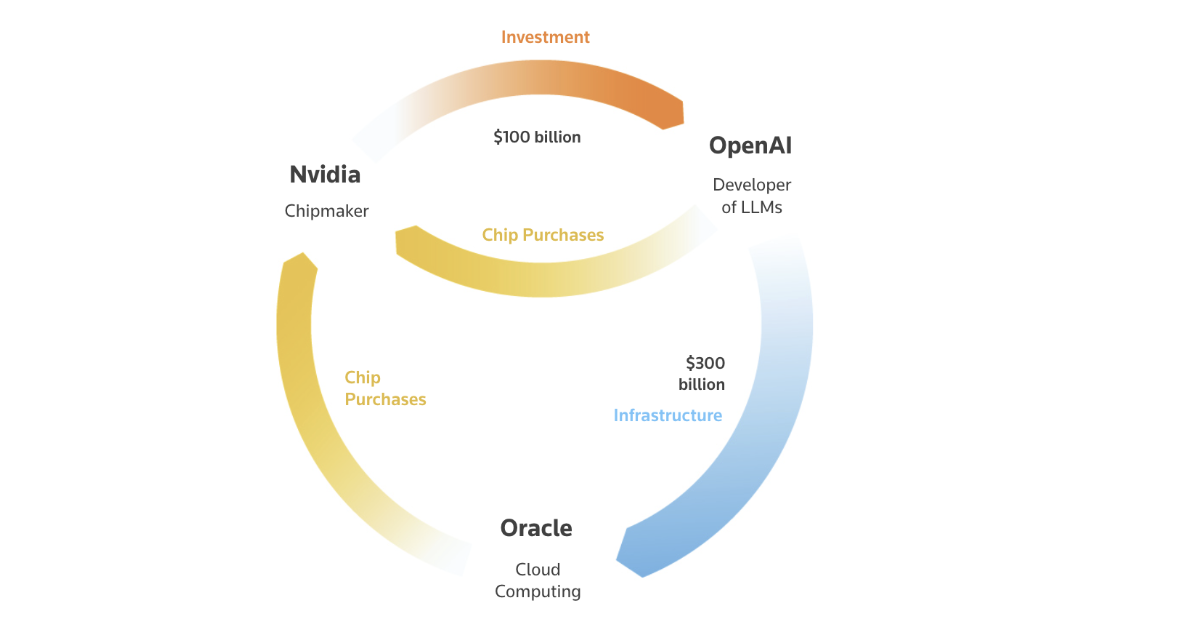
MB: We try to think about the question the reader needs answered at each point in the story. If the question is about scale over time, a chart usually works best. If it’s about relationships or systems, something more diagrammatic might make sense. In this story, for example, the circular financing loop between companies was hard to explain in text — but once you visualize the flows between OpenAI, Nvidia, and Oracle, the structure becomes immediately clear. At the same time, there’s always a temptation to make something more visually elaborate than it needs to be. If a graphic requires a long explanation to understand, that’s usually a sign it’s too complicated. The goal is always to reduce cognitive load, not add to it.
How do you balance interactivity with narrative clarity in digital storytelling?
MB: Interactivity works best when it reveals something the reader wants to explore, rather than when it’s required to understand the main point. The charts communicate the core trends immediately — the interaction can then help readers spend more time with the data, for instance by really scrolling through to feel the scale of AI investment. I think of interactivity as an enhancement rather than the backbone of the narrative.
How does telling a story at the intersection of AI and the economy change your approach compared to other topics?
VK: The AI story involved telling the monetary impact in the economy due to a new technological innovation. Drawing comparisons to historical moments — railroads, the internet boom, the automobile — can help audiences connect to complex topics they otherwise wouldn’t feel close to.
MB: AI stories often involve two layers of abstraction at once: the technology itself, and the financial system around it. Most readers don’t have an intuitive sense of either the technical infrastructure behind AI or the scale of capital flowing into it. So the challenge becomes building clear mental models — which is why historical comparisons matter so much here.
What does a good collaboration between reporter and visual journalist look like on a project like this?
VK: Involving both the reporter and visual journalist during the initial ideation and brainstorming phase helps set the narrative, with visuals complementing the story’s direction from the start. Visual journalists are invaluable for breaking down complex ideas into simpler pieces that readers can actually grasp.
MB: Often the graphics end up influencing the reporting as well. When you start visualizing data, patterns or questions appear that might not have been obvious from text alone. The tension usually comes from trying to balance narrative simplicity with accuracy. Economic stories can get complicated quickly, so there’s always a discussion about what to include, what to simplify, and what’s essential for readers to understand.
How do you know when a data story is done?
VK: A story is done when the relevant data points mentioned or visualized in it help answer the question the story sets out to discuss.
MB: For me, the signal is when every visual element clearly answers a question the reader likely has. If you can trace a direct line between each graphic and a genuine reader question, the story is ready.
What surprised you most in the data?
VK: The massive amount of money that has already been spent across this sector since 2013 — $1.6 trillion in total — was genuinely striking. I don’t think even those of us following this space closely had a felt sense of that cumulative figure.
MB: For me, it was the degree of financial interdependence between some of the largest companies in the ecosystem. The flows of capital between chipmakers, cloud providers, and AI developers form a surprisingly tight loop — far more circular than the usual picture of separate industries investing in a new technology.
- Making Trillions Make Sense: How Reuters Visualized the AI Economy - April 23, 2026


