A roundup of measles outbreak visualizations, maps and interactives
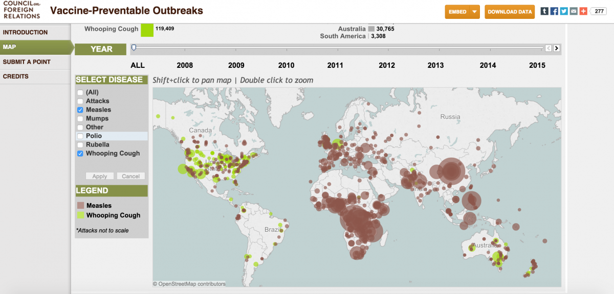
The Council on Foreign Relations built a map allowing one to explore vaccine-preventable outbreaks across time and geography.
The Guardian published a visualization of how measles spreads by looking at several cases of outbreaks.
Medium.com’s The Nib published a comic on the measles outbreak and Disney.

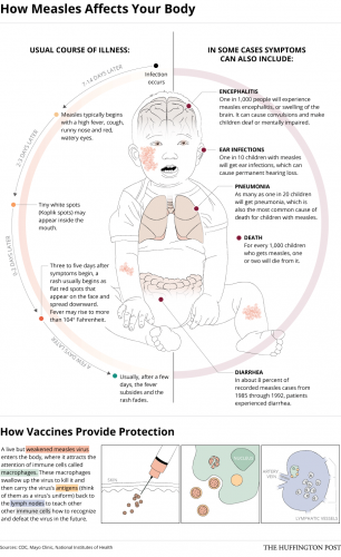
The Huffington Post drew up some graphics to illustrate the symptoms and course of the illness.
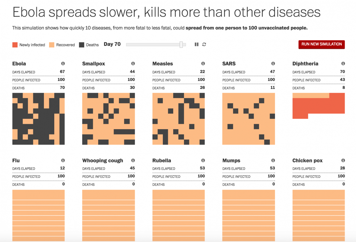
In a visualization from last year, The Washington Post contextualized Ebola by comparing its virulence to measles, smallpox and other diseases.
The New York Times explains herd immunity and maps where there have been outbreaks in the U.S.

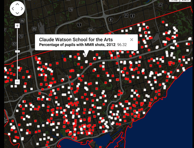
Global News Canada mapped out how many students at Toronto schools are vaccinated.
Aleszu Bajak was the founding editor of Storybench. He is currently the director of data visualization at the Urban Institute. Previously, he was a senior data reporter on USA TODAY's data team, part of the newspaper's national investigative unit. He is a former Knight Science Journalism Fellow at M.I.T., was a founding senior writer at Undark magazine and founding editor of Esquire Classic, a project resuscitating the magazine's archives. His work has appeared in The New York Times, The Washington Post, M.I.T. Technology Review and Nature.
Latest posts by Aleszu Bajak (see all)