Blizzard of 2015 visualizations and news apps
Today’s storm coincides with a flurry of related visualizations and news apps. Here are a few that caught our eye.
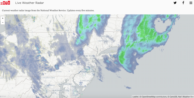
WNYC‘s Data News team was quick to provide embeddable radar, transit trackers and traffic maps.
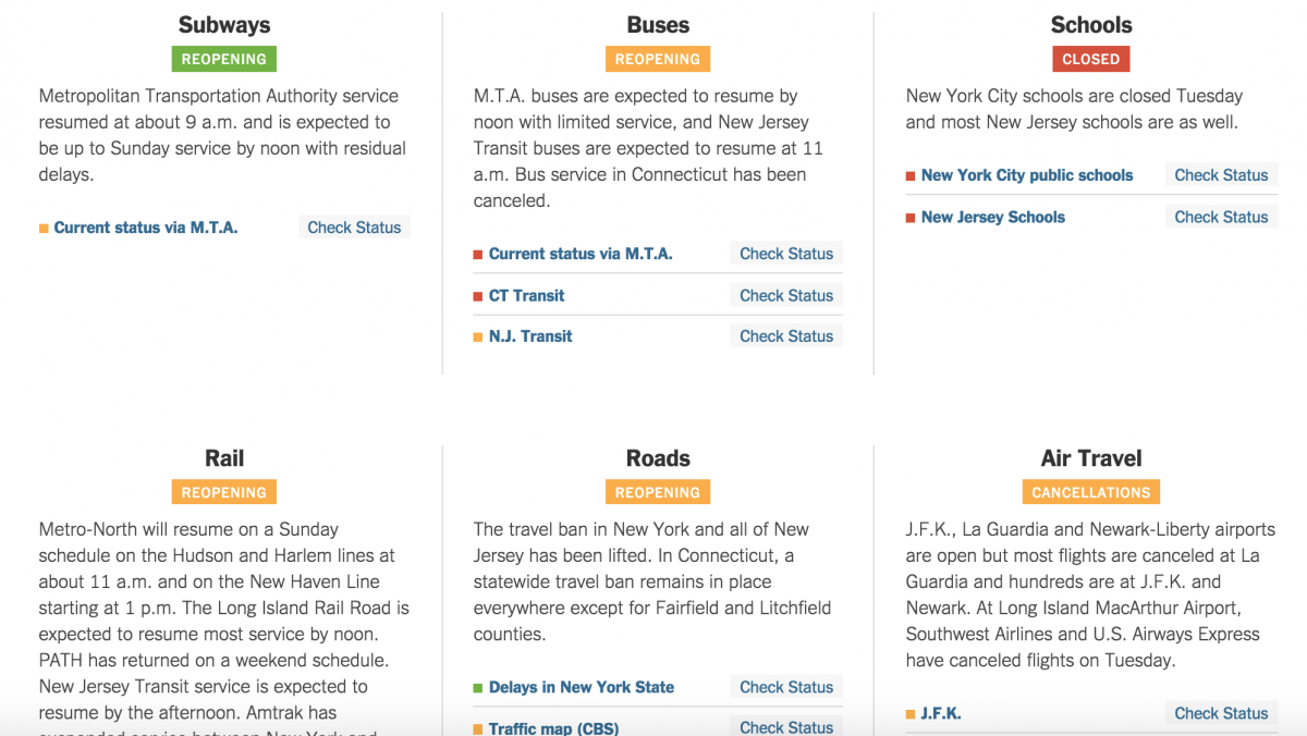
The New York Times built a dashboard to track the status of airports, trains, and schools in the NYC area.
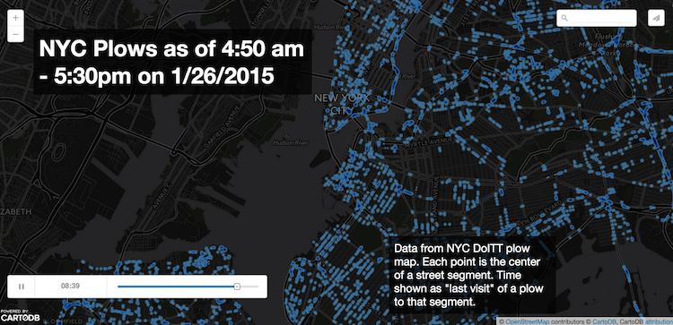
Chris Whong built a timelapse map on CartoDB of snow plows traveling around New York City last night.
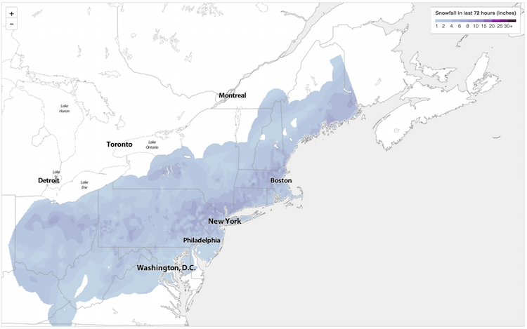
The Boston Globe built a static map of snow accumulation.
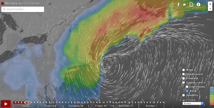
Windyty.com and earth.nullschool.net visualize global weather conditions. The wind data are updated every three hours. The tech is open-source.
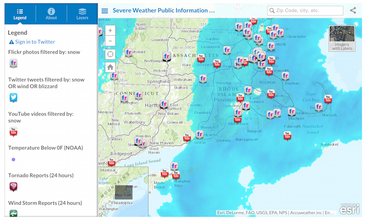
Smithsonian published a map tracking geo-tagged social media updates related to the storm.
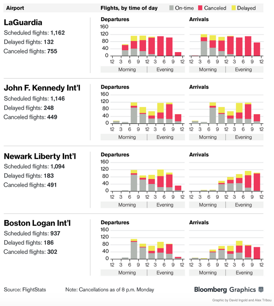
Bloomberg Businessweek compiled flight delay and cancellation data.
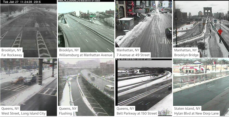
The Guardian posted a collage of live camera feeds from U.S. East Coast cities.