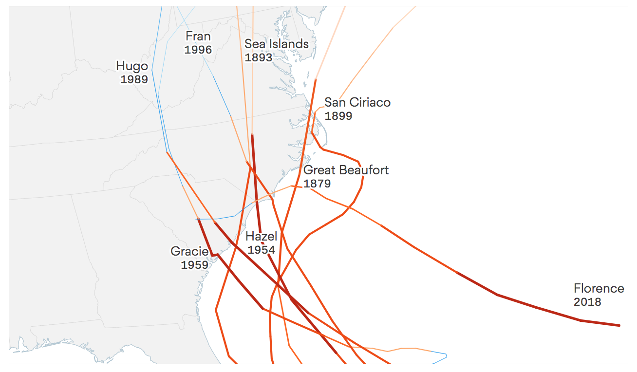
How Axios built an animated map showing hurricane paths hitting the Carolinas
When Hurricane Florence made landfall in the United States last month, few could anticipate the strange journey the hurricane would take. While many major hurricanes have hit the Carolinas, it turns out, none have taken the same path as Florence.
Harry Stevens, a data and visual journalist at Axios, analyzed the data collected by the National Oceanic and Atmospheric Administration (NOAA) to create a stunning visual comparing the hurricane to past ones. Storybench spoke with Stevens about his process for creating the visual.
What was the main objective of this visual?
I wanted to show that Florence’s trajectory was unusual for a major storm in that location. When I started working on the map, Florence was projected to make landfall as a Category 4, so it would have been the eighth storm to hit the Carolina-Virginia coast as a Category 3 or higher. Fortunately for the people in its path, Florence ended up making landfall as a Category 1. That partially undermined the purpose of the graphic, but it was still a worthy project.
What was the inspiration for the project?
I wanted to make something similar to what my colleague Lazaro Gamio made last year for Hurricane Harvey, but when I put the previous hurricane paths on a map near the Carolinas, it looked like an incomprehensible spaghetti of lines. So then I thought, ‘How is Hurricane Florence different from other major hurricanes that have struck the Carolina/Virginia coast in the past?’ And it was obvious that its trajectory was really unusual. The major storms that have struck that area since 1850 all came up from the south, while Florence came west across the Atlantic. Last Monday, when I started working on this, Florence was still projected to make landfall as a Category 4, so it made sense to compare it to other “major hurricanes,” which are defined as Category 3 or higher. There have been just seven to make landfall in South Carolina, North Carolina, or Virginia as Category 3 or higher since 1850, and filtering the data down like that made the map legible.
How did you acquire the data from past hurricanes?
NOAA maintains a dataset of every Atlantic storm since 1850. I downloaded the data, which is formatted as a text file, and then wrote a parser to convert the data to GeoJSON, which is a data format for visualizing geospatial data. GeoJSON can be used with many tools, but it is probably most used with JavaScript. The path for Florence came from the National Hurricane Center, which updated the path regularly as the storm approached the coast. I downloaded the observed path as well as the predicted path, and then I wrote a parser that stitched them together.
What were the other tools used to visualize these data?
The map is written in JavaScript, making heavy use of D3.js, a data visualization library. I also used TopoJSON for showing the U.S. states. Unlike GeoJSON, TopoJSON preserves the topology of geospatial data, which means that when you have a file with polygons that share borders, you don’t encode those borders multiple times. That makes the file size smaller, which means it loads faster than GeoJSON. It also allows you to do things like make a mesh of all the polygons, which let me draw a light blue border around the coast.
What was the process for making this visualization?
After getting all the storms data into a format I could visualize, I loaded it into QGIS to see what it looked like. There were way too many lines to make sense of, so I decided to make the map in JavaScript, which would let me quickly apply filters to the hurricanes data to see what happened if I only showed storms of certain intensities. I had planned to bring the result of my JavaScript work into a tool like Adobe Illustrator to touch it up, but that was before I decided to animate the paths of the previous hurricanes. When I started working on it in JavaScript, the first thing I tried was to make a graphic of “small multiple” maps, where each map showed the hurricanes from each year, with Florence’s path superimposed on each one. That looked cool, but it didn’t really tell a story. So I narrowed it down to only those seven storms that had hit the coast of North Carolina, South Carolina, or Virginia as category 3 or higher, and that let me put everything on one map. I showed what I had it to my coworkers, and they were like: This would be cooler if it were animated.
What were some of the challenges you faced while trying to make this project?
Animating the paths of the previous storms was challenging. D3 has functions that make animating transitions easy, but the data for each storm included different numbers of path segments that would appear on the map. I wanted each storm, rather than each line segment, to take the same amount of time animating, so I had to do some math so that each path segment delayed for the right amount of time and animated at the right speed. It was also somewhat challenging get the labels to fit on a small screen (the smallest screen we design for is 280px wide, so it’s pretty tight). If I had more time, I would have improved the labelling. I probably also would have simplified the color scheme to improve the discriminability of the different hurricane paths. In journalism, you only have so much time to make stuff.


