How Kirell Benzi’s data art balances creativity and scientific accuracy
Kirell Benzi is a self-taught artist whose art is not only aesthetically pleasing to the eye, but it’s also rooted in data visualization principles and often embedded with a message.
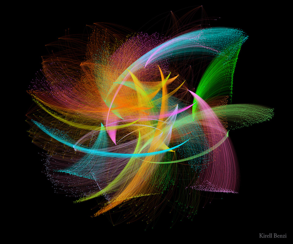
Using artificial intelligence, or machine learning, Benzi creates visuals not only with as many as 335 million parameters, but also to generate text and summaries of art pieces. Communicating through his data-driven art, he uses data, creativity and science to convey sounds, images and animations that create an emotion to drive home the intended message.
His art uses everything from data on hierarchical positions of company employees and millions of images to the pandemic’s length and the lockdown, among many other topics.
“I want to show that technology can be beautiful, fun and happy,” said Benzi, who also works as a senior applied scientist at Ecole Polytechnique Fédérale de Lausanne (EPFL) in Switzerland.
Storybench spoke with Benzi about transforming data into art while ensuring scientific accuracy, limits of data visualizations, and associating the data with different shapes, colors and textures.
What is the difference between data art and data visualization?
Data visualization is most efficient at transforming data into visuals. A good data viz follows the rules of design and biology of the human visual system so that it is easy to understand.
Whereas when we do data art, the goal is to put forward emotions first so that you may be drawn by the imagery that you see, as an art piece. But because it’s based on data, it has a deeper meaning and a more objective truth than a regular artwork.
We can debate whether it is objective as there’s always bias, but at least because it is based on data, the universal truth is a bit bigger than just my own subjective view as an artist.
How do you choose the data that you work with for your projects?
I try to do this professionally, so I have clients. We don’t usually talk about dataset first, we talk about the message: What do you want to convey artistically and visually?
We then try to find the dataset from your own data to see how we can illustrate this point.
Another part of my data art practice is about academic research. Because I’m a researcher, I am in touch with tons of other academics. Here, it’s about the dataset that they created from their research topic.
These are the two main sources, but you can also use personal data. For instance, you can track your fitness habits or your weight and transform that into art.
Do you always know what message to convey before you start a project?
Not always. When it’s a client, we first talk about it. Sometimes you want to convey a message, but it’s not actually shown in the data. If the data says your company is losing money, I cannot transform it to show that you earn money. It doesn’t fit the data, so we try to find another data set. I try not to lie too much.
Can you walk me through your workflow from dataset to data art?
First, I try to get the gist of the data. I open it up with Python, [and] I try to understand: What are the different dimensions and clusters in the dataset? What do they mean?
To do so, I first create simple charts to get an idea of what I am working with. For instance, I group the data by job or by company to try to understand where the interesting part is. This is just the preliminary part before the real data analysis.
Questions I would ask myself: Do we have outliers that are sufficiently big that it will make sense to have two different categories? What algorithms could I use to extract, transform, aggregate that would make sense here?

The second part is: Which artistic technique would be best suited for this? It also depends on whether you want to create a 2D or 3D still image, a video animation or an interactive piece. This is a completely different technology, and in most cases, a completely different set of constraints.
Putting aside the obvious budget factor, the choice of the artistic technique depends on where (and how) the work is going to be shown. If it is to illustrate a scientific paper it will most certainly be an image, if it’s for twitter maybe a short video, for a website an interactive piece.
The funny thing with data art is that it is similar to what you do in design or data visualization: you try a few initial ideas, and iterate many times. And it’s not necessarily linear – sometimes you have a good idea after five hours, and the end is going to be the best idea you get, but you still continue working on the piece for two weeks.
How do you use machine learning in this workflow?
It’s not the same technique. It is a loose definition of data art, because you need data to train the neural network, but it is not artistic data visualization. There’s another field called AI art or neural art. I do both. It is very interesting to me, because you can create beautiful imagery and use it to talk about societal changes brought by machine learning.
What tools and software do you use to create data art?
All my data analysis is done with Python, so it’s text-based code. For interactive web visualization, I use a tool called Cables. It’s a very nice, node based visual programming framework.
Sometimes I use Houdini, which is another very famous software in the VFX industry. Quite expensive and difficult to learn, but amazing. I am also working with vvvv to create bigger interactive visualizations.
How do you balance the creative process, while also making sure the scientific accuracy is intact?
It is difficult. There is a thin line between the two that makes it interesting but also very challenging. Because if you say, I’m doing purely art, why should I care about data visualization and data principles? And if I do data visualization, why should I care about artistic emotions? I don’t have a clear answer. I try to respect the scale of the data.

For instance, if the data is linear, I’m going to visually try to make it a quadratic function. So if it changed linearly in the dataset, it should change linearly in the visuals as well. I try to keep the magnitude of the data the same.
If it’s an outlier, one point should not be very big on screen, because it doesn’t really reflect what’s happening in the data. And this is really rooted in the data visualization principles.
There’s a mantra rule in the dataviz world called the lie factor. It is the difference between the magnitude in your dataset versus the magnitude in your visuals. So in theory, it should be one to one. But in most cases, you want to highlight more so you “lie”, and make the visual look bigger.
For data visualization, this is an issue. For data art, this is where you could be creative. Yet, I don’t highlight something that is completely irrelevant just to make it pretty.
Do you have a general guideline on associating the data with different shapes, colors and textures?
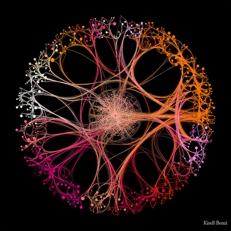
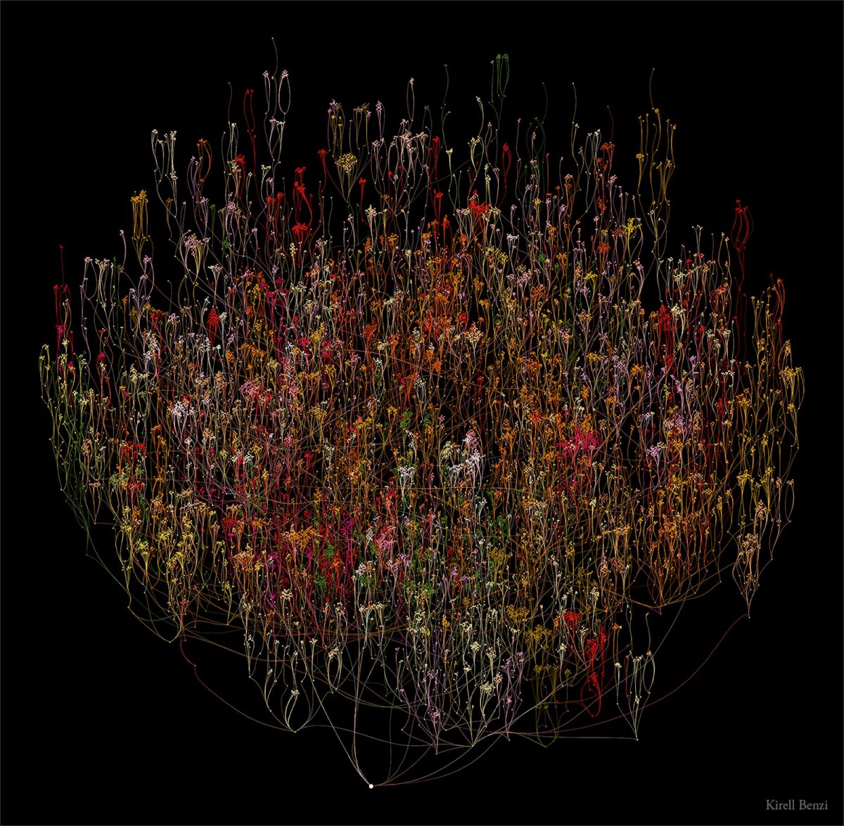
I don’t have a clear process for this. Usually, I assign a specific color to a group of points that belong together.
In data visualization, you are limited to between six and eight colors. But this is too few if you want to make an art piece. If you have 200 communities, then you’re going to need more colors. This is where you break the principles.
How do you choose the colors to reflect positive emotions?
That’s a good question. In most cases, I use black backgrounds because you have better contrast, so it pops up more. But it is true that you always need balance. It cannot only be black and white. In my artwork, I choose different sets of colors so my pieces don’t look too similar, but it has to work with the underlying dataset.
For instance, I’m working on data coming from blood samples, the piece is going to be mostly red. It would not make sense to show blood samples in green. This is where you find a color palette that works. Sometimes, you have more freedom and it’s more about the inspiration and the shade. For instance, in Secret Knowledge, the data comes from Wikipedia. How would you color Wikipedia? I usually try different palettes until I am happy with the emotions I get from looking at it, and hopefully my audience shares it too.


