Eleanor Lutz on drawing science
Eleanor Lutz is Seattle-based freelance designer whose illustrations and animations have been featured in National Geographic, Popular Science, The Huffington Post and Slate, among others. 
Lutz, who has an undergraduate degree in cellular, molecular and developmental biology from the University of Washington, spoke with Storybench about her mission: tapping the power of art to communicate the workings and wonder of complex scientific concepts to as broad of an audience as possible.
What was the first scientific illustration you tackled?
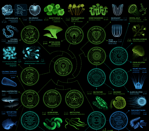
The first science infographic I tried to make was a guide to glowing creatures and it was probably the hardest art project I’d done in years. The project took almost 100 hours to finish because I had no idea how to approach making a science illustration and I was also learning [Adobe] Illustrator at the same time. So there was a steep learning curve for me at first, but it definitely got easier with practice. I think the last science infographic I made only took two days.
Do you have science textbooks at home?
I have a ton of science textbooks at home. I got my degree in molecular biology and I kept all of the really useful books I was assigned in my classes.
What are the most important themes you try to convey with your work?
[inlinetweet prefix=”” tweeter=”” suffix=””]The most important thing for me to get across in my science illustrations is a feeling of delight or surprise[/inlinetweet]. I want people to think science is awesome and really exciting, even if they don’t understand everything about the subject.
Your illustrations of the various stages of embryonic development is particularly striking. What is your approach to conveying a scientific process?
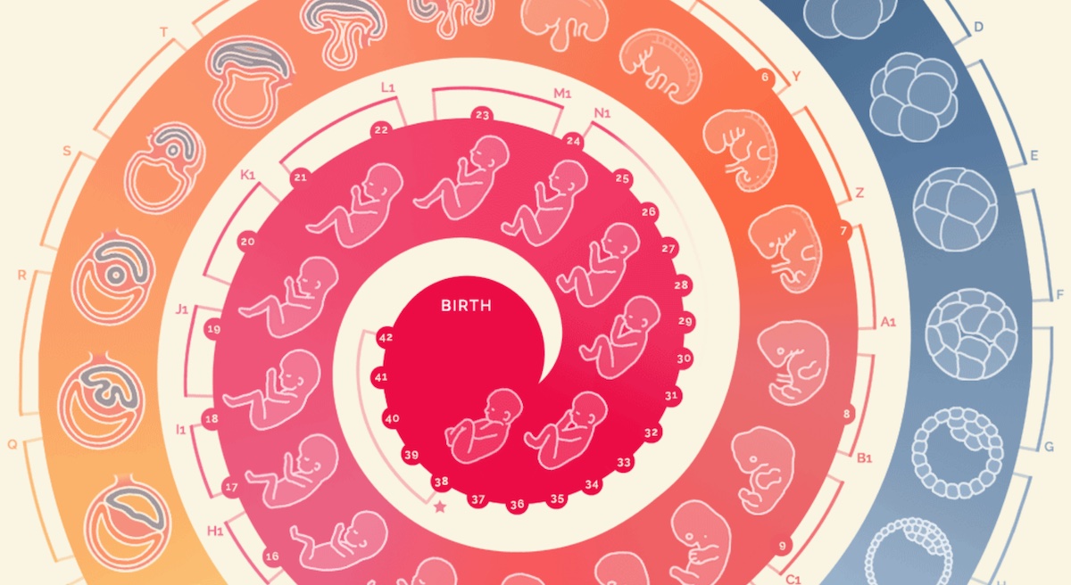
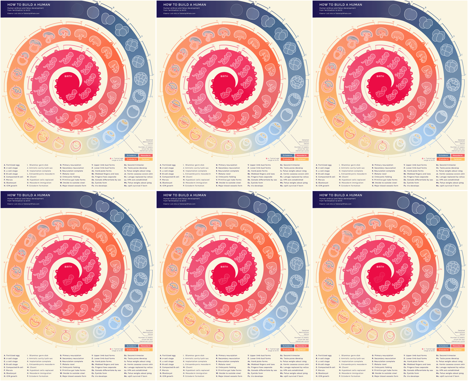
I decided to make an embryo development infographic because I’d never seen something like that before and I thought it would be fun to make. Even in the basic reproduction unit in middle or high school, the pictures in the book jumped really quickly from a four-cell blob to a human-looking thing. I remember being kind of confused about how that actually happened, and I thought other people might feel the same way.
Lutz wrote on her blog about the GIF: “I’m actually really happy with how this turned out. I made this using 44 animations that are 9 frames each. That’s 396 sketches total – probably the most complicated GIF I’ve made so far. I am a little sad that I wasn’t able to show size properly though. For example. the 24 week fetus is about 40 times heavier than a 12 week fetus.”
How do you start sketching out an idea?
When I make an infographic I always start out with an idea about a particular scientific concept that I think would look great animated. After that I slowly build everything, starting with the basic design layout, then the colors, then the actual animation or illustration. I love color schemes, and [inlinetweet prefix=”” tweeter=”” suffix=””]picking a color palette is one of my favorite things about a project. [/inlinetweet]
Is science inherently difficult to draw? Do you wish you could abstract the facts more? What are your challenges?
I don’t think science is inherently harder to draw than any other design subject but it does have some unique problems. For example, in a lot of cases, scientists simply don’t understand everything about a certain subject and it can be difficult to figure out how to represent that graphically. Another common issue is bending statistics to sound sensational like “this gene increases your risk of cancer by 300 percent” when the difference is really only an increase from 0.25 percent risk to 0.75 percent risk. Something like that can sound really scary, so [inlinetweet prefix=”” tweeter=”” suffix=””]it’s important to me to make sure I don’t sacrifice clarity for the sake of catchy phrasing.[/inlinetweet]
What advice would you give students that are trying to illustrate concepts that border on incomprehensible for many people?
I think the most important part of illustrating complex concepts is to make sure that you really understand what you’re explaining first. If you’re confused at all it really shows through in the end product and the infographic will often end up looking like a hodgepodge of statistics without any clear flow or message. But if it’s a subject you’re totally on top of, you sometimes get the opposite problem of wanting to put way too much detail into the infographic. I personally try to aim for doing enough research so that you could sit in on a college intro class to the topic and not be totally lost, then put only the top 25 percent most interesting things you found into the infographic.
What tools do you use to make your illustrations and how do you make them into GIFs?
I use Photoshop and Illustrator for all my science infographics. I make the bulk of the layout and text in Illustrator, and then move everything over to Photoshop to use their animation tools. If anyone’s interested, I actually made a tutorial a while back that goes through the process.
See Eleanor’s tutorial for making animations in Photoshop here:



What a talented artist! I hope she has as wonderful a career as her work promises here.
I also hope she inspires young people to take up scientific illustration for fun or profit.
Thanks for profiling her, Aleszu!
Cheers Lou! Thanks for reading.
I really love the embryo development graphic. Very well done!
Such a beautiful mind creating wonderful work.