How The Boston Globe used digital tools to call for new gun laws
This article originally appeared on the Society for News Design (SND) website and was written by Kyle Ellis, Director of Strategic Programs for SND.
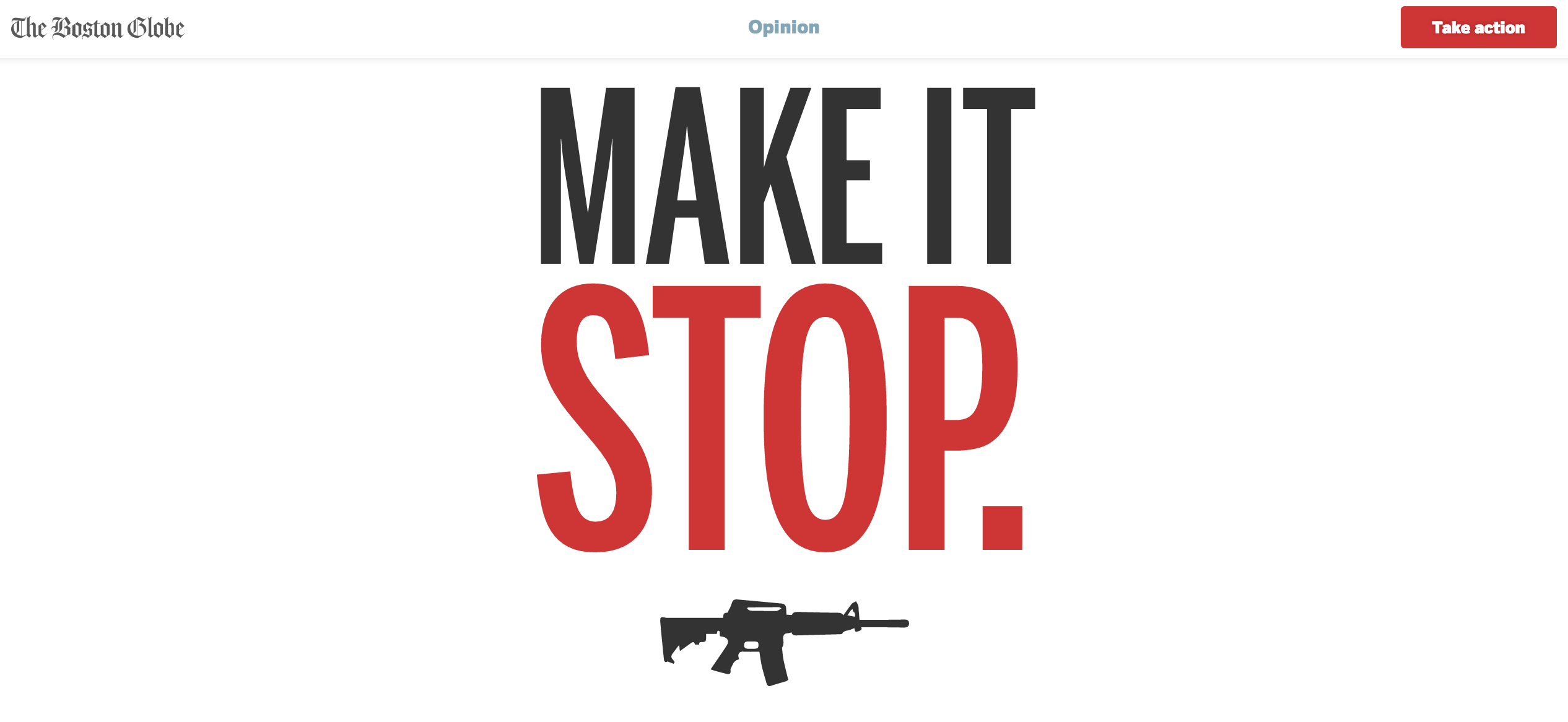
At just after 9 p.m. on Wednesday, June 15, The Boston Globe Opinion team tweeted the front page of the next day’s paper. On it, an AR-15 assault rife, a single bullet hole, and a headline that implored, ‘Make it stop.’ A powerful, and unequivocal call to action in the wake of the deadliest mass shooting in United States history.
As Wednesday night turned to Thursday morning, the project gained virality. It became clear this would be a time where the press and the American people spoke with one voice. (Recent polling suggests 61 percent of the American people support tougher gun laws.) In the wee hours of morning, The Globe’s digital team published a companion that shows, among other things, the number of shots a semi-automatic weapon could fire as you’re reading, and ways to contact the Senators blocking tougher gun legislation.
I asked Dan Zedek, Assistant Managing Editor for Design, and Michael Workman, Digital Design Director to share how the pieces came together.
Running off the presses as we speak, stay tuned. #MakeItStop pic.twitter.com/o8KN8h9Msy
— Boston Globe Opinion (@GlobeOpinion) June 16, 2016
Tell me about the origin story of this project.
Dan Zedek: On Sunday night, editor Brian McGrory sent out an email to a group of us that began “I’d like us to think very hard, very quickly, of how we could wrap, say, Wednesday’s or Thursday’s paper with a strong institutional statement about gun control.” We brainstormed across the newsroom, product, and dev teams on Monday, did some rough prototyping on Tuesday, and scrambled all day Wednesday. The filibuster was a complete coincidence, but we sent a PDF of the front down to Washington while it was in full swing and were pleased to see it held up on the floor of the Senate.
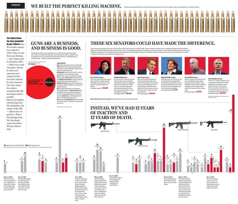
A lot of papers responded to the shooting with front page editorials, but what sets this one apart is timing (after Wednesday’s filibuster), the big visual play, and that it’s a full wrap. What led to the decision to go with visuals and headline only on the cover and infographics on the inside spread?
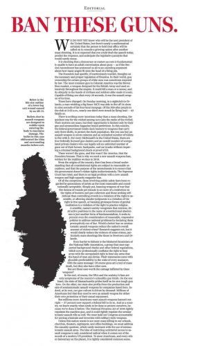
Zedek: We briefly considered having an essay on the front, but the simple power of “Make it stop” as a headline suggested a similarly simple, powerful visual approach for the front. As we were conceptualizing the wrap, we thought a lot about the rhythm for the audience reading it. First, make a bold statement that acknowledges how overwhelmed we all feel, but counters with the imperative that we can make it stop. “Make it stop” has that double meaning. Second, ask and answer the question “how did we get here?” Who profits from gun violence? Who enables it? Who suffers from it? Infographics seemed to be a good way to tell that piece. Finally, a straight opinion piece on how readers can take action.
Who were the designers involved?
Zedek: Myself, Omar Vega, and Heather Hopp-Bruce did the design with infographics by David Butler and Tonia Cowan, but really the whole team contributed their eyes and ideas. (And a few Photoshop silhouettes!)
The stark imagery of a full size rifle with bullet hole and exit wound, and the real-time count of how many shots could’ve been fired in the online presentation are really impactful. Can you share some of the discussion around the art direction?
 Zedek: There’s something about objects seen full size that takes a reader from the abstract to the immediate. We actually were worried that the entrance and exit holes would clutter the design, but our editor Brian McGrory saw it and loved it (we eliminated some other elements instead).
Michael Workman: We spent a lot of time thinking about how we could make the piece feel like something that was native to the internet, as opposed to trying to recreate what was in print. The number of shots in the time you were reading was a great example of making a similar point as the print presentation, which showed all 45 bullets that could be fired in a minute, but in a way that embraced the medium.
Walk us through the design and development process for the digital presentation.
Workman: We had to break the design and development into pieces, but fortunately we already have a custom framework that allows each person to work on one piece and then easily merge the pieces back together when we are ready. We provided general guidelines about color and typography and then just tried to coordinate with each other as much as possible. We have three versatile team members who design and write code — Elaina Natario (who designed and developed the type intro on the piece, as well as many other parts) and Russell Goldenberg and Gabriel Florit (who are responsible for building the great framework we used, as well as individual pieces). I did art direction and just tried to jump in wherever necessary. We also got help from product director Lauren Shea, designer Amanda Erickson and developer Miles Blackwood on the “contact the senators” piece.
As someone put it last night, this was like an 18-hour hackathon. We all sat together and tackled each need as it arose. At first we were worried that we might not get everything done, but fortunately we didn’t have to cut anything for time.
Darrell Abbott, 38 years old. Shot 12/8/2004, Columbus, Ohio. #MakeItStop
— The Boston Globe (@BostonGlobe) June 16, 2016
I’d imagine part of the reason this piece is having the impact that it has — across platforms — is that you really get a sense it was a well-coordinated effort across many departments in the newsroom. Could you talk a little about the collaboration and process leading up to publication?
Zedek: It was a big effort spanning the news, design, product, development, and social teams. I could go on at length, but all brought unique contributions. Katie Kingsbury, the Ideas editor, coordinated it all masterfully with significant input from ME/Digital David Skok.
Workman: As Dan mentioned, we had a great project leader in Katie Kingsbury, who devoted a lot of time to getting this right across mediums, from print to digital to social. But I do think that the level of communication and coordination we have within the design department was enormously important. Dan always had his finger on the pulse across departments, from senior management to editorial/opinion to design and graphics, and he did a great job of sharing that information quickly with everyone. That kind of coordination is a traditional role of the design department, and we have been able to extend it into digital because we communicate and work together so well.
We kept tabs on progress with meetings at least once and usually twice a day. The other helpful part was that since this was such a short, high-intensity project, it was easy to get key players together for a quick ad hoc meeting together whenever we needed one.
Another important milestone is that this is our first big project where just about everyone involved was using Slack. It was a huge help in sharing information between different departments and staying out of confusing email chains.
Ultimately this piece is a call to action, and it seems to be resonating, but I’m curious what the internal reaction has been like.
Zedek: I think there were some initial reservations about wrapping an opinion piece around the A section, but I think we ended up feeling that it was a powerful way to make an important point.
(SND.org editor Courtney Kan contributed to this report.)
- How The Boston Globe used digital tools to call for new gun laws - June 20, 2016


