Exploring the rhythm of Brazilian literature through textual analysis and visualization
Much like Spanish or French, Portuguese is very musical to the ear. Inextricably linked to that melodic feeling is the language’s rhythm. To explore that cadence, visual journalist Rodolfo Almeida and data scientist Daniel Mariani at Nexo, a Brazilian digital news website with an explain-the-news approach, decided to analyze literature written by the Portuguese language’s most well-known authors.
The duo scrutinized works by acclaimed writers such as Paulo Coelho, Clarice Lispector and Machado de Assis – as well as authors mostly known in Brazil like Guimarães Rosa and Raduan Nassar. The resulting piece, which took only three days to produce, enjoyed nearly 2,000 shares on Facebook.
One takeaway from this rapid-fire literary analysis? “Paulo Coelho has a very uniform way of writing,” says Mariani, “while José de Alencar is all over the place.” Storybench spoke with Almeida and Mariani about why they decided to explore literature from a data perspective, how they crafted this story on deadline, and what their approach is to data journalism.

How did you come up with the idea for this piece?
Almeida: For some time I wanted to do something with literature and data. I just had not had a good idea until I saw on Medium an article by Gregory Ciotti, where he writes a series of sentences with exactly five words. Then, he writes the same thing using varying lengths to demonstrate how that brings musicality and rhythm to the text. I thought that was interesting and I wanted to see how that applied to Brazilian literature.
How did the idea evolve from initial concept to final product?
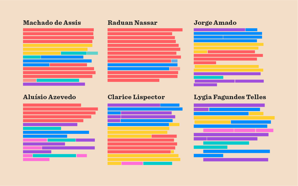
Almeida: Daniel and I took a while thinking about formats and the best way to show that. We decided it was an interesting concept to highlight sentences with color, imitating the [Ciotti] text.
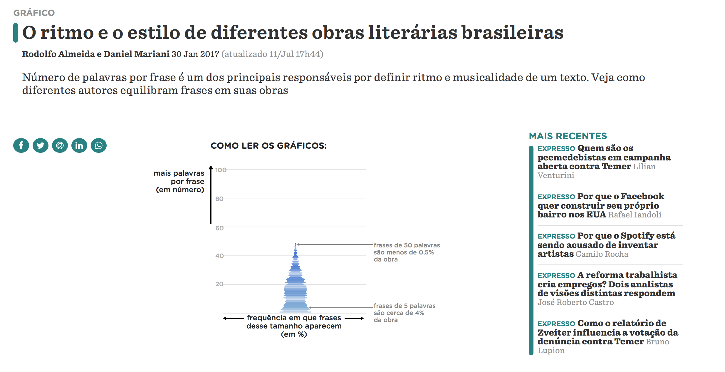
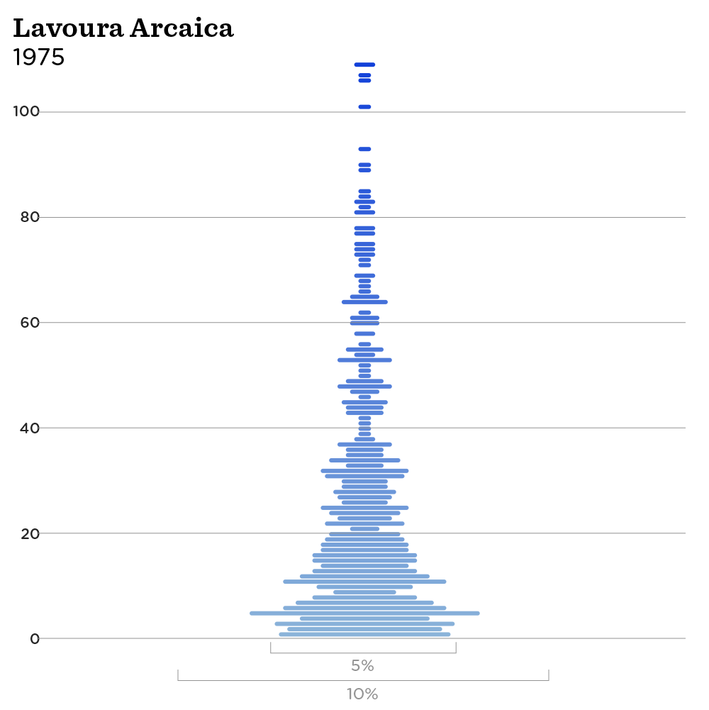
Mariani: From the data side, I used sentence lengths to reveal rhythm. The initial thought was to use the variation between one sentence and the next, but I never really came up with a satisfactory solution. I thought that was an interesting approach, and a natural way to go would be a box plot, but that was a chart that would require above the average understanding of statistical analysis, percentile, outliers — and that just would not work for our readers.
We also tried to use bars to create a heat map effect of the variation in each book, but, since we had so much data, all that was clustered together and you could not effectively notice any variation. So, we came up with a solution that was very similar to a violin plot, where we could show the distribution [of sentence length]. It had a symmetric shape and was pleasing to the eyes, so we adopted it.
Tell me more about these trade-offs between showing one or another aspect of the data.
Almeida: We also had another idea of putting all the authors and books in one single scatter plot, but we also thought it would be very complicated to explain what the axes meant. What that chart wouldn’t show in the GIFs we created is how an author varies between his works. The violin plot GIFs have all the variations but it would not have been that obvious with the scatter plot.
Mariani: It is part of our job as data journalists to weigh that “academic” view of data and the ability to portray a message. In this case, I believe our editors also did a great job in making this as easy as possible for the readers, including having Rodolfo create an explainer on how to read the charts.
What tools did you use for the project?
Mariani: It was mostly done in R. We already had the PDFs of all books and authors from previous work we had done — they had all been downloaded from Google. After converting the PDFs to TXTs with PDFtotext for Ubuntu, I used an R script based on Regex that I wrote to separate and tabulate sentences. After that, I plotted the charts and sent them to Rodolfo for styling.
Almeida: Mainly, all the decisions about how the charts would be visually were done before R, so I just needed to make some minor edits in Illustrator: identifying each book for each author, labeling the axes, and generating the GIFs. After the charts were plotted, we also had to find representative excerpts from the books to use. That, [Almeida and a visual graphics intern] did by reading every work and selecting interesting clips of 120 to 150 words.
Then, I counted on the help of one of our developers to write and tweak the code we generated through ai2html to design the layout of the colored paragraphs. That is when we opted to use different colors, instead of different shades of the same color, which would have made things look too much the same. I also tried to keep the original paragraph format from the original works.

How long this piece take from start to finish?
Mariani: Three days. The thing is the solution came pretty fast and we already had all the PDFs from before.
Almeida: We would love to do some deeper digging and look at this data from different perspectives, but we usually do it this way. We publish what we have and we can go back to it later, digging deeper into one aspect.
How was the readers’ reaction to this piece?
Almeida: It was very good. We are used to publishing several data and visual pieces a week and this was very above average in social sharing and page views.
Mariani: What made me really happy was that scholars, in general, liked the piece. There was one or another critical comment, but they were moderate. I am always wary of how this communities will react to this type of piece. It was a first step for an analysis, and now people can dig deeper into this.
Editor’s note: On Facebook, the story was shared over 1,900 times and over 3,000 reactions. On Twitter, there were over 100 retweets and 270 likes.
What were the most interesting findings in your opinion?
Almeida: For me, the most notable discovery was [the author] Raduan [Nassar]. It was really noteworthy how he has his own personal style of not using periods, but rather semi-colons, which does not determine the end of a sentence. And that really is reflected when reading his work.
Mariani: The first thing I observed after plotting the charts and going through them by author is that I could notice when I changed authors because something changed. We also noticed how Paulo Coelho has a very uniform way of writing in his works while José de Alencar is all over the place.
Almeida: This has nothing to do with the quality of their work, as some people wanted to interpret it. We never had the intention of determining who was the better writer.
Mariani: We are talking essentially about one characteristic trait of the authors’ works: their rhythm.
What tools do you usually use for data and visual projects at Nexo?
Almeida: At the visual graphics department, we use [Adobe] Illustrator a lot. That is were most of our work is done. And ai2html as I already mentioned. We use QGIS for geoprocessing and mapping, and Daniel often helps with R for some geoprocessing as well. We have also used an extension called ScapeToad for mapping. For more advanced stuff and bigger infographics that might need three-dimensional construction, we use Cinema 4D. When we need to code, we use regular text editors like Sublime, for HTML, for example.
We are always looking for tools that will help automate processes because there is always someone out there thinking of how to make things more automatic and easy.
Mariani: Completely agree with that. I mainly use R for data processing and since it is an open-source language, there is a whole community out there developing and creating new tools and packages that I can use.
What is your advice for people interested in creating data-driven and visual journalism?
Mariani: I am a biologist originally, and for that I learned how to code in R. But, at some point, I decided I wanted to work in data journalism because I was really interested in drawing meaning from data. It kind of started as a hobby, downloading data from the web and playing with it at home. I had a blog where I posted some analysis and I also checked the /dataisbeautiful on Reddit, where people post a lot of interesting stuff.
Another thing that really helped me to start was a book from [Edward] Tufte. Today I think he may be a little bit too radical for me, but the idea that data is beautiful because it is simple helped me a lot at the start to fall in love with this.
Almeida: There are a lot of people who are discouraged because they see a lot of complex and colorful graphics and they just do not understand. What I have to say to those people is that the story is in the data, and the format, the styles, serve that. Colors reaffirm the story. People should stay aware and keep and an eye open for those communities where you can start to understand that and form your perception of how different things can be used to tell a story.
- SXSW: ‘Excel is okay’ and other tweet-size insights for data journalists and news nerds - March 17, 2018
- NICAR: Data stories from last year that you could be doing in your newsroom - March 13, 2018
- How to scrape Reddit with Python - March 12, 2018