How we plotted 17,000 data points in 3D to explore police use of force in New Jersey
Last November, I pushed my first commit to Github having no idea what I was in for: creating visualizations with more than 17,000 data points representing police officers who had used force in New Jersey from 2012 through 2016. One month later, we published “Explore 17,354 officers who used force in N.J.,” the first three-dimensional data visualization to run on nj.com.
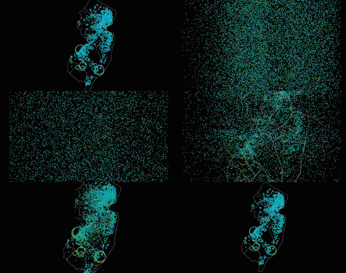
This visualization was part of The Force Project, a 16-month investigation by NJ Advance Media for NJ.com into problem police officers in the state. In this piece, we wanted to show readers that a small proportion of police officers accounted for a large amount of all uses of force and provide a new way for users to explore the dataset.
Just a week before the final project was published, this close-to-finished draft got killed because our editors thought it was not intuitive enough.
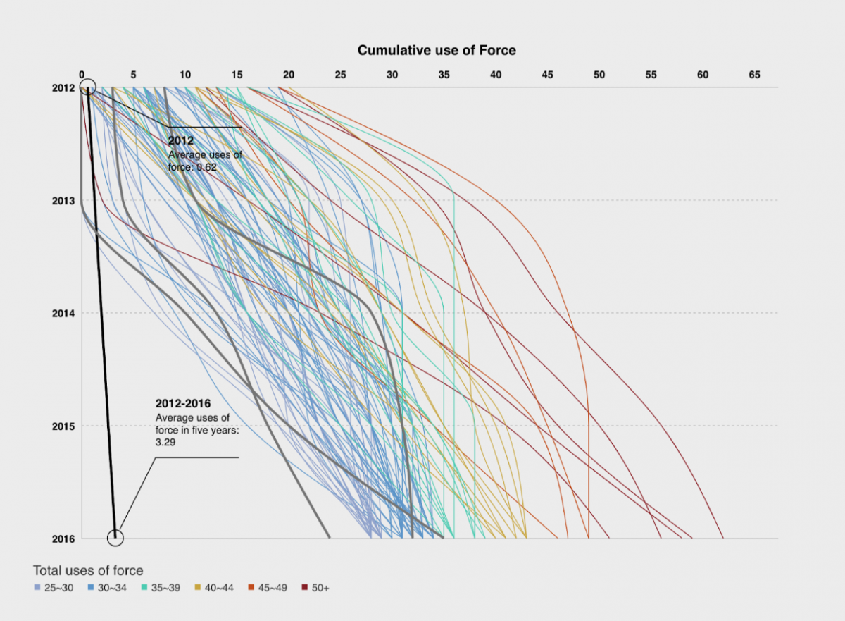
The challenge of visualizing 17,000 nodes
Christopher Baxter, my editor on the data team at NJ Advance Media, offered me a second chance. Baxter described his vision of a universe with each officer as a star and challenged me to create something resembling the Milky Way.
We had quite a few brainstorming sessions and one of our inspirations was The Pudding’s “Unlikely Odds of Making It Big.” Based on some sneaky code inspection, I knew I could simply mimic their functionalities to tell our story of outliers and my editor would be happy. But I wanted something different and refreshing.
I did some experiments and found some things out. First, when I used D3 to create SVG circles some browsers went nuts rendering 3,000+ SVG circles; Second, I used d3.forceSimulation() with canvas, but my experiment showed that it choked the browser; Third, I couldn’t find an innovative way to congregate all the data without harming the galaxy vision of my editor. I was abandoning my D3 comfort zone.
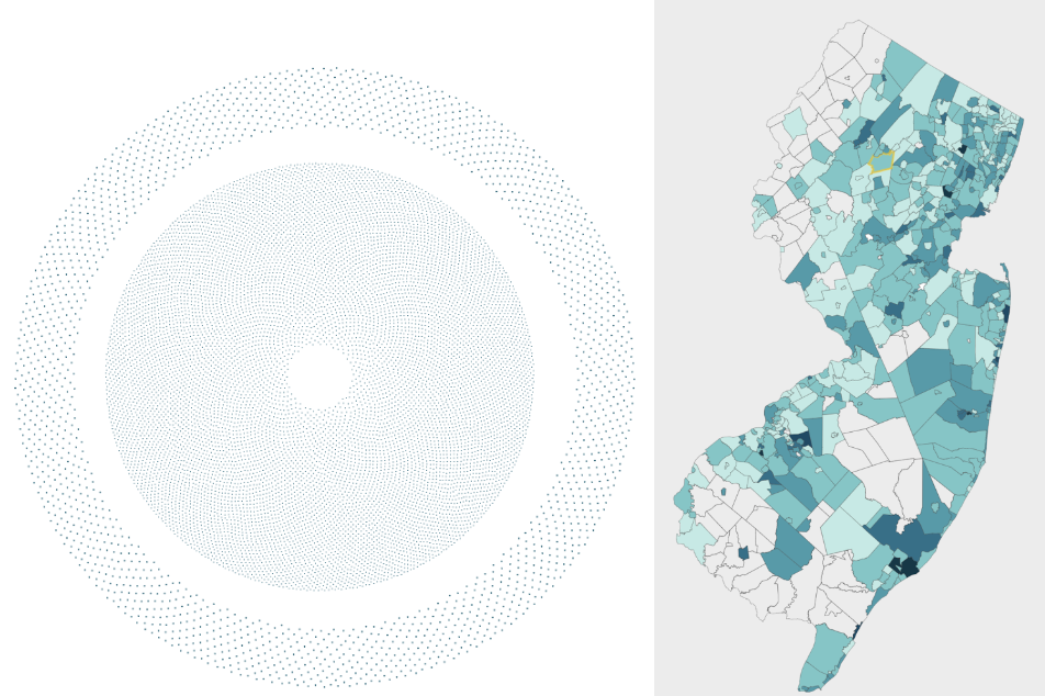
I asked for help at the D3 Slack community and a few gurus advised me to try WebGL, a JavaScript API for rendering interactive 3D and 2D graphics within web browsers. I remember trying to read through the WebGL documentation and feeling very blue.
Soon, I turned to three.js, a framework build on top of WebGL which makes it easier to create 3D graphics in the browser. I had done some experiments with it on a project over the summer, which was long-listed by the Kantar Information is Beautiful Awards. However, I was really worried that I was going to be trapped in a black hole and accomplish nothing due to my painful experience trying to tame it the last time.
Cracking some examples to serve your needs
Luckily, my editor was so generous that he set me no deadline. Besides, three.js provides a few great examples for me to get started.
The overall code is compiled to thousands of lines and it’s not practical to explain them line by line. Besides, I’m still a newbie in programming — my coding practice may irritate someone if I open-sourced my code. But the technique behind the final outcome is just a combination of a few examples based on the understanding of the three.js documentation and Javascript.
Here are the examples inspired me or even became indispensable parts of my project:
- I chose The Pudding’s Starter template as our basic template and added a few NJ.com features.
- Used enter-view.js and stickyfilljs to implement scrollytelling, a technique I learned from a post by The Pudding.
- Created interactive points cloud by learning the example from three.js documentation, which allows users to interact with the data behind every point;
- To animate those points with smooth transitions, I took inspiration from this example;
- Used sprites to create labels and annotation;
- Used tween.js to create camera transition, a technique I figured out by studying an experiment done by The Google Data Arts team. I used it for A Tour Around the Earth and you can find the code here.
From Saturn to bar chart
After I got the some techniques figured out, I need to find the right design for storytelling. The first stage in visualizing 17,000 nodes was to attach data to each node. I created a Saturn-like system. Purple nodes represented the officers that used force less than the average. Others are classified as outliers and are positioned around Saturn’s rings. As you can see, it’s sort of a reversed and ugly version of The Pudding’s “Making It Big” piece.
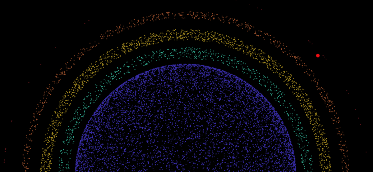
For the second stage, I figured out how to aggregate officers by their overall uses of force on a 3D bar chart and by their department located on a map. After seeing all the options, my editor and I painfully agreed to abandon the original Saturn plan and embrace the 3D bar chart composed of nodes.
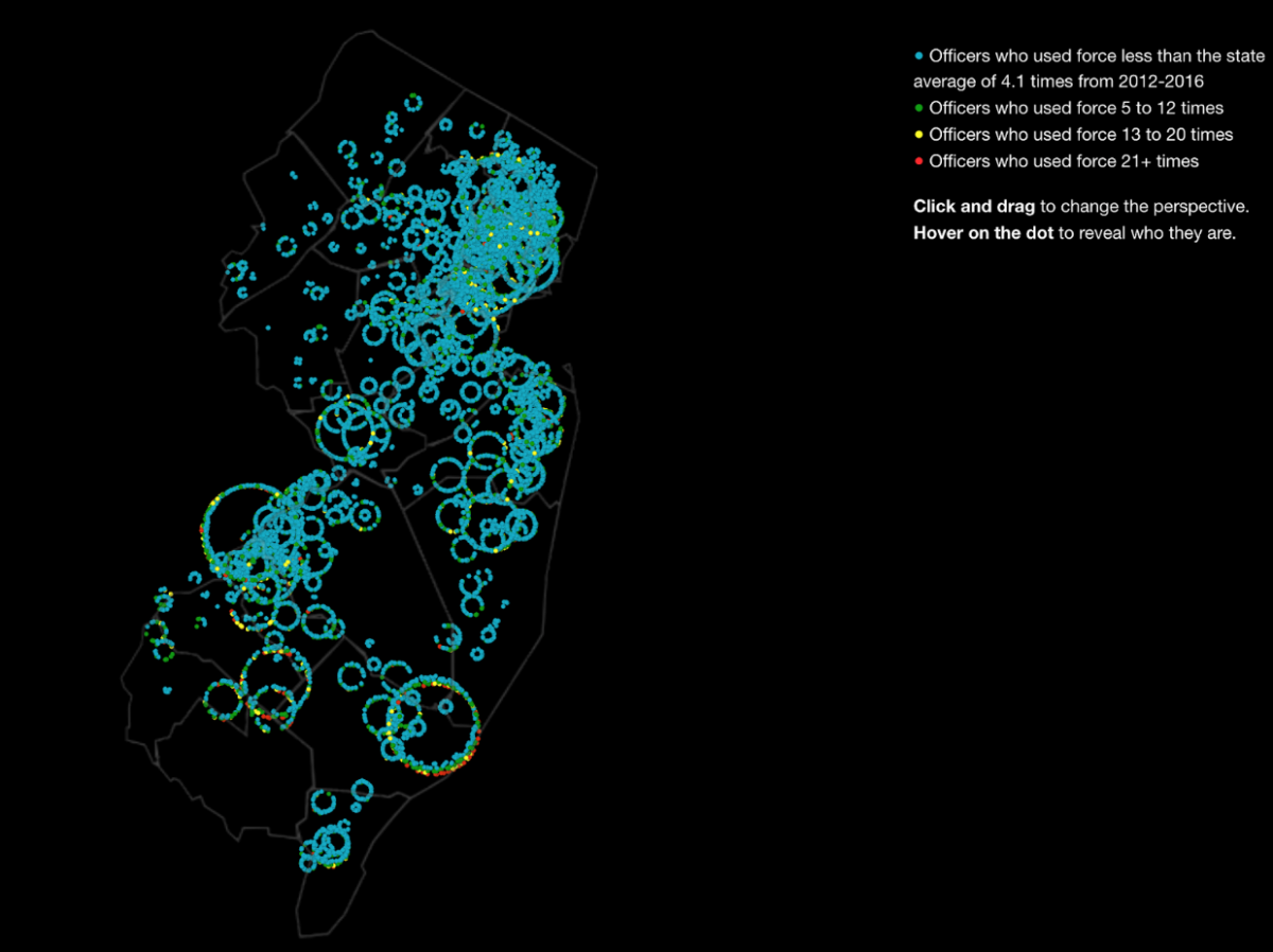
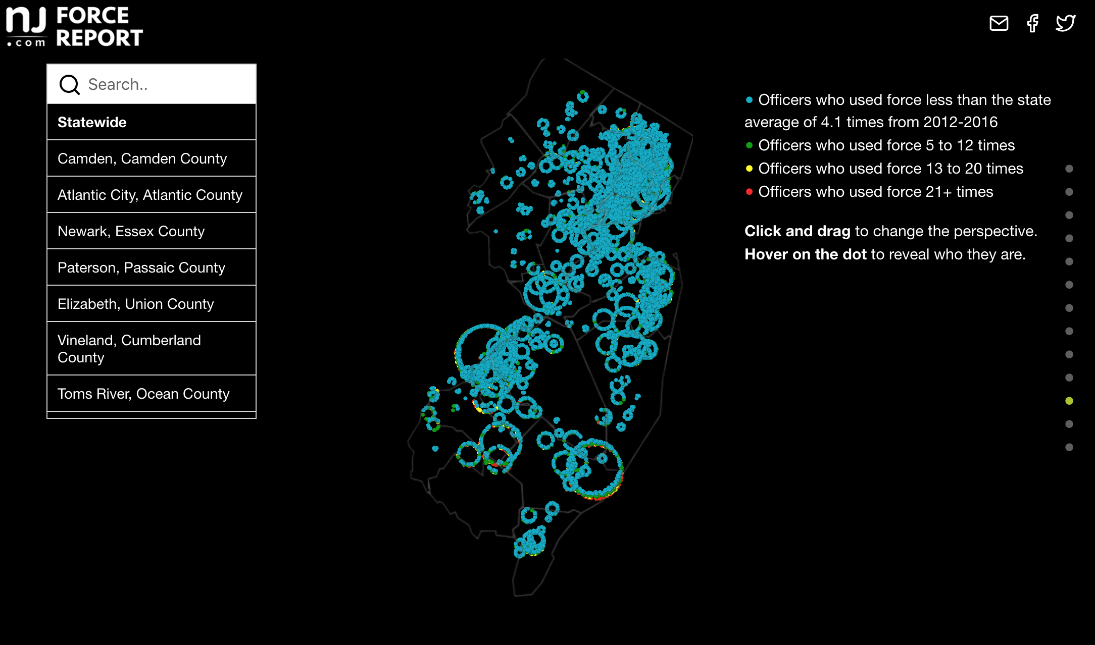
For the third stage, I created a map to give people a general idea of where in New Jersey police officers used force the most and who was using force. We did a few user tests in the newsroom among editors and it became clear that we required a search bar for users to look up police officers by their departments. It took me weeks to figure out how to reposition the dots and retarget the camera depending on the users’ input.
Moments of epiphany
It was painful to calculate the coordinates of each node on the 3D system at first. But it soon became a journey in finding the beauty of mathematics. Just like that, high school math became useful to my life.
There were other moments of epiphany that took me by surprise. For example, the nodes on the screen edges were not hoverable at some point. I thought it would take me weeks to overcome as Google, Stack Overflow and the three.js forum failed to offer me examples and solutions. Then one day I was watching a totally irrelative three.js videos on Youtube and figured I should just try that. It worked like a charm.
During design and development, everyone on my team was constantly giving me feedback and reporting bugs that all helped elevate the story. Without their help, this project wouldn’t have been so slick.
Though this 3D visualization drew a lot of attention, I was initially doubtful about the value of making all officers individually identifiable. For me, using discrete elements to represent individuals makes the graphic more intuitive and provides users the power to interrogate every officer. In this case, I think it is necessary for the public to interrogate these police officers who were given the right to use force on others. In the end, the project allowed us to pinpoint these specific abuses of power.
An introduction to three.js
Interested in getting your feet wet with three.js? Basically, with three.js, you need to create four things:
1. A 3D scene with new THREE.Scene().
2. Add a camera to the scene, which assembles the real world camera with field of view, aspect ratio, etc. As the director of the show, you need to direct the camera to the right spot to allow your audiences to view your scene.
3. A renderer to render the potential animation.
4. Add the object you want to show in the scene.
As THREE.Points(), what I was using for this project, is not the best way to start the journey, you can learn to create a 3D cube here.
If you want to go further, I would follow this tutorial by Engin Arslan on lynda.com. It introduces a few useful tools and concepts for three.js development.
I created a simplified points cloud on Codepen. Basically I used initPoints() function to set the position, size, color and index of each point. This function told all dots to spread in a box randomly and generated its (x, y, z) position, a color, a size, and an index for each of them. Too ugly? Learn about the three.js examples and keep building new functions above it, it can turn out to be stunning.
My biggest takeaway after all this? Learn from what others have built and keep trying. Breakthroughs often arise from failures.


Really enjoyed reading the breakdown. One of your colleagues linked me here from the newjersey subreddit. — Still busting chops as a solo learner in R/ggplot2 so always nice to read the trials and struggle that end up paying off.