Growth as a metaphor: how Kristin Baumann used flowering plants to explain poverty
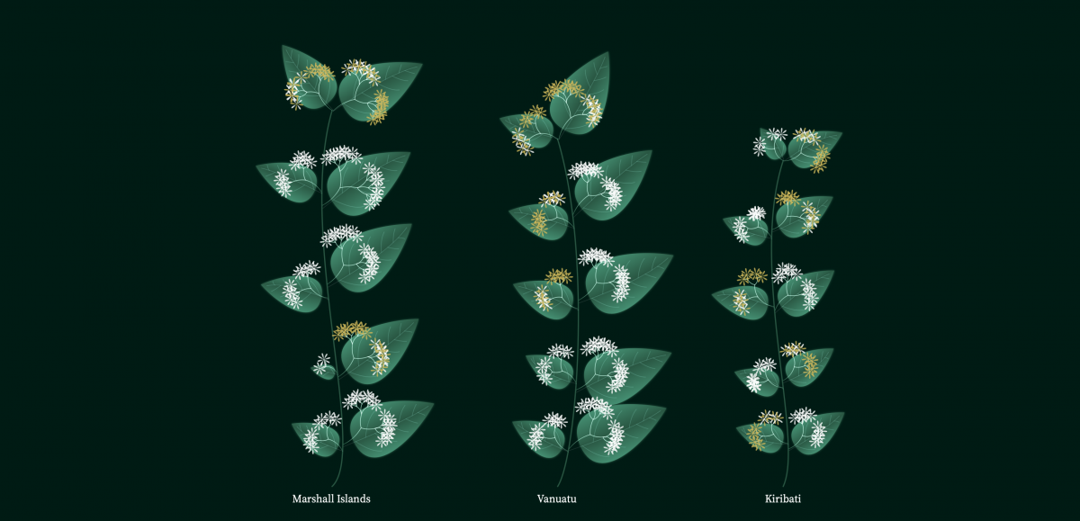
The main topic of the challenge was gender inequality, but then you had to choose another data set for that and I chose poverty. I mostly code interactive data viz because it’s the most fun for me. So, I definitely wanted to do that, and I also wanted to have a natural look and feel. I didn’t want to create a standard bar chart, or a line chart, but something custom, because I find it very fascinating to recreate these natural shapes and forms. And because it’s harder than just putting a line, solid color all the way, it’s hard to mimic, but you also have to try to not get too far down this rabbit hole of being photorealistic. I mapped out the data points in the data set to specific components. I chose a flower for that and tried a custom encoding. And then to make it easily digestible, I also added a legend below so you can actually see what is what.
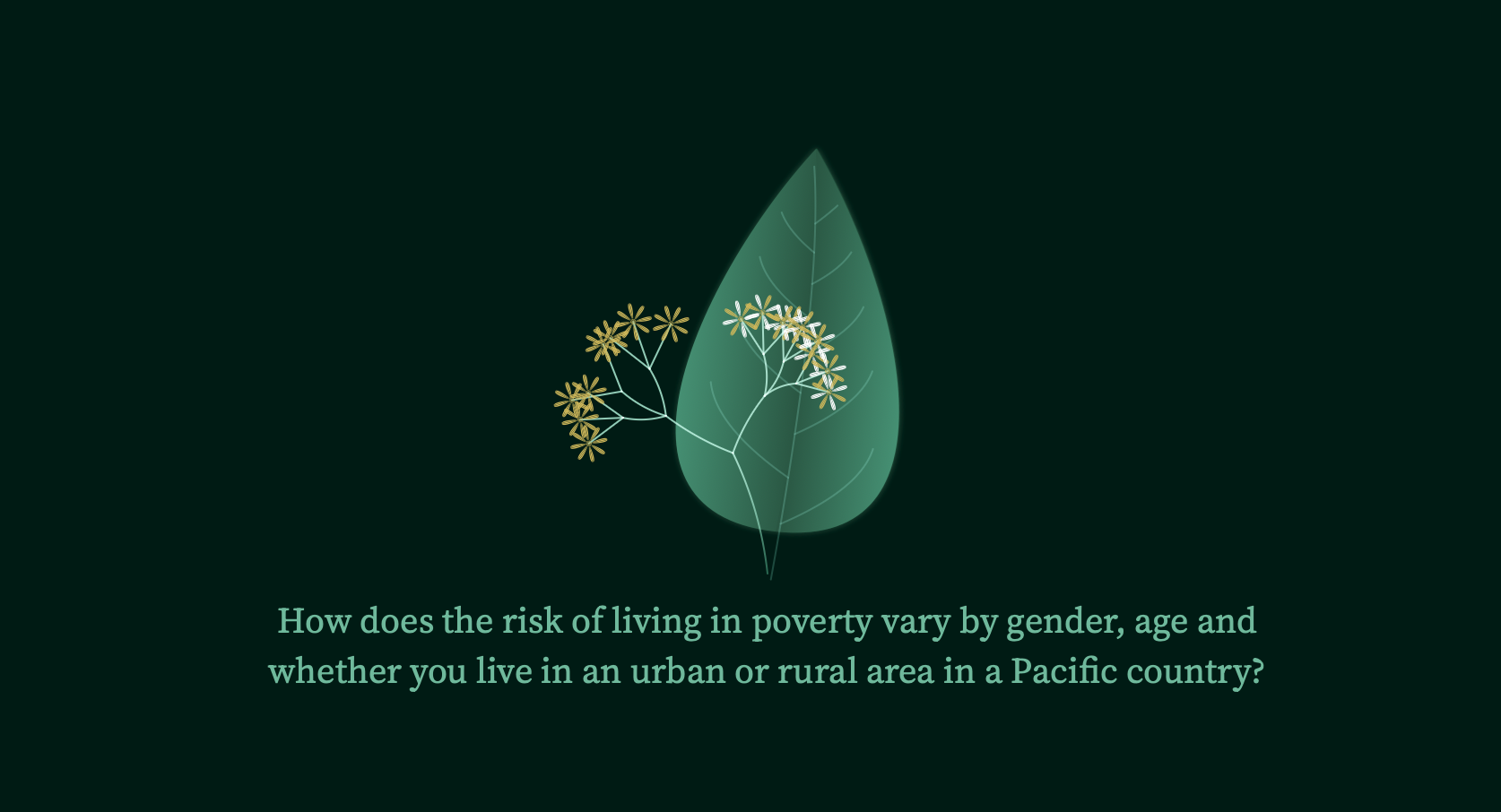
How did you decide on the topic of poverty? How did you come up with the metaphor of the Amborella trichopoda?

What was the design process for this project? For what the leaves and blossoms represent, did you know that from the start or did you test out other configurations?
I drew a lot of sketches on my iPad, and then I came to the analogy of blooming flowers. How do I map poverty? Flowers and poverty, how do they come together? The blooming flower is like the opposite of poverty. I thought, “Okay, I have to have this analogy of when there’s many flowers, it’s blooming, it’s blossoming, there’s enough sun, enough water, room to grow. And when there’s only a few flowers, there’s more poverty.” So I did this inverse correlation of more flowers and less poverty. And so I knew quite early on to incorporate that, and because the main topic was gender inequality, I had to map this to gender inequality. And then I just tried out, like, how can you show urban areas and rural areas? They’re kind of like opposites, so I put them on the opposite side of the stem. It came together quite quickly in the concept, but then making it also in real life with the data was a different thing.
Is there anything you’d change about it or keep in mind for future projects?
I didn’t receive that much feedback from the competition side, just a bit about the storyline. The criteria that they judged the challenge on was design, story and a few more things. It’s similar to why I thought about having these insights before giving it into exploratory mode. And I asked my community, as well, to get feedback on the names of the parts of a flower, because I’m not a native English speaker. And I was like, “what are these pieces called, is the blossom of a flower the whole thing, or just the parts?”
I had quite a long list of what I would have loved to do if there was more time. What I would change, or focus more on is, having it [require less exploration by readers]. Now, when you look into it you can hover and you see something, but what I would like to show is more like getting a guide through a few insights and then having users explore. A custom data viz is always like, what is this? What is the encoding? What does left and right mean? It’s not a natural connection [for readers]. I would incorporate a more explanatory style to see that blooming flowers means less poverty, and explain it step by step, by pointing out insights. And then after, have the user go through it. I had lots of more items on my list for making it more dynamic so that every time you reload the page, it looks a bit different because it’s a bit randomized, and sometimes it moves a bit and stuff. These are like super tiny details, but I would love to have a bit more of that, because in the normal world or the real world, things also move.
Do you see data visualization as a whole taking a step this way in the future? Do you think interactivity is going to become the main way we consume data?
I think there are use cases for both static and interactive dataviz. You really have to see what the data is, and what story it is you want to tell. I can see a bigger need for data viz that is dynamic, not necessarily interactive, but more like a format where things happen one after the other. You introduce the viewer to the elements of your database, and then have the people explore that really want to, because nowadays the attention span is so short, having a super complicated exploratory data viz is a waste of time. It’s not like users see something like this and just think it’s interesting, they have to have a reason to [explore].