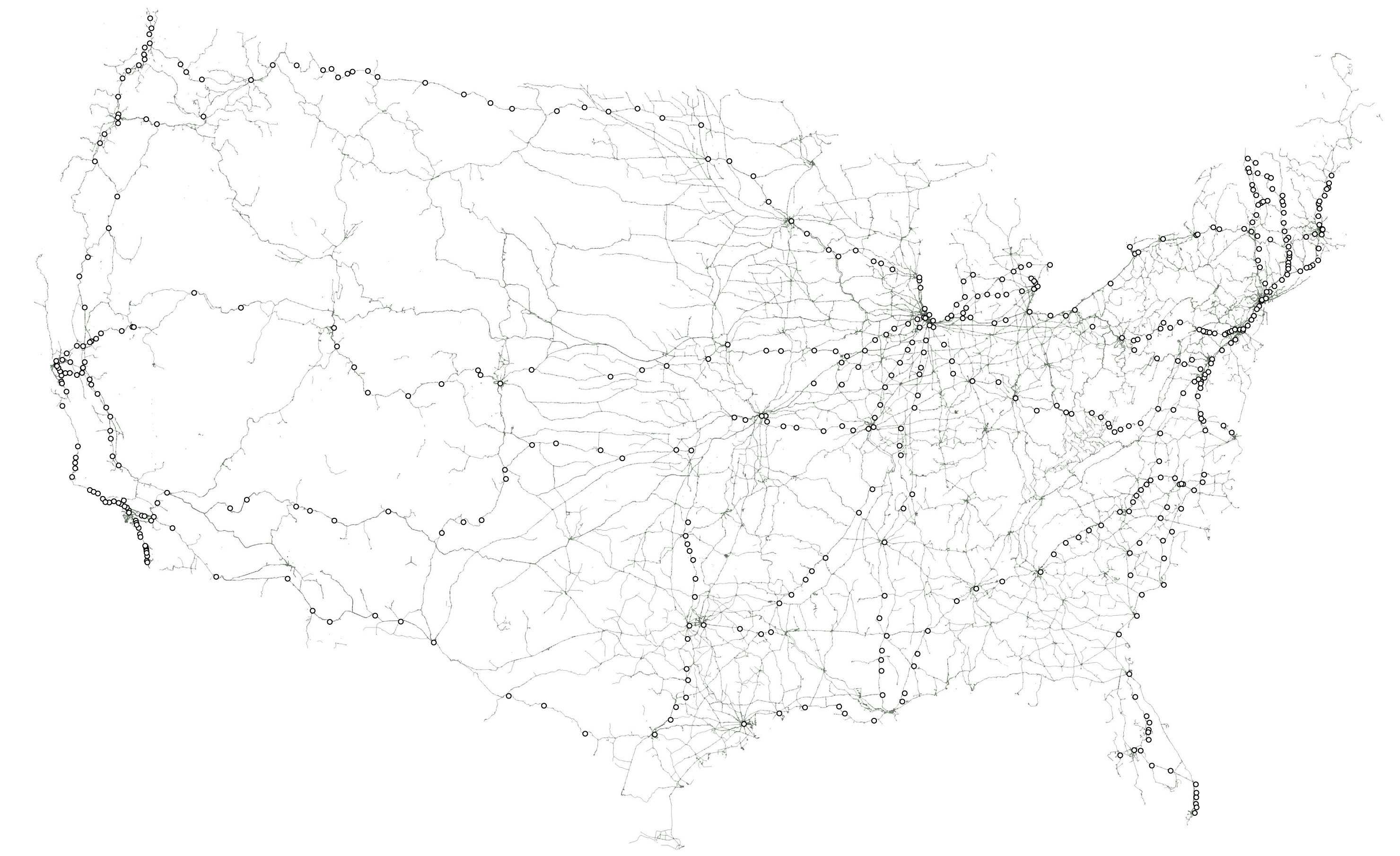
How Tim Meko visualized America’s vast web of pipelines, railroads, electricity and more.
Tim Meko, a graphics reporter with The Washington Post, recently published a series of stunning maps that explore the state of American infrastructure. President-elect Donald J. Trump has vowed to upgrade the system at a cost of more than half a trillion federal dollars. As Meko’s visualizations show, the country is threaded with this vast web of infrastructure, from bridges and energy pipelines to railroads and an electric grid – much if it in dire need of repair.
Storybench spoke with Meko about how he tackled the mapping project and what advice he has for students hoping to produce similar visualizations.
How did you get the idea for this mapping project?
I’ve been an energy geek for years. When I first moved to D.C., I worked for the National Energy Education Development Project, and while there uncovered a vast array of these datasets from the Energy Information Administration. So I knew they were there, and I knew how cool they were.
When talk after the election shifted away from “how did we get here” to “what’s next,” I focused in on Donald Trump’s plan to invest half a trillion dollars into the nation’s infrastructure. That’s a big deal. But how would we show how the scale? I wanted to focus on the vast expanse of infrastructure that connects America and I was hopeful that I could highlight elements that did not closely mirror population.
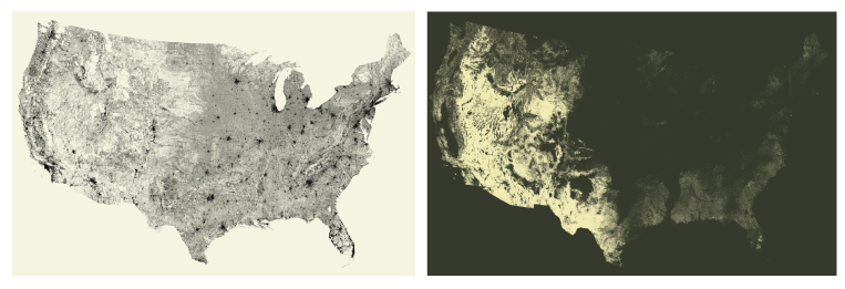
In the end, I settled on six maps: electric grid, railroads, bridges (which closely mirror roads), waterways, airports and pipelines. I was partly inspired by a minimalist map that Seattle-based design firm Fathom created. It shows the U.S., as defined only by its streets. Because of the nature of streets, this map really highlights population clusters, which I wanted to avoid because population maps aren’t very useful. But the concept was one that stuck with me. I’ve also seen this minimalist style associated with mapping trees and vegetation, notably by artist Michael Pecirno.
How was the project pitched to your editors at The Washington Post?
The pitching process was pretty easy. As with all our big graphics, we have a series of ‘open office’ hours with the top graphics editors. First we discuss the pitch, then show a working version, and then a nearly final version. These three rounds of discussion help shape the project from the beginning. The pitch itself was simple. In high school, teachers would use overhead transparencies to project the different systems of the body onto the board. They’d start with the skeletal system, then overlay the circulatory system, then nerves, and so on. That became a nice analogue for the rest of the project— this unseen anatomy of America. Once we nailed down the core idea it was easy to iterate and expand.
Could you walk us through your process for one of these maps, in terms of data sourcing, analysis and visualization?
The data
Some data came from government sources: pipelines information came from the EIA, ports came from the U.S. Army Corps of Engineers and marine traffic came from MarineCadestre.gov. Other layers are commonly available (like major airports, Amtrak stations, and detailed hydrography). These all opened up QGIS — our preferred GIS mapping software — like any other dataset. One dataset that I expected to find via an official source was electrical transmission lines. Years ago, I was able to find a source from the National Renewable Energy Lab with data from FEMA, but that dataset has since been taken down, so I had to keep looking.
For many of the other datasets, we turned to OpenStreetMap. OpenStreetMap’s power comes from it’s user-based tagging system, allowing an infinite number of attrributes to describe each feature. Although OSM data is vast, it is user-generated, so possibilities of holes and incorrect classifications exist. That’s something we kept our eyes on. Regional-scale files are available to download, containing every feature in OSM. These files are huge, and chock-full of data.
We used a command-line tool called OSMFilter to pare down the multi-gigabyte files. For example, the command osmfilter us-south-latest.osm –keep=”bridge=” -o=south-bridge.osm takes the southern region file and creates a new file with only objects tagged “bridge.” I did this for every region. I also used different tag filters to give me airports (–keep=”aeroway=”) and electric transmission lines (–keep=”power=line”). For railroads, I had to double-filter in order to remove abandoned railroads from the dataset: railroads (–keep=”railway=”), and then (–keep=”railway!=abandoned”). These output regional OSM files were then able to be opened inside QGIS like any other shape file.
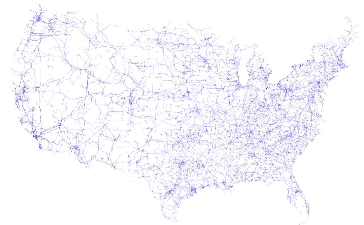
Once I opened the bridges datasets, I knew we were onto something. Yes, this roughly mirrors population clusters — you see that in the cities. But what’s also interesting is that areas with smaller populations, like Iowa and Nebraska, have huge numbers of bridges. What’s also cool is that you can make out roads as well as rivers in this dataset. In the heartland, for example, you can see many of the smaller tributaries of the Mississippi River system.
Flight data came from Flightradar24.com. The team there was gracious enough to send us data for every U.S. flight over the period of a week in early November. We processed this data using a python script, taking CSV files of location data and turning them into paths, which could then be opened by QGIS.
Styling the data
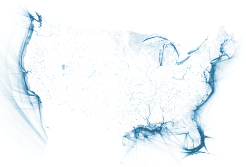
Once the data was imported into QGIS, I reprojected the project into the ‘USA_Contiguous_Albers_Equal_Area_Conic’ projection. I adjusted the style properties for each layer in order to create a simple, clean, grayscale image. Then, I exported as a large JPG. Normally, we would export the data in vector format and style in Adobe Illustrator, but the resulting vector files were hundreds of megabytes — enough that it made working on them prohibatively slow. Instead, we did as much styling in the QGIS editor and then refined using Adobe Photoshop. Below is what my marine vessel traffic layer looked like:
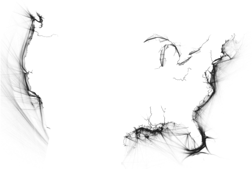
By exporting as grayscale images, we were able to shift the hue and saturation to any color we desired.
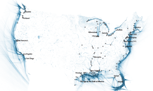
After the images were toned in Photoshop, I imported them into Adobe Illustrator, where I added labels and scaled the project to fit on different screens.
How did you manage to lay these maps out on the page?
We use ai2html for many of our web graphics. For this project, all the visuals (with the exception of the rotating gif at the top) came in through ai2html. Our standard ai2html template contains three art boards: one for desktops (980px wide), one for tablets (600px), and one for mobile devices (280px). Through the magic of ai2html, different art boards are displayed depending on the user’s browser size. For this project, we really wanted to go big. 980px is large, but not when you’re looking at a project on a huge desktop computer. So instead of three art boards, we expanded to five. Our largest is nearly 1500px wide. Below you can see the “my airports” file.
To pull all the text and images together, we use a variant of ArchieML to convert a Google doc to HTML.
From data gathering to digital design, what advice do you have for journalists trying to build similar visualizations?
Be curious. [inlinetweet prefix=”” tweeter=”” suffix=”says @timmeko”]Find a topic that you know a little bit about and teach yourself the rest.[/inlinetweet] Call experts—actually get them on the phone. You’d be amazed at how much more robust your project will become once you talk to somebody who lives, breathes and sleeps in the world that you’re trying to explain.
Don’t be afraid to try something new and take some chances. For example, I had never filtered OpenStreetMap data before, and had I not been able to figure that out, I would have found another way to get that data.
And get feedback. One awesome thing about the Post graphics team is that we all sit together. It’s easy to bounce ideas off each other and come up with “what if” scenarios. Open your mind to these new ideas and explore.
