How the Hindustan Times is introducing Indian readers to interactive stories
Over the last year, a young team of data journalists and coders at the Hindustan Times have been quietly reinventing the way stories are being told at the Indian paper.
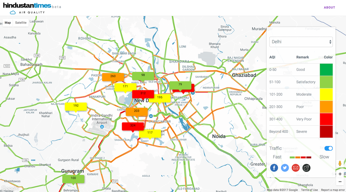
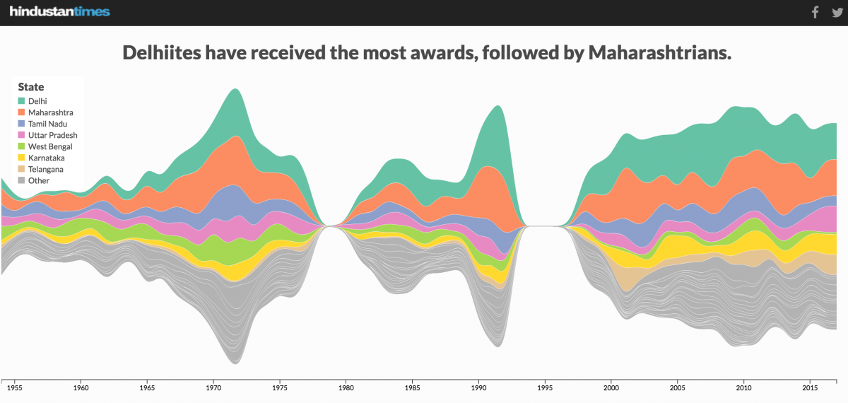
Based in Delhi, the Hindustan Times’s data team includes a tight-knit group of three data journalists and two experienced programmers. Together, they’ve produced outstanding infographics and interactive data visualizations that have pushed the envelope of data journalism in India, publishing stories like an analysis of Prime Minister Narendra Modi’s speech and an interactive tracking levels of air pollution in Indian states. And the team’s been rewarded for their efforts. Last March, they won three awards at the 25th Malofiej International Infographics Awards.
Storybench spoke with Gurman Bhatia and Samarth Bansal, data journalists at HT, to learn more about the data visualizations they’ve produced, the challenges of doing data journalism in India, and their readers’ response to this new form of storytelling.
When did the Hindustan Times data team get started?
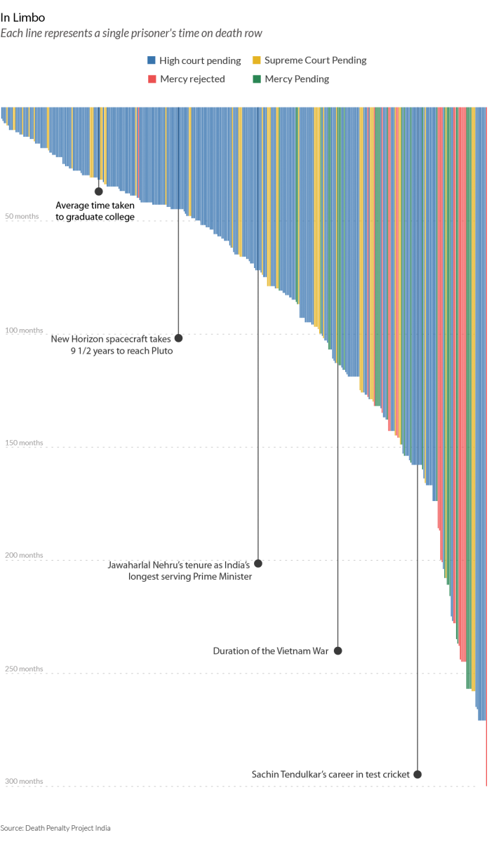
Bhatia: It all started last year. It was the vision and initiative of Nic Dawes, [formerly] chief content officer of the HT, to kind of think of newer ways of storytelling. It started with the air quality map which first kicked off in late 2015. After that, they did the story “At Death’s Door – An investigation into capital punishment in India“ in March 2016. And with a few successes, they thought this was something we should do more.
So, we started doing data interactive process in full swing sometime in January last year. January 2016 was also when Harry Stevens, one of the three data journalists on the team, joined HT and that’s when we started doing things on the web. So, you could say management efforts and some early [project] successes led to the beginning of it.
What are some of the challenges you have encountered being data journalists in India and how do you work around them?
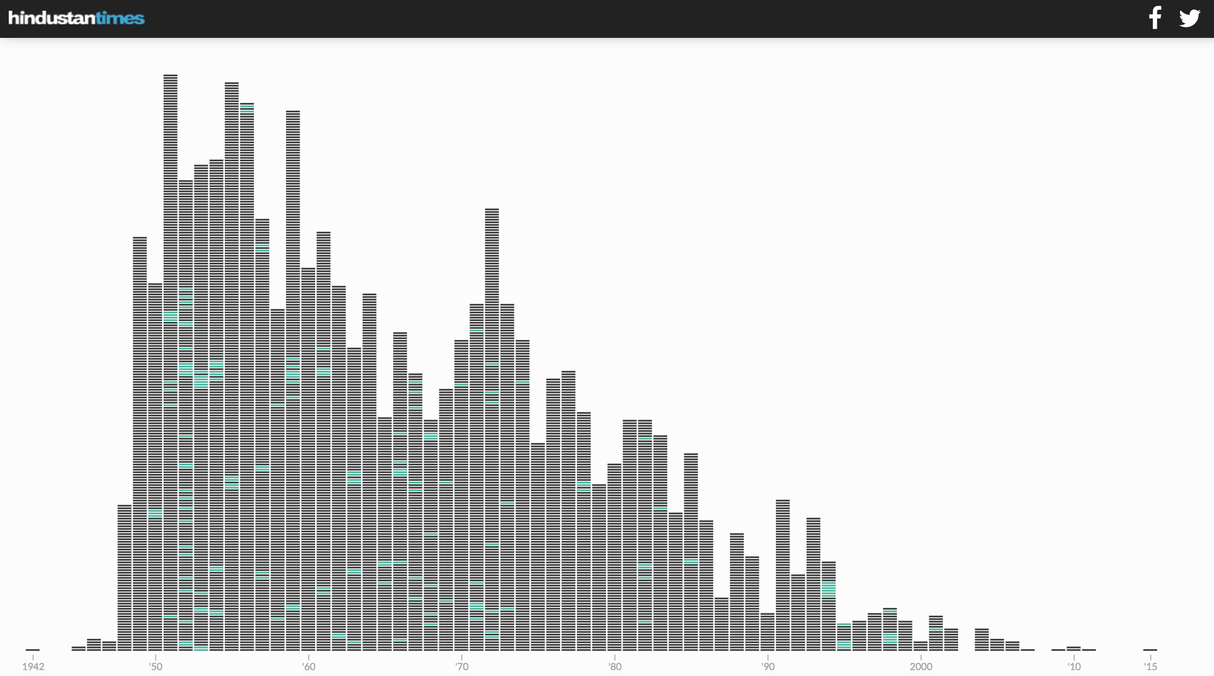
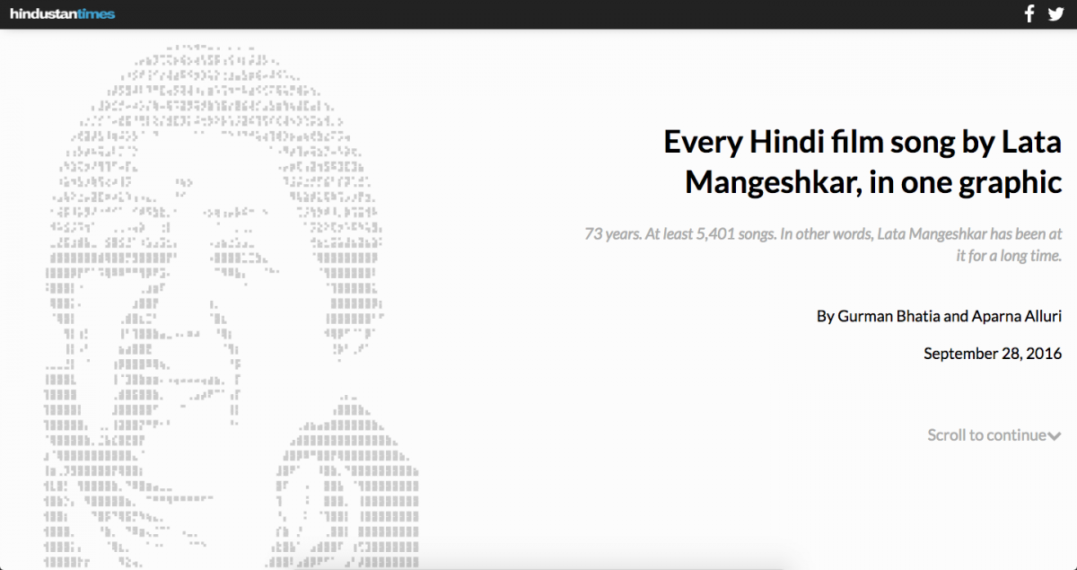
Bhatia: One of the biggest challenges you face is finding reliable data. For example, for the story “Every Hindi film song by Lata Mangeshkar, in one graphic,” there was no cohesive database of Indian music available. Nobody had a database on that subject and finding the data alone took me 14 days. Same goes for the story: “How toxic are your favourite firecrackers?“
Data sources are a big challenge. Even with sources that are readily available, there’s a lot that can be done but is not being done. For example, historical election data in India is good and HT has done some cool stories with it.
Bansal: In general, when it comes to public policy or politics, you will find different data sources tell you a very different story. Therefore, you need to be very careful not just in choosing the data or interpreting it but also in explaining how the data is generated. That is what I find particularly challenging.
Another challenge is data literacy among readers. For instance, there are several charts we kill daily because we create a chart and then realize perhaps our readers won’t understand it. If a story has a bar chart or line chart, many readers intuitively understand it but if you try to do something innovative, the purpose of which is to tell the story but it’s an interactive dataviz or design, you don’t know whether people will understand it. So, whether the data visualizations will convey the story or not is another big challenge.
Bhatia: Also, designing for the phone. That’s another big challenge. There are all these amazing visualizations we can create but don’t because there’s no way that they could work on a phone. That happens all the time.
Designing for phone and loading time – these are a few things that you need to consider. For an Indian audience, it’s extremely important that the data visualization works on a shitty phone with shitty network especially when the bulk of our readers are consuming news on the phone. So, the emphasis is that you design for the phone first. If it works on the phone, it’ll work on the desktop.
Data visualizations can help explain data-heavy, complex stories but they often get too complicated for readers. What have you found to be the best practices for avoiding such difficulties?
Bhatia: We try to do more scrollers than steppers. We try to not hide information behind tooltips. We try to do more annotation. As Amanda Cox said, “Annotation is the most important layer in your data visualization.” For instance, if you look at Harry’s data visualizations, he believes in exploratory data visualizations so the audience should be able to play with it. I, on the other hand, don’t use tool tips at all. I feel tooltips don’t work for the audiences so why should I bother making one [at all]?
Essentially, what all of us try to do is not hide information behind tooltips. We try to walk the reader through the story and then give them a chance to explore it.
What has been the response of readers in India to the data stories HT has published? Can you give us a sense of your analytics or web traffic for the data stories?
Bhatia: Low page views, high engagement time. That’s been the general trend that we’ve observed.
We have noticed that our stories have a higher engagement time than the regular HT stories but at the same time, we have also seen that our stories don’t get a lot of people in the first place. So maybe what’s happening is that a very niche audience is coming to our stories and maybe that niche audience does get the stories we produce.
However, we have had a few successes. For example, Harry did a story around demonetization that did well, our election dashboard did well, a Usain Bolt piece did really very well. So we have had successes but these are few and far between. Most of the time we’re struggling to get an audience. Maybe that’s because most of our audience is above 40. And maybe it’s not typically a tech-savvy audience. Basically, if my mother understands what an interactive story is trying to communicate, I feel I’ve done a good job.
Could you tell us what prompted you to become data journalists? Your team has quite a range of experience, some of it in U.S. newsrooms, no?
Bhatia: I happened to have studied journalism twice. My undergraduate degree is also in journalism and I had computer science until [high school] but never touched it after that. So, when I went to Columbia Journalism School, there were one or two classes on Javascript, R, and other programming languages. It was while learning at Columbia that I realized that these things that I hadn’t touched for years and used to be good at – I still have an interest in them. And not a lot of my classmates have an interest in it, so I realized that I’d stand out if I combined these two. And that was it.
Bansal: I come from a science and engineering background. I learned programming from the first year at college. While in college, I worked at a start-up, used to write software and I was also a blogger. But it was not until my final year that I kick-started my journalism effort and that’s when I developed an interest in writing and telling stories. I did an internship at The Hindu. It was a two-month internship and that’s where I got my first real-life journalism experience. I thought my skills could add value to the stories that The Hindu was doing and then I decided to take it ahead.
Bhatia: Of the three data journalists on the team, Harry Stevens has been associated with the HT data team the longest. He’s worked at a couple of local newspapers in the U.S. including the Salt Lake Tribune. He got a degree from Columbia in May 2014 and then he moved to India, joined HT and has been associated with it since. He also got first exposure to data journalism at Columbia Journalism School and then he interned at The New York World, which used to be a fellowship at Columbia where he did investigative data reporting around New York [politics], mainly campaign finance, and then he came here.
So, we three have pretty much the same skillsets.
- The New York Times’ Graham Roberts on why augmented reality is suited for hard news - July 26, 2018
- How one Pennsylvania station hopes to reinvent local TV news by embedding reporters in communities - June 6, 2018
- How the Hindustan Times is introducing Indian readers to interactive stories - June 9, 2017
