How Marco Hernandez visualized humanity’s plastic waste problem — and changed the way we think about pollution
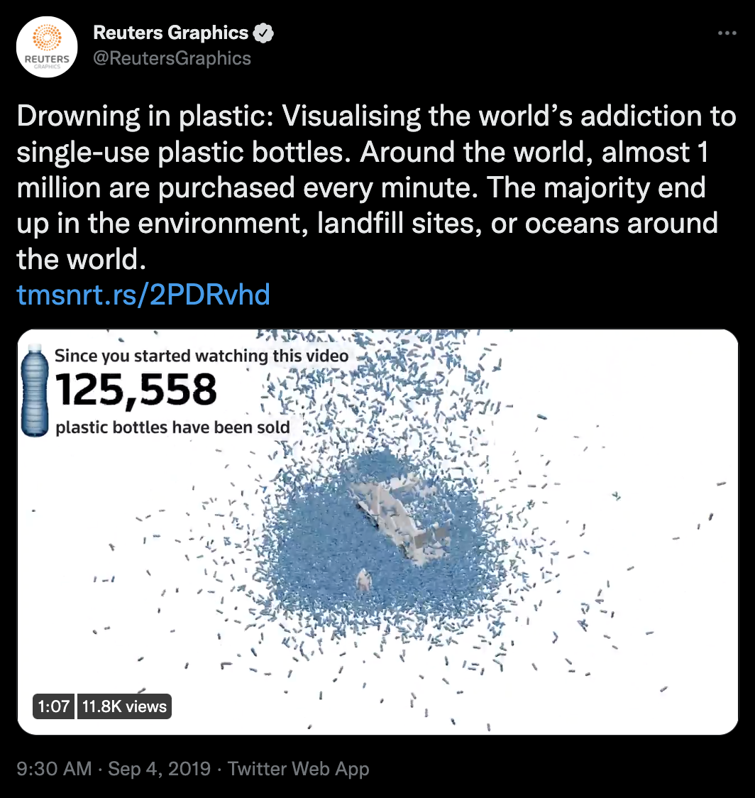
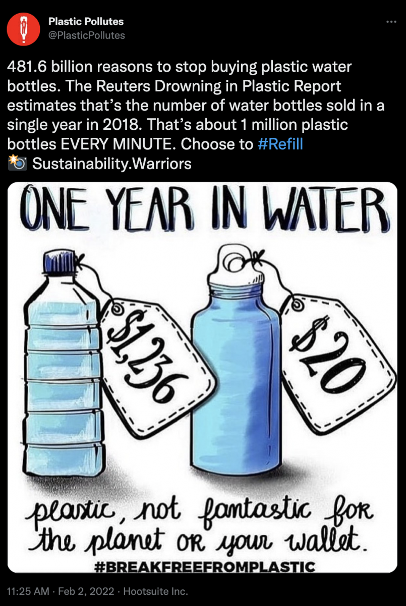
Around the world, the human race manufactures and sells nearly 1 million plastic bottles every minute. That means each year, we produce over 480 billion bottles – many of which aren’t properly discarded. This rapid pace of plastic production – coupled with deficiencies in the recycling process – continues to pose a significant threat to the health and safety of thousands of endangered species and ecosystems.
It’s one thing to hear or read about these numbers. But are words alone enough to grasp the gravity of the issue? Wrapping your head around such staggering figures is a difficult task, and it’s exactly the challenge that Reuters contributors Marco Hernandez and Simon Scarr decided to take on when they created Drowning in Plastic, an influential example of interactive graphics made several years ago that has spurred further media innovation.
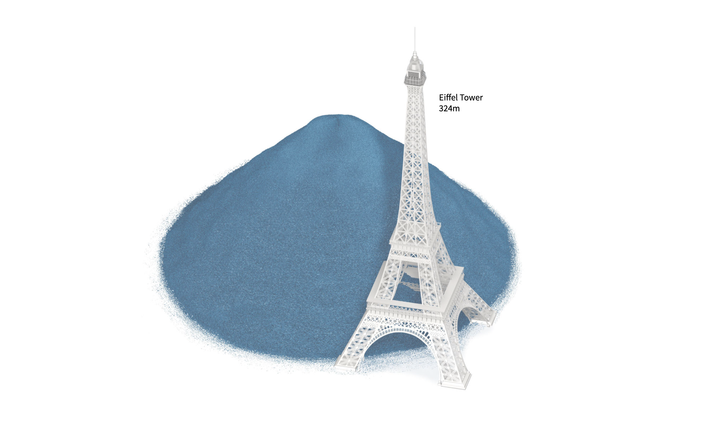
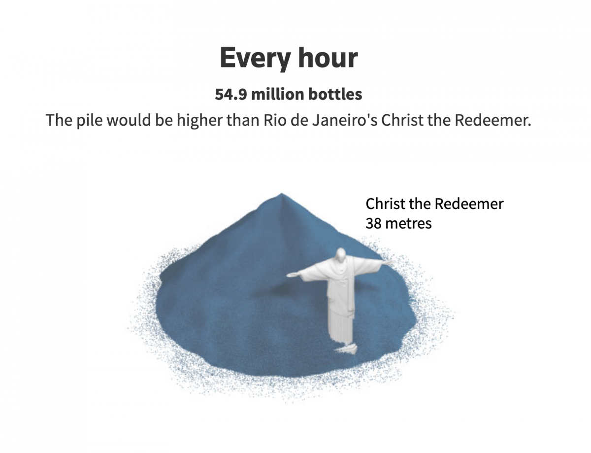
The project viscerally renders the planet’s plastic waste problem through a mix of data visualization, 3D modeling, and procedural animation. Hernandez and Scarr created various illustrations which use famous landmarks and monuments as a reference point for the reader to conceptualize the sheer scale and speed of the plastic waste we produce over time.
Upon publication, the article elicited ample discussion amongst readers, news outlets, and environmental groups across social media platforms. The article also garnered numerous awards and recognition for its innovative approach to digital storytelling, from prominent organizations such as The Sigma Awards and Information is Beautiful.
Storybench spoke with Marco Hernandez to reflect back on that important project and discuss how he tackled this project’s data visualization and imagery, as well as the impact of multimedia storytelling on both the public and the news industry at large.
This interview has been edited for length and clarity.
What drew you to information design and data visualization?
I wandered around for awhile and found design as something I could pursue and develop. But somehow the editorial world also pulled me a little bit. And I found myself working with journalists when I was in college starting in the early years.
My work was split in half. Half of me was about design and arts. The other half was looking for communication or analysis — something. Graphics became the place I was looking for without even knowing it. I was working for a small company doing magazines and websites. Suddenly, I got a job offer in a newspaper in Costa Rica, which is the biggest newspaper over there. And they were looking for someone to join the graphics team. That was when I learned about infographics as something I can integrate into stories – using design, but also communication and data.
So, all that came together in the perfect way I was hoping to find someday. Then I got different offers here and there – I spent a few years in Asia, Hong Kong, and Singapore with The South China Morning Post and Reuters. And more recently, I moved back to America working for The New York Times, now with the graphics team.
“You can use something from the design world to make stories more accessible; to make it easy to digest and to expand the bounds of words.”
When you talk about having all these different elements of storytelling you enjoy combining, it feels like this project is one where you were really able to execute that. Can you tell me more about the inspiration behind this project?
We were looking to engage the readers – to understand a big number. Maybe it’s powerful enough to have a headline saying one million plastic bottles. But of course, it’s not the same. You can take the reader and explain or give context to how many of these there are – how big this number really is. It’s more than just a bunch of zeroes.
You can use something from the design world to make stories more accessible; to make it easy to digest and to expand the bounds of words.
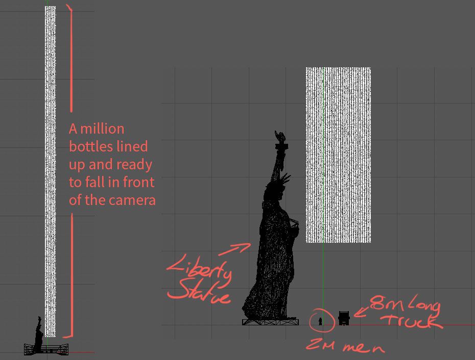
I did a lot of testing around this – the final piece that’s online now is not like any of the first drafts that I did. Because we have seen things visualizing big numbers before, but not something that takes you right into the beginning of the project. You start looking up from above and a rain of bottles falls on you. It gives the scale of how many there are. It gives you an idea of how much it is – is this happening in real-time? Because that’s something important as well. It wasn’t just to visualize a pile of things there, but also to give you a sense of the speed of how much we produce this waste.
Speaking of the procedural animation you just mentioned, what was it like creating it — and what was the decision process behind pushing it to the top as the cover page for this story?
This was a project I did with my editor. We wanted to do something not just administrative – not just a concept.
I was working in an office in Hong Kong. I got a bottle from the vending machine in the same office. I started to take measurements and take some pictures for reference, then modeled one bottle, and started to make simulations in Cinema4D to see how good the rendering process would run on my laptop.
I remember the first day I tried, I left the computer working all night, and I came in the next day and it had died because I forgot to plug the computer into the source power. So, I wasted one day of testing just because I forgot the cable! It was a tough process because it was so many bottles that we needed to visualize that there wasn’t enough power for my laptop to process all the data. It was a matter of placing cameras to get the direction of the animation as we figured it out in our heads.
We started just making doubles on a whiteboard, thinking, how can we tell the people? How can we show people the speed of this and the amount at the same time, but also get the attention and the feeling of this production of waste? In a single frame, can we just drop them on a website that is raining all the time? Or do we need to make one first screen and leave you there for awhile to pile up all these bottles? All these decisions were just on whiteboards.
Then we moved to the simulation software to get the dynamics of it – how this thing will behave, how they fall, and how we want to pile them up. I ran tons and tons of versions of this single animation at the top. There were, I don’t know, 20 or 30 versions of this just to get the right one.
And then I thought about: now you’ve introduced this story with something that you think will catch the attention of the rhythm. How do you want to proceed from there? How do you develop the story? And that’s all the smaller pieces. Because there were statistics, it was a little bit easier. I think the nightmare there was just the first one at the top.
How did you find a way to strike the right balance between having more realistic renderings that allow the viewer to identify what each object is, but also incorporating degrees of simplicity for illustration’s sake? What was your process for finding the right aesthetic approach for this project?
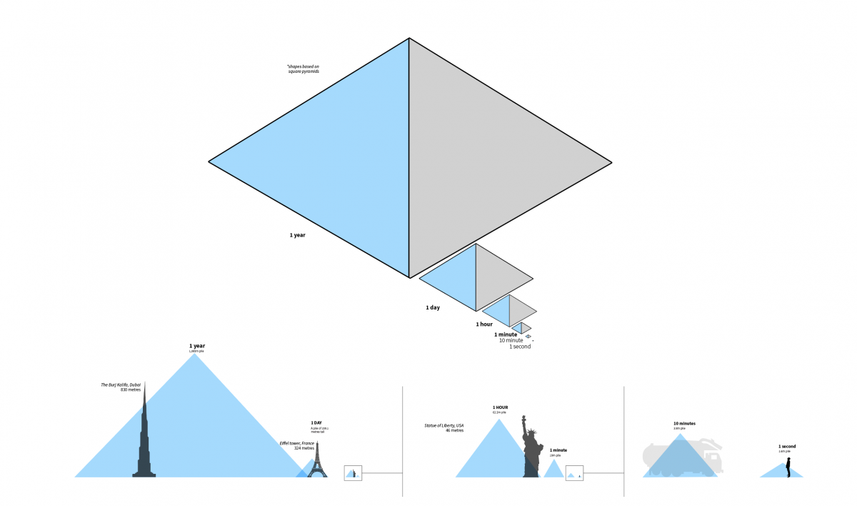
To me, the main thing across the story was the material – just plastic. That’s why the bottles are blue and everything else is neutral green. Once you see the first bottle falling down, you get the first frame. You understand everything blue from there on will be plastic always. And it’s scaled up progressively to see the real dimension of the problem.
It isn’t a crazy amount of bottles produced every minute or every hour. But the amount of plastic that we have produced overall is massive – beyond the imagination of anyone.
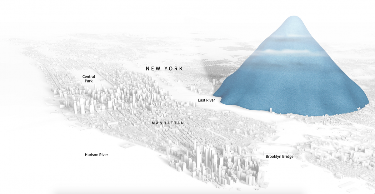
We want to keep the attention of the reader – just progressively giving the sense of scale. I think the idea of using landmarks was pretty much the same concept as the top – something that you’re familiar with but also can fit the volume of all this waste.
I tried a lot of different landmarks, but it’s tricky because you need to get something that’s well-known around the world. The audience isn’t just us, or just Latin America, or just Asia. Some landmarks are more well-known than others, but that’s the idea – everyone can identify at least one or two if not all of them.
But familiarity was very important because that was the main point of not just using the headline of one million and that’s it. We need something familiar – especially if you’ve been in the same place of these big statues or structures before – so you get the sense of the craziness of the scale of this thing.

You mentioned earlier that you used Cinema4D to create these visuals. Were there any other programs or digital tools involved?
It was mostly done in Cinema 4D. The animation also involved a little bit of After Effects.
We did a few different versions of this. There were some different crops for social media; just adapting the same content with the counter and all this stuff into Cinema 4D.
And for the aesthetics, I also used Illustrator. It’s an easy tool to get the graphics done – just make basic renders from Cinema 4D and then place them in Illustrator and the output for the HTML page is quite simple.
So, it’s not a big deal. No fancy scripts at all – just plain HTML. We were more focused on the development of the story than fireworks or anything like that.
What were you hoping readers would take away from this story, and what was it like seeing the response from readers, news outlets, and environmental groups that picked up on it?
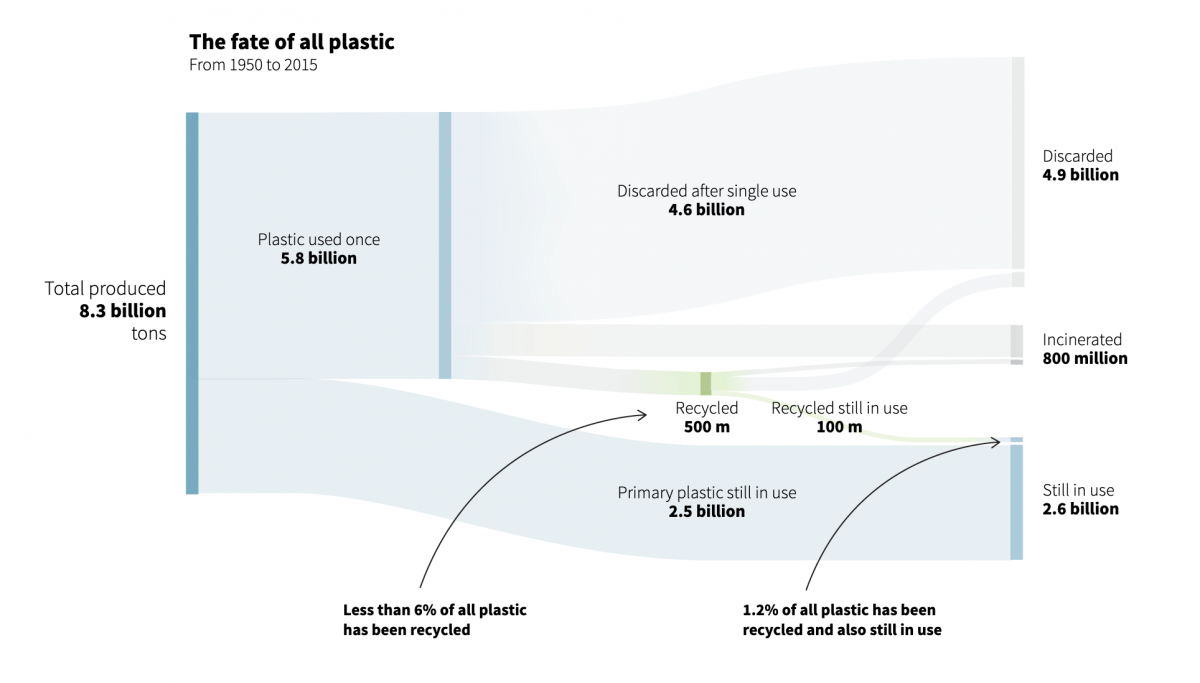
From a personal view, the most shocking part wasn’t the piles or the amount of plastic. We can see it on the streets. We can see it in the always full bins. It was more about this little Sankey chart and how much of this is put back into recycling. The amount of plastic that gets recycled or is designated to be recycled – some of that also gets wasted as well. Even the things you put in recycling don’t always go through the process.
We actually also worked on another project just to see microplastics and all this waste that goes somehow and why they’re not recycled. That also was a kind of branch from this story. So it gave us more ideas for the future.
It was nice to see the response of people checking by the numbers, but also the sense of scale – the many, many organizations and people picking up the story and sharing it on social media. Greenpeace also made a tweet about it. So, it feels really good to do contributions like this.
Somehow all these things are known by us, but sometimes you just decide to ignore them because they’re hiding in a warehouse somewhere or maybe in another country. But once you get a sensation of how big this problem is and how badly we’re managing it, you get a nice sense of retribution that you’re making some kind of collaboration for people to understand it’s important to find alternatives.
So all of that – it was really good. And to see the response of the people – many people sharing, many people asking how we did it. Actually, later I saw a few similar projects popping up. I like to think that maybe it was some kind of inspiration for someone else to do it better. Even government agencies were doing their own versions! I remember once in the UK – I don’t know who did it – but it was in the street and they started raining bottles until everything was full at the end.
I like to think that my work and all my teammates can make a difference or even just spark an idea.
Is it common that people working in the journalism or design industries are continuously inspired by each other as new projects come out?
I’d like to think that way, but I don’t think that’s usual.
I’ve been doing a lot of these stories. Sometimes you feel like this is really important; this has some impact. And it just gets blurred into the world, into the news days. It depends on how busy the day is for news or even the people outside — if you do this on Christmas or New Year’s probably no one will see it. So it’s about timing and many, many things that come together to make a story.
I like to think that my work and all my teammates can make a difference or even just spark an idea. It doesn’t really matter if we’re changing the course of something – maybe not the final, final intention of it – but sparking one idea. And one idea could be, do we need to do something? Or maybe someone else in another news organization saw this and they say, “Oh, they did this. I’m gonna do it better.” It would be great to someday realize that I helped someone in that way, even just with inspiration.
Someone needs to tell the story. And once you tell the story, it will help someone. It will help make a change.
Do you have any advice for people that are interested in data visualization or just visual storytelling in general?
Curiosity. We know there’s data everywhere, but it doesn’t have to be complex and hiding or secret or difficult to access. Sometimes daily things that are easy to find or see are important as well. Realizing an issue is hiding in plain sight is not hiding in a way. You know what’s happening, but maybe someone needs to tell the story. And once you tell the story, it will help someone. It will help make a change. It will help someone else make something even better.
So sharing, keeping curiosity around, finding things in publishing no matter how simple they are – I think that helps. And don’t be afraid. I mean, sometimes we just need to embrace the failure and say next time, maybe we’ll be better.
Sometimes we need to accidentally leave computers on overnight as we try to get them to render, but that’s all part of the process, right?
Yeah, it is!