How a design agency is teaming up with an Italian newspaper to visualize journalism
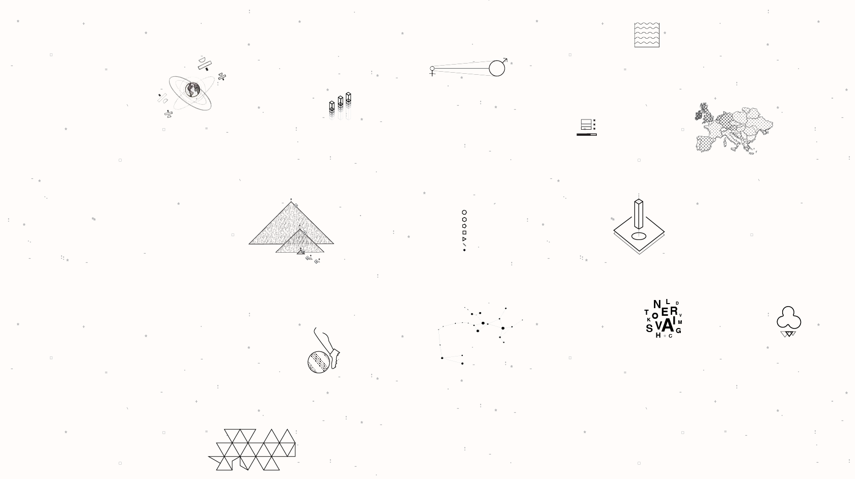
Tommi’s design portfolio is a constellation of unique, eye-catching visualizations. Each project is a one-week deep dive into an intricate, data-driven story told visually. Tommi, a Milan-based visual design agency founded in 2014 by Italian information designer Tommaso Guadagni, has tackled subjects as diverse as space debris that surrounds Earth, the mountains of ice cream we consume, and the speaking fees charged by Hillary and Bill Clinton over the years.
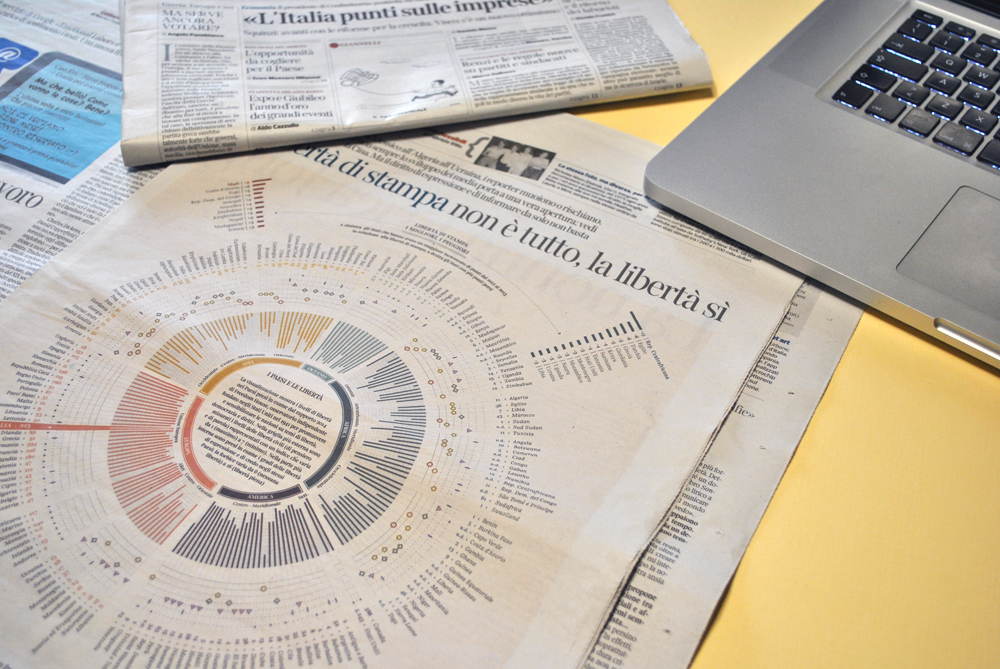
Tommi is made up of a team of five information designers and two data journalists. Their intricate, eye-catching data visualizations have appeared in both the online and print versions of La Lettura, a magazine of the Italian newspaper Corriere della Serra.
Guadagni spoke with Storybench about the importance of data journalism, the design process his team uses, and what it means for storytellers to think visually.
How did you start working with newspapers like Corriere della Sera? How does the pitch, design and publication process work with them?
I started my collaboration with Corriere della Sera in 2013 first with The Visual Agency and later with Tommi. Our work with data visualization normally goes like this: initially data journalists find a topic and the corresponding data set, I share these ideas with the designers who will be responsible for the visualization, and then we present the idea to the editor of Corriere della Sera. The publication date is then decided, and normally we have a week to work on the visualization.
What was the first project Tommi worked on?
The editorial team of La Lettura asked us to design a single page with a visualization. In the big discourse of sustainability and green politics, the case of urban waste disposal in Italy seemed like an interesting issue to zoom in on. The aim was to give the reader a consistent point of view about this issue, and since we had a lot of scattered data about very different subtopics, we decided to build the narrative around the geographic scale.
The final visualization is a general overview of the urban waste issue starting with European nations, then focusing on Italian regions, with a final focus on Italian main cities.
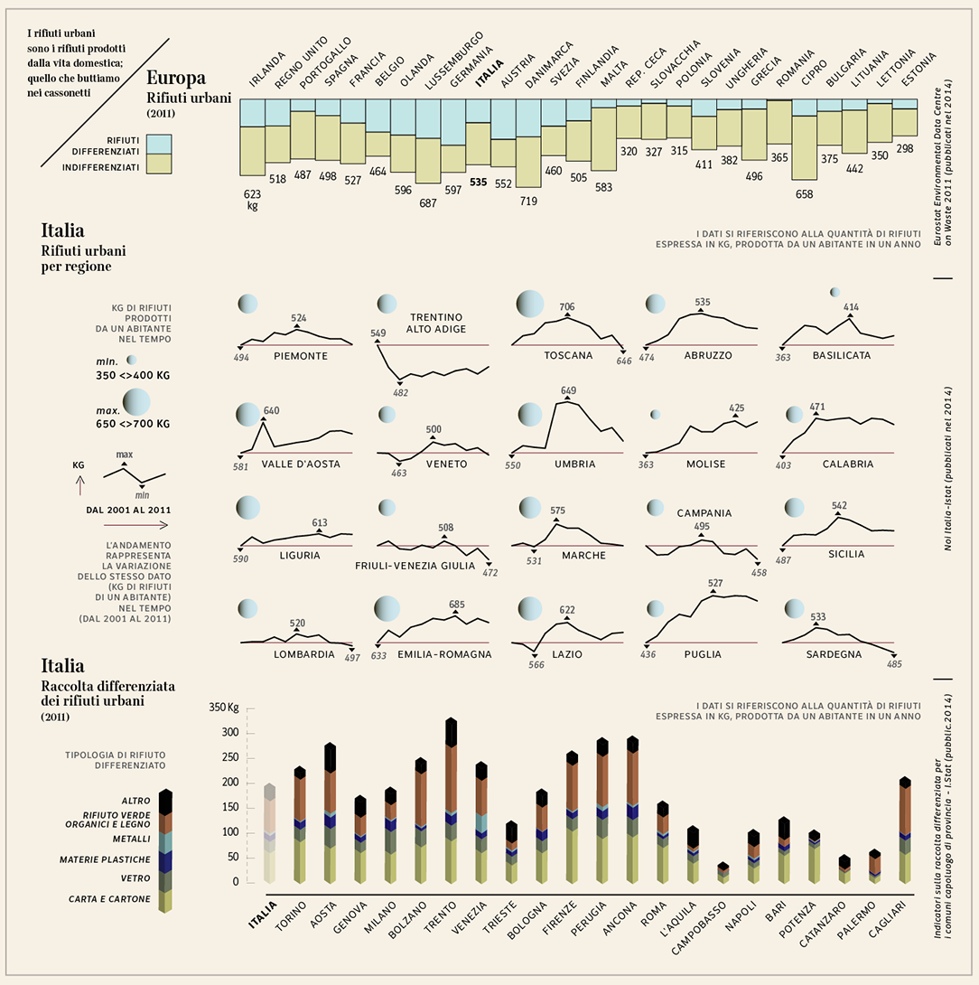
Ironically, the thing we most struggled with in the design process was the color palette: we wanted to stick with a radical black and white, but finally we were asked to propose a softer one.
Where did the data journalists on your team work before Tommi? How do you ensure designers and journalists work well together?
Tommi at the moment is a group of freelancers. Our two data journalists are also collaborating with Wired, L’espresso, l’inkiesta, Il Sole 24 Ore, and many other publications. They are both members of datajournalism.it.
We have been really lucky to find journalists enthusiastic about visual journalism. They have been an integral and active part of the group since the beginning. I strongly believe that time and passion helped in creating a perfect atmosphere and collaboration. I always try to generate a tight link between journalists and designers. I believe this is the key to generating a truly good and efficient product.
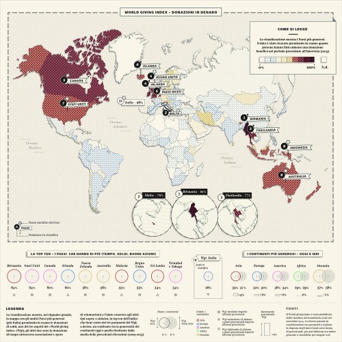
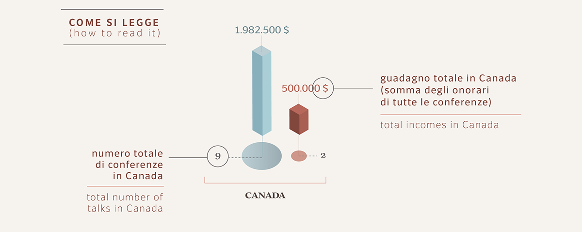
We liked your Hillary and Bill Clinton project. How did you design it?
That was Corriere della Sera’s idea. I was asked to find more information and data on the fees charged by both Clintons for their speeches. It took us a week to find all the individual bills.
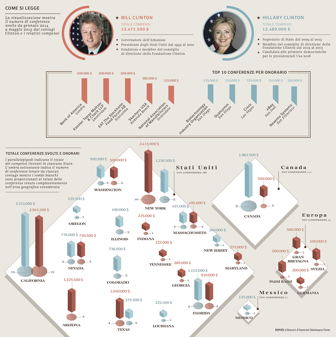
Once the data were collected, the difficulty was in visualizing them in a proper and efficient manner and to find the correct way to make them easily understandable. We decided to make a visualization very clear and easy to read. Below, our legend.
What advice do you have for journalism students looking to learn more visual design?
My advice is to observe, research, as well as study. It is very important to realize what is happening in the world of journalism today. The web and smartphones is distorting what for years has been very consolidated and taken for granted.
What do you tell students and young designers about being ethical with their treatment of data?
It is not that easy! There is nothing more important than ethics in data visualization. Data and visual journalism draw from statistics and so they are much more faithful to the reality than written text. Each figure must be treated and visualized as realistically as possible.
Why do you think visual design is important for journalism?
The human brain has a visual way of understanding the complexity of the environment and memorizing complex concepts. This is the reason why the “visual quota” of journalism is fundamental; today we have accessibility to an incredible number of data, news increased exponentially, so to perceive in the best way all these information we need to synthesize, schematize and visualize them.
What advice do you have for newspaper editors looking to insert more visualization to their journalism?
My advice is to try to understand the full potential held by data visualization. With an effective visual, part of the information can be implemented much better. This has a scientific rationale: We all have a visual mind.
Tommi is currently working on several projects, among them an illustrated guide for nature and animals. You can find more of their work here.


