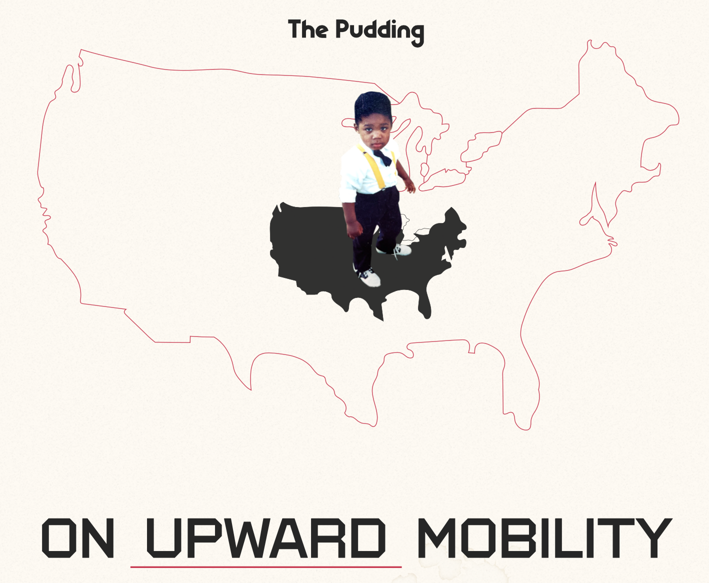
How Aaron Williams visualizes his own story to talk about economic mobility
The idea of upward mobility in the United States is often defined in terms of money, but it can also be defined in terms of opportunities such as schools, or exposure to certain kinds of thinking or forms of education.
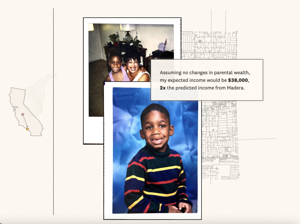
It was this thought, paired with a recent move from the East Coast back to his home state of California, that got Aaron Williams thinking about his own upward mobility, and how his life may have played out differently had he not relocated from Los Angeles to the Bay Area at the age of seven.
Williams, a former graphics and investigative data reporter at The Washington Post and current data visualization engineer at Netflix, spoke with Storybench about the conceptualization and creation of “On Upward Mobility,” a visual essay for The Pudding, which explores research on upward mobility through the lens of his own childhood.
This interview has been edited for length and clarity.
Where did the idea for this story originate?
I grew up in the Bay Area of California but was born originally in Los Angeles. After spending a little over six years on the East Coast, I wanted to move back to California, closer to my family.
One thing I’ve always been interested in, as someone who has covered socioeconomic data, racism, segregation, and other big topics like that in the U.S., is how where we are born and the communities that we call home impact us years later. When you move from one place to another, how that can kind of change your fortune.
When you think about the place you were born — that’s something you have zero control over, the same way you have zero control over your gender identity or your race. There are these characteristics we inherit, regardless of what we feel, and stats that try to predict where you might wind up. So I always wanted to do a story around this idea, to take the data journalism techniques I had used throughout my career and turn that on myself. I wanted to see if I could go looking through data to see how much matched my own intuition about how I grew up.
This was your first time working with the folks at The Pudding. How did you get connected and get the ball rolling on the story?
In terms of The Pudding, I have been a big fan of their work since they started, and I had met some of the folks on their team over the years through data journalism communities. The former managing editor of The Pudding, Rob Smith, reached out to me after I left The Washington Post and asked if I had any story ideas that maybe wouldn’t have worked with The Post that could work for The Pudding.
Originally, the piece I pitched was less of a personal story. It was much more focused on this idea of a national look at upward mobility. I had this really ambitious story memo, and I was going to use my life as an example but really zoom out to the whole nation and create a very big story.
The final product ended up being a much more personal piece. What inspired the shift, and what was the process of writing a more personal piece like?
As we started working through this, I started working with another reporter at The Pudding named Michelle McGhee. She and Rob then came to the conclusion that what drives this story is the personal element. … The personal story was what was really anchoring this, and the data was more of an entry point into that versus the personal story being an entry to the data.
Having spent the last several years of my career at The Washington Post, I had done plenty of stories that were focused on one community, but you always try to connect it back to a broader national narrative and how it may have a broad impact. This piece was interesting because it forced me to think less about this big narrative and really just focus on myself, my community, and my family story. Even the writing is probably a little more embellished than I would’ve typically written.
Because I am now back in Southern California, where most of my family lives, including my mother, I had access to all this great stuff like family photos. My mom came over and dropped off a giant box of family photos and I just started going through them.
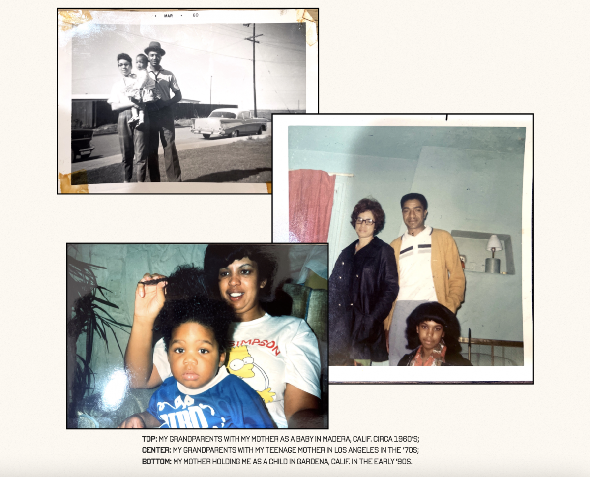
The reporting process became much more intimate and personal — the interview subjects became my grandfather and my uncle and my aunt. Talking with my family is a very different experience than calling up somebody and saying, ‘Hey, can you talk to me about this thing?’ … Most of the work was just going narrower and narrower, and zooming in until we really got to the heart, which is about family and belonging.
Can you tell me a bit about the technical and data-based aspects of this story? Did you collaborate with anyone?
From a technical standpoint, it was very straightforward. A lot of it is based on census data, which is a data set I have used for most of my career, so none of the data itself was too daunting for me to figure out. … The data is from Opportunity Insights, which they publish as a CSV on their website, so I tucked the data and wrote a very simple Python script. I had a Jupyter notebook that I used to analyze the data and figure out what I wanted.
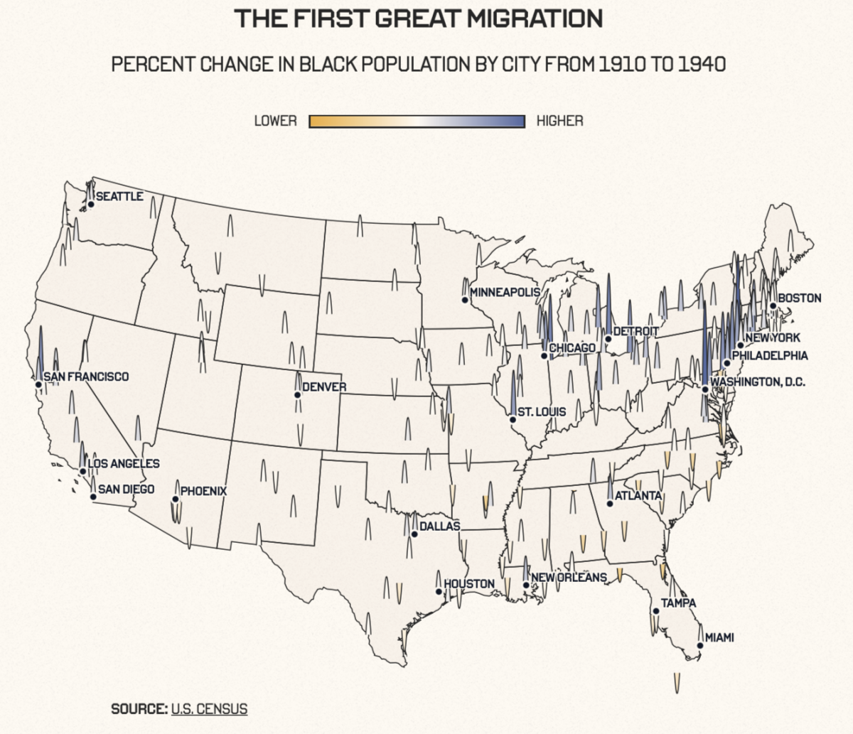
The actual webpage itself is built using the Svelte JavaScript library, which is very similar to ReactJS or any kind of view library. I had never used that specific technology before, but it was pretty easy to pick up. All of the charts are done in D3.js, including the map you see in the middle of the page, which I built and designed.
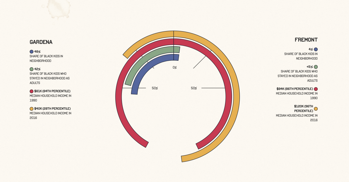
Toward the end of the project, we had a rough design that Michelle and I had drafted, but it still felt like it was missing something. There was another designer on staff, Jan Diehm, who came in and took my low-fidelity designs and punched them up to a billion. It’s her design work you see in the final product: the roadway maps, the textures, the color palette. … the radial chart that you see at the bottom, she added that … and the photo gallery that appears near the top.
What are your biggest takeaways from this project?
As a journalist, it can be really easy for us to report these stories about impacted communities. For me, personally, doing this project really brought a sense of empathy and perspective that I don’t necessarily think I was lacking as a journalist, but it was a good reminder of what we are asking people [interview subjects] to do — which is to unearth these really personal and sometimes painful parts of their past to a total stranger, and then publish that to the internet. For me, it was a reminder to be really thankful to the people I have interviewed in the past who were willing to open their doors to me for those kinds of opportunities and conversations.
It was also cool being able to apply this skill set outside of a newsroom context because The Pudding is more like a magazine. Their style, publication, and editorial process is very different than what you might see in a national, regional, or local newspaper. … I told a lot of my friends, if they ever get the opportunity to write or produce something for a place that maybe on its face doesn’t seem relevant to you — try it. You might be pleasantly surprised with how it might make you feel or how people will resonate with the story.
“… Relatability is incredibly relative.”
Aaron Williams
Finally, it was a reminder about the power of journalism. There’s a lot of power in showing such a personal or very specific kind of story because it might relate so much more than you think. What I learned with this project is that relatability is incredibly relative. Especially in the case of the Internet, we have access to everyone. When you are super specific, you’re still reaching a lot of people, which hopefully means folks are thinking about doing stories that are a little more kooky, a little more personal.