The Seattle Times interactive of the Oso landslide, one year on
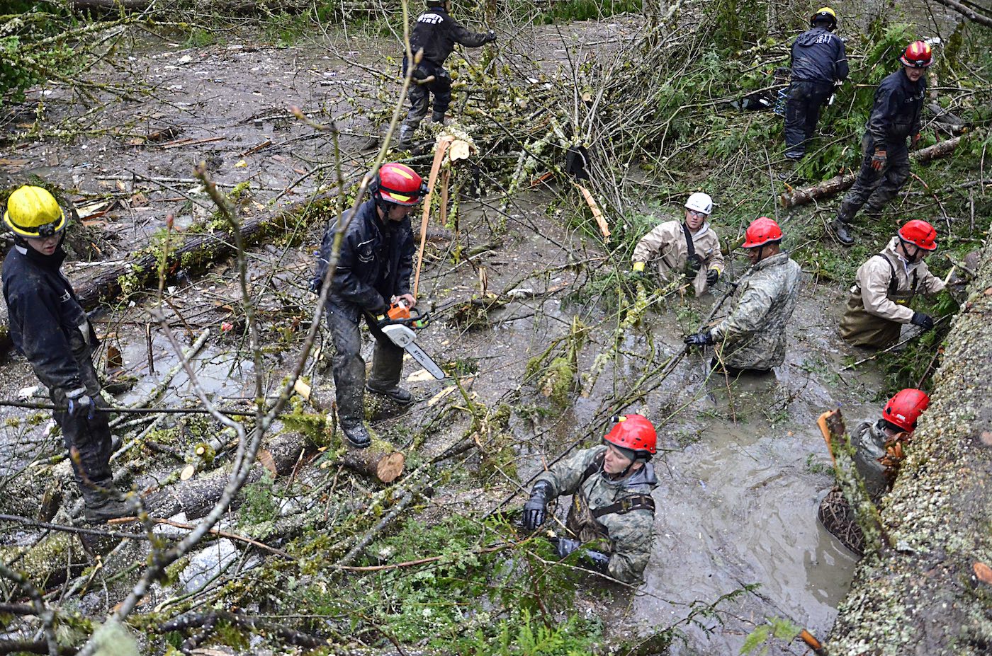
It’s been one year since the Oso mudslide killed 43 people in Washington state. The neighborhood of Steelhead Haven, which was engulfed by the landslide on March 22, 2014, was precariously located under an unstable geological formation. Indeed, the hill above Steelhead Haven that gave way had a long history of repairs and warnings. The neighborhood should never have been built, The Seattle Times later reported. (For that reporting, the Times won a Polk award.)
To shed light on the troubled history leading up to the landslide, a team at The Seattle Times worked in the months following the disaster to research and build an online interactive timeline. The timeline allowed the user to explore 80 years of history with 13 aerial photographs (dating back to 1933) and data on home construction, logging, warnings and attempted fixes. The interactive was published in July 2014.
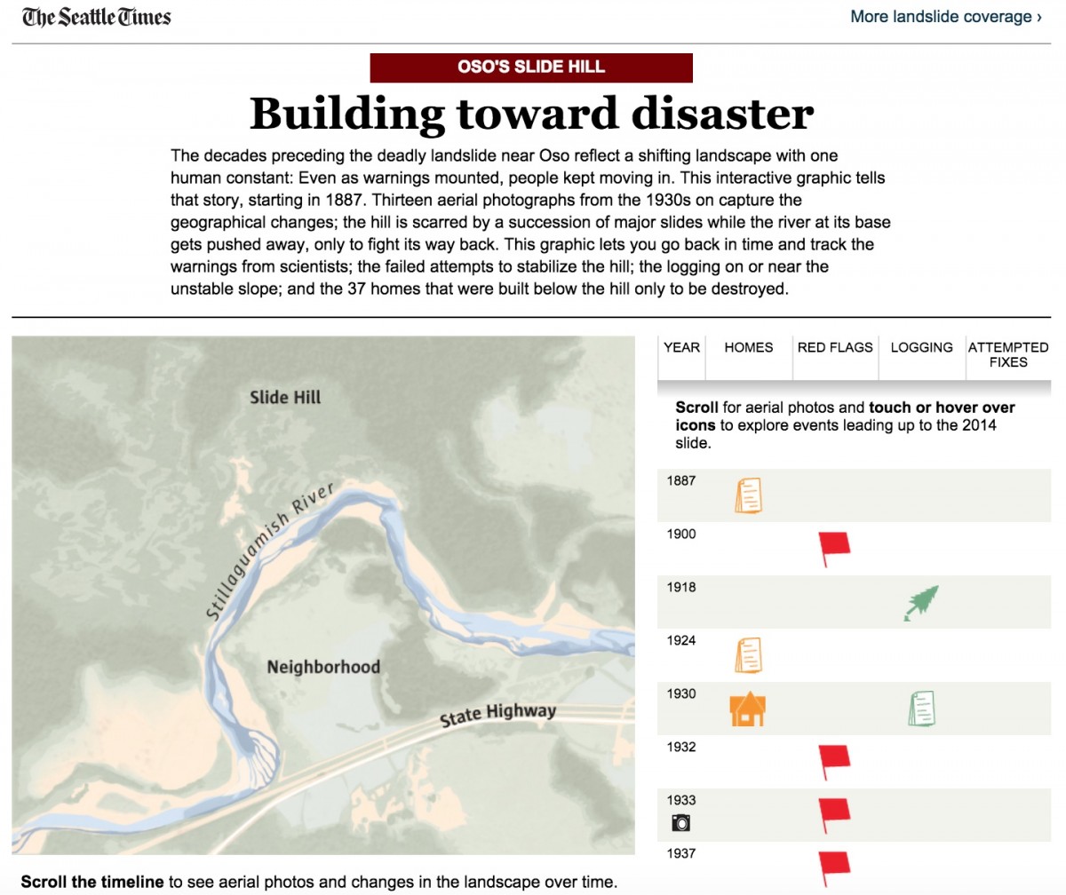
“Although it was longer from concept to publish date, I’d figure that about two weeks of work went into this,” said Thomas Wilburn, the newsroom developer who built the interactive. “The biggest challenge I had, actually, was making sure that the images would blend smoothly. The original aerial photos that the reporters pulled were 1500×1500 [pixels], and loading all of those into a page with a transform applied would crash Chrome’s GPU compositor. Once they were shrunk, it worked a lot better.”
The Oso landslide interactive was the debut of new technology that expedited the newsroom workflow, Wilburn told Storybench in an email. “This was one of the first projects we built on our static news app scaffolding, which let us import data directly from CSV files that the reporters put together.” This kind of spreadsheet-to-interactive technology is becoming increasingly popular in newsrooms because it requires very little programming expertise from reporters. The Chicago Tribune developed Tarbell.io for precisely this reason. They call it “Google spreadsheets for content management.”
Though the reporting phase was helped by the Times‘ news app template, it took only time and a careful eye to polish the interactive. “Getting it functional didn’t take that long, but polishing it and making sure that it was a decent mobile experience even on tiny iPhone screens was a challenge,” said Wilburn, who has been working for The Seattle Times for nine months. “It doesn’t actually take us that much time to put something together, but we do spend a lot of time then dotting the i’s and crossing the t’s.”


