How Alvin Chang designs visualizations for everyone
“How do I explain this to my mom?”
That’s the question that data journalist Alvin Chang asks himself whenever he creates a piece. He considers how his mother, a first-generation immigrant from Korea who is not fluent in English, would best understand the projects he works on.
“It’s very clear that so much of journalism isn’t for her and isn’t designed for her,” said Chang, who works on data stories for publications like Vox and The Pudding and also teaches journalism and design at The New School in New York.
While he knows his mother is smart and that she wants to be informed on current issues, he finds that news coverage in mainstream outlets like The New York Times does not always serve readers like her.
“If there’s one of her, there must be millions — if not hundreds of millions — of people like her who want information in a more accessible way or in a way that takes a different angle that’s more relevant to them,” Chang said.
This perspective drives his work, where his goal is to tell whatever story he wants, however he wants to tell it, in a way that everybody can understand.

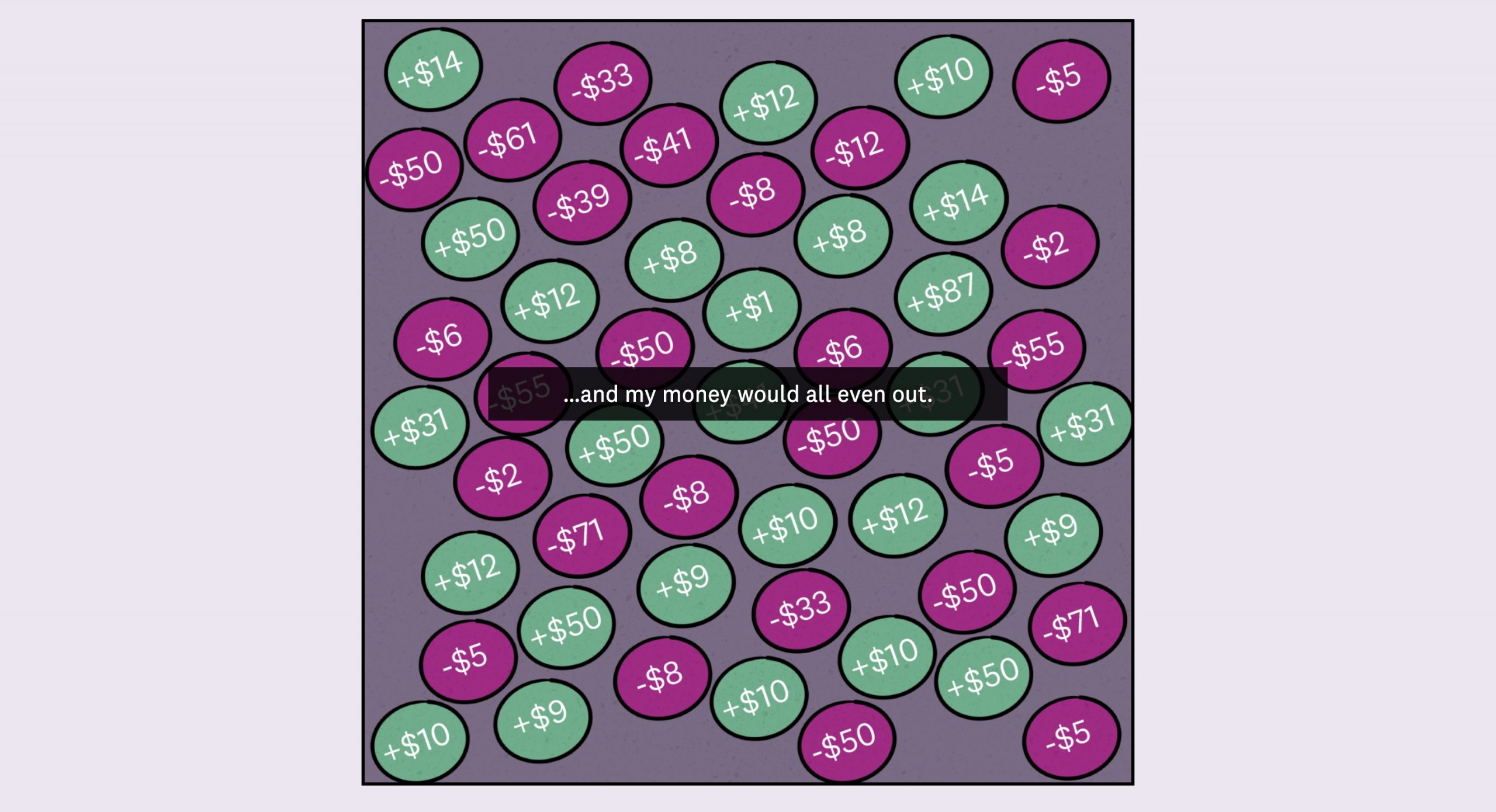
One example is Chang’s interactive data story, “Why the super rich are inevitable,” an in-depth explanation on wealth inequality, published in The Pudding in January earlier this year. The article appears like a cartoon, with a lively purple and magenta color palette and fun animations, contrasting the tedious nature of financial news.
“For an economic story, you might think it’s going to be really masculine with lots of rigid numbers and very precise,” said Chang. “I just don’t think that has to be that way.”
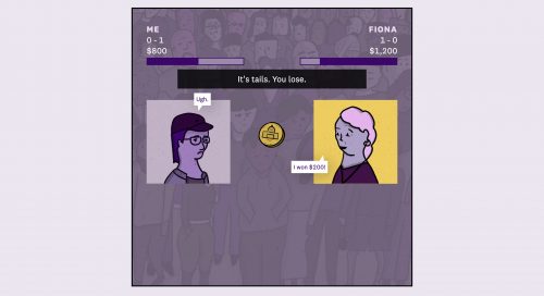
Chang tries to get people to think about niche topics – like economic theory – in ways that are not as daunting. In this piece, he introduces the concept in four different ways throughout the story: an anecdote on buying a watch, an animated game, data visualizations and an interactive simulation.
However, even someone as experienced as Chang still gets overwhelmed when working on complex stories with so many moving parts.
Concepts like coding and design – vital for many data journalism stories – did not always come naturally to him. It wasn’t until Chang’s first job out of college, as an ESPN sports writer covering hockey and focusing on statistics-driven reporting, that he began to learn how to program with Microsoft Excel and Python.
Originally intimidated, he took things one day at a time, slowly practicing and improving his skills.
“It’s almost like a confidence that you can learn it,” Chang said. “That helps you not self-sabotage.”
As the scope of data journalism grows larger and the boundaries of traditional design are stretched, Chang will continue to expand the storytelling possibilities that go along with them.
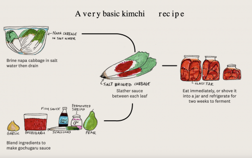
His latest piece for The Pudding is titled “The search for my kimchi.” Here, he created an interactive story for users to discover the flavors of kimchi that are core to his own culture and upbringing. With help from public submissions, Chang expanded on themes from intertwined and collective experiences around the traditional Korean dish, turning them into a first-person journey about food, family and nostalgia.
“There’s a lot of stories to be told here,” Chang said, while in the process of creating this piece. “I’m excited about the possibility of telling a story that isn’t explicitly like, ‘Read this first. Read this next. Here’s the takeaway. Here’s an interactive to give you another takeaway, so on and so forth.’”

- How Alvin Chang designs visualizations for everyone - September 12, 2023