How journalism students warmed up to data visualization tools Plot.ly and CartoDB
Recently here at Northeastern Journalism School’s Media Innovation graduate program we ran in-class workshops on data analysis using spreadsheets and then presented our students with a few datasets and two free visualization platforms: Plot.ly for charting and CartoDB for mapping. For our spreadsheets section, we used IRE NICAR’s excellent Excel course pack.
We wanted to figure out the “minimum viable product” approach to learning here – the basic tools to empower students. So that would be Excel and two end-user applications to visualize and map. In just two weeks, we found, you can give students a huge amount of confidence and skill.
There has been a steady stream of calls by media and educators for more data skills and literacy. But we seldom hear from students about the experience of becoming data literate. So we asked for student feedback and we are posting it here with the theory that it may be useful to others teaching workshops, seminars, courses–or for those just looking to inject some data-oriented learning in a traditional course.
A bit of background
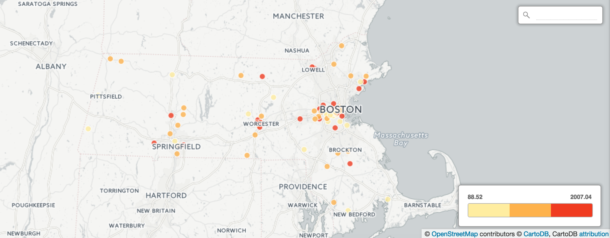
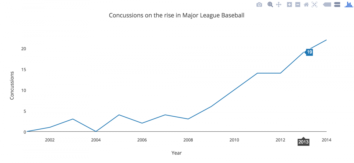
In order to introduce the tools and the journalistic decisions made in collecting, vetting and cleaning a dataset, we walked them through the mechanics of Plot.ly (using baseball concussion data) and CartoDB (with Massachusetts restaurant and university food waste data).
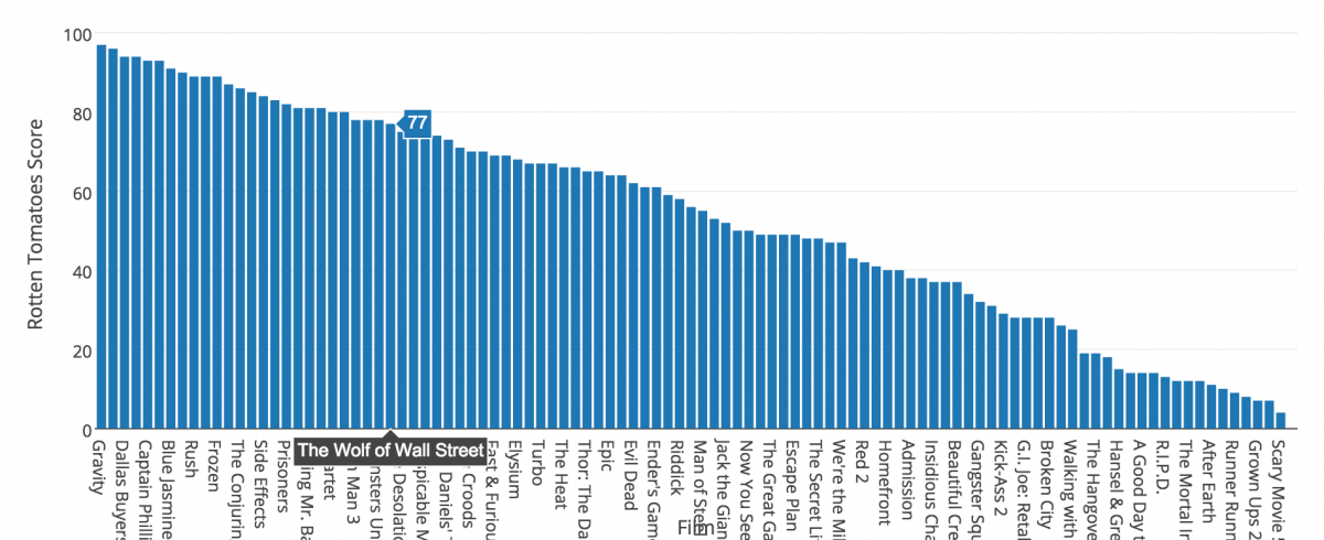
Once they were comfortable visualizing and customizing those datasets, we introduced a dataset collected by Information is Beautiful that listed Hollywood movies by budget, genre, profitability, opening weekend profits, and more. We paired up the students and had them mine the dataset for an interesting story. After 30 minutes they would have to present their story complete with a headline, a teaser and a visualization produced in Plot.ly.
Student reflections on our data journalism unit
“What I found most interesting about this workshop was how it made me think of the data visualization tools not just as a way of displaying data, but also a way of understanding data.”
“As a journalist I felt that Google and Microsoft Word were quite enough. Now, after I got into the Media Innovation program, that view has radically changed. In less than three months I have understood that data is the cornerstone of great reporting.”
“When I first started using Excel, CartoDB, and Plot.ly, I was nervous because I am not very good at math and had been hoping we wouldn’t be doing math in journalism school. But, these applications and programs are not that difficult to use and were accessible to me.”
“After two weeks of basic concepts and exercises I have one word to define the experience of creating a pivot table and drawing analysis from it: magical. I can see how formidable it would be to really know this stuff, how better of a journalist I would become. We worked with Plot.ly and CartoDB this past week, two data visualization tools that prompted many story ideas in my head.”
“I found Plot.ly extremely useful for making graphs and didn’t have much of a problem figuring that out. It will take more practice for me to get better at using CartoDB and Plot.ly, but I enjoy using Excel to organize information. Being able to visualize the data makes stories come to life and makes them more relatable.”
“With a small dataset, Plot.ly couldn’t be easier. You import your data file, select the plot you want, and that’s it… CartoDB felt a bit more robust and intuitive, although you can only be working with data that’s location-based.”
“I will likely use Plot.ly most often as part of the reporting process in order to more easily see possible trends and outliers. I loved the way Plot.ly enables users to create charts and other graphs that are immediately interactive.”
“The challenge is incorporating intriguing data so that the information adds to the story, as merely throwing in some statistics to have numbers in the piece is lazy and won’t suffice. I’m excited to produce my data visualization this week: It will be good test of just what I can accomplish. I know it will involve CartoDB. From there, the possibilities are infinite.”
“I want to work for National Geographic one day as a photojournalist and I can use tools like Plot.ly & CartoDB to broadcast any sort of international project I may be working on.”
“I knew, in the back my mind, how important data can be for stories, and I knew stories could be developed from certain pools of data… I thought, out of sight, out of mind, which wasn’t the best approach. I always figured if I needed help with data I’d find someone who has those skills and partner up on the project. I don’t feel that way anymore.”