How NASA Earth Observatory creates stunning maps to tell technical stories visually
At the heart of any finding by the National Aeronautics and Space Administration is a massive amount of data. Its fleet of satellites collect datasets so large they can be hard to imagine – let alone visualize. This data allows scientists to piece together trends to better understand the phenomena and systems that make our world tick.
However, lack of public understanding of science often makes the task of communicating these findings and drawing in the public difficult. One person tasked with bridging this divide is Joshua Stevens, data visualization and cartography lead for NASA Earth Observatory.
From mapping the intricate details of Hurricane Maria, to tracing the tale of an archeological quest to find a lost city, Stevens’ maps tell complex scientific stories each with its own texture, color, and unique character. These visualizations are vital in conveying NASA’s complex findings in condensed, eye-catching formats. Storybench sat down with Stevens to discuss his work.
NASA collects vast amounts of data. How do you decide what topics to cover? What in particular sparks your interest in any given dataset?
So there are a few different avenues where that happens. Sometimes we cover a story where NASA scientists have made some kind of finding or discovery and we know that story — that publication is already out and we help them tell about the research that has already happened. Other times a natural event or some kind of disaster will happen and then we think, “Is there a NASA satellite that can see this and can we use that to tell the world about this event that’s currently happening?”
With my role at the Earth Observatory, I try to communicate to a really broad audience. We reach people like kindergarten teachers, professors and scientists, so it’s really important that whatever data set I use can be distilled and it’s something that is understandable by pretty much anyone. But that said, I always try to find the data that tells a deeper story than just, for example, “there’s a fire happening here.” That’s interesting and all, but what about that fire? What’s going on with the aerosols? How is that impacting climate or the local weather system?
What does the process look like for deciding exactly how to visualize a certain dataset? Is it more analytical, is it more creative, or is it a little bit of both?
It’s a little bit of both. One thing with massive scientific data sets is they’re very standardized. For example, if there is a particular satellite that’s measuring aerosols or something along those lines, it’s always doing that in the same way, so we have a refined process. If we map that thing again in three weeks, those two maps will be somewhat comparable; they will at least have the same look and feel. However, the overall look and feel that’s designed initially really depends on the data set and what it’s trying to show. If it’s something that impacts where human beings are, we’ll add in road networks and cities – something that shows the built environment and how whatever it is that’s being mapped relates to that.
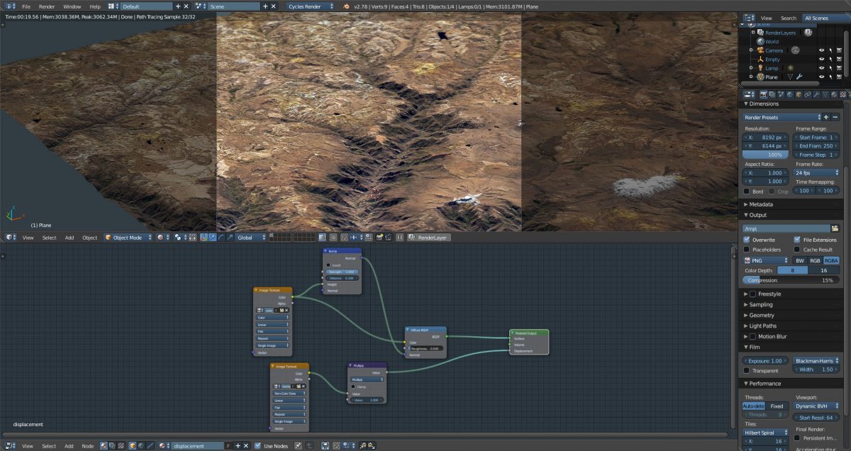
A rendering in progress of a terrain model of the Cotahuasi Canyon in Peru. The model is derived from NASA data to reflect the actual topography and land cover of the area. It is being rendered in Blender.
Can you describe the timeline of producing a typical a piece, from obtaining the initial data set to having it published on the website?
We work with really tight deadlines. We might hear about a story that’s breaking at 10:00 AM and we’ll have a writer who starts contacting people to ask questions about what is going on scientifically. Meanwhile, I’ll start digging into the data to see which satellites can actually measure whatever we’re looking at and try to figure out what exactly we are seeing. After this, we come together and have some back and forth about what kind of story we’re trying to tell and what its impact is. Then we get to work somewhat separately — the story is being written while I’m visualizing it and then we come together a few hours later and see how everything meshes to make sure that the math and the texts are both communicating the same thing in a very complimentary way. Most stories take three to twelve hours; it’s very quick. But if it’s involving a publication that’s already out and we’re telling a deeper science story, we’ll have a bit more time on that. Then occasionally we do a longer form feature which might be 3000 words or so, in which case we will work on it for several weeks.
How many people work on a typical story?
The typical story has about three people working on it. We have our editorial team who will work on most stories, but the number of scientists who contribute commentary and review can vary from one story to the next. Everything that we do, especially really technical and sophisticated stories, are reviewed by external scientists or experts on the particular data or the phenomenon.
What is your favorite project you’ve worked on or are currently working on?
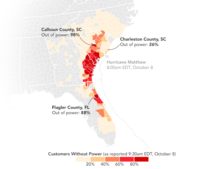
I think my all-time favorite is the map that showed hurricane Matthew moving in on Florida at night time. We used the Suomi VIIRS Day/Night band to show the cloud structure coming over the city at night and then all the power outages that happened as a result. We paired that with some data scraped from the power companies showing how the individual counties and the surrounding states — Florida, Georgia, and South Carolina — were impacted by that. The reason I love that one is because when people think about NASA or satellites, it’s often about something very science driven. But, all these satellites and measurements impact things like national security and disaster relief and response. So, even if you’re not a scientist, these sensors can help you understand and prepare for what’s actually happening around you.
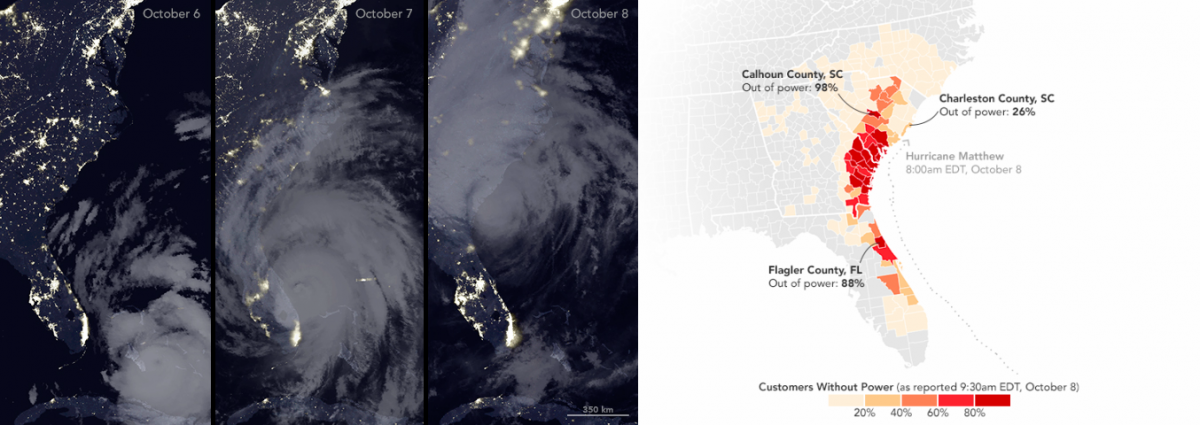
Using VIIRS Day/Night Band, Stevens overlays power outages with hurricane Matthew’s progress (left) and uses the information to map the power outages along the coast (right)
What audiences do you hope to reach and why do you think the projects that you work on are important?
We don’t target any group in particular. If I made something and it really resonated with one audience but failed for eighty percent of the others, then I would see that as a major failure; but if it works for a broad audience, that’s where I find success. A lot of the time, NASA data can be really complex. There’s all kinds of measurements, calculations and analysis that goes into something, and much of that might be over the head of the general public. If you can just distill something into a really understandable graphic that can be copy and pasted on twitter, people can share that with their friends or print it out and take it to class — people learn a lot from those visuals. On one hand I want the visuals to sort of have their own legs so they can tell a story on their own, but I don’t want them to answer all the questions. There’s a whole body of text written around each visual that explains what’s actually happening in-depth. My hope is that these graphics actually send people to the story so that they read more and learn something about science that they wouldn’t have otherwise encountered.
How do you think advances in computing, technology, and data visualization are changing the field of storytelling?
On one hand, I don’t know if a lot has changed. Human beings have always been very visual. The first stories we ever told were in cave paintings, which existed long before written language. What I think is happening now is that we can make more sophisticated cave paintings and share them with a much broader audience who aren’t in our particular caves. People around the world can get data they wouldn’t have access to otherwise. The internet has been democratized in a way where others can take place in visualization where it isn’t just a one way street; Instead, it’s sort of a conversation surrounding data. It has opened up so many possibilities.
If you had to give a budding scientist or data journalist one or two pieces of advice, what would they be?
I would say definitely get familiar with coding. You don’t have to be an expert, but coding can help you access data that you wouldn’t otherwise be able to. It can help you automate and standardize analysis. If you’re doing routine stories and you want to make an animation or something that would otherwise take you ages to do manually, scripting something up can really save you a lot of time and open up possibilities where a lot of point and click software falls short. I use python for probably 90 percent of the work that I do.


