How the L.A. Times mapped new buildings near freeways to highlight health risks
More and more Californians are living near freeways and that’s a problem because those people are breathing in soot and other carcinogens from passing vehicles. That’s according to environmental health research and a new map-heavy analysis of building permits and census data that the Los Angeles Times published earlier this month.
Storybench spoke with Jon Schleuss, a data visualization reporter at the L.A. Times, about “L.A. keeps building near freeways, even though living there makes people sick” and how he built several maps to tell the story of air pollution and Southern California freeways.
Tell us how this story came together.
There were three of us working on it: Tony Barboza is a super talented reporter who usually covers pollution and air quality issues; David Zahniser, who covers city and local government and planning and review process; and me. My background is in mapmaking, data analysis and visualization. I think there are a lot of potential stories you can tell through maps.
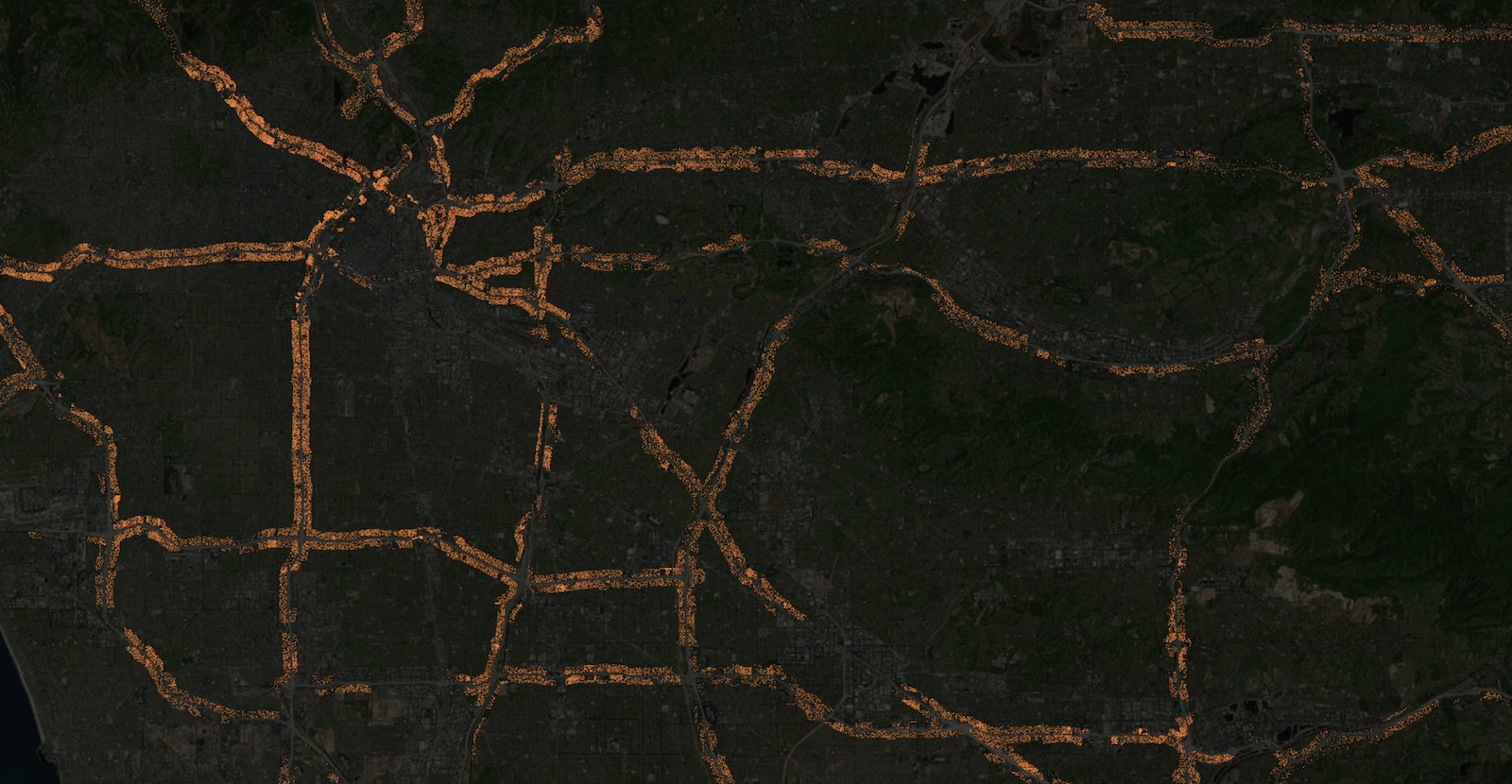
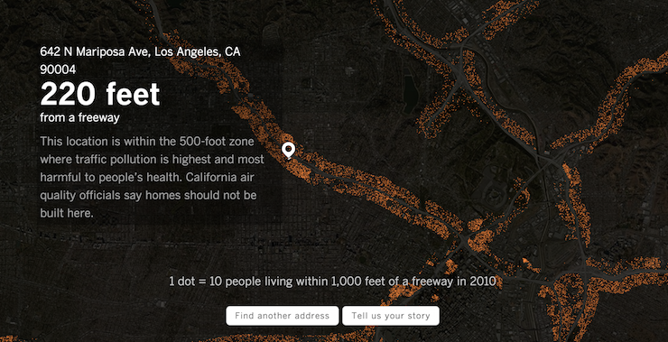
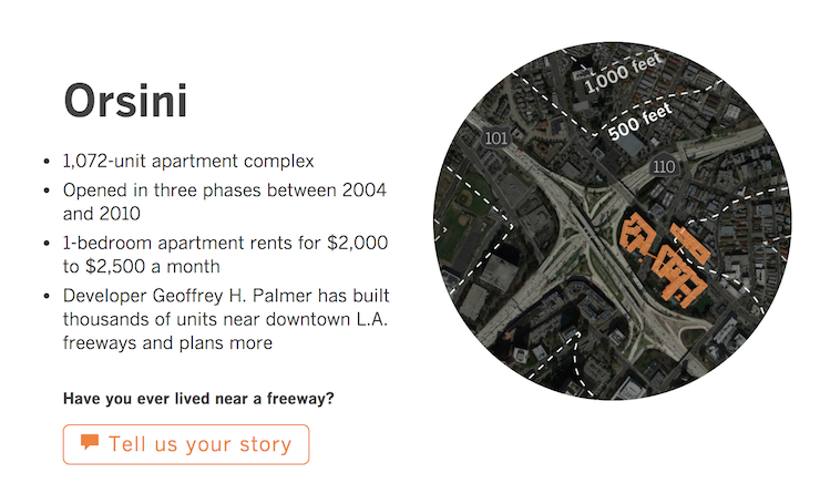
Given what we know about the effect of air pollution on health, we wanted to look at the number of people that live within 500 feet of freeways in southern California and how that has changed in the last 10 years. There are more than 1.2 million people living within 500 feet of a freeway in southern California. And we found that the rate of growth in L.A. close to freeways is faster than the rate in the city at large.
What went into the maps and why did you choose that format to tell this story?
I think there are a lot of potential stories you can tell through maps. This story begged a dot density map, showing points of light on a dark map. The cool thing about Carto is that it allows you to turn complex data into flat tiles. The way it works is that you type in an address, it finds a match, it hits Bing’s API, passes Bing an address, it returns a coordinate, and then we take the latitude and longitude, and then runs a postGIS query against the massive, ugly freeway polygon I uploaded into Carto. That allows us to ask ‘What’s nearest point that your address is to the freeway? It calculates the distance between the two points.’
Your methodology explains how you got the building permits and census data. But where did you get the freeway data?
The SCAG regional data group has land use data and freeway data which we used. We had to add data for San Diego. We also had to do some journalism on it, too. We had to cut out busy boulevards that didn’t exactly count as freeways from the data. We shaved off a lot of these extra little bits.
And you released that data, right?
Yes. We’re trying to get better at the Times in thinking about how to empower smaller news organizations. I want to release the data. It’s not my data, it’s not the L.A. Times’ data. This is, in my opinion, public data.
https://twitter.com/gaufre/status/838454282391166977
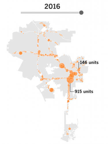
How did you make the timeline slider?
It was made in QGIS. The city had permit data that we had to geocode. I opened it in QGIS, projected it and then went into each year individually and screenshotted it. Then I aligned those images pixel by pixel in Photoshop and set it up in a slider. Andrea Roberson, who works on the Times’ Data Desk, helped design the page and wrote the slider to get the image switcher working. (CSS here.)
What did you do to prepare the piece for mobile?
We tend to work on flexible templates and CSS that expand to any window size. In this case the graphics were small enough to work well both on desktop and mobile. I exported them larger and they’re sized down with CSS to read more clearly on high-definition displays. There were just a few tweaks to the interactive map to make it work better in mobile. For instance, the distance calculation box sits above the map rather than as text in the map. But mostly, everything easily scaled down and up.
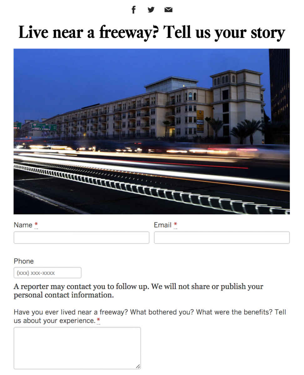
What was the conversation around the element that helped you crowdsource stories?
Tony [Barboza] really wanted to do this because he’s going to be leading the follow-up effort, if he can get access to individuals suffering from these problems. There’s all these stories out there. For us, it’s this great way of getting those stories. It’s more than just the comments at the bottom. We used Screendoor which is cool because readers can upload photos. You could do Google Forms, too. People are writing to us saying, ‘Now I know why I have asthma.’