How The New York Times predicted your politics using a quiz
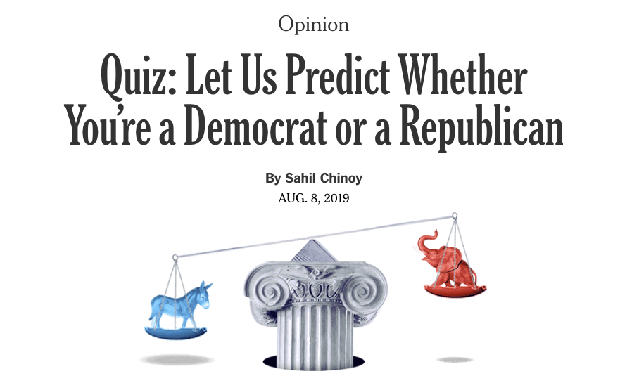
Can your race, religion and education predict your political party affiliation? Last month, Sahil Chinoy, a former graphics editor for the opinion section of The New York Times, published an interactive quiz and accompanying article that laid out exactly how demographics influence the way Americans vote.
The piece includes a quiz for the reader that predicts if they are a Democrat or a Republican, as well as a decision tree used to show all possible outcomes, and how the voting patterns of different groups have changed over time.
Now studying for his Ph.D. in economics at Harvard University, Chinoy spoke with Storybench about how he found the best way to display the data and draw the reader in.
Where did the idea for this story come from?
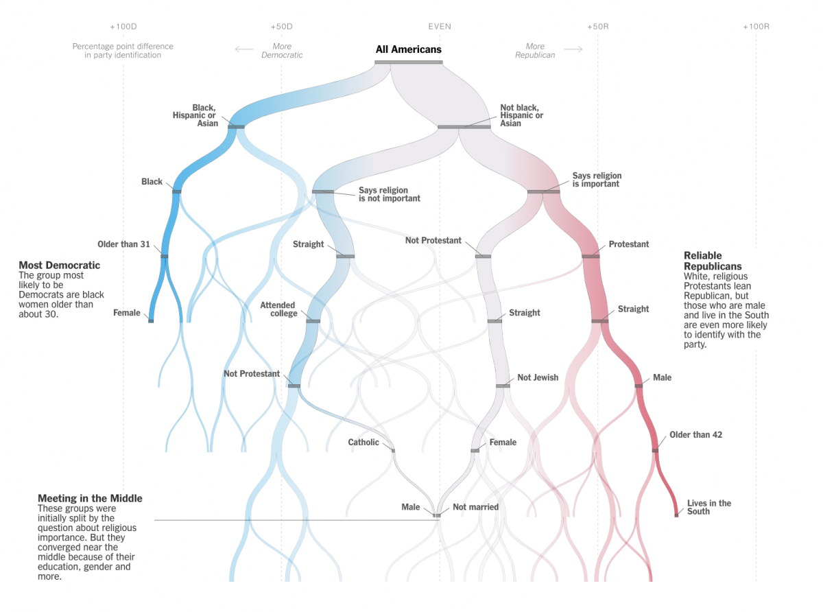
This idea came about from a couple of different things mixing around in my head. One is this idea of using a decision tree approach. I was working on an earlier idea and Amanda Cox brought this idea to my attention and I had looked at some of her work. I think I was looking vaguely at survey data, some political science and statistics papers, and those came together. The quiz wasn’t the starting point, the starting point to me was the second graphic, that looks like a tree, that is where I started. In talking about it with my editor and colleagues we were like how do we insert the reader into the story, and that’s where the idea for making the quiz came about.
How did you pitch the idea?
I think I was just working on it with some free time I had, coming up with initial sketches, originally it was more of a flow chart than a tree, and I had a really intricate version of that, I was trying to play with it and work it into a form that seemed more reasonable. I had a bunch of versions of that and went to my editor, and he was like, “It’s kind of a perennial interest, how parties relate to demographic.” So we started chatting about it and he gave me some time for it.
Could you tell me about the process for the quiz, in terms of data sourcing, analysis, and visualization?
There’s a lot there. I ended up using the CCES (Cooperative Congressional Election Study) and the ANES (American National Election Studies). I had just been familiar with both of those and I wanted to use them with something but couldn’t come up with the right story. I poked around with those, and I was looking for a large data set, and this one fit the bill and had a couple years of data. The AP had this vote cast data that I found in the middle of me working on this, and I played around with that, but the problem was it didn’t have all the questions I was interested in so I ended up not using it. I wasn’t too worried about reliability because the CCES is widely used and cited in a lot of papers.
I tried a bunch of different things because there’s regression trees and classification trees and I was split on what to use. I initially was pretty strong leaning towards the classification approach and got almost all the way there, but I think ultimately the outcome with that is it’s really hard to explain what you’re measuring. There was a bunch of analysis stuff that included recoding, and categories, a lot of reading literature as to what people have used in the past and how people have chosen to do those things.
I was showing it to my colleagues, who said it would be nice if the width measured something, which ended up being an interesting geometry coding thing as well. I spent a couple days figuring out how to do that. So then I had a mostly working reel in JavaScript. So then we started thinking out how to make a quiz, and how to move up and down this tree in an interesting way. When you answer a question in the quiz the actual size of that graphic grows in height and if you don’t do anything about that you get a skipping effect, so the graphic grows beyond your screen, so there were a lot of little refinements.
What would you say is the biggest trend you saw in this data?
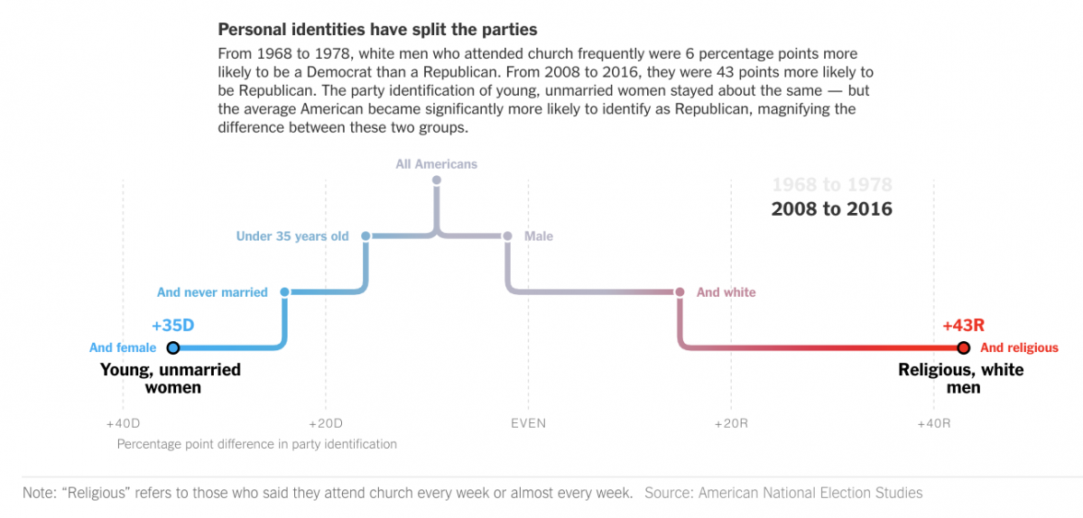
At the start that was the other thing was I was looking for – essentially a correlation between demographic and party ID, all these things have been strong at parts in history, in contemporary data a can you create a ranking of predictors and I ended up emailing a fairly well known social scientist saying what do you think of this idea, and they were like I wouldn’t do this, I don’t think it would make sense to readers. So I had to think about that, what the critique was and how to address it. Thinking of a way to rank these predictors, and this tree approach is a novel way to do it. When I was doing a research I came across political scientists working on papers they hadn’t published so that was cool, calling and saying I have read these working papers, can we talk about it. I was also really interested in how it has changed out over time. I created a bunch more technical challenges, like at what level are you going to aggregate, and whether to analyze this on a yearly basis. That was the initial framing, to what extent can you investigate this question of demographics.
How did you organize so much data for the piece?
Poorly, is the answer. I think I had a couple of false starts. Looking back on it, it seems more linear than it was, at the time I had three approaches I was pursuing at once and I was working on them all parallel until one seemed more promising. The data itself is organized in the sense it’s published by researchers, but it was sort of a random way, working on one or the other until one was working better and that’s when I went to my editor.
How did you develop the metric to show how far Republican or Democrat a person is likely to be?
There’s two ways to measure this, there’s the discreet choice by party identification from strong democrat to strong republican, or within a group you say a person is a democrat, independent or republican. Those two are not my measures, they are standard in the literature. Applying a regression tree to either one of those was hairier, that’s when I started calling these researchers like does am what I’m doing make sense? I had to adjudicate between those two myself and what will make the most sense to readers. Then you get something that’s more interpretable .
There are several different visualizations included, that go with the actual quiz for readers, how did you lay those out and decide what is more important and goes higher up?
I really liked the tree, that’s where I started, and was most excited about, but it became clear once we came up with the quiz that was going to be what people were engaged with. So the tree can come later on in page. So the tree then the data, and then go on to rewind into how this has changed over time, that came pretty naturally. There’s a race and religion and gender and age, doing that I don’t know if there was a particularly strong logic to it, it just came around as I played around with structures. Race and religion are, and have been, the strongest predictors so they went first, education and class went together, and the age and gender and marital status all go together in my head. In terms of writing through it, I started talking to a lot of political scientists and got those sections fleshed out and it became clear that the way to frame it was with polarization. The more I read about it, that was the lens I wanted to take in the introduction and conclusion.
What was the biggest challenge in this piece?
I don’t know, I think a lot of it was the uncertainty about how exact you want to code these variables, with five or four categories or what will you include. I think it becomes more art than science at a point. You’re trying to combine information in novel ways and you’re going to have to make decisions and the technical problems can be solved but the actual methodology and how to justify it are harder.
Were you able to include everything, or were there things you wish you could have included?
Oh yeah. I feel like in any project things get cut, the actual length before it went out was like three times as long. I feel like it is useful for someone to look through and see what people will actually care about.
What advice do you have for journalists trying to build similar visualizations?
I think advice I haven’t always taken form myself but I would say I found that it’s useful to give myself the benefit of the doubt. I think 99 percent of ideas seem like they’re not going to work at first and I get discouraged easily and often it takes pushing through something, and eventually you get to appoint with a glimmer of hope and that’s especially true with something people haven’t done before.
Anything else you would like to add?
In print was another challenge, figuring out how to put an interactive piece into print form. You design for phones, for laptops and that feels like you should be done after that but then how will it translate to the printed page. That’s something the graphics team does a good job of. But I always found that rewarding but challenging too.
- How The New York Times predicted your politics using a quiz - September 30, 2019