How The New York Times visualized racist historical redlining and urban heat
In late August, The New York Times published “How Decades of Racist Housing Policy Left Neighborhoods Sweltering,” a visual reckoning on historical redlining, persistent racial inequality and who feels increased urban heat across U.S. cities today. The project, led by Times climate graphics editor Nadja Popovich and Times climate reporter Brad Plumer, opens with a striking interactive map of Richmond, Virginia.
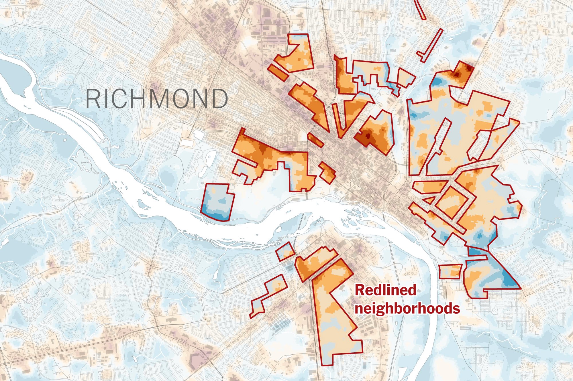
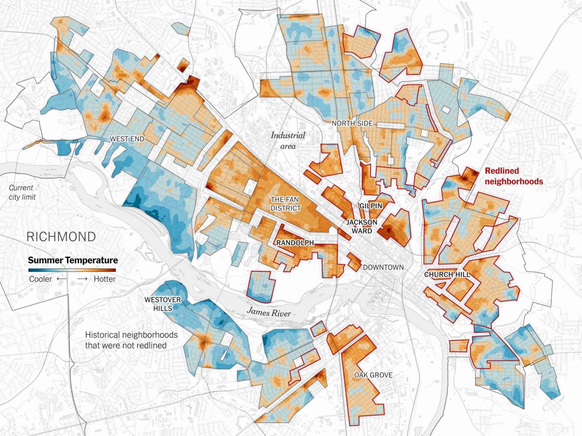
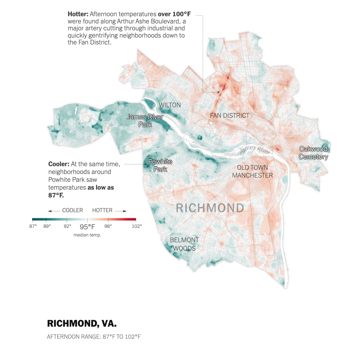
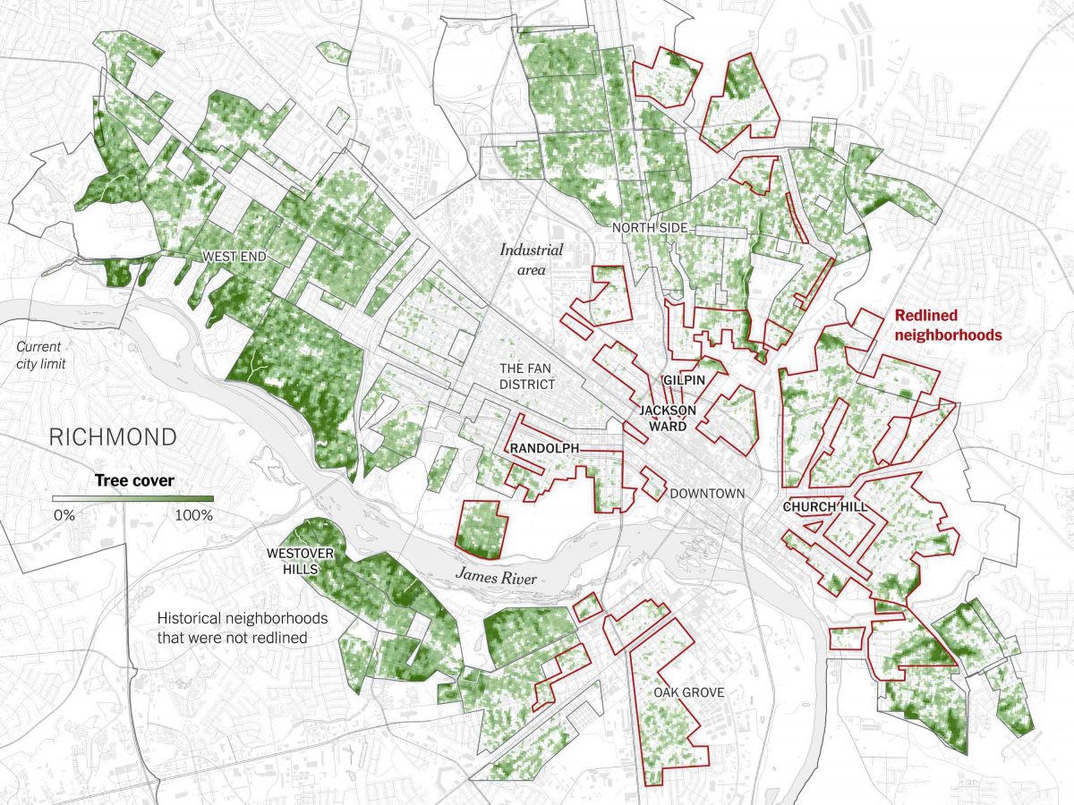
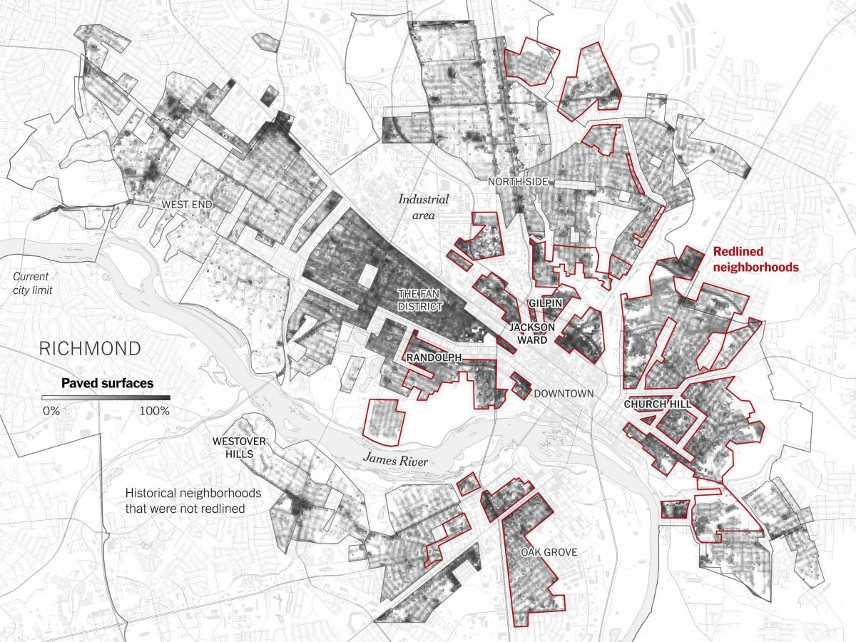
At first, the animated map outlines specific neighborhoods that were redlined as places with Black residents in the 1930s and shifts to differences in satellite surface temperature in the summer, comparing formerly redlined areas to historical areas that were not redlined, based on a study of 108 U.S. cities. Later on, more maps show the variation of tree coverage and paved surfaces, factors that impact the amount of urban heat on a hot summer day.
The article details the personal accounts of Black residents in formerly redlined neighborhoods in Richmond alongside photos taken by Richmond-based freelance photographer Brian Palmer. Based on extensive research, this visual interactive recounts the history of racist housing policies using 1930s federal Home Owners’ Loan Corporation document excerpts and maps, made digitally available through the Mapping Inequality project.
“You have lots of different layers to the story, as you have lots of different layers within the data graphics,” said Popovich. It is a multifaceted story that is localized to Richmond and expands to show a trend across multiple U.S. cities.
Storybench spoke with Popovich to unpack the research, reporting and data journalism skills behind this complex story on history, race and climate.
Could you describe your role in this piece specifically and also generally at The New York Times?
I’m a graphics editor on the climate team at The New York Times. I make graphics, like charts, maps, other visuals. I do data analysis, and I also report and write stories based on datasets.
For this story specifically, I collaborated with my longtime colleague Brad Plumer who’s a very data savvy science and climate policy writer. He reported and wrote for this piece, and also helped do some of the background data reporting that went into it. I also did a lot of reporting – speaking with scientists and local residents to better understand the issue and think through how to visualize it – and I created the graphics. It was very much a collaboration between the two of us. And then we also brought in Brian Palmer who is a freelance visual journalist actually based in Richmond and he was able to really help us capture the human elements of the story and make it less abstract for our readers.
Was there a specific reason why you chose Richmond as the city to focus on?
The article broadly talks about the study that found that more than 100 cities across the country had similar patterns: That redlined areas are much warmer today than many areas that were favored by government investment in the 1930s.
We decided to focus on Richmond, which was actually not one of the more extreme examples, partly because we didn’t want to take the most extreme example and show it. Also partly because one of the authors of the study who we spoke to, Jeremy Hoffman is the chief scientist at the Science Museum of Virginia in Richmond. He’s very, very involved in this idea of ameliorating heat disparities on the ground, so he was able to get us in touch with some folks around the city who were working on this problem actively.
And then, once we dug into it, we realized that there was this really interesting historical story to tell in Richmond. The city has also recently been struggling with other, much more obvious remnants of a racist past with taking down Confederate monuments, and there were huge protests there this summer. So we thought that it’d be a really good example to focus on to show the climate effect of these pretty explicitly racist housing policies that helped shape cities in the middle of the 20th century and going forward.
The New York Times has covered redlining maps in the past, and it’s also covered extreme heat and racial equity in articles with a photo essay focus. Why did you decide to combine these two topics in this article?
I actually did a story with my other colleague last summer looking at heat disparities and other data from Vivek Shandas and Jeremy Hoffman, who did this redlining study that I mentioned earlier. At the time, the article we did focused on just introducing people to this fact that there can be a substantial heat disparity within cities.
There’s this concept of the urban heat island, and traditionally the way it’s talked about is that cities are much hotter than the surrounding countryside because there’s so much more pavement, less trees, etc. But what Dr. Shandas is really focused on is that within a city there’s a pretty unequal landscape of heat. Some neighborhoods are greener, some neighborhoods are more paved over and have other things going on that make them hotter. We wanted to bring that to our readers’ attention.
But that piece didn’t really get at the question of why places are like this, beyond that kind of simpler explanation of “Oh, it’s trees and pavement.” But why do some neighborhoods have more trees, and why do others have less trees and more pavement?
And so this year, a crop of new studies came out trying to answer this question or at least raising some new possibilities. And they looked at things like redlining – these historical policies that certainly played a huge role in shaping the way cities look today – and how they actually may have had an impact on heat. We spoke to various researchers who have been looking into this question.
What types of experts did you consult?
We spoke to many city planners, many people who are experts in redlining and other housing policies. We spoke to climate folks. We spoke to health experts who could tell us about various effects of redlining on communities, things like gaps in life expectancy, access to fresh food. And then, in thinking more about those discrepancies, we were able to create a better picture for how the urban landscape of heat might have been impacted by these kinds of historical policies.
We also spoke with Richmond residents in some of these very hot areas. They’re really the experts on the lived experience of the heat disparity and so we wanted to make sure that was also a primary focus of the piece – that it wasn’t just this academic exercise, but it really showed how it impacts the people’s lives.
What other kinds of resources, physical or digital documents did you look at for your research?
We really tried to tell the story through various different sources. There were lots of studies on urban heat disparity, including ones on how redlining and other urban policies have affected the urban heat environment. I think this is a really rich area of focus for researchers currently.
I became really interested in how we can use historical imagery or other documents to really show how a city has changed, how a neighborhood has been transformed or impacted by these kinds of historical policies. And so, we looked into a neighborhood in Richmond called Jackson Ward, and the northern part of that is today called Gilpin. I reached out to The Valentine, which is a museum in Richmond that has a huge historical collection of photographs … (including) images of the former Jackson Ward at various points in time. I found more historical imagery on the highway-building project, which is one of the things that really separated this neighborhood in two, adding a lot of asphalt around, just hugely disrupting the area and displacing hundreds of families.
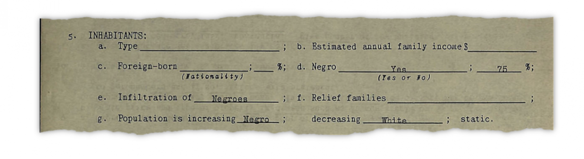
We wanted to provide historical documentation. We have these maps from the Home Owners’ Loan Corporation that we featured, including excerpts, which are also part of this Mapping Inequality project. They actually digitized not just the maps that the federal government ended up putting out, but the notes from the appraisers who did the appraisals. The appraisers were literally filling in the blanks; sometimes if the neighborhoods were Black or majority Black, they would fill in “infiltration of: Negros” and that was one of the reasons that the neighborhood was redlined and marked as “hazardous for investment.” I wanted to make sure I featured those to provide more evidence of this idea of these policies actually being quite explicit in their racism.
Those were the main historical documents that we consulted, but of course, there were lots of intermediary things like reading for part of the reporting, reading historical documents on the decisions behind the highway building project and various other things within Richmond and other cities across the country.
How did you create the interactive maps, and how does the fact that they are interactive aid in telling the story?
The maps were first made in QGIS and then I imported them into Illustrator where I was able to do some fancier styling. I then used a program called ai2html to export them out of Illustrator and got them online. I created the separate data layers for the parts I wanted to animate and then I used D3 to animate them. It’s a slightly complicated workflow but what it allowed me to do is have these beautiful base maps that were highly detailed while also adding animation layers. And I think that makes the piece a lot more visually interesting. As you’re reading that these areas are redlined, the act of drawing in the lines with animation reinforces this idea that redlining was an active decision-making process.
I think the maps overall help tell the story for two reasons. One, I think heat and especially heat disparities are incredibly hard to capture with photography alone. Heat isn’t in a lot of places visible and oftentimes what we can see is the effect on people. It’s not always so easy to show in photography this concept of how much hotter or cooler the summer is.
Second, the maps allow a layering of different elements. We have the satellite heat data and then we have the redlining shape, and then later also tree canopy and paved surface cover, and that kind of layering of different elements in a way reflects the narrative. The top maps serve sort of a dual role. First it’s an introductory visual evidence for the rest of the story and then it’s also kind of a visual teaser for the rest of the story. In those three slides, it helps people understand what we’re going to get into much more detail about later on.
Was it challenging to find the right way to organize the story, considering all the different parts, including the maps, personal anecdotes, photos and the overall history?
For sure. It took a while to figure out the exact right organizational structure for this; as you mentioned, there’s lots of different visual elements. But I think from the beginning, it tracked pretty closely with the outline of ideas that Brad and I came up with. Of course, as with every story there’s some rearrangement … but we decided to lead with the big map at the top to provide visual evidence that redlined areas were hotter immediately because we decided that is the crux of the story.
We also wanted to have this very human moment follow that very closely, showing how people in these areas are affected because while the maps provide very strong evidence … they can also be rather abstract. So we then worked with Brian Palmer, who’s a photographer, to get some photos of one of the families we profiled, as well as some of the differences in landscape between these areas. We tried to work these photos into the piece in a way that naturally flows with the text in the same way that we worked with the graphics … so that it all feels part of a larger whole.
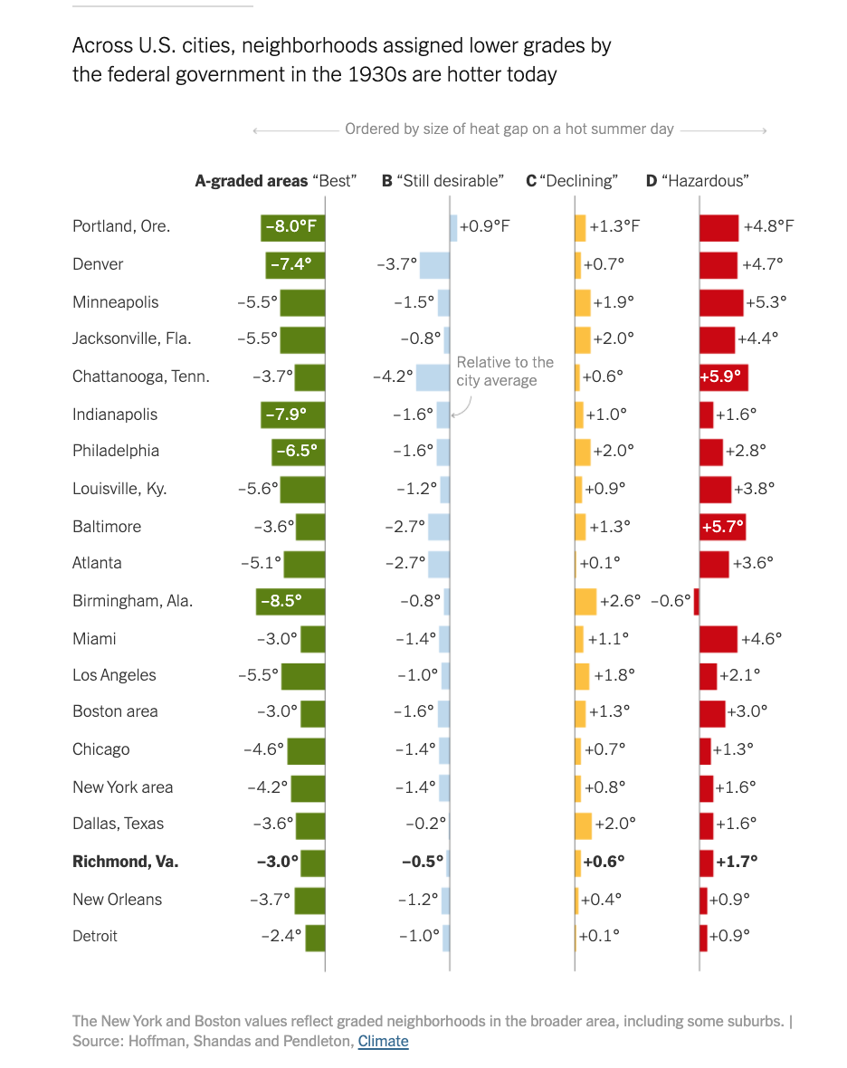
For that bar chart, the one that shows the temperature difference based on the grade, how did you modify that from the source study you referenced?
That chart is a basic summary of Hoffman and Shandas’s study about 100 plus cities across America where they found that the vast majority of formerly-redlined neighborhoods are much hotter than neighborhoods that were favored by government investments in the 1930s. We couldn’t show that long, long list, so we ended up truncating it to a list of 20 major cities and organizing it so that visually you can see it goes from the largest gap – so between the D graded, which is the redlined, and the A graded, which is what we call greenlined areas – to smallest gap in these 20 cities.
That chart was really important to include because while we spend a lot of time in this piece explaining how some of these policies impacted Richmond, it’s a story, to a greater or lesser degree, that plays out in cities across America… It’s a story about Richmond, but it’s not a story just about Richmond.
Do you think in the future you would want to apply these elements of heavy data visualization, photo essays and resident profiles for other climate stories?
I think some of the best projects the Times and other news organizations have done follow this model. It’s definitely not something that we just invented with this story. But it also is something that is hugely labor intensive in order to get all of these different visual elements as well as written elements working in unison. It’s not something that’s possible for every single story that you do, but when you have a chance to do it and when you have the right story which can really benefit from a wider lens looking into the issue, I think that is hugely helpful.
For this story, it worked very well to have photography, data graphics, historical imagery and historical maps because to some extent it is a slightly complicated story. It’s about redlining, and it’s about climate change, and it’s about inequality more broadly. I think all of these different kinds of visual elements really help people coalesce this one story in a way that I think if we had just shown a couple of maps and a chart wouldn’t have come across the same.
Cover image: Map of formerly redlined neighborhoods and summer satellite data of surface temperatures in Richmond. Courtesy of Nadja Popovich / The New York Times.
- Behind the scenes at ‘How to Save a Planet,’ a climate solutions podcast - January 29, 2021
- How the podcast ‘Science Vs’ investigated a 1971 virus conspiracy - January 11, 2021
- How The New York Times visualized racist historical redlining and urban heat - September 17, 2020