How the ‘Visual Communication Guy’ made impeachment easier to understand
“Impeachment” was the ultimate buzzword in politics for several months before the U.S. Senate voted to acquit President Donald Trump earlier this month. The United States population hears this word and, while many recognize the importance of it, some may not understand the complexities of how it works.
The political world can be overwhelming with hundreds of thousands of resources explaining the seemingly never ending layers of government. In today’s digital world, distrust in the media is at an all-time high. It is convoluted with threats of “fake news,” partisanship, and overall confusion about what is the truth. It hinders peoples’ interest in learning about certain topics that have an enormous impact on modern democracy.
That’s where The Visual Communication Guy, Curtis Newbold, comes in.
Newbold is a professor at Westminster College and self-proclaimed “infographic junkie.” He takes massive subjects, such as impeachment, and breaks them down into comprehensive infographics. By doing so, he alleviates the stress of sorting through boundless, complicated, and text-heavy resources that most people don’t have the time, patience, or capacity to coherently process.
“You can’t include everything in visual information, and maybe that’s not the goal,” Newbold said. “Maybe the goal is really just to help the majority of people accessing this to feel like they understand it.”
Storybench spoke with Newbold about his creative process composing infographics and how he created an impeachment infographic that fits on a single piece of paper.
How did you get into creating infographics, and how did your process evolve over time?
Back in undergrad, I was really struggling to find what “my thing” was. I switched majors several times going from journalism to business and even moved into food science for a while with a pre-med focus. I was all over the place but ended up realizing my real strength was in writing and design, which led me to get my bachelor’s degree in technical communications. I realized I liked the material, but I didn’t like doing it. Technical writing in general wasn’t something I could get really passionate about until I discovered that you could combine the visuals with the writing. Integrating the two made things easier for people to understand. I started with instruction manual projects, which were pretty dull for me. But I found out I could turn those into infographics where people were learning from it, and it was much more fun.
My education evolved and I did a master’s degree in professional communication. Then I did a Ph.D. out of Clemson University with a concentration in rhetoric communication and information design. The last part, information design, is where I discovered there’s a whole academic world in information visual design, which is really what I was passionate about.
My first infographic I published was this funny little topic about the 15 punctuation marks. That was my first attempt and it went mildly viral. That’s when I discovered there is something here that people really latch onto. Coming toward where I’m at now, I was asked to teach an advanced web design course, which I wasn’t totally familiar with. I created a website in experimentation and learning. I wanted to explore how to play with writing, information, design, and visuals. I wanted to see how I could better explain things to my own students. Taking obscure, unclear topics like the impeachment process and creating infographics is a really fun passion for me.
How effective is this form of communication?
It seems to be very effective. I try to create things that are meaningful and useful, especially on complex topics or topics that people feel like they don’t fully understand. Research backs this up, we live in a world where people don’t really read anymore. We use the term “read” as sitting down for a lengthy period of time. Research has shown people aren’t really reading anymore. We now live in this world where we’re so distracted – I am looking at my computer screen now with at least 12 tabs open. This is the way most of us function.
Living in that kind of world, we are looking for information that is accessible but also meaningful. It can’t just be visual, it also has to be something that gives us some sort of lasting meaning. What I’ve discovered is while I’ve written a lot of articles with heavy text, the ones that seem to get the most traction are the ones that have been totally visualized by combining digital components with textual ones.
There is a pretty clear correlation between turning information into an infographic and it actually being utilized. Anecdotal evidence shows that visualizing is far more effective than text alone.
How much research is dedicated to your process creating these infographics?
There is a whole body of research that talks about the way that the brain has really been designed to learn. Visual processing is much, much faster. So much more so than learning through listening or reading. It is not just about speed, but also about retention, engagement and what we’re able to remember.
Research shows that if you show someone a picture, they will remember that up to a year later, they will have the visual association. But if somebody reads text, they forget almost all of it within three days. Or if you give a presentation where someone is only talking, people will remember only about 10% three days later. If you tell a story, it will help because people put visual pictures in their mind, but if it is just facts and information much of that is lost. When you put a slide deck with pictures, suddenly people can remember up to 65% three days later.
In terms of quick processing, when someone looks at something, they’ll learn it much faster if it’s visual. There is a lot of research to back it up, even though the research is obscure when it comes to infographics themselves. A lot of the research shows supplementing text with images is helpful, but not as effective as turning the entire content into a graphic.
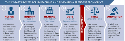
What was your process when you came up with the six steps for the impeachment infographic? Did you come up with the steps or visual first?
A lot of it came back down to research. I felt like I didn’t know the nuances of the process. It was the day after Nancy Pelosi came out and said they were going to file the impeachment inquiry. That triggered me into wanting to really know what happened from start to finish.
The first step is truly understanding the process so you don’t miss something critical. A lot of this infographic was just collecting information. I went to several different websites and was really trying to be non-partisan and looked at both CNN and Fox News. I wanted to make sure I had the facts right. I looked at several government resources and I actually read the constitution and how it had designed the impeachment process out, just to see if I could feel like I really knew it.
The next thing is parsing that down. Again, research has shown that most people can’t remember more than seven things. I thought if I could figure out what the major steps are and we can get it to under seven, then that would be ideal. There could always be subsets, but there really are six essential steps to impeachment.
It’s interesting going through this process on the phone because we’re moved beyond impeachment and are in this trial* stage. The trial stage has some steps I’ve left out on this graphic. The graphic is not totally inclusive. I think that’s important to take note of in any type of storytelling or journalism, everything can’t be included visually or even really textually. It’s research, it’s breaking it down into steps, and then once I have the steps it’s figuring out where people need a little bit more detail.
*Editor’s note: On Feb. 5, the U.S. Senate voted to acquit President Trump on both impeachment articles.
Bigger picture: Does breaking subjects down into graphics actually help people better understand things or does our society simply want efficiency?
That is the exact question we have to ask ourselves. Are we just accessing [the infographic] because it’s pretty fun and easy to look at, or is it actually improving understanding and learning? I think there’s a few things to think about here. If you noticed, I made the infographic free as a downloadable PDF. I think if I am going to make this really valuable, it needs to just be a sheet of paper for that efficiency component. I asked myself, what can I accomplish with a one-sided piece of standard paper? How much detail do I need to leave in so people really understand the impeachment process? I wanted something shareable and useful that people can use in different settings.
There’s a real ethical question when it comes to visuals. I didn’t want to create something about impeachment that was wrong. We live in this world right now that is so focused on this term “fake news.” My goal is to be impartial and nonpartisan. I want to present information as it should be understood. At some level, you have to get it right the first time with research and making sure you don’t miss something important.
People do trust visual information in ways they don’t always trust written information, which is why there is an ethical obligation to get it right. If you create a professional looking visual document, intuitively, people think it’s reliable because it looks nice. Which is unfortunate sometimes because we shouldn’t always trust visual information as there’s obviously a lot of bad visual stuff out there.
What advice do you have for those who are trying to break into the digital and visual informatics world?
There are a few things. You can’t be a good designer if you aren’t a good writer. I think there are a lot of excellent graphic designers out there, but that’s not what digital and visual infographics are.
If you want to go into infographic design and that realm, you don’t necessarily have to be this amazing illustrator. What you really want is this combination of visual acuity in combination with writing. You need to know how to write. Learning how to break down information in a few words then how to use words and phrasing that are both clear and engaging.
The second is to study the world of information design. It’s a concept that’s not as common. It really is about data visualization. Making data visual is a world that seems to be a lot less familiar with people. There are certain things our brains interpret in certain ways. Our brain makes immediate associations with things that are related to data. You have to learn and understand how that works. Even how negative space affects our ability to misinterpret information. They’re all related, but the understanding of data information is really the most important.
It’s really about learning and practicing. Practice, practice, practice. I tell my students to create infographics on how the internet works, and most don’t have a background in data information or design. They figure out what doesn’t work and why it doesn’t work. Take something that you’ve never done before or something you don’t understand that well. Take that topic you’re confused about and turn it into an infographic. You’d be surprised by how much you learn about that topic.
- How the ‘Visual Communication Guy’ made impeachment easier to understand - February 25, 2020