What improv comedy can teach us about visualizing data
While storytelling can take on many forms and span several disciplines, the techniques and methods we use to tell good stories are fairly similar. Understanding those similarities and what makes a particular story effective on a particular medium can help us become better storytellers. There are certain tricks to improv comedy, for example, that can help us better visualize data.
For both data visualization and improv, the storyteller is inviting an audience into an artificial world. This is a big ask. We’re asking our audience to suspend their understanding of reality for a moment and accept new rules and conditions. For example, when an actor walks on stage, arms outstretched, complaining about the imaginary fishbowl she’s carrying that’s brimming with water, the actor is asking the audience to picture a fishbowl in her hands. What’s more, she has to account for the fishbowl for the entire scene — is she holding it the whole time, is water spilling out of it at all, does she ever put the bowl down, or if it breaks, what happens to the fish?
When we visualize data, we are doing the same thing. We are asking our audience to understand shapes and forms on a digital screen to be something other than what they are. We do this by constructing the world within which these shapes exist — as well as the rules that govern them. We create space with coordinates and maybe gravity — a bar chart, for example, establishes a “ground” and the bars themselves are stacked piles or filled cylinders. This gives the height of the bars meaning.
An important thing we can learn from improv comedy is that we must maintain the logic of the environment we’ve established. If the actor on stage forgets she’s holding a fishbowl and slowly drops her arms as the scene progresses, the scene is ruined. The audience’s trust is lost. The world the actors have asked the audience to imagine has been broken.
The same thing applies to data visualization. When we create a bar chart, we are establishing certain rules and logic. We are asking our audience to understand this environment based on these rules. The bars are stacks of entities representing concepts in the data — people, places, ideas, etc. For entities to be stacked, there needs to be gravity and a ground. The x axis is our ground. To compare the bars, we look at which stack is higher. We can understand relative differences this way as well: This bar is twice as tall, which means its value is twice as large, unless a scale or annotation notes otherwise.
Just like the actor lowering her arms and forgetting about the fishbowl, we can just as easily forget the logic that’s holding together the bar chart. This is essentially what happens when we do things like truncate scales—or starting a scale at a value other than zero. This is a very common mistake — as this recent FlowingData article points out. In this way, differences can be overly exaggerated.
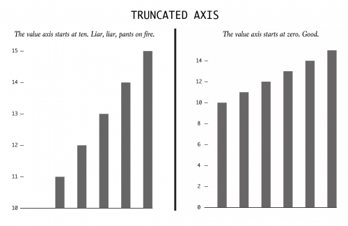
How To Spot Visualization Lies. Credit: Nathan Yau.
When there are suddenly two “grounds” — the invisible ground that the stacks are stacked upon and the visible ground floating high above it — the graphic stops making sense. How can we understand differences when we can’t see the whole stack? Most bad or misleading visualizations can be attributed to this kind of broken environmental logic. Some of the most egregious examples can be found on WTF Visualizations — a collection of confusing, illogical visualizations: wholes that don’t add up to 100%, values that don’t correspond to their forms, or meaningless forms that contradict and confuse the established logic.
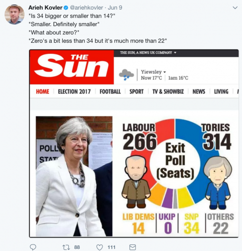
Tweet by Arieh Kovler. Credit: viz.wtf.
Not all logic breakdowns are this obvious — even small breaks can affect credibility. This could be something simple, like symbolically assigning meaning to the color blue and then using blue for a different purpose in the same environment. Ultimately, when trust is broken, you lose your audience — or worse, you could accidentally mislead them.
On the other hand, when logic is carefully maintained, something magical happens. Your audience is no longer interpreting signs. Your audience starts to exist in the world you’ve created and begins reacting to it accordingly.
Back to the improv stage. If the actor drops his arms and reacts to the fishbowl breaking on the ground, there’s laughter. Other actors on stage slip in the puddle. More laughter. Laughter in an improv comedy scene is the same as understanding — or deriving insight from — a visualization. It’s the moment when all the work you’ve asked of the audience pays off — where the logic reveals something special. It’s a reward.
We can especially see this in visualizations that transform. The logic is established, and then entities transform by some other variable — maybe time. One of the early, memorable visualization of this kind was the transforming bubble chart by Gapminder.org that looked at the prosperity of nations through time. In the first frame, the rules and logic are established — it’s an environment where each nation is represented by a circle (size represents population) and the circles are organized by two variables: income (x axis) and life expectancy (y axis).
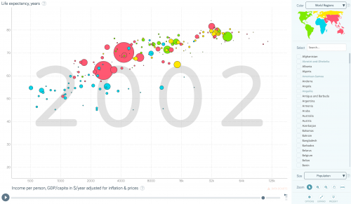
Credit: gapminder.org
We see a correlation between these two variables — high income correlates with higher life expectancy. Then, as we move forward through time, the entities move around in this space, reacting to the new data for each year. We see more of the circles move to the top right — and we know what this means because of the consistent, established logic. Nations are becoming wealthier and their populations are living longer. The transformation has allowed the audience to experience the moment of discovery for themselves.
The importance of the experience is the biggest thing visualization designers can learn from improv comedy. Just as explaining a joke isn’t funny, reciting a fact is not that impactful. An audience needs to experience it for themselves — and as storytellers, we must create the proper environment for them to do this.
- What improv comedy can teach us about visualizing data - October 2, 2017